


-
MGGSOnlineAsked on January 6, 2019 at 8:31 PM
Hi there,
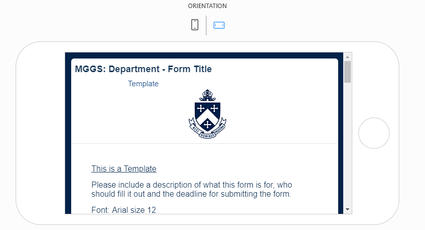
This form is centering the header and image when device is below 767 pixels wide, and I'm afraid I can't work out how to change the CSS to prevent this happening. Could you advise?
https://form.jotform.co/83297330749870
Thanks,
Caroline
 Page URL: https://form.jotform.co/83297330749870
 -
Welvin Support Team LeadReplied on January 7, 2019 at 12:58 AM
If you'd like to move it back to its original position, inject the following custom CSS codes:
.form-header-group.hasImage>.header-logo {
display: table-cell !important;
}
If you'd like to left align the text, inject the following custom CSS codes:
.form-header-group.hasImage>.header-text {
text-align: left !important;
}
Guide: https://www.jotform.com/help/117-How-to-Inject-Custom-CSS-Codes
-
MGGSOnlineReplied on January 7, 2019 at 6:43 PM
Thanks very much Welvin, that works.
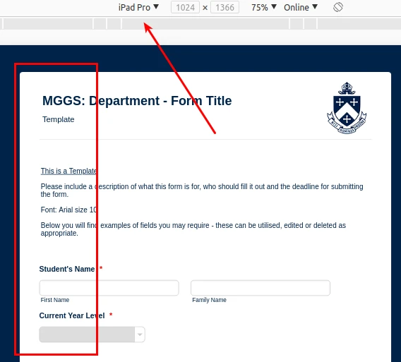
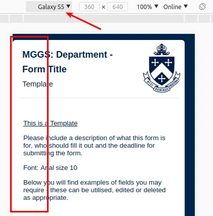
Could you also advise on how to align the text left but maintain the same left padding as the form, so that the text aligns with the rest of the form? In addition, is there a way to maintain the font size, particularly when in Portrait on tablet?
Also when previewing in Portrait on mobile, the whole form seems to align left, which means the navy margin disappears. Is there a way to avoid this?
Annotated pictures attached.
Thanks
Caroline


-
DonaldHagReplied on January 7, 2019 at 11:05 PM
To adjust the navy margin, add the following CSS to your form. It can go below the already existing CSS. Note that you can adjust the 20px to a higher or lower value depending on how wide you want the margin to be on mobile.
@media screen and (max-width: 699px) {
.form-all {
padding-left: 20px !important;
}
}
The margin is removed to make the form appear better on mobile. Due to the small screen size, making use of all the space renders the form better.
The Form Title does align with the rest of the text on desktop, tablet, and mobile devices. I have run some tests on desktop, mobile, and tablet and it aligns correctly. The issue could be the preview rendering it incorrectly however on a real device it aligns correctly.
-
MGGSOnlineReplied on January 7, 2019 at 11:44 PM
Hi Donald, thanks for your reply, and for looking into the alignment issue.
For the margin, your CSS increases/decreases the white padding before the text begins, but doesn't affect the width of the left navy margin in the background. Is there a way to specify in the CSS to pad the navy background rather than the form itself?
Thanks
Caroline
-
DonaldHagReplied on January 8, 2019 at 1:12 AM
Yes, this is possible, add the following CSS instead of the one mentioned above;
@media screen and (max-width: 699px) {
.jotform-form .form-all {
margin: auto !important;
width: 95% !important;
}
}
Modify the percentage on the line width: 95% to your preferred form width on mobile.
-
MGGSOnlineReplied on January 8, 2019 at 5:12 PM
Perfect, thank you!
- Templates
- Integrations
- INTEGRATIONS
- See 100+ integrations
- FEATURED INTEGRATIONS
 PayPal
- Slack
- Google Sheets
- Mailchimp
- Zoom
- Dropbox
- Google Calendar
- Hubspot
- Salesforce
- See more Integrations
- Products
- PRODUCTS
- Form Builder
- Jotform Enterprise
- Jotform Apps
- Store Builder
- Jotform Tables
- Jotform Inbox
- Jotform Mobile App
- Jotform Approvals
- Report Builder
- Smart PDF Forms
- PDF Editor
- Jotform Sign
- Jotform for Salesforce Discover Now
- Support


