


-
sergeantcarterAsked on February 10, 2019 at 12:47 PM
Hello,
I have the form AMP TVHL Main Contact Form and I'm using the Thank you page upon successful submission.
I cannot get the unnumbered list to center properly in iPhone portrait orientation and iPad landscape orientation.
I have tried tweaking the custom css but cannot figure out the magic formula. I don't want the text in the bulleted list to wrap. It should spread out and center in the div.
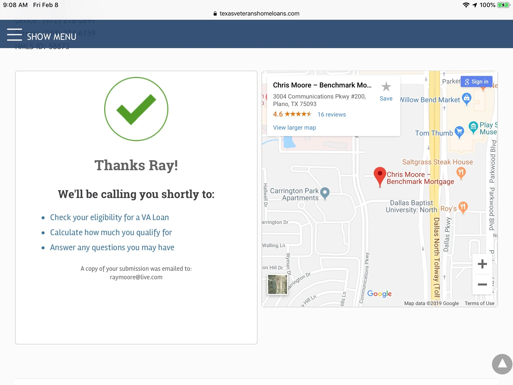
These are actual screenshots for the iPhone and the iPad...
iPad Landscape
iPhone Portrait
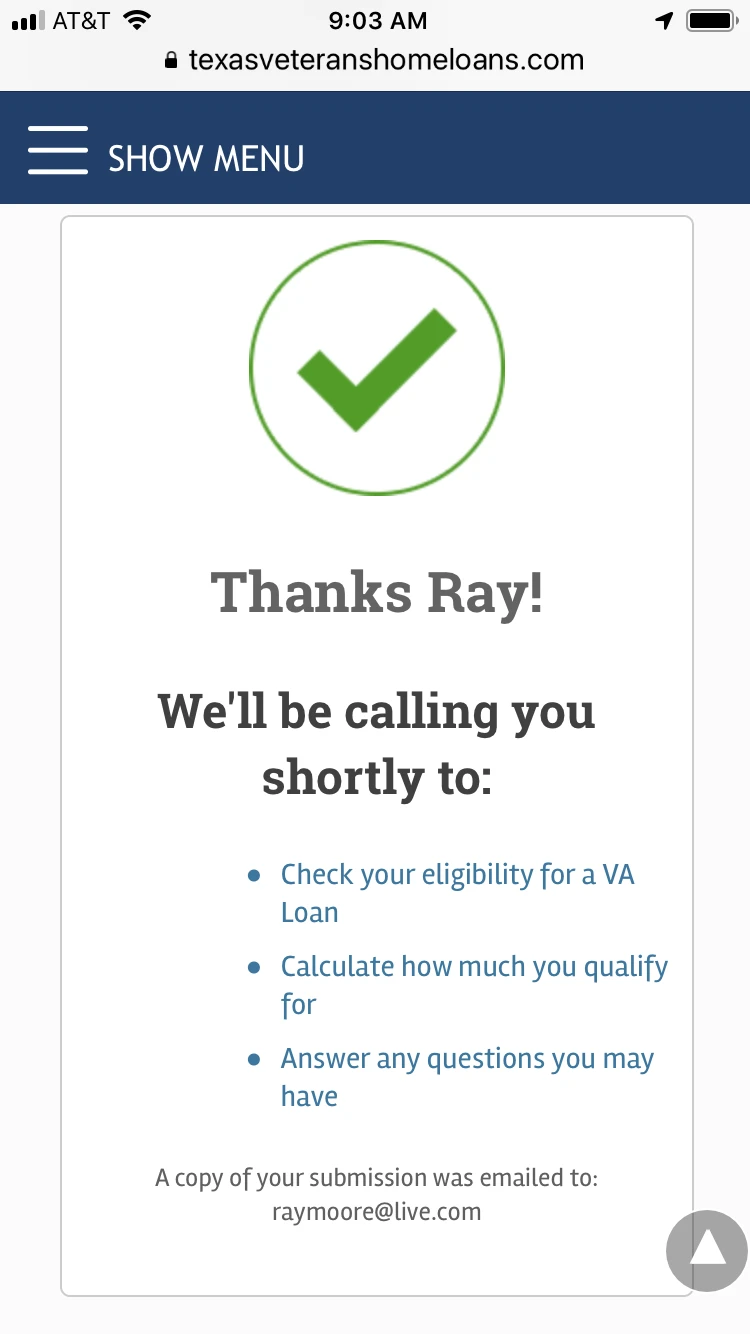
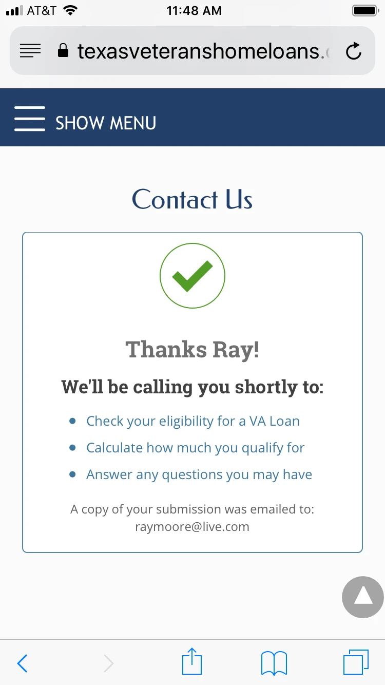
This is what it should look like...
Any help would be greatly appreciated.
-
MikeReplied on February 10, 2019 at 3:36 PM
You may try the next CSS to center the div with the ul element:
.ul-list-wrapper {
width: auto;
display: inline-block;
}
div#stage ul {
padding-left: 0;
} -
sergeantcarterReplied on February 10, 2019 at 3:58 PM
Do you mean add this to a media query? As in...
/* iPad Landscape */
@media only screen and (min-device-width:768px) and (max-device-width:1024px) and (orientation:landscape) {.ul-list-wrapper {
width: auto;
display: inline-block;
}
div#stage ul {
padding-left: 0;
}/* iPhone Portrait */
@media screen and (min-width: 480px) {.ul-list-wrapper {
width: auto;
display: inline-block;
}
div#stage ul {
padding-left: 0;
}}
-
Victoria_KReplied on February 10, 2019 at 5:28 PM
Yes, please try with media query, I can suggest this code:
@media screen and (max-width: 480px), screen and (max-device-width: 768px) and (orientation: portrait), screen and (max-device-width: 415px) and (orientation: landscape) {
div#stage ul {
padding-left: 45px !important;
}
}
How-to-Inject-Custom-CSS-Codes
It should center the list for tablets and mobile devices.
We will be glad to assist if you need more help.
-
sergeantcarterReplied on February 10, 2019 at 6:56 PM
The above code has no affect on the two devices and orientations that need to be fixed (iPhone portrait and iPad landscape, but it further messes up the other orientations, so I took it back out.
-
jherwinReplied on February 10, 2019 at 9:08 PM
Could you let us know what Ipad and iPhone you are using to test this so we can test it also on our end?
Looking forward to your response.
-
sergeantcarterReplied on February 10, 2019 at 10:49 PM
A iPhone 6 and a iPad Pro.
I've found that the only way to truly test code is to look at the website on the actual device. The DevTools in Firefox and Chrome are sometimes misleading.
-
jherwinReplied on February 11, 2019 at 12:48 AM
Please allow me some time to run a few tests and get back to you via this thread.
Thank you for your patience.
-
sergeantcarterReplied on February 11, 2019 at 4:41 PM
Did you figure anything out?
-
MikeReplied on February 11, 2019 at 6:00 PM
The next CSS is supposed to center the div on all the devices, but you will need to remove your other CSS from the @media rules which is affecting the div/ul.
.ul-list-wrapper {
width: auto;
display: inline-block;
}
div#stage ul {
padding-left: 0;
} -
sergeantcarterReplied on February 11, 2019 at 9:35 PM
That fixed the iPhone in portrait orientation!
iPad landscape is still left-aligned.
-
jherwinReplied on February 11, 2019 at 11:04 PM
Please change the width of iPad Portrait and landscape from 100% to auto.
Here's what I'm referring to:
FROM:/* iPad in Portrait & landscape orientation */
@media only screen and (min-device-width: 768px) and (max-device-width: 1024px) {
div#stage div.ul-list-wrapper {
width: 100%;
margin: 0 auto;
}
TO:
/* iPad in Portrait & landscape orientation */
@media only screen and (min-device-width: 768px) and (max-device-width: 1024px) {
div#stage div.ul-list-wrapper {
width: auto;
margin: 0 auto;
}
Please give it a try and let us know how it goes.
-
sergeantcarterReplied on February 12, 2019 at 11:28 AM
That seemed to have worked. Thank you!
- Templates
- Integrations
- INTEGRATIONS
- See 100+ integrations
- FEATURED INTEGRATIONS
 PayPal
- Slack
- Google Sheets
- Mailchimp
- Zoom
- Dropbox
- Google Calendar
- Hubspot
- Salesforce
- See more Integrations
- Products
- PRODUCTS
- Form Builder
- Jotform Enterprise
- Jotform Apps
- Store Builder
- Jotform Tables
- Jotform Inbox
- Jotform Mobile App
- Jotform Approvals
- Report Builder
- Smart PDF Forms
- PDF Editor
- Jotform Sign
- Jotform for Salesforce Discover Now
- Support


