


-
maserafiAsked on June 5, 2019 at 4:28 PM
I have an iFrame element in my form. It displays a google sheet. The width looks good on a desktop however on an iPad ithe width is squeezed like for a mobile phone.
 Page URL: https://form.jotform.com/91546957703164
 -
jherwinReplied on June 5, 2019 at 5:21 PM
Could you please try injecting this custom CSS code to the iFrame embed widget:
@media screen and (min-width: 768px){
iframe#customFieldFrame_28 {
width: 700px!important;
max-width: 800px!important;
}}Guide: How-to-Inject-CSS-Codes-to-Widgets
Please give it a try and let us know how it goes.
-
maserafiReplied on June 5, 2019 at 5:43 PMMade the change however I do not see a difference
Sent from my iPad
... -
jherwinReplied on June 5, 2019 at 6:02 PM
I injected this custom CSS to your iFrame embed widget:
iframe {
width: 100% !important;
}Can you please check your form again?
-
maserafiReplied on June 5, 2019 at 6:43 PMThat seems to have worked!!! Thank you.
... -
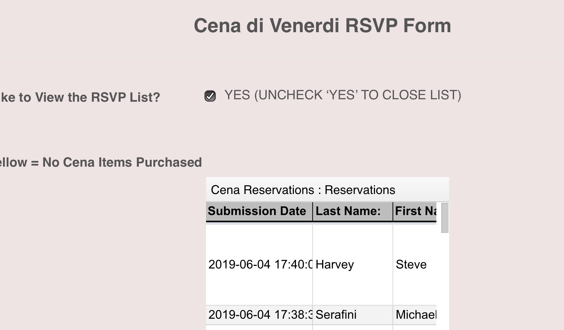
maserafiReplied on June 6, 2019 at 10:43 AM
-
Jed_CReplied on June 6, 2019 at 11:45 AM
I'll address your concern on a separate thread here https://www.jotform.com/answers/1848437 shortly.
- Templates
- Integrations
- INTEGRATIONS
- See 100+ integrations
- FEATURED INTEGRATIONS
 PayPal
- Slack
- Google Sheets
- Mailchimp
- Zoom
- Dropbox
- Google Calendar
- Hubspot
- Salesforce
- See more Integrations
- Products
- PRODUCTS
- Form Builder
- Jotform Enterprise
- Jotform Apps
- Store Builder
- Jotform Tables
- Jotform Inbox
- Jotform Mobile App
- Jotform Approvals
- Report Builder
- Smart PDF Forms
- PDF Editor
- Jotform Sign
- Jotform for Salesforce Discover Now
- Support


