


-
prideglobalAsked on July 5, 2019 at 10:00 PM
Hi,
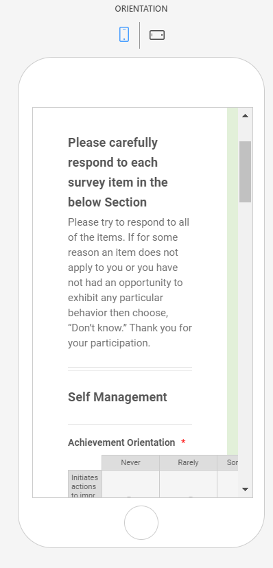
Could you please help me to set the below form, both mobile and desktop friendly.
https://form.jotform.com/91836060431149
The mobile version is getting skewed.
Thank you!
Best regards,
Martin
 Page URL: https://form.jotform.com/91836060431149
 -
Ashwin JotForm SupportReplied on July 5, 2019 at 11:06 PM
Please inject the following custom css code in your form and see if that solves your problem:
@media only screen and (max-device-width: 480px) {
.form-section.page-section {
padding-left: 5px !important;
padding-right: 5px !important;
}
th.form-matrix-column-headers {
min-width: 15px !important;
width: 50px !important;
}
.form-matrix-column-headers.form-matrix-column_2, .form-matrix-column-headers.form-matrix-column_4 {
word-wrap: anywhere !important;
}
#cid_13 {
margin-left: -19px;
margin-right: -17px;
}
.form-matrix-row-headers {
width: 166px;
word-break: break-all;
min-width: 30px;
}
}
The following guide should help you how to inject custom css code in form: https://www.jotform.com/help/117-How-to-Inject-Custom-CSS-Codes
Hope this helps.
Do get back to us if you need any other changes.
- Templates
- Integrations
- INTEGRATIONS
- See 100+ integrations
- FEATURED INTEGRATIONS
 PayPal
- Slack
- Google Sheets
- Mailchimp
- Zoom
- Dropbox
- Google Calendar
- Hubspot
- Salesforce
- See more Integrations
- Products
- PRODUCTS
- Form Builder
- Jotform Enterprise
- Jotform Apps
- Store Builder
- Jotform Tables
- Jotform Inbox
- Jotform Mobile App
- Jotform Approvals
- Report Builder
- Smart PDF Forms
- PDF Editor
- Jotform Sign
- Jotform for Salesforce Discover Now
- Support
