


-
quinnponeAsked on August 20, 2019 at 7:00 AM
form: https://form.jotformeu.com/92312675024351
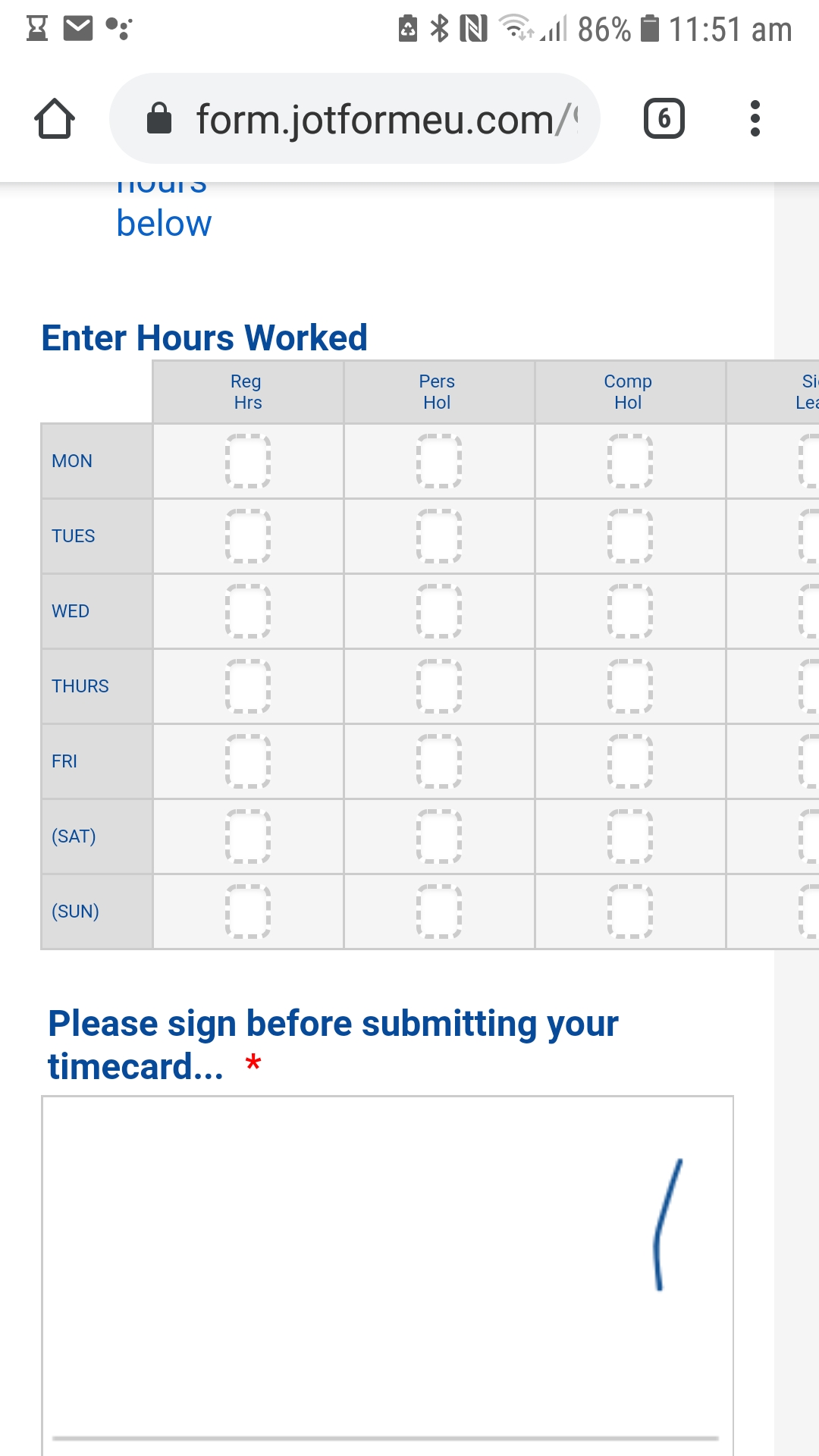
I have a timecard table which on desktop looks ok.
On the mobile, the 'hours worked' table extends past the right of the screen (see attached screenshot).
Can I adjust the table so that the entire table appears on the screen?
Can I reduce the paddings on the cells of the field?
Thanks for your help.
On the mobile, the hourly entry table overhangs to the right of the mobile. Can

-
jherwinReplied on August 20, 2019 at 8:46 AM
Please try to inject these custom CSS code to your form:
@media screen and (max-width: 480px), screen and (max-device-width: 767px) and (orientation: portrait), screen and (max-device-width: 415px) and (orientation: landscape){
.form-matrix-row-headers {
word-break: break-word;
}
th.form-matrix-column-headers {
min-width: 25px;
width: 25px;
}
.form-all{
margin:auto!important;
}
}Guide: How-to-Inject-Custom-CSS-Codes
Please give it a try and let us know how it goes.
-
quinnponeReplied on August 20, 2019 at 9:43 AMThanks so much, that worked!
Is there code that could make the row header width smaller? If you look
at our form, half the field is empty...would prefer to have the space in
the column cells. See screenshot below
---
Kind regards,
Graciela Quinn
Accounts
07729 906976
... -
quinnponeReplied on August 20, 2019 at 9:43 AMPlease disregard question below...I took what you gave me and replaced
header with row, changed to max rather than min width and it looks
better.
---
Kind regards,
Graciela Quinn
Accounts
07729 906976
... -
Ashwin JotForm SupportReplied on August 20, 2019 at 10:52 AM
I am glad to know that your form looks as expected. Do get back to us if you have any questions.
-
quinnponeReplied on August 20, 2019 at 11:43 AMref: https://form.jotformeu.com/92312675024351
I do have another problem I can't seem to solve...
Again, on the desktop it looks acceptable; however, on the mobile - I
have fields displayed I would like to have on the same row...but the
mobile puts one field on a row... see screen shot below
I would like to have total hours on one row and then the following four
fields (regular, company, personal and sick) on the same row.
Can this be done?
Thanks for your help,
Graciela
---
Kind regards,
Graciela Quinn
Accounts
07729 906976
... -
jherwinReplied on August 20, 2019 at 1:00 PM
Considering that your other concern is about another topic, I have moved it to a new thread to avoid confusion.
https://www.jotform.com/answers/1933447
Please refer to that thread for any related questions and/or follow-ups.
- Templates
- Integrations
- INTEGRATIONS
- See 100+ integrations
- FEATURED INTEGRATIONS
 PayPal
- Slack
- Google Sheets
- Mailchimp
- Zoom
- Dropbox
- Google Calendar
- Hubspot
- Salesforce
- See more Integrations
- Products
- PRODUCTS
- Form Builder
- Jotform Enterprise
- Jotform Apps
- Store Builder
- Jotform Tables
- Jotform Inbox
- Jotform Mobile App
- Jotform Approvals
- Report Builder
- Smart PDF Forms
- PDF Editor
- Jotform Sign
- Jotform for Salesforce Discover Now
- Support


