


-
vitacaretechAsked on October 3, 2019 at 11:32 AM
What is the correct mobile format / CSS code for the scale rating feature? When used in my form on a mobile device it does not fit in the screen
Page URL: https://form.jotform.com/92685388717172 -
denis_calin Jotform SupportReplied on October 3, 2019 at 12:15 PM
Hi @vitacaretech!
Please inject the following CSS code into your form:
@media screen and (max-width: 480px) {
li[data-type="control_scale"] table.form-scale-table tr th, table.form-scale-table tr td {
padding: 9px 0px !important;
}
li[data-type="control_scale"] table.form-scale-table tr td input {
width: 10px !important;
}
}Here is the guide on how to inject CSS code into forms: How-to-Inject-Custom-CSS-Codes.
-
vitacaretechReplied on October 3, 2019 at 4:17 PM
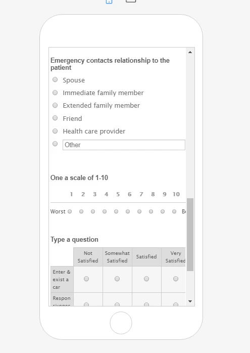
This still doesn't fit. The best & worst are what do not fit on the screen
-
denis_calin Jotform SupportReplied on October 3, 2019 at 5:03 PM
Hi @vitacaretech!
It appears that the word "Best" has been obscured by the slider in the preview mode - this will not be the case on the real device. Here is what I see when I preview your form on Firefox browser:

I have also viewed your form on an iPhone 6s and everything correctly on the screen. Please let us know if you have any other questions.
- Templates
- Integrations
- INTEGRATIONS
- See 100+ integrations
- FEATURED INTEGRATIONS
 PayPal
- Slack
- Google Sheets
- Mailchimp
- Zoom
- Dropbox
- Google Calendar
- Hubspot
- Salesforce
- See more Integrations
- Products
- PRODUCTS
- Form Builder
- Jotform Enterprise
- Jotform Apps
- Store Builder
- Jotform Tables
- Jotform Inbox
- Jotform Mobile App
- Jotform Approvals
- Report Builder
- Smart PDF Forms
- PDF Editor
- Jotform Sign
- Jotform for Salesforce Discover Now
- Support

