


-
erkes1Asked on November 11, 2019 at 8:42 AM
-
Richie JotForm SupportReplied on November 11, 2019 at 8:56 AM
You may add these custom CSS in your Form builder CSS
@media screen and (max-width: 480px) {
#customFieldFrame_19{
height: 70px !important;
position: initial;
}
#customFieldFrame_20{
height: 90px !important;
}
}Guide:https://www.jotform.com/help/117-How-to-Inject-Custom-CSS-Codes
Please give it a try and let us know if this fits your requirements.
-
erkes1Replied on November 11, 2019 at 10:10 AM
Thanks
It solved the issue partially, the [Configurable List] widget at the bottom of the page is still unresponsive on mobile.
-
Richie JotForm SupportReplied on November 11, 2019 at 11:24 AM
You may add this custom CSS inside the widget CSS.
@media screen and (max-width:480px){
#list tbody:first-child > tr:first-child {display: none;} #list {width: 100%; border-collapse: collapse;} #list tbody:first-child > tr > td{display:block; padding: 6px 0;padding-right: 60px;} #list tbody:first-child > tr + tr + tr {border-top: 1px solid #ccc;} #list > tbody:first-child tr td.col1 {padding-top: 20px;} .mobileColumnName {display: inline-block; padding-bottom: 4px; width: 40%; box-sizing: border-box;} .mobileColumnName + input, .mobileColumnName + textarea, .mobileColumnName + select, .mobileColumnName + .radio-container, .mobileColumnName + .checkbox-container, .mobileColumnName + .dateContainer {width: 40%; display: inline-block; box-sizing: border-box; vertical-align:top; box-shadow:none;} .buttonsColumn {text-align: right;}
}If you need further assistance, let us know.
-
erkes1Replied on November 12, 2019 at 1:58 AM
Nope, still unresponsive and not aligned to the right.
Both on my mobile device (iPhone 7 Plus) and in the preview form mode.
-
jherwinReplied on November 12, 2019 at 4:31 AM
I checked your form and the configurable list widget is already mobile responsive, please check my screenshot below.
Can you tell us how you like it to be displayed?Looking forward to your response.
-
erkes1Replied on November 12, 2019 at 4:35 AM
I don't know where you preview my form but I don't see that it's responsive.
Below is a screenshot of the form from the mobile preview mode:

-
jherwinReplied on November 12, 2019 at 5:07 AM
Please give me more time to test this further. I'll update you through this thread.
-
erkes1Replied on November 13, 2019 at 2:43 AM
Any updates?
-
jherwinReplied on November 13, 2019 at 4:34 AM
Sorry for the delay, can you please test my test form here: https://form.jotform.com/93152738664970
Please open it using a real device or iPhone 6/7 plus to see the real results.
Let us know if it now meets your requirements.
-
erkes1Replied on November 13, 2019 at 4:48 AM
Thank you, but the bottom [Configurable List] widget is still unresponsive on mobile.
By the way, I've updated my form according to the answers I've received on this support thread: https://www.jotform.com/answers/2035030-How-can-I-right-align-the-terms-amp-conditions-widget-to-the-right
So currently there're just 2 issues in my form:
1. The bottom [Configurable List] widget is still unresponsive on mobile and it's also not totally aligned to the right.
2. The terms & condition widget checkboxes aren't aligned to the right - as per Richie_P there's some issue with CSS on mobile and he's checking it.
Perhaps it would be a good idea to merge the 2 support threads into 1 so that only one person could sort out the issues.
-
jherwinReplied on November 13, 2019 at 5:12 AM
Thank you, but the bottom [Configurable List] widget is still unresponsive on mobile.
Can you please show us how it displays to your end? I don't have an iPhone in my hand right now, but I'll check it with the iPhone emulator.
Unfortunately, we cannot merge your two threads to avoid confusion. We need to focus on one issue so we can solve it as quickly as possible. It will also help you if your two issues are separated so that each supporter can focus on one problem only.
I will work on this issue (configurable list widget) and will update you later through this thread. I'm not sure why it doesn't responsive to you, but when I send you my test form it works as expected.
Thank you for your patience.
-
erkes1Replied on November 13, 2019 at 5:54 AM
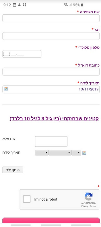
Ok, below is a screenshot of how it looks like on my iPhone.
And by the way, when I'm doing inspect and viewing the form on other devices besides it's still not responsive + I've checked it on Android mobile device (LG G6) and there it's not responsive as well.

-
Kiran Support Team LeadReplied on November 13, 2019 at 6:18 AM
Let me check on this and get back to you with relevant information shortly.
Thank you!
-
Kiran Support Team LeadReplied on November 13, 2019 at 6:49 AM
I have cloned your JotForm and checked the form on my Android mobile and other emulators including iPhone X, Samsung S9 and LG G5. However, all the devices displayed the configurable list widget in the responsive mode. Please see the screenshots below:
Asus Max Pro M2 (Android)

Apple iPhone

Samsung Galaxy S9

Samsung Galaxy S7 running Android 6

LG G5

Could you check the form on a different device and let us know how it is being displayed?
-
erkes1Replied on November 13, 2019 at 7:35 AM
That's totally strange, below is a screenshot of a test I did on LG G6 just now.
I'm using the following form link for the testing: https://form.jotform.me/93142828942463

-
Richie JotForm SupportReplied on November 13, 2019 at 8:22 AM
I have tested your form on my devices Android and IOS, and the configurable list widget and calendar is responsive at my end.
Can you please check again and let us know if the issue still remains?
-
erkes1Replied on November 13, 2019 at 8:37 AM
Well, I don't know what you did but now it's now responsive both on the iPhone and the LG G6
Thank you.
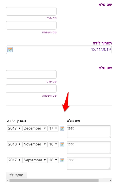
Could you please assist me now with aligning the titles of the fields in configurable list widget to be on the right side of the input fields and also the bottom button (הוסף ילד) to be aligned to the right and not left.
At present, the below CSS code is updated in the widget:
@media screen and (max-width:480px){
#list tbody:first-child > tr:first-child {display: none;} #list {width: 100%; border-collapse: collapse;} #list tbody:first-child > tr > td{display:block; padding: 6px 0;padding-right: 60px;} #list tbody:first-child > tr + tr + tr {border-top: 1px solid #ccc;} #list > tbody:first-child tr td.col1 {padding-top: 20px;} .mobileColumnName {display: inline-block; padding-bottom: 4px; width: 40%; box-sizing: border-box;} .mobileColumnName + input, .mobileColumnName + textarea, .mobileColumnName + select, .mobileColumnName + .radio-container, .mobileColumnName + .checkbox-container, .mobileColumnName + .dateContainer {width: 40%; display: inline-block; box-sizing: border-box; vertical-align:top; box-shadow:none;} .buttonsColumn {text-align: right;}
}
-
Richie JotForm SupportReplied on November 13, 2019 at 9:11 AM
I have used these CSS code to adjust the labels however, it seems to be working only in IOS devices.
.mobileColumnName{
float:right;
padding-left:100px ;
}
.add{
float:right;
{Updated CSS
@media screen and (max-width:480px){
#list tbody:first-child > tr:first-child {display: none;} #list {width: 100%; border-collapse: collapse;} #list tbody:first-child > tr > td{display:block; padding: 6px 0;padding-right: 60px;} #list tbody:first-child > tr + tr + tr {border-top: 1px solid #ccc;} #list > tbody:first-child tr td.col1 {padding-top: 20px;} .mobileColumnName {display: inline-block; padding-bottom: 4px; width: 40%; box-sizing: border-box;} .mobileColumnName + input, .mobileColumnName + textarea, .mobileColumnName + select, .mobileColumnName + .radio-container, .mobileColumnName + .checkbox-container, .mobileColumnName + .dateContainer {width: 40%; display: inline-block; box-sizing: border-box; vertical-align:top; box-shadow:none;} .buttonsColumn {text-align: right;}
.mobileColumnName{
float:right;
padding-left:100px ;
}
.add{
float:right;
{
}Can you please try the CSS and let us know if this works at your end?
-
erkes1Replied on November 13, 2019 at 9:30 AM
Yeah, it looks a bit weird.
Ok, I'll leave it as is...
Thank you anyway.
- Templates
- Integrations
- INTEGRATIONS
- See 100+ integrations
- FEATURED INTEGRATIONS
 PayPal
- Slack
- Google Sheets
- Mailchimp
- Zoom
- Dropbox
- Google Calendar
- Hubspot
- Salesforce
- See more Integrations
- Products
- PRODUCTS
- Form Builder
- Jotform Enterprise
- Jotform Apps
- Store Builder
- Jotform Tables
- Jotform Inbox
- Jotform Mobile App
- Jotform Approvals
- Report Builder
- Smart PDF Forms
- PDF Editor
- Jotform Sign
- Jotform for Salesforce Discover Now
- Support


