


-
BenebleAsked on January 27, 2020 at 6:26 PM
Hi there,
I've read all the posts on here on styling the Radio Buttons widget, but cannot find the information I need.
I'm trying to style the Yes / No buttons on the 2nd page of this form (https://form.jotform.com/93254786917169)to look exactly like the ones on the 2nd page of this form (https://www.brunorecs.com/survey-dc/).
Specifically:
I want to make Yes/No buttons have a shadow on hover, and then become dark blue with thicker white text on click. I want to get rid of the default blue border and triangle on click.
I think I've managed to set the right initial state, but cannot manage the click or hover. Desired sytling:
When hover: box-shadow: 0 0 20px 0 rgba(0, 0, 0, 0.2);When clicked:
font-weight: 700;
background-color: #5398D9;
color: #fff;
border: 1px solid #537dd9;
box-shadow: 0 0 20px 0 rgba(0, 0, 0, 0.1);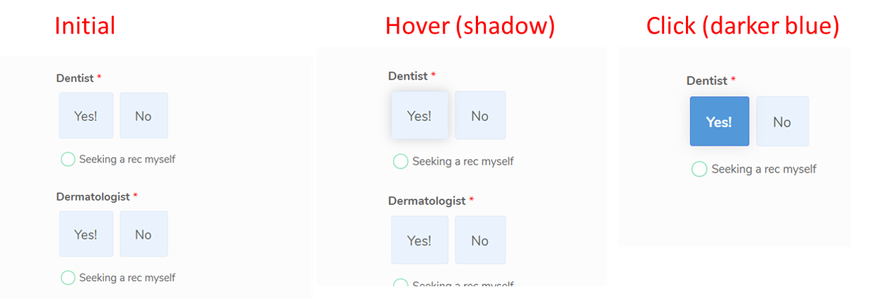
-
Kiran Support Team LeadReplied on January 28, 2020 at 1:10 AM
Let me check on this and get back to you with relevant information.
Thank you!
-
Kiran Support Team LeadReplied on January 28, 2020 at 2:29 AM
Please add the following CSS code to the custom CSS section of each Button Radios widget to make the necessary changes.
.wrapperButtonRadio:hover {
box-shadow: 0 0 20px 0 rgba(0, 0, 0, 0.2)
}
.radios input:checked + label span {
font-weight: 700 !important;
background-color: #5398D9 !important;
color: #fff !important;
border: 1px solid #537dd9 !important;
box-shadow: 0 0 20px 0 rgba(0, 0, 0, 0.1) !important;
}
.actviv_elem {
background: none !important;
}
https://www.jotform.com/help/428-How-to-Inject-CSS-Codes-to-Widgets
Please get back to us if you need any further assistance. We will be happy to help.
-
BenebleReplied on January 28, 2020 at 2:14 PM
Hi there,
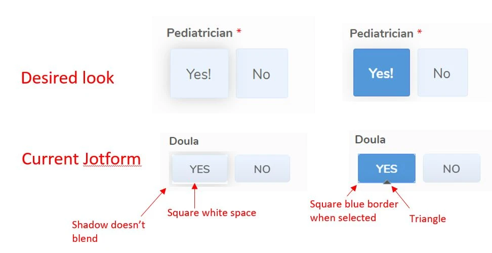
I added all three of those and that helps a bit, but there are still a few issues. I added a side by side photo of the desired look vs the current jotfotm:- the shadow on hover doesn't blend/fade in to background it's cut off into a rectangle
- there's a square border of white space on hover
- on click, there's a square blue border we need to remove
- on click, there's a black triangle we need to remove.
Thanks a lot for your help!
-
BenebleReplied on January 28, 2020 at 2:19 PM
adding close up photo of issues if helpful

-
Kiran Support Team LeadReplied on January 28, 2020 at 3:55 PM
Please allow me sometime to check on this and get back to you with relevant information.
Thank you for your patience.
-
BenebleReplied on January 29, 2020 at 12:41 AM
Thanks Kiran, I’m waiting for your answer. I appreciate the help!
-
Kiran Support Team LeadReplied on January 30, 2020 at 10:04 AM
Sorry for the delay. Please try replacing the CSS code in the widget to make the necessary changes.
.wrapperButtonRadio:hover {
box-shadow: 0 0 20px 0 rgba(0, 0, 0, 0.2)
}
.radios input:checked + label span {
font-weight: 700 !important;
background-color: #5398D9 !important;
color: #fff !important;
border: 1px solid #537dd9 !important;
box-shadow: 0 0 20px 0 rgba(0, 0, 0, 0.1) !important;
}
.actviv_elem {
background: none !important;
}
.wrapperButtonRadio{
border:none;
margin: 5px 5px 5px 5px;
box-shadow:none;
border-radius: 5px;
}
.radios input + label span{
background-color:#a5d2ff36;
box-shadow: 0 0 1px 0 rgba(0, 0, 0, 0.1);
border: 1px solid #a5d2ff36;
}
.radios input + label {
color: #606060;
font-family: "Nunito", Sans-serif;
font-weight: 500;
font-size: 100%;
border-radius: 5px;
}
label {
height: 42px !important;
}
.radios input:checked + label span {
border: none;
}
This is how it should be displaying after replacing the CSS code in the widget.
Thanks!
-
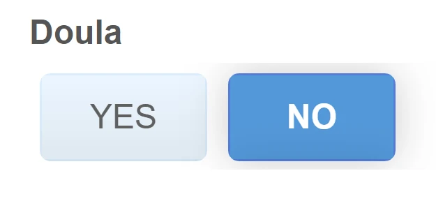
BenebleReplied on February 4, 2020 at 7:53 PM
Thanks Kiran it worked great! But how do I remove the "active" blue colored border? It moved to whichever button I have last clicked. See blue border on No button below. Thanks!

-
roneetReplied on February 4, 2020 at 10:29 PM
I am not sure if I have understood your questions correctly. Do you just want the blue color while hovering on the button? Do you want to remove the blue color when the button is selected?
Looking forward to your response.
Thanks.
-
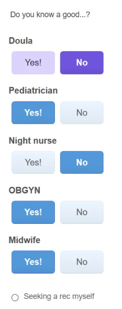
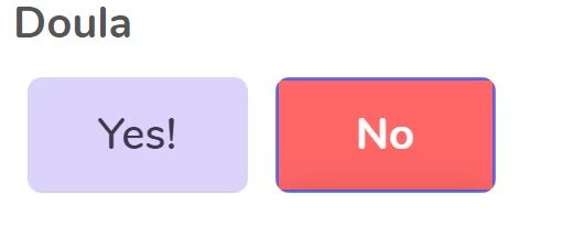
BenebleReplied on February 5, 2020 at 3:23 PM
It's the blue border when clicked I want to remove/change. See here I made the background red so you can see blue border better.
-
Vanessa_TReplied on February 5, 2020 at 4:42 PM
Please add the Custom CSS below to remove the border for selected button:
.radios input.checkedButtonRadio:checked + label span { border: none !important; }
- Templates
- Integrations
- INTEGRATIONS
- See 100+ integrations
- FEATURED INTEGRATIONS
 PayPal
- Slack
- Google Sheets
- Mailchimp
- Zoom
- Dropbox
- Google Calendar
- Hubspot
- Salesforce
- See more Integrations
- Products
- PRODUCTS
- Form Builder
- Jotform Enterprise
- Jotform Apps
- Store Builder
- Jotform Tables
- Jotform Inbox
- Jotform Mobile App
- Jotform Approvals
- Report Builder
- Smart PDF Forms
- PDF Editor
- Jotform Sign
- Jotform for Salesforce Discover Now
- Support


