


-
deanburdenAsked on February 19, 2020 at 2:43 PM
I have completed a form but cannot get the Configurable List onto two lines...I've searched the forum and found some CSS designs and attempted to adapt them. They did put it onto two lines but messy...
I'd like to put location / work carried out / working with onto a new line (with possibly of adding more)

Any help greatly appreciated.
-
Girish JotForm SupportReplied on February 19, 2020 at 6:22 PM
Please allow me some time to get you the suitable CSS code to achieve your requirement and I'll revert via this thread.
-
Girish JotForm SupportReplied on February 20, 2020 at 1:02 AM
First go to the field properties and increase field width to 700:

Then please insert the CSS code below into the CSS tab of the Configurable List widget:
th {
display: none;
}
td.col1,
td.col2,
td.col3,
td.col4,
td.col5,
td.col6,
td.col7 {
display: inline-block;
float: left;
font-weight: bold;
padding: 20px 15px 1px 1px;
}
.col1:before {
content: "Date";
display: block;
}
.col2:before {
content: "Start";
display: block;
}
.col3:before {
content: "Finish";
display: block;
}
.col4:before {
content: "Total";
display: block;
}
.col5:before {
content: "Location";
display: block;
}
.col6:before {
content: "Work carried out";
display: block;
}
.col7:before {
content: "Working with";
display: block;
}
td.col1 {
width: 30%;
}
td.col2 {
width: 20%;
}
td.col3 {
width: 20%;
}
td.col4 {
width: 20%;
}
td.col5 {
width: 20%;
}
td.col6 {
width: 20%;
}
Related Guide: How-to-Inject-CSS-Codes-to-Widgets
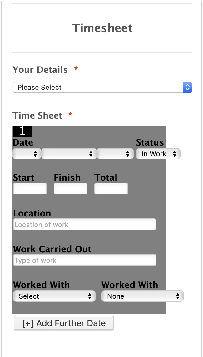
Result:

Here is a demo form: https://form.jotform.com/200497092293963
You can clone it if required: https://www.jotform.com/help/42-How-to-Clone-an-Existing-Form-from-a-URL
-
deanburdenReplied on February 27, 2020 at 2:28 PM
Thank you very much for your help. As you can probably see from my form I have been able to move things into a more manageable format from your help...
I'd like it to be formatted suitable for mobile phones with the below fields on each line:

Date / Status
Start / Finish / Total
Location of Work
Work Carried Out
Working With / Working With
One line break between last field and '+ Add Further Date'
I'd also like the list total to keep left - but can't get it to [can be be made to look smarter?] - with a visual background - white then slight grey to show each different form entry?
A lot to ask but hopefully not impossible. Thanks in advance.
-
enterprisesupportteamReplied on February 27, 2020 at 5:28 PM
Hi @deanburden!
Just to clarify, for the mobile view you would like to have the Date and Status fields to be aligned next to each other? And the same would go for the Worked With and Working With fields?
Please do verify that these are the changes you'd like so that we can work on a CSS solution for you.
As for the line break and the counter, you may use the following CSS code to adjust these sections for the mobile view:
@media only screen and (max-width: 600px) {
td.col9 {
width: 80%;
padding-bottom: 20px
}
tr::before{
position: relative;
left: -50px;
top: -10px;
}
}
Also, if you'd like the counter to be on the left side in the desktop view I would suggest adding this CSS before the @media code:
tr::before{
position: relative;
left: -130px;
top: -10px;
}
Please do test the CSS I have provided and let us know what other changes you'd like to see so that we can continue to assist you. We look forward to your response!
-
deanburdenReplied on February 28, 2020 at 6:45 AM
Hi FelipeSantana,
The above didn't affect my form in anyway?
To clarify....
I'd like Configuration List entry one to have a white background the second entry grey to show a noticeable difference in each entry added.
Date / Status (2 Fields)
Start / Finish / Total (3 Fields)
Location of Work (1 Field)
Work Carried Out (1 Field)
Working With / Working With (2 Fields)
This is my existing code:
.col2 > input {width: 50px !important;}
.col3 > input {width: 50px !important;}
.col4 > input {width: 50px !important;}
.col5 > input {width: 50px !important;}
.col6 > input {width: 225px !important;}
.col7 > input {width: 225px !important;}
.col8 > input {width: 150px !important;}
.col9 > input {width: 50px !important;}
th {
display: none;
}
td.col1,
td.col2,
td.col3,
td.col4,
td.col5,
td.col6,
td.col7,
td.col8,
td.col9 {
display: inline-block;
float: left;
font-weight: bold;
padding: 20px 15px 1px 1px;
}
.col1:before {
content: "Date";
display: block;
}
.col2:before {
content: "Status";
display: block;
}
.col3:before {
content: "Start";
display: block;
}
.col4:before {
content: "Finish";
display: block;
}
.col5:before {
content: "Total";
display: block;
}
.col6:before {
content: "Location";
display: block;
}
.col7:before {
content: "Work Carried Out";
display: block;
}
.col8:before {
content: "Worked With";
display: block;
}
.col9:before {
content: "Worked With";
display: block;
}
td.col1 {
width: 18%;
}
td.col2 {
width: 100%;
}
td.col3 {
width: 20%;
}
td.col4 {
width: 20%;
}
td.col5 {
width: 20%;
}
td.col6 {
width: 67%;
}
td.col7 {
width: 67%;
}
td.col8 {
width: 39%;
}
td.col9 {
width: 10%;
}
#list {
counter-reset: counter -1;
}
#list tr:before {
content: counter(counter);
counter-increment: counter;
display: inline-block;
background: BLACK;
color: white;
width: 20px;
font-size: 18px;
margin-right: 5px;
text-align: center;
}
#list tr:first-child:before {
content: "";
}
-
Ivaylo JotForm SupportReplied on February 28, 2020 at 9:29 AM
In order to make the Configurable list widget mobile responsive, please try to inject the following CSS code:
@media screen and (max-width:480px){
#list tbody:first-child > tr:first-child {display: none;} #list {width: 100%; border-collapse: collapse;} #list tbody:first-child > tr > td{display:block; padding: 6px 0;} #list tbody:first-child > tr + tr + tr {border-top: 1px solid #ccc;} #list > tbody:first-child tr td.col1 {padding-top: 20px;} .mobileColumnName {display: inline-block; padding-bottom: 4px; width: 40%; box-sizing: border-box;} .mobileColumnName + input, .mobileColumnName + textarea, .mobileColumnName + select, .mobileColumnName + .radio-container, .mobileColumnName + .checkbox-container, .mobileColumnName + .dateContainer {width: 60%; display: inline-block; box-sizing: border-box; vertical-align:top; box-shadow:none;} .buttonsColumn {text-align: right;}
}
You should inject this CSS code in the widget.
Can you please provide a screenshot, in order to illustrate your other question?
We will wait for your response.
-
deanburdenReplied on March 2, 2020 at 12:31 PM
IvayloK,
The above did not make any changes visible...
These are the changes I'd like to make to the existing form. Col1 keeps recognising the list count [1] and then won't allow the Status to align?
As long as Status goes next to date...I'm happy. If they could both fit on the page for mobiles.
Additionally - worked with too.... My CSS is above in my previous post.

Ideally I'd like a background colour change to separate each entry....
[1] Date, Status, Start, Finish....etc [WHITE BACKGROUND]
[+ Add Further Date]
[2] Date Status, Start, Finish....etc [GREY BACKGROUND]
[+ Add Further Date]
[3] Date, Status, Start, Finish....etc [WHITE BACKGROUND]
....
I worry my above CSS maybe contains an error? Can you check it and then post corrections with new CSS as required above please????
-
enterprisesupportteamReplied on March 2, 2020 at 2:20 PM
Hello @deanburden!
I have tested the CSS that you added in your earlier response and I have found that it does work however it keeps each field in a separate line. You may try the following CSS to move the Date / Status and Worked with fields
@media only screen and (max-width: 600px) {
td.col1 {
width: 40%;
padding: 0
}
td.col2 {
position: relative;
left: 110px;
width: 40%;
padding: 0
}
td.col9 {
width: 45%;
padding-bottom: 20px;
position: relative;
left: 30px;
}
}
You may also try the following CSS code for the background color changes you wish to make after a new time is created.
tr:nth-child(even){
background: white;
}
tr:nth-child(odd){
background: gray;
}
tr:first-child{
background: white;
}
Please do let us know if the above code solves your request. If not, we can certainly continue to assist you with making these changes. We look forward to your response!
-
deanburdenReplied on March 2, 2020 at 4:05 PM
Hi FelipeSantana,
Thank you for your code! The grey and white works brilliantly and latter two 'Worked With' - although the list now over-lays into the wrong place.

-
enterprisesupportteamReplied on March 2, 2020 at 5:52 PM
Hello,
My apologies for missing the counter section when editing the CSS. You can try the following code to move the counter to the top left of the section.
tr:before{
position: relative;
top: -20px;
left: -195px;
}
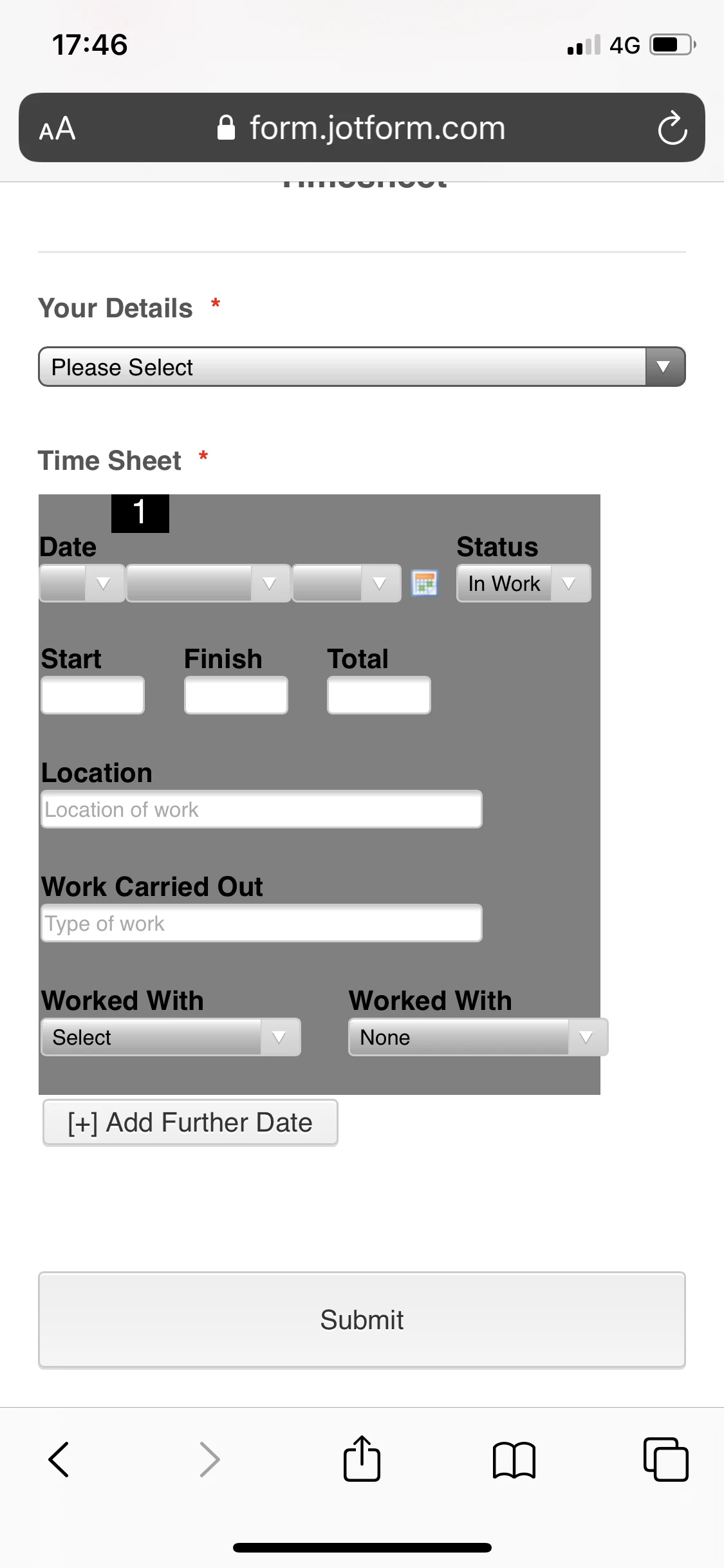
However, I have just noticed as I was running some tests that the "x" button to delete a date section is being blocked off by the status field. Please see the following screenshot of the mobile view of the form for reference:

Unfortunately, there isn't sufficient space on the top to make these sections fit on the same line, however, you may want to move the "x" button to the bottom as a workaround. Please replace the previous CSS code with this one and let us know if you'd like any further adjustments:
@media only screen and (max-width: 600px) {
td.col1 {
width: 40%;
padding: 0
}
td.col2 {
position: relative;
left: 100px;
width: 40%;
padding: 0
}
td.col9 {
width: 45%;
padding-bottom: 20px;
position: relative;
left: 15px;
}
tr:before{
position: relative;
top: -20px;
left: -195px;
}
td{
vertical-align: bottom
}
}
This is the outcome:

-
deanburdenReplied on March 3, 2020 at 12:49 PM
Im concerned there's been so much CSS injected into the form some parts are now conflicting with new entries. The background colours now don't display properly. Are you able to look at the CSS and make sure everything that's there should be and isn't conflicting?
The position of the 'X' even at the bottom overlaps the 'Worked With' - could we add another carriage return to the below?
The preview in the form maker actually presents differently to a mobile phone too - the counter looks correct on the preview but on mobile telephone its off-set from the left still.
-
enterprisesupportteamReplied on March 3, 2020 at 4:22 PM
Hello @deanburden,
I have checked your form and I am certain that the CSS is not conflicting, there may just be a difference in the styles based on the browser that you are using. May we know what browser you are opening the form in on your mobile device?
After some further testing, I am seeing that the "X" button was overlapping with the "Worked With" field at the bottom and that the number at the top was also a bit off. I have made some adjustments to the mobile responsive CSS and here is the updated code:
@media only screen and (max-width: 600px) {
td.col1 {
width: 40%;
padding: 0
}
td.col2 {
position: relative;
left: 100px;
width: 40%;
padding: 0
}
td.col9 {
width: 45%;
padding-bottom: 20px;
position: relative;
left: 15px;
}
tr:before{
position: relative;
top: -20px;
left: -215px;
}
td.col10.buttonsColumn {
vertical-align: bottom;
padding: 10px;
}
}
After adding this CSS I checked the form from my mobile device (Samsung Galaxy S9 on Chrome browser) and this is the form as of now:

Please test the CSS I have provided and let us know how you are seeing the form on your end. We can certainly continue to assist you with this. We look forward to your reply.
-
deanburdenReplied on March 5, 2020 at 4:39 PM
I have been accessing the form via 'Safari' on iOS.
This is how the form initially looks upon being opened/loaded....missing a border to the right as outlined in the below screenshot.

Once you add a second entry it then expands the grey but misses the top right part as identified in the below screenshot.

Additionally I'd like to add a space before and after each number (circled in a red circle) as they appear 'pushed together'.
Thanks
-
deanburdenReplied on March 9, 2020 at 6:16 PM
What are the chance of sorting the above?
I've had another idea and that's to have a black banner to separate each grey and white line. I've amended the code to how I think this should be and visually it works but doesn't work within the app or Safari as it distorts the fields...
Form Builder and example of how I want it to visually look (minus above errors)

Safari view:

I'd ideally like it better spaced out too...so the last fields on the Config Form has more of a space of the same colour before the black.
-
BJoannaReplied on March 10, 2020 at 3:34 AM
This thread is long and you already added a lot of custom CSS codes, and I'm not sure where to start.
Did you consider to make the configurable list responsive by following steps from this guide?
How to Make the Configurable List Widget Mobile Responsive
Here is a demo form with the CSS code from the guide - https://form.jotform.com/200691727415960
I also added your CSS code to change the background color of the rows.
- Templates
- Integrations
- INTEGRATIONS
- See 100+ integrations
- FEATURED INTEGRATIONS
 PayPal
- Slack
- Google Sheets
- Mailchimp
- Zoom
- Dropbox
- Google Calendar
- Hubspot
- Salesforce
- See more Integrations
- Products
- PRODUCTS
- Form Builder
- Jotform Enterprise
- Jotform Apps
- Store Builder
- Jotform Tables
- Jotform Inbox
- Jotform Mobile App
- Jotform Approvals
- Report Builder
- Smart PDF Forms
- PDF Editor
- Jotform Sign
- Jotform for Salesforce Discover Now
- Support


