


-
obraim.expressAsked on May 29, 2020 at 8:58 PM
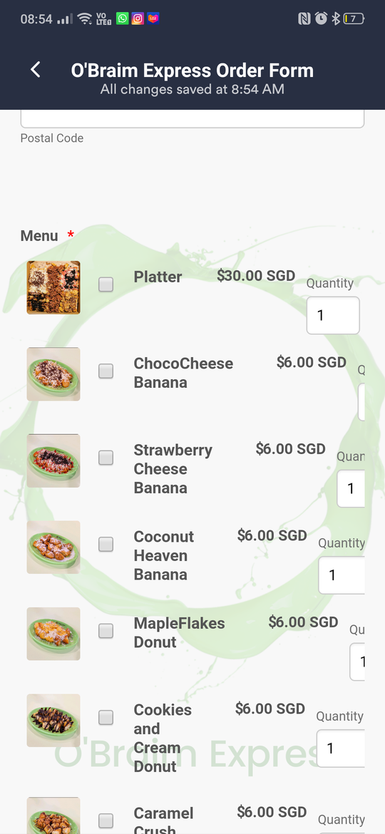
My Purchase order looks fine on desktop but when I view from mobile it looks as attached.
Here's the link to my form
https://form.jotform.com/obraim.express/Obraim-Express-Order-Form
-
roneetReplied on May 29, 2020 at 11:18 PM
Please allow me some time to check this and provide mobile responsive CSS to be able to view the products correctly.
Thanks.
-
obraim.expressReplied on May 29, 2020 at 11:23 PM
Okay thank you, eagerly waiting
-
roneetReplied on May 30, 2020 at 12:25 AM
Could you please inject this CSS in your Form Designer:
@media screen and (max-width: 480px), screen and (max-device-width: 767px) and (orientation: portrait), screen and (max-device-width: 415px) and (orientation: landscape) {
.form-line[data-payment="true"] .form-product-item .form-product-item-detail {
display: contents!important;
}}
Guide: https://www.jotform.com/help/117-How-to-Inject-Custom-CSS-Codes
Let us know how it goes.
Thanks.
-
obraim.expressReplied on May 30, 2020 at 12:39 AM
Thank you so much. I hope it's not too much to ask but is it possible to get the tick box to be either beside or beneath the product text?
-
obraim.expressReplied on May 30, 2020 at 3:29 AM
Hello, I just checked and it went bonkers again.
-
roneetReplied on May 30, 2020 at 4:05 AM
Based on your request, I have injected this CSS in your form:
media screen and (max-width: 480px), screen and (max-device-width: 767px) and (orientation: portrait), screen and (max-device-width: 415px) and (orientation: landscape) {
.form-line[data-payment="true"] .form-product-item .form-product-item-detail {
display: contents!important;
}
.form-line[data-payment="true"] .form-product-item .form-product-container {
position:relative;
width: 80%;
top: -48px!important;
left: 26%!important;
}
}Let us know how it geos.
Thanks.
- Templates
- Integrations
- INTEGRATIONS
- See 100+ integrations
- FEATURED INTEGRATIONS
 PayPal
- Slack
- Google Sheets
- Mailchimp
- Zoom
- Dropbox
- Google Calendar
- Hubspot
- Salesforce
- See more Integrations
- Products
- PRODUCTS
- Form Builder
- Jotform Enterprise
- Jotform Apps
- Store Builder
- Jotform Tables
- Jotform Inbox
- Jotform Mobile App
- Jotform Approvals
- Report Builder
- Smart PDF Forms
- PDF Editor
- Jotform Sign
- Jotform for Salesforce Discover Now
- Support

