
-
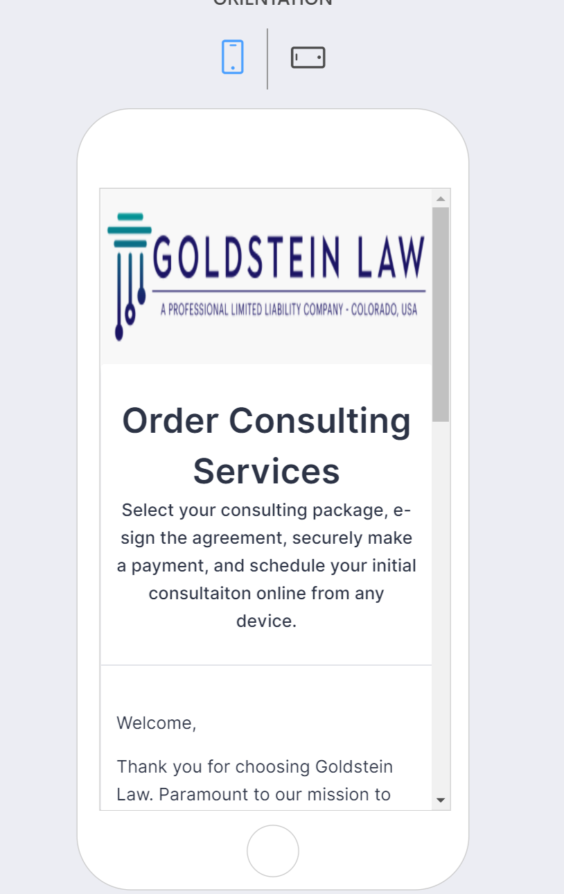
GoldsteinLawAsked on December 30, 2020 at 10:04 AM
-
GoldsteinLawReplied on December 30, 2020 at 10:06 AM
Oops... I wrote the body in the title.
Basically, the logo is stretching width in mobile portrait mode. i tried a few of the css code fixes on jot-form answers to no avail.


any tips?
thanks in advance!
-
Jovanne JotForm SupportReplied on December 30, 2020 at 10:44 AM
Hi, thank you for contacting JotForm support.
Please try adding this custom CSS code:
@media only screen and (max-width: 480px) {

img.formLogoImg {

  width: 100% !important;

  height: auto;

margin-bottom: -100px;

}

}
Guide: https://www.jotform.com/help/117-how-to-inject-custom-css-codes
Here is a sample output:

Please give it a try and let us know if this worked for you.
-
GoldsteinLawReplied on December 30, 2020 at 11:10 AM
Score. Thanks Jovanne!
In case others come around with the same Q... I see your code above is similar to others ive seen on here and tried, but not the exact same. The issue is in the logo height from the original PNG? How can this post help others in the future figure out the +/- px settings for the CSS?
-
Gaetan_BReplied on December 30, 2020 at 12:30 PM
Hello,
You pointed it out nicely: your code above is similar to others ive seen on here and tried, but not the exact same.
The base will be similar, but depending on the image size and other elements, we have to make slight adjustments every time as it is almost always unique.
At the end of the day, it just comes down to trial and error and to see what fits best. The only difference is that we do this all day long.
I would recommend doing it exactly like you, to simply try it out and to reach out for help if it's not working.
Gaetan
-
GoldsteinLawReplied on December 30, 2020 at 1:52 PM
rockstar, thanks y'all! works perfectly.
- Templates
- Integrations
- INTEGRATIONS
- See 100+ integrations
- FEATURED INTEGRATIONS
 PayPal
- Slack
- Google Sheets
- Mailchimp
- Zoom
- Dropbox
- Google Calendar
- Hubspot
- Salesforce
- See more Integrations
- Products
- PRODUCTS
- Form Builder
- Jotform Enterprise
- Jotform Apps
- Store Builder
- Jotform Tables
- Jotform Inbox
- Jotform Mobile App
- Jotform Approvals
- Report Builder
- Smart PDF Forms
- PDF Editor
- Jotform Sign
- Jotform for Salesforce Discover Now
- Support