


-
JJLeGrangeAsked on February 10, 2021 at 8:24 AM
Good day,
What is the correct mobile format / CSS code for the scale rating feature? I would like the scale rating feature to fit the screen on mobile.
Here is the link to the form: https://www.jotform.com/build/210391173520041.
Thanks.
-
Sam_GReplied on February 10, 2021 at 9:16 AM
Hi JJlegrange,
I have checked your form and it fits perfectly on a mobile view.
I tried it on mobiletest.me and it looks great as well.
Kindly check and let us know if the issue persists.
-
JJLeGrangeReplied on February 11, 2021 at 4:29 AM
Hi, I need the numbers from 0 - 10 to be on the same line. Is that possible? Thanks for the feedback.
-
Vick_W Jotform SupportReplied on February 11, 2021 at 4:44 AM
Hi there,
Please try injecting the following CSS in your form.
.rating-item-group, li[data-type=control_scale] .form-sub-label-container {

    display: flex;

    flex-wrap: nowrap;

    width: 54% !important;

}

@media screen and (max-width: 600px){

.rating-item, .rating-item>label {

    display: flex;

    width: 1.33333em;

}}
Related Guide:
https://www.jotform.com/help/117-How-to-Inject-Custom-CSS-Codes
Let us know if you need further assistance.
Thanks
-
JJLeGrangeReplied on February 11, 2021 at 6:15 AM

Thanks, is there a reason why it looks squashed?
-
jonathanReplied on February 11, 2021 at 6:37 AM
We apologize for inconvenience. I was able to see the issue as well when check/test using mobile browser.
The custom injected CSS codes needs to be updated. Allow me some more time to check. I will get back to this shortly.
-
JJLeGrangeReplied on February 12, 2021 at 7:59 AM
Hi,
I'm still waiting for feedback?
Regards,
-
Jovanne JotForm SupportReplied on February 12, 2021 at 8:20 AM
Hi,
Let me contact my colleague for an update. We will get back to you as soon as we have more information.
Thank you.
-
JJLeGrangeReplied on February 15, 2021 at 8:12 AM
Hi,
Do you have an answer? I need it to be done asap please.
-
Sigit JotForm SupportReplied on February 15, 2021 at 8:55 AM
Greetings,
Kindly inject the following CSS code in your Form Design
.rating-item-group, li[data-type=control_scale] .form-sub-label-container {

    display: flex;

    flex-wrap: nowrap;

    width: 54% !important;

}

@media screen and (max-width: 600px){

.rating-item, .rating-item>label {

    display: flex;

    width: 1.33333em;

    height:1.33333em;

    transform : scale(1,1) !important;

}

}
You can change the width and height according to your needs.
Related Guide: https://www.jotform.com/help/117-How-to-Inject-Custom-CSS-Codes
Let us know if you need further assistance.
Thank you. Regards.
-
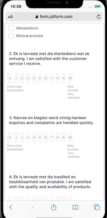
JJLeGrangeReplied on February 15, 2021 at 9:43 AM

Hi, thanks. That's a screenshot from my mobile, I need the scale to fit the whole screen without it looking squashed.
-
Ashwin JotForm SupportReplied on February 15, 2021 at 10:46 AM
Which mobile device you are using, and what is the screen size? I did check your form in the mobile device, and it seems to display the fields correctly.
I would suggest you to please update the injected CSS code with the following custom CSS code and see if it displays the field correctly:
@media screen and (max-width: 600px)
.rating-item, .rating-item>label {
display: flex;
width: 1.33333em;
height: 1.33333em;
transform: scale(1,1) !important;
margin-right: 4px !important;
}
Do get back to us if the issue persists.
We will wait for your response.
-
JJLeGrangeReplied on February 16, 2021 at 2:17 AM

Hi, I'm using a Samsung A51. Tested it on an iPhone XR and it displays the same way.
-
JJLeGrangeReplied on February 16, 2021 at 2:19 AM

It needs to look like in the image above, it must just not look squashed.
-
Vick_W Jotform SupportReplied on February 16, 2021 at 3:36 AM
Hi there,
The code provided by my colleague required a minor fix. Please check the form on your mobile device now and let us know if you need further assistance.
Thanks
-
JJLeGrangeReplied on February 16, 2021 at 5:32 AM
Hi,
It's fine, thanks.
- Templates
- Integrations
- INTEGRATIONS
- See 100+ integrations
- FEATURED INTEGRATIONS
 PayPal
- Slack
- Google Sheets
- Mailchimp
- Zoom
- Dropbox
- Google Calendar
- Hubspot
- Salesforce
- See more Integrations
- Products
- PRODUCTS
- Form Builder
- Jotform Enterprise
- Jotform Apps
- Store Builder
- Jotform Tables
- Jotform Inbox
- Jotform Mobile App
- Jotform Approvals
- Report Builder
- Smart PDF Forms
- PDF Editor
- Jotform Sign
- Jotform for Salesforce Discover Now
- Support


