


-
HuttonSafetyGroupAsked on February 12, 2021 at 2:45 PM
Hey there,
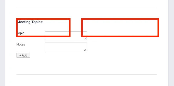
Right now in my form: https://form.jotform.com/200024794080245, I have a configurable list labelled "meeting topics".
I'm looking for a way to display it differently when the form is being used on a desktop or ipad, as opposed to a. phone. Is that possible?
When it's on a phone, it'll likely need to be displayed stacked on top of eachother (as it currently is), but ideally it has larger boxes when it's displayed laterally or on a wider screen:
Can I do this with CSS? or would I be better off to have two configurable lists, use the Hidden Box widget and only display one or the other based on device specs?
-
Sigit JotForm SupportReplied on February 12, 2021 at 9:08 PM
Greetings,
Kindly allow me some time to do some test.
Regards.
-
Sigit JotForm SupportReplied on February 13, 2021 at 12:05 AM
Hi,
Thank you for your patience.
Kindly inject the following CSS code in the Form Designer Styles Tab
iframe#customFieldFrame_37 {

 min-width: 100%!important;

}
Related guide: https://www.jotform.com/help/117-how-to-inject-custom-css-codes
Remember to click the Save button.
Also kindly inject the following CSS code in the Configurable List Widget Custom CSS
table#list {

 width: 100%!important;

}

td.col1>textarea, td.col2>textarea {

width: 90%;

}
Remember to click the Update Widget button.
Here's how it looks on mobile
on tablet and desktop
Please give it a try, and let us know if you need further assistance.
Regards.
-
HuttonSafetyGroupReplied on February 16, 2021 at 12:27 PM
Thanks that works.
I have been told in the past this is an apple iOS issue, but is there a way to stop the forms from zooming in when you tap on a box to start typing? It zooms in to that specific field and then you have to pinch to zoom back out and navigate over to the next field. Just makes more work.
-
Basil JotForm SupportReplied on February 16, 2021 at 3:18 PM
Hi,
From my understanding that is not possible unless zooming is prevented on the page.
But could you try to add the CSS code to your form:
@media screen and (-webkit-min-device-pixel-ratio:0) {

select,

textarea,

textbox,

input {

font-size: 16px;

}
Looking forward to your reply.
- Templates
- Integrations
- INTEGRATIONS
- See 100+ integrations
- FEATURED INTEGRATIONS
 PayPal
- Slack
- Google Sheets
- Mailchimp
- Zoom
- Dropbox
- Google Calendar
- Hubspot
- Salesforce
- See more Integrations
- Products
- PRODUCTS
- Form Builder
- Jotform Enterprise
- Jotform Apps
- Store Builder
- Jotform Tables
- Jotform Inbox
- Jotform Mobile App
- Jotform Approvals
- Report Builder
- Smart PDF Forms
- PDF Editor
- Jotform Sign
- Jotform for Salesforce Discover Now
- Support


