


-
GreenTeaAsked on October 2, 2014 at 1:43 PM
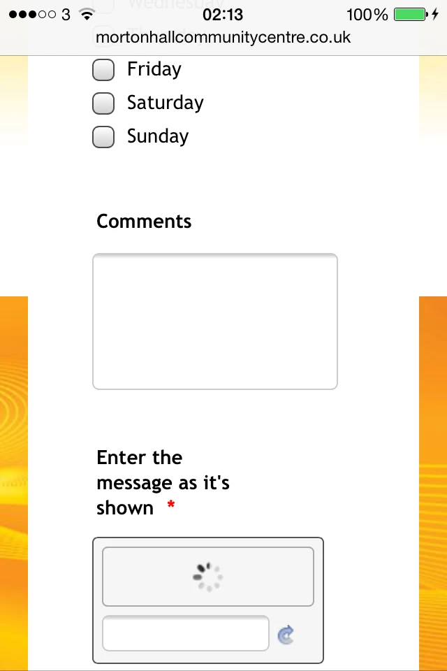
2) The PROBLEM is that CAPTCHA doesn't display on mobile - there is a spinning wheel in its place in the captcha box - so people will not be able to submit the form without it. Can anything be done about the Captcha so that it displays on mobile?
-
Mike_T Jotform SupportReplied on October 2, 2014 at 2:48 PM
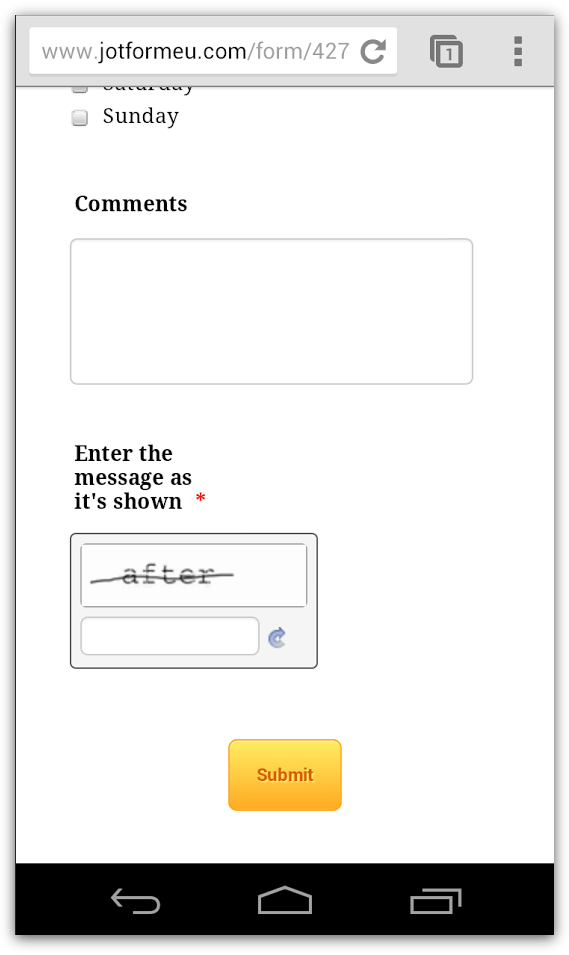
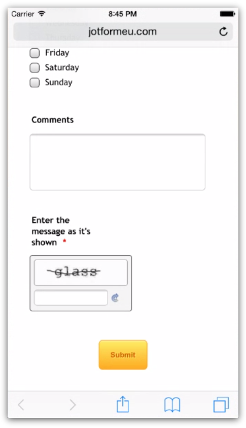
I have checked your Volunteer Application jotform, and the captcha seems to be fine.
Screenshot from my Android phone:
iOS 8 test through browserstack.com:
Are you still having the issues with the captcha field? If this is happening with some embedded form, please provide us with a link to the web page in question.
Thank you.
-
GreenTeaReplied on October 2, 2014 at 9:24 PM
I see that you are testing the form itself and not as it is displayed on my website http://www.mortonhallcommunitycentre.co.uk/volunteer/
Clearly the problem is with the website but perhaps there is a solution for it?
I am using the 1and1 visual editor to edit the website. To clarify, this post has been branched out from another thread: http://www.jotform.com/answers/437743-Form-is-not-displayed-on-mobile-website
What I have already done is described here (another branch from the above thread): http://www.jotform.com/answers/437808-The-editor-interface-now-looks-a-little-bit-different-than-in-their-help-article
-
Elton Support Team LeadReplied on October 3, 2014 at 4:08 AM
@GreenTea
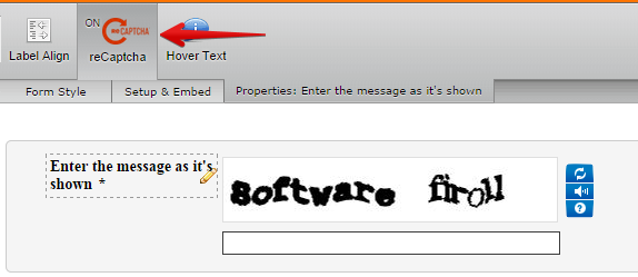
Probably due to script conflict. Since you have already tried iframe embed which doesn't help according to your previous answer on the other thread, then I think turning regular captcha to reCaptcha is the best solution. This should work on mobiles.
Here's how to enable reCaptcha.
Click the captcha field and click reCaptcha above.
Hope this helps!
-
GreenTeaReplied on October 3, 2014 at 11:46 AM
Thank you! reCAPTCHA does work - it does display on mobile, so this is better.
But now the form is wider and it doesn't fit in the vertical width of the mobile screen. The form adjusts itself to the widest field, which is now reCAPTCHA, and specifically the "Privacy & Terms" link which is next to the input box makes the form so wide. reCAPTCHA itself is also quite wide.
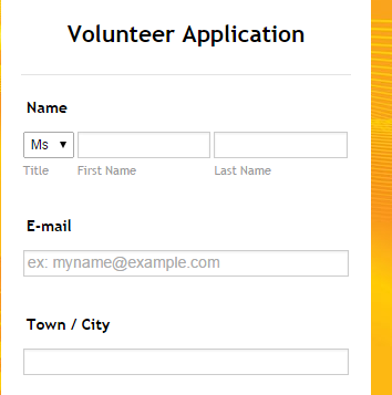
BTW the first item in the form now has the Title ("Mr") drop down menu wider than it is on desktop. It seems to also adjust its width to the reCAPTCHA image because reCaptcha loads later, reloading the whole page, and the form adjusts to its width. The 4th screenshot below was taken before loading reCaptcha (it takes just a second to see the page in this width - you can see the spinning wheel at the top which means that the page is still loading, and what happens next is that the form becomes wider than the page).
The problem seems to be the reCaptcha image width, and also the "Privacy & Terms" link which could e.g. be placed in the next line - if it is possible for you to redesign the reCaptcha field for mobile. I presume the image itself needs to be that wide? If you could adjust the image width, this could be the solution for the form width problem.
Below are 4 screenshots from iPhone 4.
Guide to the images:
1) Top of the form after loading reCaptcha. The "Mr" drop down menu is quite wide (the longest word there is "Other" - there is no need for such a wide bar, it could be much shorter). The form is wider than the mobile page.
2) Bottom of the form after loading reCaptcha. The form is wider than the mobile page.
3) After loading reCaptcha. The "Privacy and Terms" link makes this point the widest element on the form. Bottom of the form shown as being much wider than the rest of the page.
4) Before loading reCaptcha. The form is responsive and its width is adjusted to the rest of the page (as it should be). The "Mr" drop down menu is of reasonable size (again, this is correct).

-
David JotForm Support ManagerReplied on October 3, 2014 at 12:27 PM
@GreenTea
How about adding the Mobile Responsive widget at the bottom of your form?

Please try it and let us know what happens.
-
GreenTeaReplied on October 3, 2014 at 12:41 PM
It makes the Submit button wider.
The form is still as wide as the reCaptcha module.

-
GreenTeaReplied on October 3, 2014 at 1:04 PM
I removed reCaptcha completely as per this thread: http://www.jotform.com/answers/430578-Problem-with-contact-form-on-mobile-device , removed the Mobile Responsive widget, and then it turned out the Form Heading was too big - I set it to the Small size, and also shortened the Mobile Number field to 21 characters - now it fits perfectly onto my mobile site.
The only thing that looks strange is the unnecessarily oversized "Mr" drop down menu on desktop and iPad (and on any screen wider than the vertical mobile screen, probably).
-
GreenTeaReplied on October 3, 2014 at 1:12 PM
As a test, I added the Mobile Responsive widget back at the bottom of the form as you advised, but removed the Yes option for the Setup & Embed: Preferences: Responsive Form (changed to No).
The form looks OK on mobile and desktop, the Submit button is of the full form width - these are OK - but the "Mr" drop down menu is still too wide.
-
Elton Support Team LeadReplied on October 3, 2014 at 1:25 PM
@GreenTea
It is because it is rendering the CSS for mobile but it just needs a little tweak with CSS. Inject the following CSS codes to your form if you want the "Mr" drop down to stay on the same width on both desktop and mobile.
select#prefix_3 {width: 49px !important;}
div#cid_3 span:first-child {width: 49px !important;}
Guide: http://www.jotform.com/help/117-How-to-Inject-Custom-CSS-Codes-to-your-Form
Hope this helps. Thanks!
-
Elton Support Team LeadReplied on October 3, 2014 at 1:37 PM
Actually, this one is a little better. Use this instead:
@media only screen and (max-width: 40em){
div#cid_3 span:first-child {width: 12% !important;min-width: 46px;}
[data-type=control_fullname] .form-sub-label-container {width: 43% !important;}
span.form-sub-label-container+span.form-sub-label-container {margin-right: 1% !important;}
}
@media only screen and (max-width: 30em){
[data-type=control_fullname] .form-sub-label-container {width: 41%;}
}
Result:
If you need help with anything else, let us know. Thanks!
-
GreenTeaReplied on October 3, 2014 at 3:27 PM
Thank you!
I changed the min-width: 46px to 70px. I guess it will depend on the device, browser and its settings (e.g. font) how exactly it is displayed. You can see the difference below.
Should I change anything else in the code so that it makes sense after the 70px change? (Did I break anything?)

-
BenReplied on October 3, 2014 at 4:15 PM
Hi,
To us it seems that everything is OK placed, but do update us if there is an issue with it and we will gladly assist you with a solution.
Best Regards,
Ben -
GreenTeaReplied on October 3, 2014 at 4:58 PM
Thanks a lot for all your help! You are absolutely brilliant. I am impressed with your attention to detail and helpfulness.
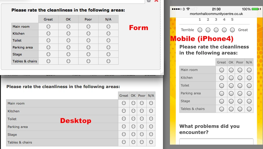
I have another form which would probably need a similar code to fix the problem - this time it is table width so it is not an identical code as above (I tried). (I fixed the "Mr" issue already.)
The table looks OK on mobile but on desktop the first column (names of the areas) is very wide and the other columns are very narrow. My intuition is to make the 1st column of a certain minimum width, and the rest of the columns of a % of the space left?
-
BenReplied on October 3, 2014 at 5:28 PM
Hi GreenTea,
In the name of my colleagues you are welcome and thank you.
I have moved this question to a new thread so that there is no confusion regarding what should be fixed. Please leave all the future responses related to that new jotform in that other thread. You can see the thread here: http://www.jotform.com/answers/438453
What we will need is the link to this other jotform so please respond to the thread mentioned above with the link to jotform and we will get back to you as soon as we see the jotform.
Best Regards,
Ben
- Templates
- Integrations
- INTEGRATIONS
- See 100+ integrations
- FEATURED INTEGRATIONS
 PayPal
- Slack
- Google Sheets
- Mailchimp
- Zoom
- Dropbox
- Google Calendar
- Hubspot
- Salesforce
- See more Integrations
- Products
- PRODUCTS
- Form Builder
- Jotform Enterprise
- Jotform Apps
- Store Builder
- Jotform Tables
- Jotform Inbox
- Jotform Mobile App
- Jotform Approvals
- Report Builder
- Smart PDF Forms
- PDF Editor
- Jotform Sign
- Jotform for Salesforce Discover Now
- Support


