


-
igold00Asked on March 12, 2016 at 2:49 AM
The area cdse keeps stretching on mobile view creating 2 lines for phone. Area code stretched too much.
I have tried everything, turning on off resposive, redesigning on the basic perhaps you have a workaround.
I attached a pic
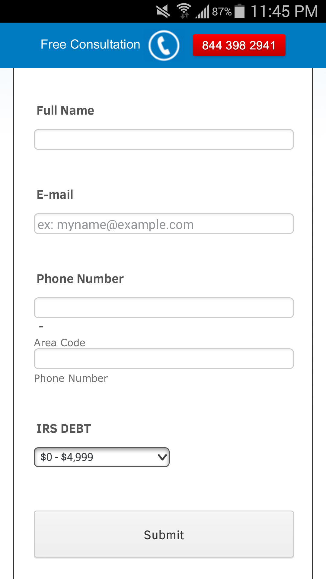 Page URL: http://www.eztaxrelief.com/
 -
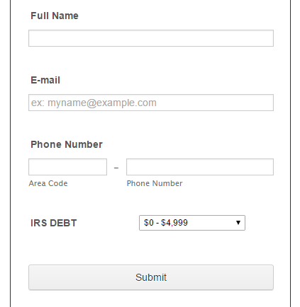
Elton Support Team LeadReplied on March 12, 2016 at 5:25 AM
Inject this CSS codes to your form, this should position them side by side.
/*responsive phone fields*/
[data-type="control_phone"] input[name$="[area]"] {
width: 80%;
}
[data-type="control_phone"] input[name$="[phone]"] {
width: 100%;
}
[data-type="control_phone"] input[name$="[full]"] {
width: 100%;
}
[data-type="control_phone"] .form-sub-label-container{
width: 40%;
}
[data-type="control_phone"] .form-sub-label-container + .form-sub-label-container {
width: 60%;
float: right;
margin-right: 0;
}
[data-type="control_phone"] .form-input-wide .form-sub-label-container + .form-sub-label-container {
width: 56%;
}
Guide: https://www.jotform.com/help/117-How-to-Inject-Custom-CSS-Codes (paste it at the bottom part if you have existing CSS codes in your form)
Here's how it looks afterwards
- Templates
- Integrations
- INTEGRATIONS
- See 100+ integrations
- FEATURED INTEGRATIONS
 PayPal
- Slack
- Google Sheets
- Mailchimp
- Zoom
- Dropbox
- Google Calendar
- Hubspot
- Salesforce
- See more Integrations
- Products
- PRODUCTS
- Form Builder
- Jotform Enterprise
- Jotform Apps
- Store Builder
- Jotform Tables
- Jotform Inbox
- Jotform Mobile App
- Jotform Approvals
- Report Builder
- Smart PDF Forms
- PDF Editor
- Jotform Sign
- Jotform for Salesforce Discover Now
- Support
