


-
superiorgloveAsked on April 1, 2016 at 1:45 PM
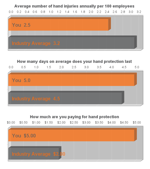
We would like to have static data appear (Industry average) as a comparison bar chart to the data submissions users enter ( It would like something like attached ComparisonGraph.jpg where You is the submitted data, and Industry Average is the static data, or pulled from a static data source).
We have approximately 25 industries in a drop down, the Industry Average information would be based on this selection.
Our form is located at:
https://www.jotform.com//?formID=60914171010239
Is there a way or recommended ways to accomplish this?
Thank you,
Rhonda Bentley
please respond to rhonda.bentley@superiorglove.com on behalf of Julie McFater.
-
MikeReplied on April 1, 2016 at 3:14 PM
We have a Visual Report tool with bar, pie and line charts, but unfortunately, you cannot add comparison data to the charts.
You may consider downloading form submission data in Excel/CSV format to process it locally (e.g. add the comparison data and then create the charts in Microsoft Excel / Google Spreadsheet).
If you need any further assistance, please let us know.
-
MikeReplied on April 1, 2016 at 3:22 PM
Sorry, I missed the part that you need this for a Thank You age.
The form can be configured to redirect the form user to your custom Thank You page with enabled post data option.
How to Post Submission Data to Thank You Page
It means that you will need a custom script to process the form post data and create the charts. You may consider hiring a programmer for this task (we can recommend https://www.upwork.com freelancers marketplace).
- Templates
- Integrations
- INTEGRATIONS
- See 100+ integrations
- FEATURED INTEGRATIONS
 PayPal
- Slack
- Google Sheets
- Mailchimp
- Zoom
- Dropbox
- Google Calendar
- Hubspot
- Salesforce
- See more Integrations
- Products
- PRODUCTS
- Form Builder
- Jotform Enterprise
- Jotform Apps
- Store Builder
- Jotform Tables
- Jotform Inbox
- Jotform Mobile App
- Jotform Approvals
- Report Builder
- Smart PDF Forms
- PDF Editor
- Jotform Sign
- Jotform for Salesforce Discover Now
- Support
