


-
pivotmediaAsked on June 8, 2016 at 5:55 PM
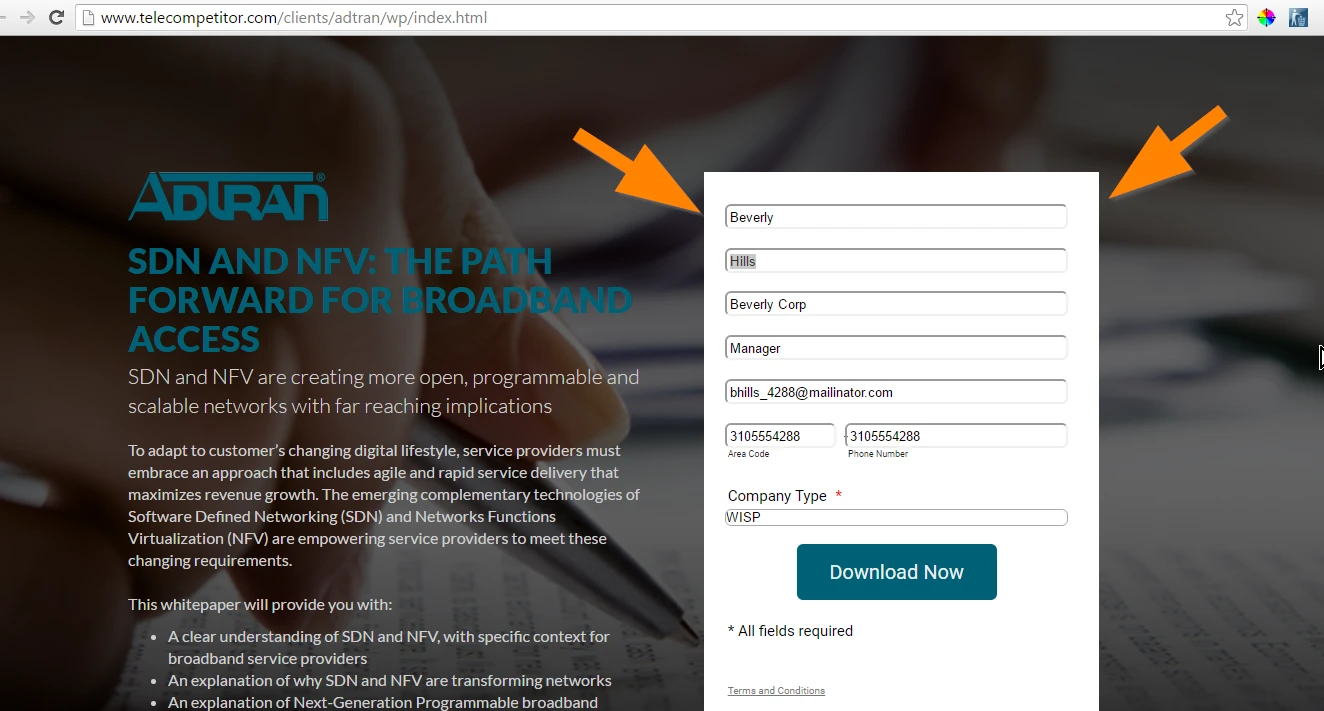
I have a form a this page, http://www.telecompetitor.com/clients/adtran/wp/index.html.
I went into design to change the height; however, it it still to long in Chrome and FFX.
Also, I tried to may for centered horizontally, but that too, isn't working. The form seems to be more flushed to the left.
Thanks for your help!
-
victorReplied on June 8, 2016 at 8:20 PM
I have just reviewed your site and was able to view your site properly. If you are still having problems designing your form, please let us know and we will be glad to help.

-
pivotmediaReplied on June 9, 2016 at 9:45 AMDoesn't look fixed. there is more padding in the left margin than the right
of the fields.
... -
CharlieReplied on June 9, 2016 at 11:09 AM
Are you referring to the margin or padding on the left and right side of the form fields inside your form?
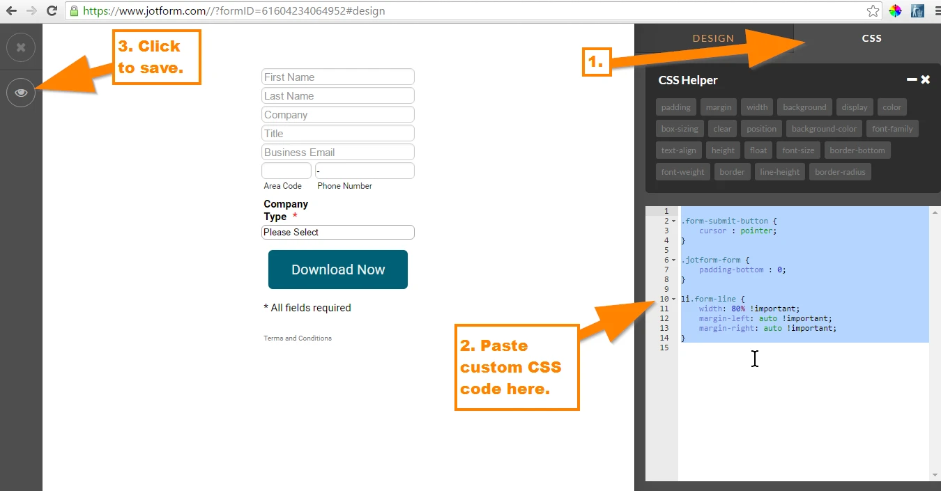
Your form's design and layout on the website is actually a mobile responsive version of it. If you want your form to look exactly how it is designed in the form builder, then you can try re-embedding the form using the iFrame embed code.
See if this form design works for you: https://form.jotform.com/61604234064952. You can try cloning it to have a copy of it in your account. Here's how to clone my form: https://www.jotform.com/help/42-How-to-clone-an-existing-form-from-a-URL
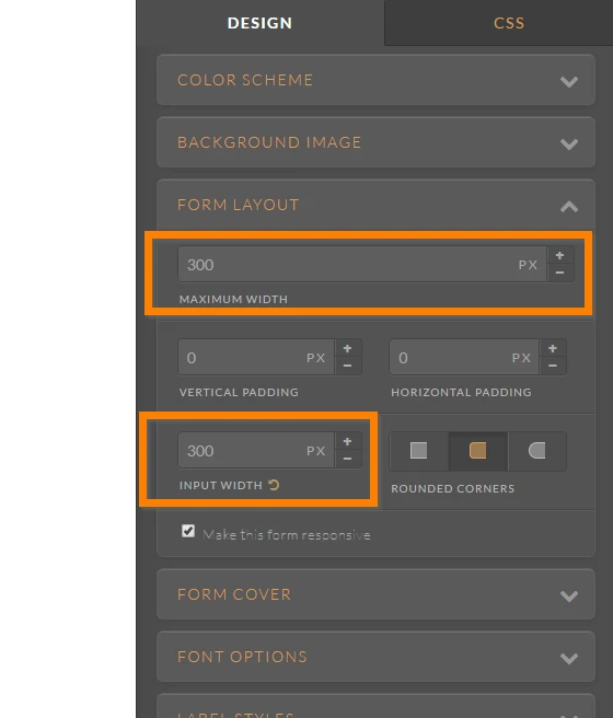
Here are the changes I made:
1. Make sure that the input width is the same of the maximum width of the form itself. In my case, I made sure that they are both 300px.
2. I then edited your custom CSS code to this one:
.form-submit-button {
cursor : pointer;
}
.jotform-form {
padding-bottom : 0;
}
li.form-line {
width: 80% !important;
margin-left: auto !important;
margin-right: auto !important;
}
The form itself is now centered, so it won't be push to the left so much but it will automatically adjust based on the width of your iFrame or the parent element where it is embedded.
Let us know if that works for you.
- Templates
- Integrations
- INTEGRATIONS
- See 100+ integrations
- FEATURED INTEGRATIONS
 PayPal
- Slack
- Google Sheets
- Mailchimp
- Zoom
- Dropbox
- Google Calendar
- Hubspot
- Salesforce
- See more Integrations
- Products
- PRODUCTS
- Form Builder
- Jotform Enterprise
- Jotform Apps
- Store Builder
- Jotform Tables
- Jotform Inbox
- Jotform Mobile App
- Jotform Approvals
- Report Builder
- Smart PDF Forms
- PDF Editor
- Jotform Sign
- Jotform for Salesforce Discover Now
- Support


