


-
ganeenetAsked on June 15, 2016 at 7:23 AM
Hi,
I have checked in the designer to have my form to be mobile responsive. However checking on Chrome and Safari in iPhone6s, I notice the fields are off the form. Is there a way to make the fields mobile responsive?
The JotForm is right at the bottom of the page.
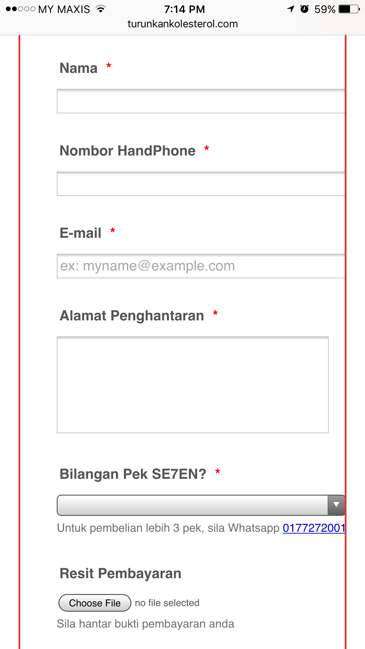
-
CharlieReplied on June 15, 2016 at 8:53 AM
I was able to replicate the problem. Could you please try re-embedding the form using the iFrame embed code generated by the "Publish" wizard? Here's a guide that you can refer to: https://www.jotform.com/help/148-Getting-the-form-iFrame-code
After that, please also try adding the mobile responsive widget on your form.
Let us know if this works.
-
ganeenetReplied on June 15, 2016 at 9:30 AM
Hi,
No luck. I have added in the IFrame as well adding the mobile responsive widget. The form still looks the same.
-
CharlieReplied on June 15, 2016 at 10:53 AM
If you check the form's direct link and viewed it on an iOS device, it works as expected. It seems like the problem is happening specifically on where your form is embedded on your website. Unfortunately, I can't further test it properly in my end without actually seeing your website's back-end.
But could you please try adding this custom CSS code in your form:
@media screen and (max-width: 480px), screen and (max-device-width: 768px) and (orientation: portrait), screen and (max-device-width: 415px) and (orientation: landscape) {
.form-all, .jotform-form {
width: 100% !important;
max-width: 100% !important;
}
}
See if that should fix the problem, you can paste it under the CSS tab in your Form Designer Tool:

We'll wait for your response.
-
ganeenetReplied on June 16, 2016 at 1:31 AM
Thanks. Your solution worked when I set the width to 95%. Although it's not perfect as I still see the form being uneven with the form shifting to the left more, but I guess this will have to do for now, until I can figure out why my WordPress site is not working with this.
-
CharlieReplied on June 16, 2016 at 2:08 AM
If you have some JotForm plugins in your Wordpress site, you should disable them and embed the form using the iFrame embed code.
It is also highly likely related to your website's CSS code or styling that handled the responsiveness of the parent element where the form is embedded, or perhaps something related to how they handle iframe elements.
You could try creating a simple Wordpress test website page, one that has the default theme and is responsive, then try embedding the form there using the iframe. See if the problem persists even on a simple Wordpress website with a generic theme.
Try also removing the iFrame embed code inside a <p> element as the parent. Try moving it upward on a <div> element.
I hope those will help.
- Templates
- Integrations
- INTEGRATIONS
- See 100+ integrations
- FEATURED INTEGRATIONS
 PayPal
- Slack
- Google Sheets
- Mailchimp
- Zoom
- Dropbox
- Google Calendar
- Hubspot
- Salesforce
- See more Integrations
- Products
- PRODUCTS
- Form Builder
- Jotform Enterprise
- Jotform Apps
- Store Builder
- Jotform Tables
- Jotform Inbox
- Jotform Mobile App
- Jotform Approvals
- Report Builder
- Smart PDF Forms
- PDF Editor
- Jotform Sign
- Jotform for Salesforce Discover Now
- Support
