


-
NicoViljoenAsked on July 1, 2016 at 3:20 AM
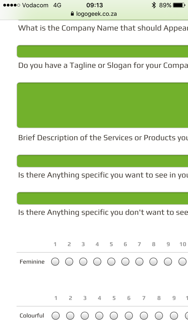
It seems that as soon as I'm adding Widgets, that this is affected.
If I add any widgets, the normal Address, Name, etc fields are cut
off on the Right hand side of mobile. Please advise as I'd like to add
other widgets as well, but it affects the layout so that the form will only
be able to be filled when at a computer.
Regards
-
liyamReplied on July 1, 2016 at 5:17 AM
Hello NicoViljoen,
I have checked your page it appears now that the form in it is already mobile responsive.

If you are still having problems viewing the form properly on your end, please do let us know.
In addition, may I also recommend using the mobile responsive widget on your form and see if your form's responsiveness is still affected with other widgets, with this widget being included.
Thanks.
-
NicoViljoenReplied on July 1, 2016 at 5:32 AM
Hi...
Thank you for your quick response. I'm using iPhone 6S,
but still exactly the same as the first image attached. My wife
uses Samsung and Cuts the Widgets on the right as well. Not
sure what phone you use, but predominant users are either
Apple or Samsung, on which we'd love to have it to show
correctly... Sorry for the hassle.
-
JanReplied on July 1, 2016 at 9:34 AM
I am using a Motorola Razr Android phone and I used Google Chrome to check your website. I also didn't encounter any issues with the form being responsive. Here's a screenshot from my phone:

Just like what Liyam suggested, please try to insert the Mobile Responsive widget to your form.

If it is still the same, please try to re-embed the form using the Iframe method. Here's a guide: Getting-the-Form-iFrame-Code
Hope that helps. Thank you.
- Templates
- Integrations
- INTEGRATIONS
- See 100+ integrations
- FEATURED INTEGRATIONS
 PayPal
- Slack
- Google Sheets
- Mailchimp
- Zoom
- Dropbox
- Google Calendar
- Hubspot
- Salesforce
- See more Integrations
- Products
- PRODUCTS
- Form Builder
- Jotform Enterprise
- Jotform Apps
- Store Builder
- Jotform Tables
- Jotform Inbox
- Jotform Mobile App
- Jotform Approvals
- Report Builder
- Smart PDF Forms
- PDF Editor
- Jotform Sign
- Jotform for Salesforce Discover Now
- Support

