


-
carterm1Asked on August 31, 2016 at 7:55 AM
Hi,
Love the plugin, but i'm struggling with getting it to be responsive for use on mobile forms and inside apps.
Can you advise please, here is my form, https://form.jotform.com/62432085353957
regards,
Mick
Page URL: https://form.jotform.com/62432085353957 -
BorisReplied on August 31, 2016 at 9:09 AM
The MultiSelect Grid widget can be made mobile responsive, but it may still have some problems on really small devices (those having under 400 pixels of available width).
To make this widget mobile responsive, we need to inject custom CSS both in the form, and inside the widgets themselves. Inside the form, we will be inserting this CSS:
li[data-type="control_widget"] > .form-input { width: 100%; }
.custom-field-frame[src*="//widgets.jotform.io/multiSelectGrid/"] { width: 100% !important; }What the code does is it makes sure that the iframe container of each widget will be taking 100% of the available horizontal space on form. As this space on your form is decreasing, so will the iframe automatically resize. You can add CSS into your form by following this guide:
https://www.jotform.com/help/117-How-to-Inject-Custom-CSS-Codes
Or you can do it by opening up our Designer, and pasting the code in the Designer.
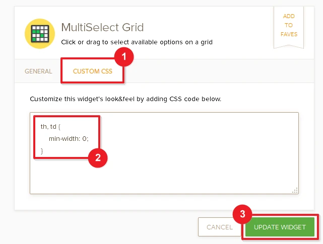
The other code we will be adding should be added to each widget separately, by clicking on the widget's wand-shaped icon, and pasting it under the Custom CSS tab:
th, td {
min-width: 0;
}
Please try it out and let us know should you need further assistance. Thank you.
-
carterm1Replied on August 31, 2016 at 10:02 AM
Thank you, its sorted it perfectly.
- Templates
- Integrations
- INTEGRATIONS
- See 100+ integrations
- FEATURED INTEGRATIONS
 PayPal
- Slack
- Google Sheets
- Mailchimp
- Zoom
- Dropbox
- Google Calendar
- Hubspot
- Salesforce
- See more Integrations
- Products
- PRODUCTS
- Form Builder
- Jotform Enterprise
- Jotform Apps
- Store Builder
- Jotform Tables
- Jotform Inbox
- Jotform Mobile App
- Jotform Approvals
- Report Builder
- Smart PDF Forms
- PDF Editor
- Jotform Sign
- Jotform for Salesforce Discover Now
- Support