


-
lumiartsAsked on September 30, 2016 at 8:47 AM
As you can see, I highlighted the text in red that in the first image, displays correctly, but on smartphone view, (second image) the text overlaps instead of going under the other. How do we fix this? Thanks!!

 Page URL: https://form.jotformz.com/62616721002646
 -
sevkiyontemReplied on September 30, 2016 at 10:20 AM
Hi, I inspected your form and I think that the line-height parameter could solve your issue.
The css for text_8 includes this parameter.
#text_8 {
font-family : Raleway;
color : #2F2E2E;
font-size : 21px;
padding : 2rem 0;
font-feature-settings : 'lnum' 1;
line-height : 10px;
}
If you increase the height of the line to 20 or more, the problem might disappear, please give it a try and share your results. Since your font size is 21, the height sould not be lower than that. However this affects the design since the box that includes the text gets bigger when you increase the value. You need to handle that situation seperately :).
I hope this helps,
All the best!
-
lumiartsReplied on September 30, 2016 at 10:39 AM
Thanks for the solution. It kind of does work, but it has a few issues.
1) It's misaligned. I would like it to be centered.
2. It needs to decide if it will stay in one line or the other.
1)
2)

-
sevkiyontemReplied on September 30, 2016 at 11:37 AM
ok here is a solution, check out this article if you want to go deeper :)
inject this code to css:
* { margin: 0; padding: 0; } body { padding-top: 50px; } h1 { text-align: center; font-size: 16px; } @media screen and (min-width: 768px){ .rwd-break { display: none; } } after that you need to inject responsive break within the email and whatsup information into the HTML:
<br class="rwd-break" />
Also you need to delete "space" codes ( ) for both information to be alinged at center symetrically and you need to adjust font size, screen minimum width and padding amount.
Please give it a try and tell me about the result.
Hope this solves your issue.
See you.
-
lumiartsReplied on October 4, 2016 at 12:58 PM
Hey, thanks for the response!
I didn't understand the HTML part, since the editor is CSS only."after that you need to inject responsive break within the email and whatsup information into the HTML:
<br class="rwd-break" />"
-
David JotForm Support ManagerReplied on October 4, 2016 at 2:56 PM
Please try injecting the following CSS code as shown on this guide: https://www.jotform.com/help/117-How-to-Inject-Custom-CSS-Codes
@media only screen and (max-width: 480px) {
#id_8 {
width: 250px;
left: 0;
right: 0;
margin: auto;
}
}
Result
Let us know if you need more help.
-
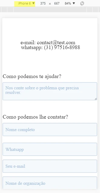
lumiartsReplied on October 5, 2016 at 8:10 AM
-
sethReplied on October 5, 2016 at 8:27 AM
Dear lumiarts,
The issue that you are dealing with is very hard indeed. We are here to help you. Could you please share the latest form that you are using so we could inspect it further and give you the solution that you want.
-
sethReplied on October 6, 2016 at 6:30 AM
I was trying the solutions above, and I think I achieved the solution here is the result:
https://form.jotform.com/62792145241959
However I clear all css code from the injector and used contemporary CSS tool:

to add css code that @sevkiyontem gave:
* { margin: 0; padding: 0; }
body { padding-top: 50px; } h1 { text-align: center; font-size: 16px; } @media screen and (min-width: 768px){ .rwd-break { display: none; } } After that I inject html code (<br class="rwd-break" />) that break the lines when the window width is lower than some value. In the code above it has the value 768px.
Here how you can inject html code to your contact information text box:

I suggest to clear all styling and start all over. Since you know how to style and how to code better now, you will prevent future disorders and malfunctions.
And please do not give up, this form will be one of the best mobile forms ever created with JotForm.
Cheers :)
- Templates
- Integrations
- INTEGRATIONS
- See 100+ integrations
- FEATURED INTEGRATIONS
 PayPal
- Slack
- Google Sheets
- Mailchimp
- Zoom
- Dropbox
- Google Calendar
- Hubspot
- Salesforce
- See more Integrations
- Products
- PRODUCTS
- Form Builder
- Jotform Enterprise
- Jotform Apps
- Store Builder
- Jotform Tables
- Jotform Inbox
- Jotform Mobile App
- Jotform Approvals
- Report Builder
- Smart PDF Forms
- PDF Editor
- Jotform Sign
- Jotform for Salesforce Discover Now
- Support


