


-
mgcaledonian13Asked on November 17, 2016 at 6:31 PM
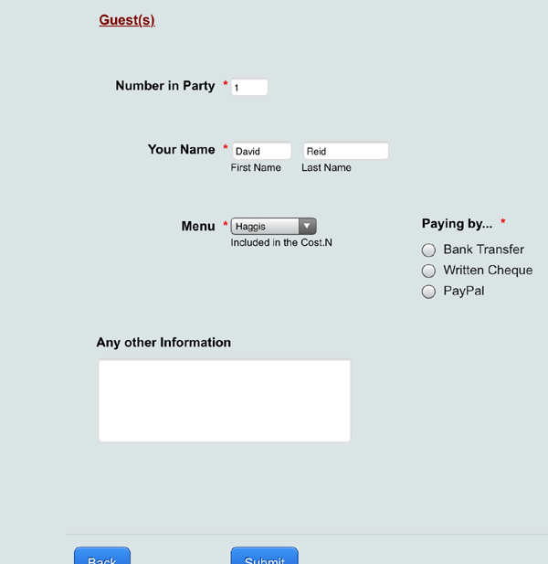
Why does an iPad show a form with some fields on top of each other.
See Screen Shots
It is OK with the Number entered as 1 but if 2 is entered it goes wrong.


-
MikeReplied on November 17, 2016 at 9:44 PM
To fix the mobile layout, please try the following:
1) Add a Mobile Responsive widget to the form.
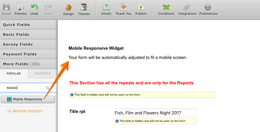
2) Remove injected CSS.

If you need any further assistance, please let us know.
-
mgcaledonian13Replied on November 18, 2016 at 12:21 PM
Mike
Carried out all the suggestions, added the widget and removed the piece of CSS but this has made no difference. It sort of appears that the form is too wide for the IPad
NOTE It is only an Ipad that is experiencing this problem.
Any ideas?
Willy Scott
-
David JotForm Support ManagerReplied on November 18, 2016 at 1:34 PM
Please check this cloned version of your form: https://www.jotformpro.com/form/63225154288962?
I removed some code related to mobile views that was conflicting, so it now displays fine:

If you like it, you can clone it in your account, and use it: https://www.jotform.com/help/42-How-to-Clone-an-Existing-Form-from-a-URL
Let us know if you need more help.
-
mgcaledonian13Replied on November 19, 2016 at 5:17 AM
That is it all sorted, well on one user's iPad anyway, I am sure the rest will be same.
If I clone this form again will the altered code still work?
and
Does the code need to be altered each time I want to do this without cloning ?
Thanks a lot for the fix, and in such a short time, you guys never cease to amaze me. If there was a equivalent of a BAFTA for support you guys would win it every year without fail.
Willy Scott
-
Nik_CReplied on November 19, 2016 at 9:29 AM
Hello Willy,
Thank you for your kind words, we appreciate that!
Whatever you do on your form will be on a cloned form as well.
If you want to do some similar adjustments on a new form you will have to do the coding in new form.
If you have any further questions, please let us know.
Thank you!
-
mgcaledonian13Replied on November 20, 2016 at 2:10 AM
OK, so I will have to do the coding in a new form. As you can see from the reply by BDAVID he was the person that removed the conflicting code, is it possible for me to do this by highlighting and deleting the offending code or is there more to this than maybe I could manage?
Willy Scott
-
Chriistian Jotform SupportReplied on November 20, 2016 at 9:20 AM
Hi there,
I am not quite sure what you mean. Do you want to find where to delete the conflicting codes in your form? Please see https://www.jotform.com/help/117-How-to-Inject-Custom-CSS-Codes for more details about injected CSS. If you have trouble finding the codes that are somehow messing up with your form, you can always ask for our assistance and we will be glad to help.
-
mgcaledonian13Replied on November 21, 2016 at 1:40 AM
Yes I want to know what the code is that is messing up the Form.
I gather from the above that I will have to post a request each time it happens.
I would like to do it myself if that is at all possible, so what bit of code did he alter, was it the removal of the Mobile Response widget t suggested in the initial reply?
Willy Scott
-
Özlem JotForm DeveloperReplied on November 21, 2016 at 3:20 AM
Hi Scott,
It is seen that you have updated your form according to my colleague suggestions (BDAVID); therefore, I couldn't see CSS codes in previous version of your form. I need to compare these two different codes to back to you with a relevant information.
Could you give me some time to find custom CSS code of your previous version of your form?
On the other hand, Mobile Responsive Widget is a functional solution to prevent browser-based distortions on your form.
If you need any further assistance, please feel free to let us know.
Thank you for your understanding.
-
David JotForm Support ManagerReplied on November 21, 2016 at 10:17 AM
I want to apologize for not specifying what code I removed from your form in order to fixed the overlapping issue on iPad view, this is what I did:
1) I cloned your: https://www.jotform.com/help/42-How-to-Clone-an-Existing-Form-from-a-URL
2) I loaded the form builder old interface by adding "?&old" at the end of the URL.
3) I went to PREFERENCES>Form Styles, and copy and pasted the whole code located in the injected CSS area, in a text editor(Sublime Text):
4) Once on the text editor I looked form the "@media" rule, and started to remove one by one until I discovered which one was given problems. So, this is the code that I removed:
@media screen and (max-width: 480px), screen and (max-device-width: 768px) and (orientation: portrait), screen and (max-device-width: 415px) and (orientation: landscape) {
.jotform-form {
padding: 0;
}
.form-all {
border: 0;
width: 100% !important;
max-width: initial;
}
.form-sub-label-container {
width: 100%;
margin: 0;
}
.form-input {
width: 100%;
}
.form-label {
width: 100%!important;
}
.form-line {
padding: 2% 5%;
-moz-box-sizing: border-box;
-webkit-box-sizing: border-box;
box-sizing: border-box;
}
input[type=text],
input[type=email],
input[type=tel],
textarea {
width: 100%;
-moz-box-sizing: border-box;
-webkit-box-sizing: border-box;
box-sizing: border-box;
max-width: initial !important;
}
.form-input,
.form-input-wide,
.form-textarea,
.form-textbox,
.form-dropdown {
max-width: initial !important;
}
div.form-header-group {
padding: 0px 0px !important;
margin: 0 1px 2% !important;
margin-left: 5% !important;
margin-right: 5% !important;
-moz-box-sizing: border-box;
-webkit-box-sizing: border-box;
box-sizing: border-box;
}
[data-type="control_button"] {
margin-bottom: 0 !important;
}
.form-buttons-wrapper {
margin: 0!important;
}
.form-buttons-wrapper button {
width: 100%;
}
table {
width: 100%!important;
max-width: initial !important;
}
table td + td {
padding-left: 3%;
}
.form-checkbox-item input,
.form-radio-item input {
width: auto;
}
.form-collapse-table {
margin: 0 5%;
}
}
Here is the example:
Let us know if you need more help, we will be glad to assist you.
- Templates
- Integrations
- INTEGRATIONS
- See 100+ integrations
- FEATURED INTEGRATIONS
 PayPal
- Slack
- Google Sheets
- Mailchimp
- Zoom
- Dropbox
- Google Calendar
- Hubspot
- Salesforce
- See more Integrations
- Products
- PRODUCTS
- Form Builder
- Jotform Enterprise
- Jotform Apps
- Store Builder
- Jotform Tables
- Jotform Inbox
- Jotform Mobile App
- Jotform Approvals
- Report Builder
- Smart PDF Forms
- PDF Editor
- Jotform Sign
- Jotform for Salesforce Discover Now
- Support


