


-
skinnytransAsked on November 25, 2016 at 9:13 AM
Hi Jotform team,
I tried to reattach, tried the designer option, tried many things, but couldn't work out why my form is not mobile responsive. Can you help out, please?
It seems to work on browser test mode but on mobile it is simply not mobile responsive.
My form: http://skinnytrans.ie/order_food.html
https://form.jotformeu.com/jsform/63252663861358
-
candyReplied on November 25, 2016 at 9:58 AM
Hello,
I have checked your website and your form on my Android mobile phone and I could not see any issue as you can see the screenshots below:
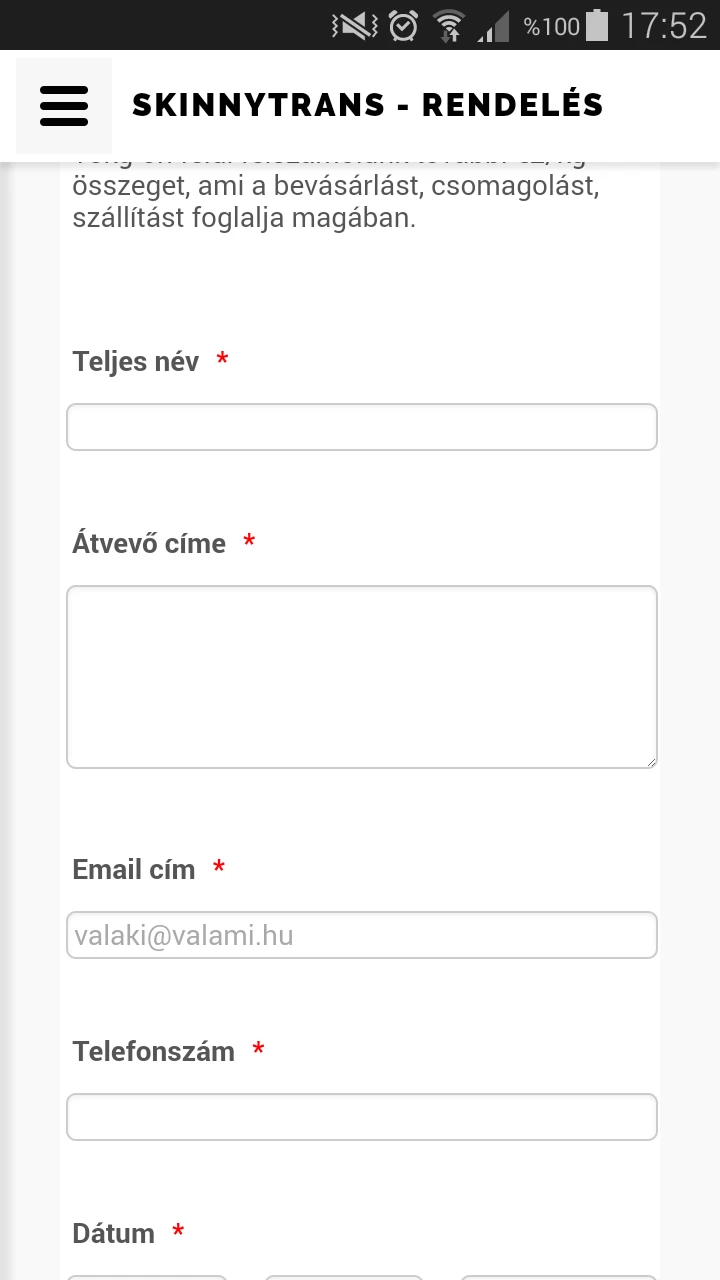
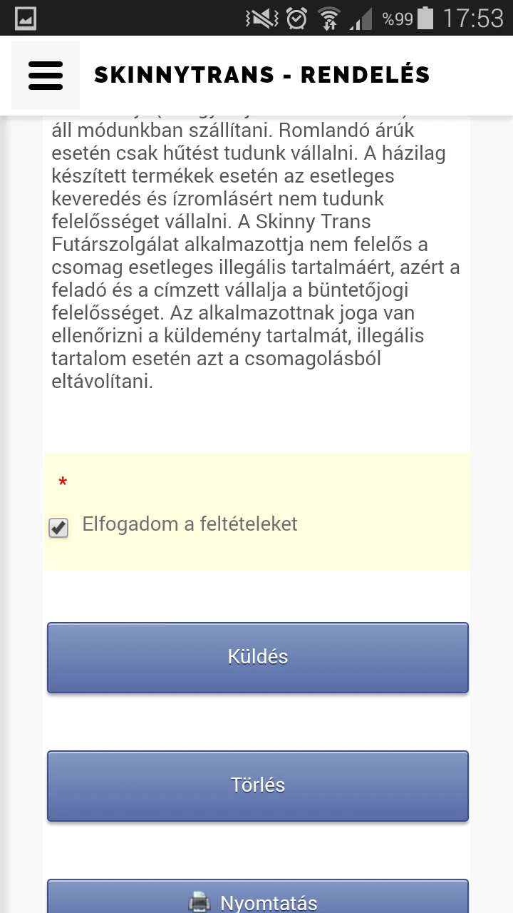
Which mobile phone did you test your form on? If you are using iPhone, I recommend you to embed your form with iFrame as the following link: https://www.jotform.com/help/148-Getting-the-form-iFrame-code
Please check and If you need further assistance, let us know.
Thanks in advance.
-
SkinnytransReplied on November 27, 2016 at 12:02 PM
Dear candy,
Sorry for being away for this long. I use iPhone5 and 6s for testing.
-
KadeJMReplied on November 27, 2016 at 2:44 PM
I took a look at this issue on my iPhone 6 and I believe I see what you mean.
The problem isn't actually with the form as the form is legitimately mobile responsive and you can see this by looking at your direct form link on your mobile device to verify the same.
The issue is actually a problem after embedding it onto your site and there's a few things we can attempt to help you with this to try to fix it.
Option 1 - You can try checking your website settings in your website builder allows it to make it fit more adversely within mobile if your site page builder is capable of adjusting the containers when viewed on mobile.
Option 2 - If your site has a mobile site builder you can fix it there or enable it to correct it.
Option 3 - Alternatively, you can keep your form the same on your site and attempt to make several tweaks to the form to make it fit better with the form designer and injected css but, this may take a bit of finagling and effort to perfect it better.
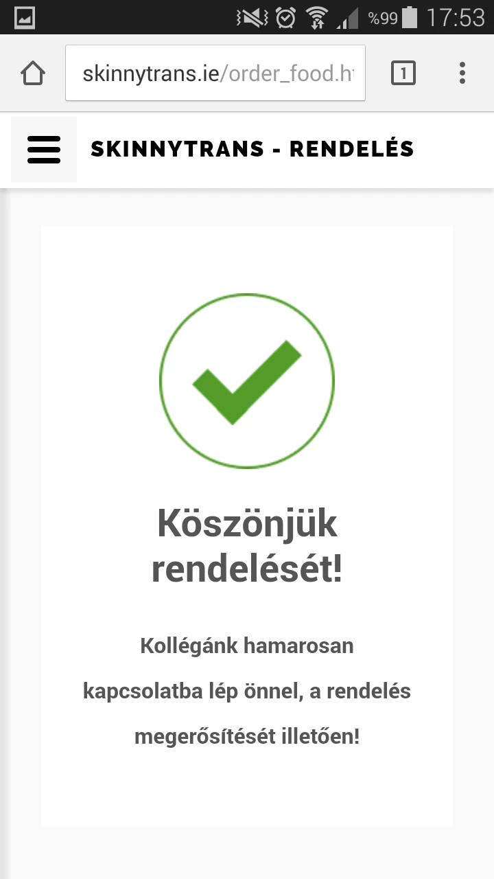
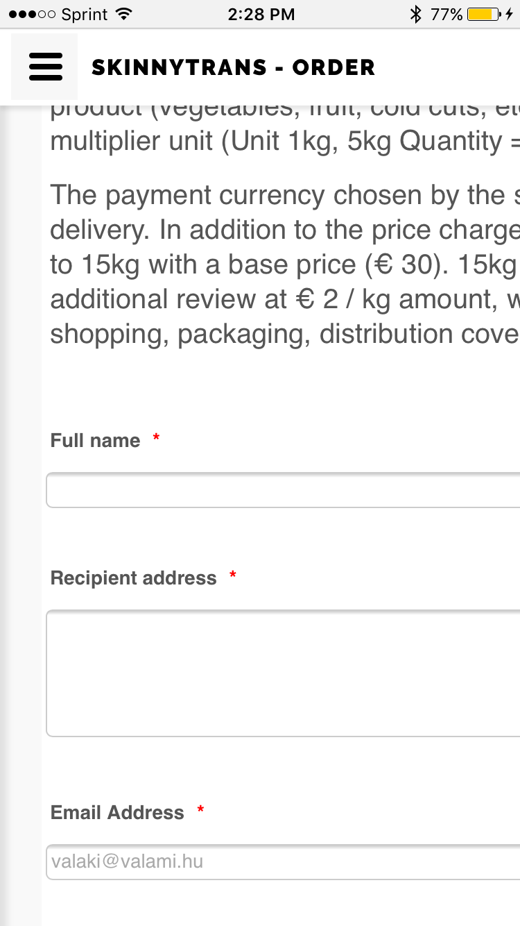
This is what I see on my iPhone 6 with just the Form Link (Working):
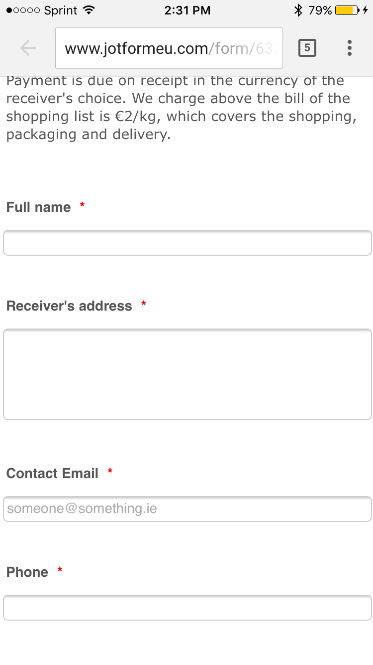
And here's what I see on my iPhone 6 with your embedded form (Cut Off on Right Side):
- Templates
- Integrations
- INTEGRATIONS
- See 100+ integrations
- FEATURED INTEGRATIONS
 PayPal
- Slack
- Google Sheets
- Mailchimp
- Zoom
- Dropbox
- Google Calendar
- Hubspot
- Salesforce
- See more Integrations
- Products
- PRODUCTS
- Form Builder
- Jotform Enterprise
- Jotform Apps
- Store Builder
- Jotform Tables
- Jotform Inbox
- Jotform Mobile App
- Jotform Approvals
- Report Builder
- Smart PDF Forms
- PDF Editor
- Jotform Sign
- Jotform for Salesforce Discover Now
- Support


