Before Dropbox launched publicly, Drew Houston had a not-quite-finished product and a waitlist of about 5,000 people. So he recorded a three-minute demo, put it on a single page with one thing to do underneath it — join the waitlist — and posted it where early adopters gathered.
Overnight, the waitlist went from 5,000 to 75,000 for a product that, strictly speaking, wasn’t finished.
That’s the power of a landing page: a single page with one job. That focus is what converts. Unbounce studied 41,000 landing pages and found a median conversion rate of 6.6 percent, with the top quartile clearing 11 percent.
You don’t need a website first. That’s what the rest of this guide covers: how to create a landing page that converts and how to get one live fast.
Pro Tip
Want to skip ahead? Type in a quick sentence describing your offer, and Jotform’s AI Landing Page Generator will build a publish-ready page in under a minute.
What’s the difference between a landing page and a website?
A landing page and a website differ in one key way: what they ask visitors to do.
Author Seth Godin, who’s been using the term since 1991, says, “Landing pages are not wandering generalities. They are specific, measurable offers.”
If someone lands on your homepage, they’re probably going to look at your About page, read a blog post, check your pricing, then close the tab. The more links you provide, the more opportunities visitors have to exit.
A landing page seals off those exits. It strips away navigation bars and external links, leaving visitors with two choices: complete the form or close the window.
Here’s both at a glance:
Website homepage | Landing page | |
|---|---|---|
| Primary goal | Broad brand exploration | A single, specific action such as a newsletter signup |
| Navigation | Extensive header and footer menus, internal links, and social icons to encourage browsing | Minimal to none; main navigation is typically hidden or completely removed to keep focus on the call to action (CTA) |
| Typical conversion rate | Around 2%; 1.7% for new visitors and 2.9% for returning visitors, according to Contentsquare | 6.6% median, with the top quartile above 11% |
When is a standalone landing page enough?
A standalone landing page is enough when you’re directing people from an ad, email, or social post toward a single action: sign up, register, buy, or join.
That can include
- A lead-generation campaign
- An event registration page
- A newsletter or waitlist signup
- A single product or service offer
- A portfolio or contact page
In each of these cases, the landing page does the work on its own, and skipping the work of building a website saves you the $1,000 to $150,000-plus price tag of a full site.
Take Buffer, for example. Today, the company serves over 75,000 customers, but it started as just two pages and an email field. CEO Joel Gascoigne validated the whole idea before he’d written any product code by tweeting a link to a page that explained Buffer and a second page that collected email addresses.
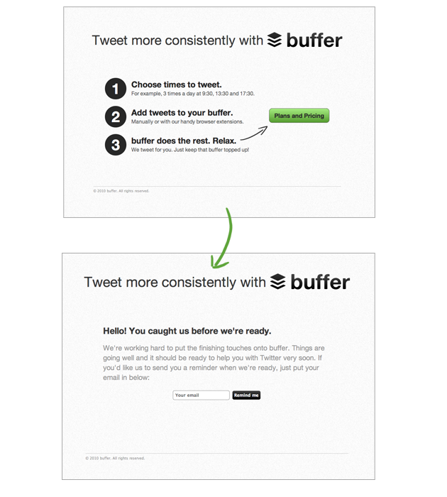
“The landing page — and more importantly the conversations resulting from people signing up through it — proved to be great validation,” Gascoigne said.
The key things you need before building a landing page
If you don’t know exactly what you want your landing page to do before you start building it, your visitors won’t either.
Ask these questions about the elements of a high-converting landing page:
| Element | The question to ask |
|---|---|
|
Goal |
What single thing should happen when someone lands here? |
|
Audience |
Who, specifically, is this page talking to? |
|
Offer |
What do your visitors get in exchange for their time, attention, or money? |
|
CTA |
What’s the one thing you’re telling people to do? |
|
Social proof |
Why should someone believe you before they act? |
|
Mechanism |
How does the page capture the action, and does it match the goal? |
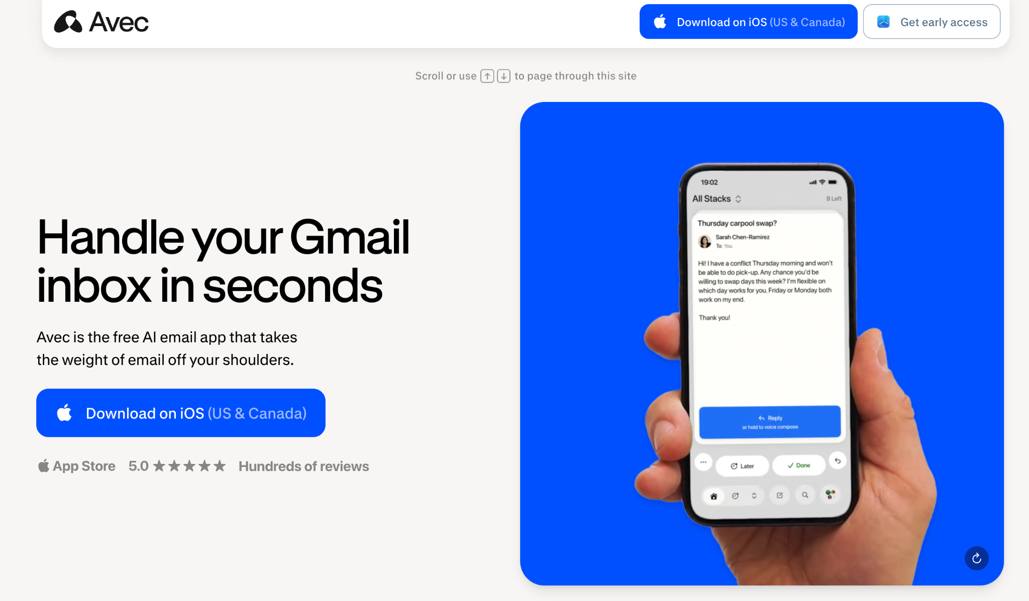
Avec, a free AI email app, pitches itself as “Tinder for email,” and it’s a great example of these principles in action:
- Goal: Encourage visitors to download the iOS app.
- Audience: Target Gmail users drowning in email, using the headline “Handle your Gmail inbox in seconds.”
- Offer: Promise a free AI-powered email assistant that helps users “handle your Gmail inbox in seconds” and takes the weight of email off their shoulders.
- CTA: Repeat one clear instruction, “Download on iOS,” from the top of the page to the footer.
- Social proof: Highlight a 5.0 App Store rating with hundreds of reviews up top, then reinforce credibility with a long list of user testimonials further down.
- Mechanism: Link the CTA directly to the App Store so the mechanism matches the goal exactly.
📚 Read more: How to create an effective landing page
How to create a landing page without a website in 5 steps
According to Unbounce, the core philosophy of a standalone page relies on attention ratio: the number of things a user can do on a page vs the one thing you want them to do.
On a standalone landing page, you deliberately create an attention ratio of 1:1.
Take your six answers from the list in the previous section. Next, you build the page. With Jotform, that takes just a handful of steps.
Step 1: Choose one goal for the page
Your page should drive one action, and one action only. For example
- To collect email signups: A baker building a subscriber list before launching a paid recipe newsletter
- To book consultations: A freelance designer filling next month’s calendar with 15-minute discovery calls
- To register attendees: A yoga studio claiming 30 seats for a Saturday workshop
- To sell one offer: A creator selling a single $79 Notion template
- To build a waitlist: A two-person team gauging demand for an app before building it
In Jotform’s AI Landing Page Generator, your goal is the first thing you hand over. Describe your page in plain language, and the AI builds around it.
Here’s my prompt: Create a landing page to book free 30-minute coaching consultations for first-time founders. Offer is a no-pressure strategy call. One call to action: ‘Book your call.’
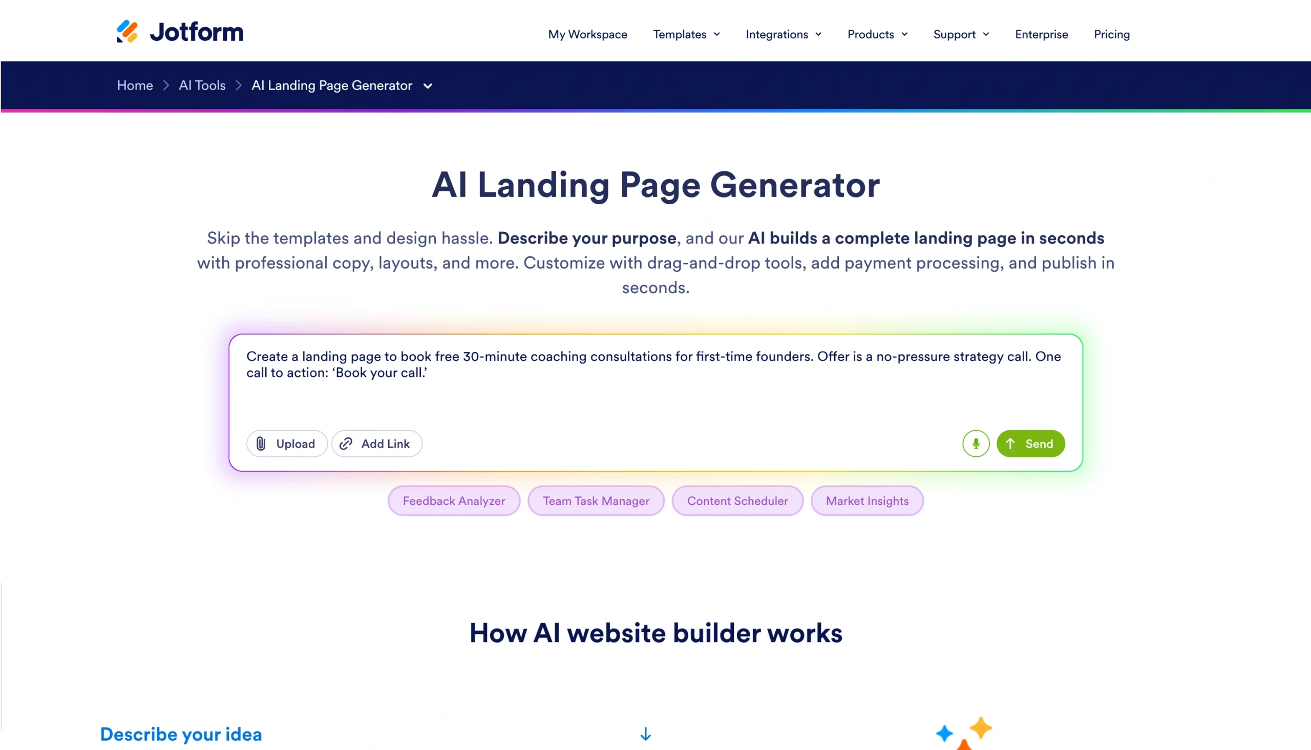
Notice how the prompt feeds the AI all the foundational constraints we just talked about:
- Audience: “First-time founders”
- Offer: “Free 30-minute coaching consultations … a no-pressure strategy call.”
- CTA: “Book your call.”
Click Send, and Jotform AI gets to work immediately.
📚 Read more: 8 landing page examples
Step 2: Write the headline and value proposition
The headline (also called the header, H1, or hed) is the line that sits in the hero section at the top of the page. It’s the first thing a visitor sees before scrolling.
David Ogilvy made the case for headlines back in 1963, in Confessions of an Advertising Man: “On average, five times as many people read the headline as read the body copy, so once you’ve written it, you’ve spent eighty cents of your dollar.”
So the top of the page has about three seconds to do three things: say what the offer is, who it’s for, and why it’s worth acting on now. Here’s how to create it:
- The headline is your offer in one line: Keep it tight. Landing-page headlines work best at roughly six to 12 words, and an analysis of real pages found the average is around six.
- The subheading is the one supporting line that answers the next logical question: Explain who the offer is for and what visitors will get. Keep the wording plain. Unbounce found that pages written at a fifth- to seventh-grade reading level convert at 11.1 percent, which is more than double the 5.3 percent rate for pages written at a professional level.
- The CTA is one instruction that matches your goal exactly: Use one clear action. When Databox asked 37 companies what mattered most on a high-converting page, clear calls to action topped the list, ahead of copywriting and visuals. If the goal is booked calls, the CTA should read “Book your call.”
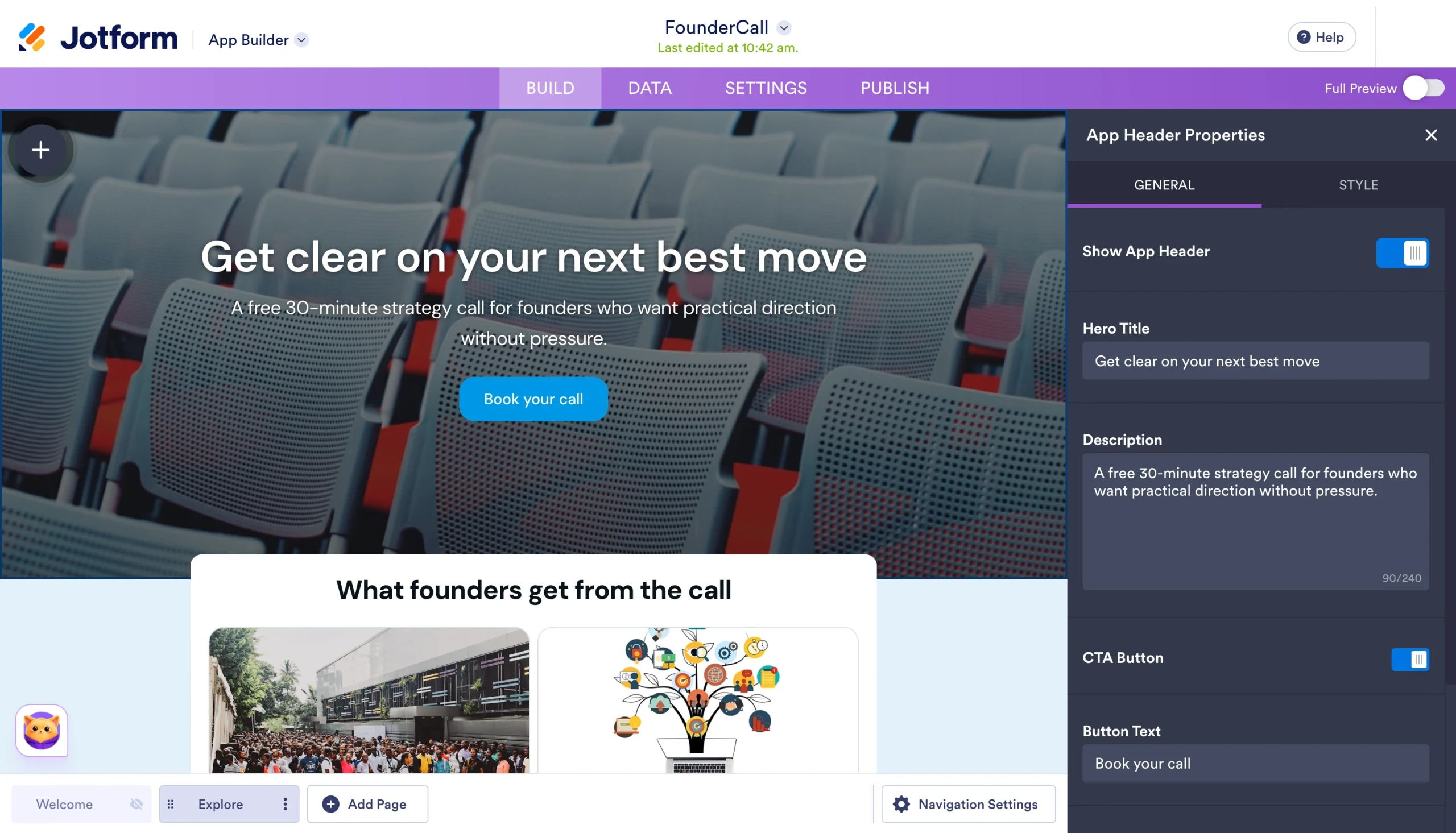
From that one prompt in Step 1, Jotform’s no-code landing page builder drafts the whole hero section for you. Here, it’s returned the headline “Get clear on your next best move,” a subheading that names the audience and the promise, and a “Book your call” button:
Pro Tip
Once you’ve written your headline, paste it into a free tool such as MonsterInsights’ Headline Analyzer to pressure-test it. The tool scores the headline on length, word balance, and clarity, and then flags opportunities to make it stronger. Tweak it, then drop the winner back into the builder.
Step 3: Add only the sections that support the conversion
A landing page is selective on purpose; every section either moves visitors toward the desired action or gets cut. That’s the whole reason landing pages convert at 6.6 percent while the average website page converts closer to 2 percent.
So build only what your conversion goal requires. For most pages, that includes
- The hero section, including the headline, subheading, and CTA
- An FAQ section addressing the three or four objections most likely to prevent conversion
- A short benefits section with three or four lines explaining what visitors will get
- A social proof section featuring testimonials, a star rating, or a few recognizable logos
- The mechanism to capture visitor data, such as the signup form, inquiry form, or payment section
You’ve got two ways to add these sections. Ask Jotform AI in the chat to build one for you. For example, I typed “Can you add a social proof block with testimonials?” and it generated a testimonial card I could then edit using my own customer quotes.
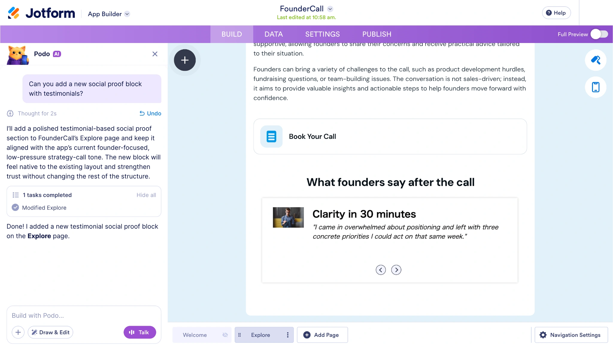
Or skip the chat and drag the element in yourself. The Testimonial element lives under the BASIC menu on the left, alongside the other building blocks.
For the FAQ section, drag a Rich Text element onto the page from the BASIC tab in the App Elements panel, then write your three or four most common objections directly into it.
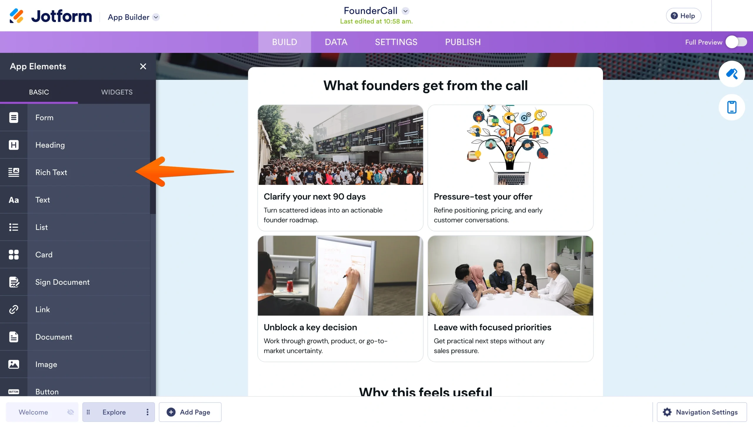
The Formats menu lets you apply headings, H2 for the section title and H3 for each question, which serves two purposes: It gives the block a clear visual hierarchy that visitors can skim, and it structures the page so search engines can better understand it.
The page converts because of what’s not on it. When you’re tempted to add something, ask yourself what it pulls attention toward. If the answer isn’t the one action, it’s pulling attention away from it.
That rules out full-site navigation, stray links, and long founding-story sections. It also means limiting each page to one offer. If you’re promoting two things, build two pages.
Step 4: Add the form or CTA that matches the page goal
A call-booking page needs a date-and-time picker. A waitlist page needs an email field and not much else.
Keep it short. GetResponse analyzed landing-page forms and found that forms with one, two, and three fields convert best (between 11 percent and 13 percent) while forms with four or more fields drop to 3.88 percent.
Jotform’s builder gives you a live split view so you can fine-tune your page as you build it. Edit the form’s properties on the left and watch the results update in real time on the right.
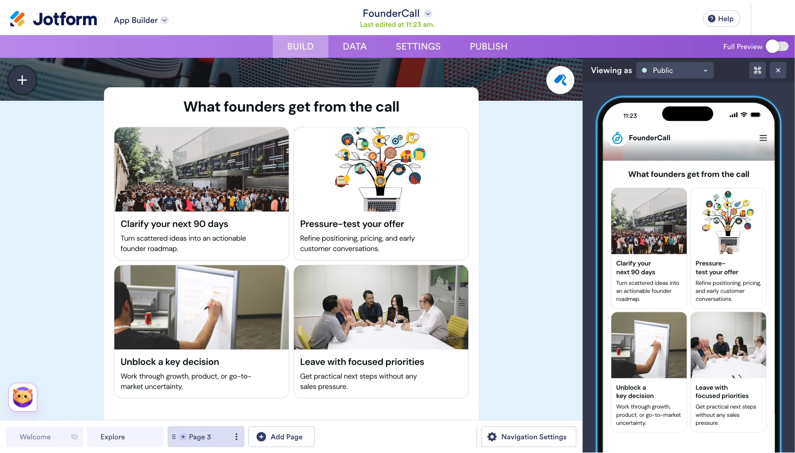
If you want more control, click into the form the AI generated to open it in Jotform’s full form builder, where you can add, reorder, or delete fields one at a time.
The right mechanism depends on what you’re asking for:
- For a lead magnet, use an email signup form.
- For a service business, use a consultation request form, such as the “Book Your Call” page from the previous section.
- For an event, use a registration form that captures attendee information.
- For a product, use a payment or order form that completes the sale on the page.
- For a waitlist, use a short interest form (often just an email).
This is where a form-first builder like Jotform pulls ahead. A page builder that focuses only on layout leaves you connecting a separate form tool, payment processor, and response-routing solution.
But because Jotform is a form builder first, those capabilities are already built in. Contact forms, registrations, and email signups drop straight in; payments run through credit cards, PayPal, and 40-plus gateways; and a submission can trigger a workflow without leaving the platform.

Step 5: Publish the page with a shareable link
Now for the final leg. If you don’t have a website, where does the page live?
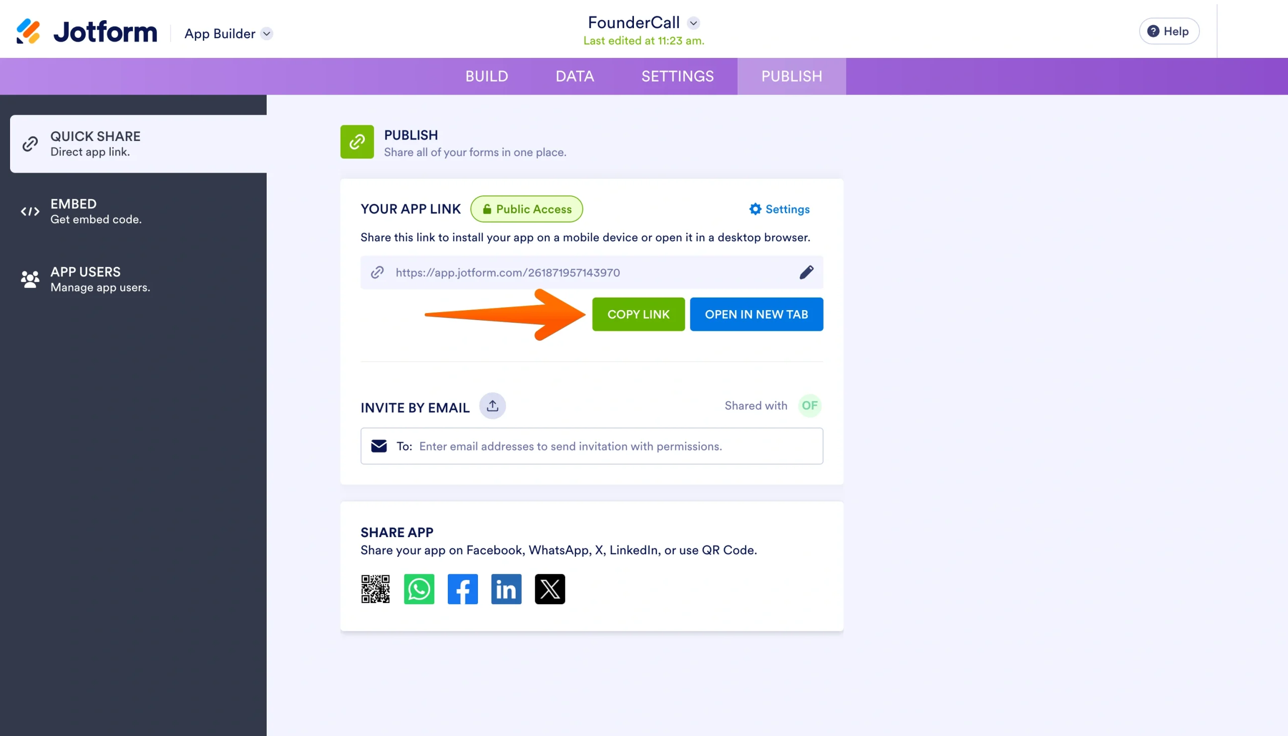
On the builder’s server. For example, when you click Publish, Jotform hosts the page and gives you a public URL, a live link like “jotform.com/app/…” that anyone can open in a browser. The page exists the moment you publish it.
From the Publish tab, you can share that link however you want. The Quick Share panel lets you copy the direct app link into a paid ad or email campaign, add it to your Instagram bio, send it in a direct message, or open it in a new tab to check it.
Create your landing page with Jotform, without code or a website
Everything in the previous section runs on Jotform’s AI Landing Page Generator; you don’t need a website running underneath it.
Here’s what you get:
- A page from only a sentence: Describe your goal, and the AI returns a complete page, copy and layout included, in under 45 seconds.
- A drag-and-drop editor: Change colors, layouts, images, text, and branding by moving things around.
- A back end that’s already wired: Route every sale or signup through more than 40 payment gateways and 150-plus integrations, so bookings and payments flow automatically to your CRM or bank.
- A page that runs anywhere: Publish once and let Jotform Apps work on any smartphone, tablet, or desktop.
- A form built into the page: Add a booking calendar or order form to the page itself, so visitors act where they land instead of clicking off the page to a separate tool.
None of this replaces a real website, and it’s not trying to. But it does replace the wait.
So build the website when the website’s the thing you need. Today, you need the page. And with Jotform, the page can go up today.
Creating a landing page without a website FAQs
For a single purpose, yes. If you need people only to book, buy, or sign up, a one-page website can do the job well. And it can also receive online payments directly, so it functions as a checkout if you need it to.
A landing page should include a headline, a short value proposition, one clear call to action, light social proof, and the form or button that captures the action.
A strong landing page design keeps the focus on that single action and removes everything that doesn’t serve it.
To create a landing page quickly, describe your goal to an AI generator, such as Jotform’s AI Landing Page Generator, which drafts a complete page in under a minute. Then edit it with drag-and-drop tools. From there, how to optimize a landing page comes down to refining the headline and CTA, and removing anything that distracts from the primary action.
This article is for creators, freelancers, founders, marketers, and small business owners who need a fast online destination for one specific goal, such as lead capture, event registration, waitlist signup, service inquiries, or direct sales, but do not want to build a full website first.














Send Comment: