
How to create an effective landing page
Whether you’re a freelancer or an established business, there are a few key principles to follow when you want to create an effective landing page. By using those principles, you’ll create a landing page that will convert more visitors to customers, spark greater interest, and improve your sales funnel.
There are three attributes that should be at the core of your design: simple, calm, and clear. Here’s how to think about them as you develop your landing page.
KISS your visitors
The KISS principle stands for “keep it simple, stupid.” The phrase became popular in the 1970s, and the concept is attributed to an aircraft engineer who emphasized the importance of simplicity in design. Some people prefer “keep it simple, sweetie” or “keep it stupid simple.”
Whatever version you choose, the meaning is the same.
You may be thinking, “But my audience isn’t dumb. I don’t want to talk down to them.”
And you’d be right. Your audience isn’t dumb — but they may be tired, overworked, and stretched really thin.
We all have so many demands on our attention it’s almost impossible to manage them. We don’t have the time and energy to consume every bit of information that we’re exposed to every day. In fact, one study indicated that the average person has a shorter attention span than a goldfish.
So a simple landing page is the way to go.
Make it placid like a summer lake
If your landing page looks like an old-world Marrakesh market, you’re doing it wrong. It shouldn’t be busy, covered with ads, or loaded with text.

Take Amazon’s home page, for example. Amazon sells pretty much everything under the sun. You can literally do all of your shopping for home goods, groceries, toiletries, and more from its site.
On top of that, it offers Audible, Prime Video, Alexa, and more. That’s a lot of products.
But if you visit the homepage, it’s actually pretty minimalistic compared to what it could be. There’s a scrolling banner showcasing big promotions, and below that is a collection of items the algorithm has deemed relevant to you.
Yet everything the company offers is accessible from that page. It’s all in the menu bar, which uses subdued colors, so it doesn’t distract from the main goal of the page — to sell you on the big promotions.
Clarify, please
The most important concept to embrace is clarity. When people visit your page, they should know what you’re offering and what to do in five seconds or less.
They shouldn’t have to learn anything new. They shouldn’t have to read or scroll much. You should do all the work for them.
You can make your page clear by keeping it simple and calm. You can also make it clear by stating what you’re about in basic terms.
As an example, look at Wikipedia. Its hallowed pages house an attempt to capture the sum of all human knowledge. But look at the landing page.
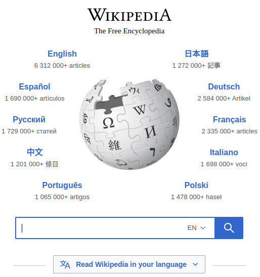
Even if you didn’t know what Wikipedia was, its purpose is completely clear. It’s a free encyclopedia with support in multiple languages.
So all this simple, calm, and clear stuff is nice, but how do you implement it?
Effective design in practice
You need to follow a few design principles and understand some basic concepts to implement the approach mentioned above.
1. Grab attention above the fold
The term “above the fold” comes from the newspaper industry — as newspapers come off the presses, the machines fold them in half for delivery. The big headline and an attention-grabbing photo are always located above the fold on the top half of the page to entice you to buy the paper.
A similar concept applies to websites. Put the most relevant information at the top of the page if you want to grab someone’s attention. The user shouldn’t have to scroll down to know what your site is about or what you want them to do.
The area above the fold should be minimal but should still let visitors know that there’s more content for them. You can achieve this by including a link or downward arrow at the bottom of the visible area and/or a subdued menu at the top.
Another option is to have a small section of the page below the fold visible from the top. The next section showcases an example that demonstrates this. There’s a thin, dark line at the bottom of the fold to show that there’s more to the page.
2. Use a header and subheader
As mentioned above, you don’t want to flood your landing page with text. Giving visitors too much to read will only confuse them and drive them away.
A good rule of thumb is to have a header and a subheader. The header is the first thing they’ll read. The subheader is what they’ll read if you’ve gotten their attention.
For a more structured approach to writing copy that moves visitors from attention to action, use the AIDA marketing model to guide your landing page messaging.
The announcement page for Jotform Workflows is a good example of this.
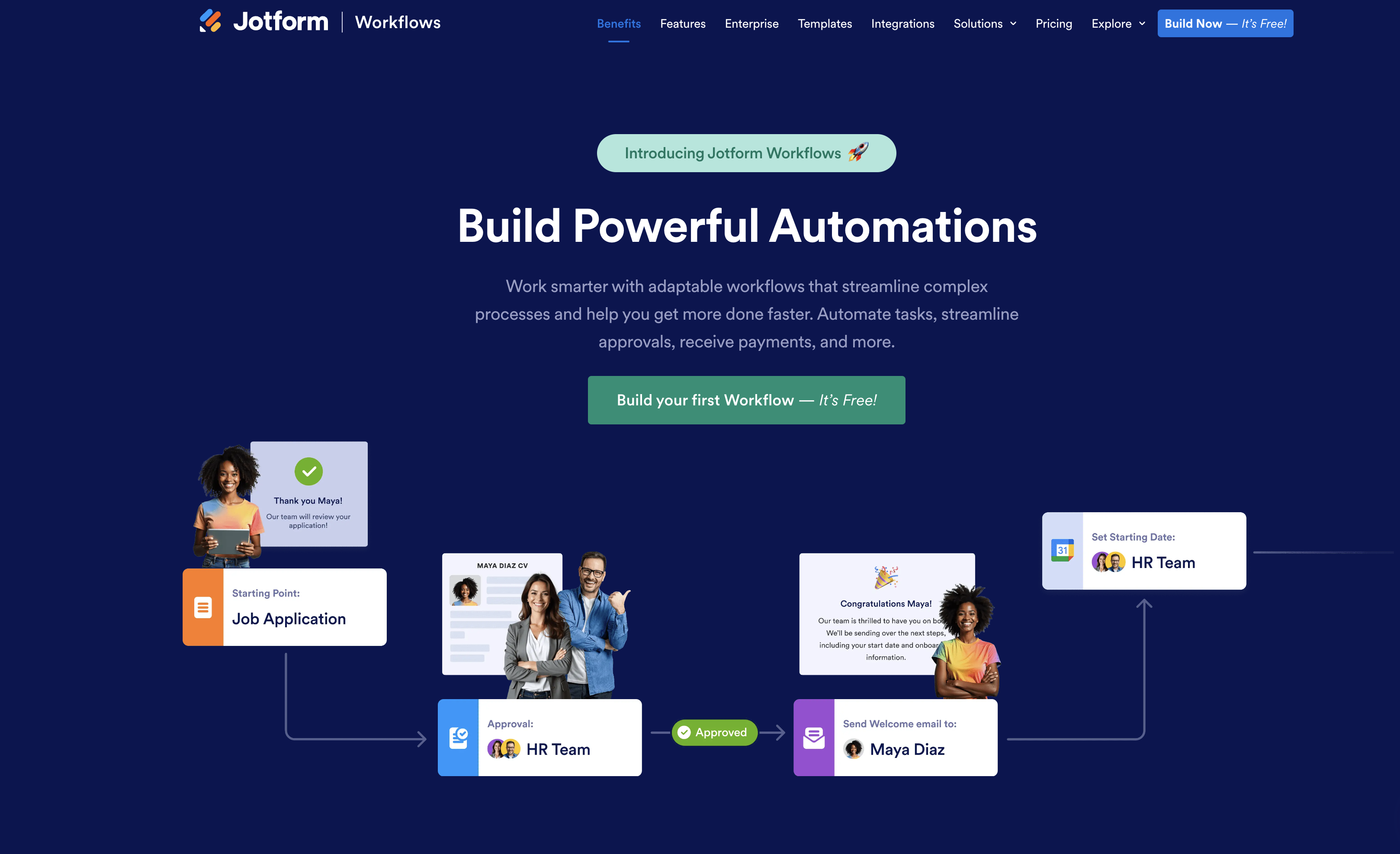
The first thing that jumps out at you is the core message: “Build Powerful Automations.” Once this gets your attention, you can read a couple of sentences explaining the product.
There are several pieces of text on this page. But they actually benefit rather than detract from the page because they’re part of an animated graphic.
3. Grab attention with imagery
Before you even noticed the header, you probably noticed the images and animation. It’s important to have an eye-catching detail on your landing page, either in the foreground or the background. It’s a good way to capture attention just long enough to get your visitor to start reading.
4. Make a single call to action
In the example above, there’s a single call to action: “Try Now — It’s Free!” The call to action is simple, to the point, and located centrally on the page.
At this point, if you’re ready to sign up, all you have to do is click the button to get the ball rolling. Otherwise, you can scroll down for more information.
5. Pave the way with color
The call to action on the Jotform Workflows page is the Build your first Workflow button. It stands out because it’s a bold, solid color that pops. Another popular choice is to use “hot” colors — like red, orange, and yellow. But don’t overdo it.
6. Remember the three qualities to convey
To summarize, your landing page should be simple, calm, and clear. Don’t make people work to find out what you’re about. Give them an easy way to buy or sign up.
Your landing page should grab their attention, give them information, and spur them to take action. It’s really that simple — just as landing pages should be.


Send Comment: