
8 landing page examples
A landing page is a standalone web page that’s designed for one purpose: to get visitors to convert or take a specific action. It’s usually part of a larger marketing campaign that includes ads driving people to the page, as well as a special offer in exchange for buying a product or signing up for an email newsletter. The median conversion rate for a landing page is between 3 percent and 5.5 percent, compared to 2.9 percent for the average e-commerce page.
Landing pages that convert make it easy for visitors to take the desired action, whether it’s submitting their email address or buying a product. These pages have simple text, make the offer very clear, and use images and customer testimonials to entice visitors to take the desired action.
If you’re looking for inspiration for your landing pages, here are eight examples to help you decide how to structure your landing page, what kind of copy you’ll use, and how much information you’ll collect, depending on what you want the visitor to do.


1.Shopify
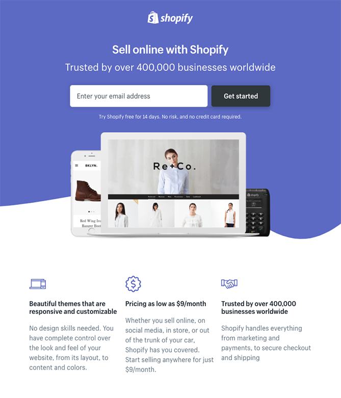
The Shopify landing page is a great example of keeping it simple. Above the fold (before you scroll down), it tells you what you can do with Shopify, who trusts it, and that all you have to do to get started is submit your email address. This is ideal for people who are ready to get started.
If you scroll down a little, Shopify further communicates its value proposition by discussing the benefits of using it and what the pricing is.
2.Airbnb
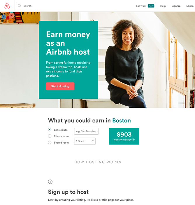
Airbnb keeps its landing page simple, too, with the call to action above the fold. The benefit is described succinctly: Earn money. For those wondering how much money they can earn, Airbnb embedded a calculator in the landing page so that visitors can estimate how much they could make when they sign up to host.
3.Wistia
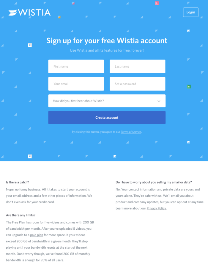
Another example of keeping it simple is Wistia’s free account landing page. The company embedded a simple form so that visitors can start an account right away.
The call-to-action button clearly communicates that an account will be created. If you scroll down, the page also explains a little more about the Wistia service.
4.Nauto
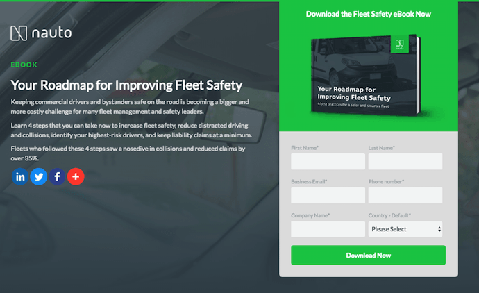
Companies making a more complex offer, like an e-book about a business-to-business topic, need to include more information on their landing pages. Nauto’s e-book landing page is a good example of how to do this.
The landing page with form explains what you’ll get from downloading the e-book, and the page includes a simple form on the right side to capture visitor information. Once again, the call-to-action button clearly says what will happen, that you’ll download the e-book.
5.Industrial Strength Marketing
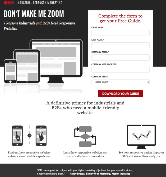
This e-book download page from Industrial Strength Marketing isn’t a complex topic that needs a lot of explanation, so the company kept it simple: the title of the e-book, a short description, and a form to fill out before downloading.
To give visitors a little more information, Industrial Strength Marketing also included short blurbs about the topics discussed in the e-book.
6.Trulia
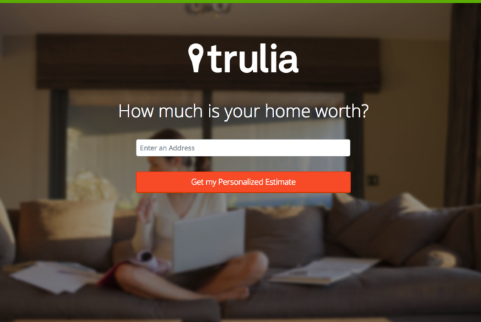
Sometimes your call to action is to have visitors learn more. Going with the theme of keeping it simple, Trulia’s landing page asks a question, requests an address, and has a call-to-action button that describes what the visitor will get.
Of course, this isn’t enough to estimate a home’s value, so Trulia takes visitors to a form that asks for more information, like the type of property, how many bedrooms and bathrooms it has, and the visitor’s contact information.
7.Webprofits
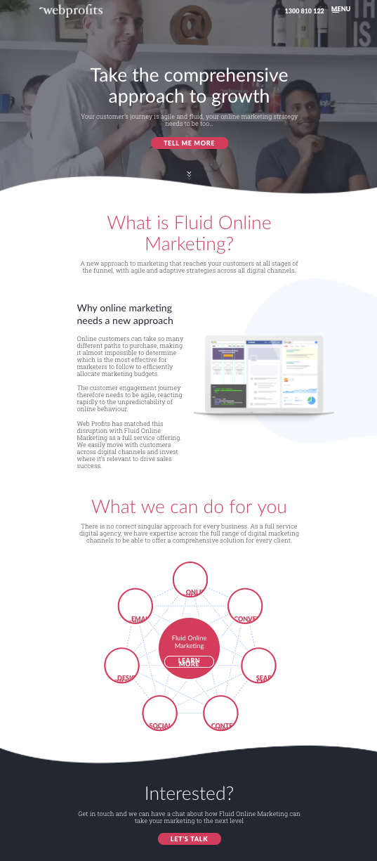
Not all landing pages are short, but they can seem short if you place call-to-action buttons strategically throughout the explanation. Webprofits does just this by using graphics and subheadings to make the text more readable.
8.IMPACT Branding & Design
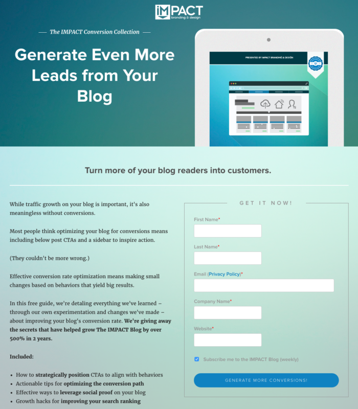
Another example of a longer landing page that works is from IMPACT Branding & Design. The company wants you to download an e-book, so it prominently places the form on the right side of the page.
Like Industrial Strength Marketing, the landing page clearly communicates what the visitor will get if they download the e-book.
These are just eight examples of landing pages that help drive conversions. Depending on your industry, you may want to use a simple landing page with a quick call to action or a longer, more involved landing page that explains the benefits of your offer.


Send Comment: