UX and psychology.
Psychology and UX.
The two go hand-in-hand.
Psychology is the study of understanding people’s behaviors and emotions. What makes them tick? What makes them happy? Without the ability to predict these behaviors, successful UX can’t exist.
To the untrained eye, good design might seem like a series of happy accidents.
But each color, shape, line, font, text, and graphics signifies something. Curved shapes represent positive emotional messages. ‘Odd one out’ images draw the eye.
These are just a couple of the psychological principles that direct our attention, and our subconscious, to where the designer wants it to be. And most of them are so hardwired that we don’t even notice them anymore.
It’s easy to dismiss such principles; their most obvious use is on slick websites or towering billboards. But by applying them to every facet of your design, you will reap the benefits tenfold.
Small-scale, everyday design needn’t be any less thoughtful. According to legendary designer Paul Rand,
“The public is more familiar with bad design than good design. It is, in effect, conditioned to prefer bad design, because that is what it lives with.”
“Everything’s designed. Few things are designed well.”
With a base knowledge of psychology principles under our belt, we can begin to design more consciously, creating experiences that truly fit our users. Forms are just the tip of the iceberg.
Let’s dive in.
First things first

To list all the design laws and psychological principles would take a bible, not a blog post.
But they all boil down to one, blaring purpose: good UX gets the user to where they want to be, as quickly and as smoothly as possible.
In other (more technical) words? They encourage minimized cognitive load:
“In cognitive psychology, cognitive load refers to the total amount of mental effort being used in the working memory.”
A task with a high cognitive load has a steep learning curve. It’s time-consuming and complicated. It’s the type of task we give up on to go for an early lunch.
A task with minimal cognitive load is simple, clear and quick-to-complete. So we’re inclined to do just that.
That’s all. This is the north star of design.
Funnily enough, it’s much harder to design something easy than to design something hard.
“Genius is the ability to reduce the complicated to the simple.”
It might be a great start to look at the psychology of cost vs. benefit.
Cost vs. Benefit
Would you run 10k on a hot day? No? What if someone gave you 10k to do so?
Every decision we make goes through a cost-benefit analysis. This is the process of weighing up the difficulty of a task vs. the reward of its completion. If the costs outweigh the benefits, we tend not to take action, and vice versa.
A designer’s job is to ensure the perceived benefits always outweigh costs.
Now, whether you want to give a reward for filling a form is up to you. Often, the best way to ensure users benefit from form-filling is to implement the changes they want, continually improve your product and keep them in the loop.
Ultimately, cost vs. benefit is subjective to each user, and there’s only so much we can influence them. What we can do, however, is a) make content as easy-to-digest as possible, and b) ensure we are transparent about the associated time and effort it will take to complete the form.
What to do about it?
Chunk text
+1–919–555–2743. 19195552743. Why is the first number easier to remember than the second?
Because of chunking. A long string of single items is overwhelming; a shorter series of composite articles isn’t.
Chunking is a memory mechanism. When we arrange information into smaller groups, it’s easier to for us to process. That’s why we know our bank pin and social security number off by heart.
How small should your chunks be? Research shows three is the magic number, and anything higher will trigger confusion. Break text, numbers and sections down into groups of three or less, and users will breathe out a sigh of relief.
Be explicit
Will users need their passport to fill out your web form? Will it, heaven forbid, take them longer than 10 minutes to complete? Let them know what they’re in for on the first page. If they’re confronted with the same information halfway through, they will be far less forgiving.
Complex password requirements? Formatting rules? Same thing. Don’t make your users play guessing games. If a field requires a specific type of input, make it visible — or pair with instructions, if necessary.
The same applies to syntax rules such as punctuation or spacing for phone numbers or credit cards.
Hicks Law
Think about how long it would take you to select your dream vacation in Italy. Now, in Europe. Now, in the entire world.
As Barry Schwartz wrote in The Paradox of Choice, too many options can be paralyzing. Hicks Law agrees. It states that our decision-making time increases in proportion to the number of choices we’re presented with. We umm and ahh and panic and dither. We might even give up on the task altogether.
Applied to design, Hicks Law is a hymn to deliberate elimination. As design flexibility increases, its usability decreases.
Levi Jackson said it best:
“A design isn’t finished when there is nothing more to add, but when there is nothing left to take away.”
When it comes to form design, less really is more.
What to do about it?
Cut and refine
Is that button 100% necessary? What about that link? Every word of copy, image, design feature, that doesn’t serve an explicit purpose will decrease a form’s conversion rate.
If it’s not adding something, it’s taking something away.
As Hans Hofmann remarked,
“The ability to simplify means to eliminate the unnecessary so that the necessary may speak.”
If long lists are unavoidable, collapse sections to reduce the appearance of content. Break down lengthy processes such as registration and checkout into bite-sized steps. Group questions in a logical order.
Carve a clear path to completion, then guide users along it with cues and clues wherever you can — predefined answers and placeholder text is a good place to start.
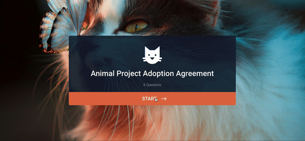
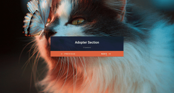
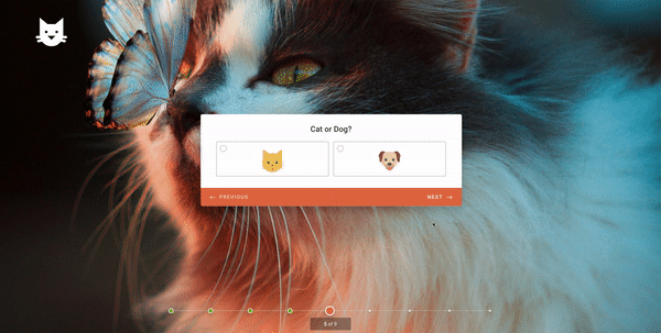
If possible, try and narrow it down to one-important-thing-per-page. This reduces the cognitive load to the bare minimum and helps users process information faster. We took this approach to the next level when building Jotform Cards, using a one-question-per-page layout.
Save people time
Think about the way two users can play the same video game, but, dependant on the moves they make, end up on totally different levels.
Similarly, two users can have contrasting experiences with the same form. Let’s say you want to ask for the home addresses of customers, but only those who live in a certain postcode. Or for the contact details of guests at an event whose satisfaction level was 3* or less.
You wouldn’t want the users to wade through all of these options, would you?
Conditional logic lets you splice up your form into multiple routes, or ‘branches’.
So, a form that appears simple could have tons of branches in the backend, that are only visible to certain subsets of users.
On the same topic, clearly distinguish between optional and non-optional fields that apply to everyone. Consider shifting ‘nice-to-have’ questions (eg. ‘Where did you hear about us?’) to after the form’s completion.
Dual-Coding Theory
Think of the word “beach”. Your mind automatically conjures up an image of blue water and white sand. Clever, right? We create visuals and link them to certain words thanks to our perception of the world.
That’s the Dual-Coding Theory. It suggests that memory has two disparate but connected systems, one for verbal information (sea) and one for non-verbal information (blue).
So, pairing words with images makes the words easier to recall. That’s why children’s books are illustrated, to help young brains learn the power of association.
What to do about it?
Present information verbally and visually
Icons, imagery, shapes: rope in whatever coincides with the content you are getting across.
Make your form easy on the eyes
The eyes are the window to the soul. A form needs to be quick, simple, easy — but it also needs to be beautiful.
As humans, we’re conditioned to think attractive design is better and easier to use — regardless of whether or not this is actually the case. Beauty makes us more patient, loyal, and even more tolerant of design problems.
Who is your survey for? Corporate clients? Playful creatives? Design for them.
The Endowed Progress Effect
American professors Joseph C. Nunes and Xavier Dreze outline the Endowed Progress Effect as:
“a phenomenon whereby people provided with artificial advancement toward a goal exhibit greater persistence toward reaching the goal.”
Basically, we are more inclined to finish a task if we have already made progress on it, and likely to give up if we haven’t.
Malls hand out 20% off vouchers to encourage us to buy. Coffee shops give stamps towards the next latte. It’s all about giving customers a head start, artificial or otherwise.
What to do about it?
Reframe
Stagger questions with the easiest at the beginning and the hardest towards the end. Users will speed through the initial sections, triggering a ‘streak’ effect: i.e., the satisfaction of quick progress, and reluctance to break the streak.
Use a progress bar
Visualize user progress with a progress bar, to reflect back to them that they are moving forward. The closer people feel to their goal, the more likely they are to propel themselves towards it.


Send Comment:
2 Comments:
June 9, 2019
awesome article. thanks
November 21, 2018
Ceren,
Where were you all these years?????? This is an incredibly researched and beautifully written article. I am in the midst of making a mindmap and a checklist out of it for training our newbies.
God bless you. :)