“Listen with curiosity. The greatest problem with communication is we don’t listen to understand. We listen to reply. When we listen with curiosity, we don’t listen with the intent to reply. We listen for what’s behind the words.”
― Roy T. Bennett
Listening doesn’t always happen face to face.
Right at this moment, someone, somewhere around the world is trying to listen to their audience using an online form.
Online forms equal data, they mean collecting responses from anyone who interacts with your business.
And like maths, or topiary, or knitting, form-building isn’t everything it seems. Behind a good form’s apparent simplicity lies tweaking, thoughtful decision making, careful planning and yes — creativity.
The right data is a beautiful thing. It clarifies and illuminates, taking businesses forward and creating stronger leaders. It’s the differentiator between a good business and a great one.
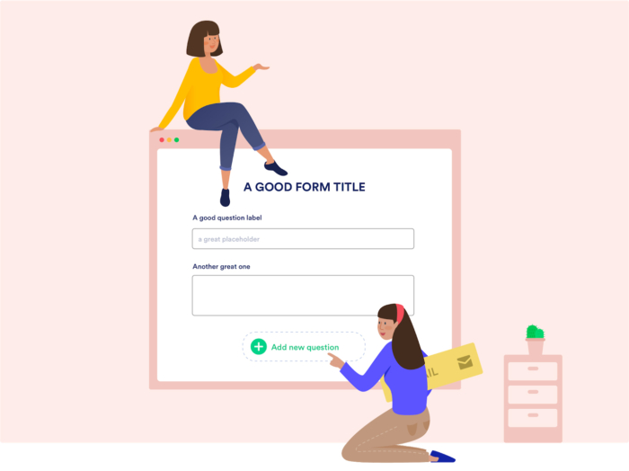
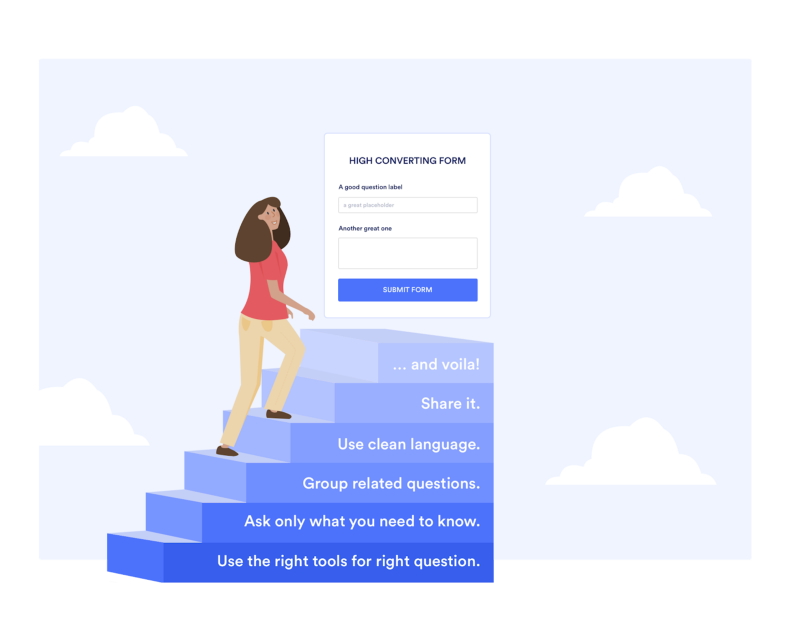
To collect the data you need, we have to start with the bare bones of a form. Every high-converting form is built with smart, savvy information architecture.
Let’s dive in.
Why do you need a form?
As Steve Jobs said, you need to get close to your customers. They are the key to your success, after all. We all would like to climb into our customer’s brains to know how to better serve them.
So, when presented with the chance to ask them questions — a form — it’s tempting to simply start brainstorming all the questions in the world you could possibly ask them.
RESIST!
Here’s the first rule of smart, strategic form building:
Every single extra question makes your users less likely to complete the form.
Every accouterment, every decoration, every additional section that doesn’t really need to be in there.
Longer forms = lower conversion rates.
Instead, write down the knowledge you’d like to gain from the form and work backward.
What is the purpose of your form? Feedback? Research? Performance?
Write down specific knowledge you’d like to gain from your survey, along with a couple of simple questions you think might answer your hypotheses including the set of possible answers.
Next to the answers, write down the percentage of responses you’d expect in each bucket. Comparing the future results against these guesses will reveal where your intuition is strong and where blind spots exist.
This pre-survey process will also help you synthesize the critical aspects of the survey and guide your design process.
Remember: as the scope of your survey widens, the pool of likely respondents grows narrower.
Simplicity is the most crucial — and most under-used — form design feature.
So. Think very carefully about what you do and don’t need. Kill your darlings.
Think carefully about why you need this answer and how you will use it. If you have any uncertainty, lose it. Consider the exact data you’re after, align your questions with that, then get your red editor’s pen — and ruthlessly cut everything else.
The shorter the form, the sweeter the results. Long forms lead to respondents a) quitting the survey altogether or b) simply switching off and clicking random checkboxes until it’s complete.
b) simply switching off and clicking random checkboxes until it’s complete.
Either way, your data is compromised.
A form is a conversation between your business and your customer. And like any conversation, no one likes a rambler.
Now, let’s look at building the form itself.
Title — Question Types — Placeholders
Title
Ever been in a hurry and picked up some poorly-labeled item, only to get home and find your tasty snack is actually dog food?
People filling out a form are usually in a hurry. A hurry to get the form over and done with, that is.
Giving it an unclear title will irritate them before they’ve even started clicking. It sounds obvious, but you’d be surprised.
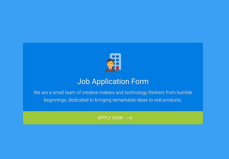
A title should be, simply, the shortest and most accurate description of what’s to come: no clickbait, no convoluted sentences, no confusion.
That means the title should be ‘Job Application’ — not ‘Fill me out.’
Welcome page
The title should be on or followed by, a welcome page with a short description of the form itself. Try to keep this description as neutral as possible.
Why? Because humans have a natural inclination to help.
Of course, that’s a good thing. But if you tell them your form has a specific goal they might answer with the intention of getting you to that goal, rather than being completely honest.
Question types
Here’s a motto for form-builders to live by:
The clearer the question, the clearer the data.
Clear question = what service do you use?
Unclear question = tell us about the service you use.
Simplicity leads to meaningful results: questions whose answers will be easy to analyze and visualize.
The right tools = the right answers
You ask for an email address; you receive a response with no @ sign. You request a phone number; half your answers don’t contain enough digits.
Putting a ton of effort into building a form, and finding the results to be unusable due to a typo, is irritating to say the least.
The devil’s in the details.
For example, if you use a textbox for email information, the email validations won’t work. The responder could then enter this:
Ecem.jotform.com
Instead of this:
ecem@jotform.com
Blocking you from contacting the user.
To avoid this, make sure you are using the right setup to get the answers you need. You can then use “field validation” to enforce answer formats:
“Answer must contain a ___”
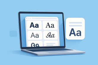
Use simple language
Now’s not the time to show off your A grade in English. Responders won’t be impressed with long words and complicated phrasing.
Avoid long words, unusual words, and words with multiple meanings. Keep sentences short, direct and snappy.
Your data will thank you for it.
Ask one thing at a time
Double-barrelled questions receive ambiguous answers. Ambiguous answers are impossible to analyze.
Make sure you’re avoiding this pitfall by scanning your form for the words ‘and/’or’. Spotted one? Splice that question in two.
Oh, and try to be as obsessively-precise as possible.
For example, instead of asking ‘do you eat junk food regularly’, ask ‘how many times a week do you eat junk food?’.
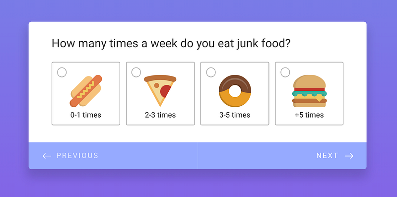
Specific answers mean crystal clear data.
How can we make our users’ lives easier?
Use predefined answers
Training for a marathon, studying for an exam, working towards a promotion. There are some areas in life where taking the hard route will reap the best results.
Form filling? Not one of them.
Easy-to-complete questions will motivate users to zip through the form; overly-complex ones will have them checking Facebook, yawning and feeding their cat.
So, how can we make answering questions as effortless as possible? By giving users a (metaphorical) head start. One way is by making questions single choice (radio) or multiple choice (checkbox):
Q: What services do you use from us?
a. Personal training
b. Spa and Pool
c. Fitness
Minimal thinking. No typing. It doesn’t get much more straightforward than that. And everyone’s a winner because predefined answers are much easier to evaluate.
If there’s a potential answer you can’t foresee, pop in an ‘Other’ option with a textbox that lets your audience enter a custom response. Boom.
It also helps to visualize answers. We played on this when building Jotform Cards with one of its most unique features: the emoji slider!
Instead of wading through the never-ending nuances of “Strongly Agree — Strongly Disagree” statements, users can select the emoji that best represents their feelings.
Another take on this is the evaluation slider. By dragging the blue dot or clicking on the grey one, respondents can get quick feedback and see their answers change instantly.
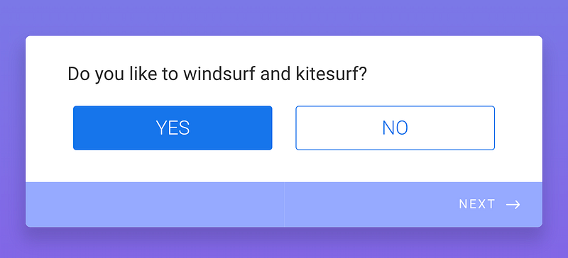
Arguably the most simple question type is the yes/no.
We noticed that users tended to create Yes-No questions using radio buttons. So our final mission was to make their lives easier by adding a Yes-No Toggle to the input table types.
Placeholders / Clarify Default Values.
Our lives are stressful. Our days are long. Our social lives are busy. So, on the scale of things people are happy to devote a high amount of concentration too, form-filling scores relatively low.
Let’s be realistic: a lot of the time, users will be answering questions in a hurry, only partially paying attention. So, think of your form as a treasure hunt. For a six-year-old. On their birthday.
You want them to get to the finish line, and their prize, quickly and without much effort. That means guiding them forward with clues, cues, and direction.
No one wants to be playing guessing games or feeling confused.
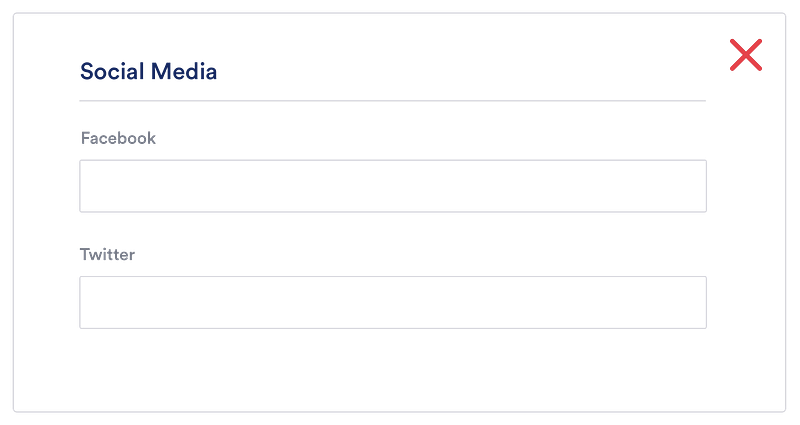
A great way to lead users along is by using placeholder text. This specifies a short hint that describes the expected value of an input field (e.g., a sample value or a brief description of the expected format).
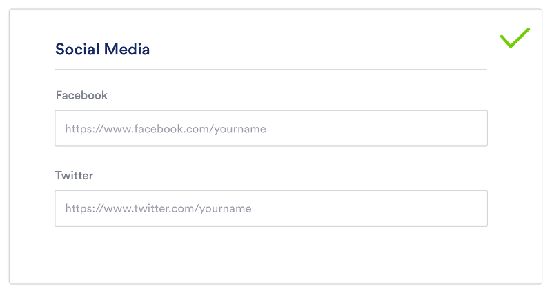
That means they can glance at the page and understand the question/answer without having to read it in full.
Related question groups (Splitting Sections) and Logical Question Order
Another way to gear users up for an easy, enjoyable form-filling ride is by grouping questions. We all make subconscious associations that we’ve developed over the years. Capitalize on this.
Grouping related questions have two primary goals:
Reducing cognitive load
The lower the cognitive load, the higher the success rate of your form. Cognitive load plummets when a form is logical; when longer content is chunked into bite-sized sections; when users can follow a well-known narrative (personal details — address — payment) without any thought.
At the end of the day, all we need to do is carry our users from the start to the finish of our form without losing them. How? By keeping them motivated.
This means they need to know what is expected of them, and how long the form is going to take. That’s why we have added a progress bar in Jotform Cards: it gives users satisfaction as they progress.
Visually dividing sections makes forms more easily-digestible. And starting with easier questions also helps make form filling smoother. When users can whizz through questions at the beginning, they will feel encouraged to continue. his triggers the endowed progress effect.
Logical Question Order
Asking questions in a logical order relies on one thing: putting yourself in your audience’s shoes. How would you expect the order to flow if you were them? Each question should nudge them on to the next.


Most of this boils down to common sense. For instance, asking for someone’s address before their name would be odd. Or asking for a payment method before selecting the product.
Conditional logic
Here’s another way to use logic to benefit your audience: by making it conditional.
Conditional logic is a powerful simplifier of complex processes. Basically, it lets you adjust a structure or process in line with the situation at hand. In this case, it would mean showing/hiding certain questions depending on the user’s answers.
Splitting your form into multiple routes is called “branching”. So, a form that seems super-simple may have multiple branches on its backend. You can visualize this by sketching a decision tree, with each route represented by a different branch.
Imagine you’re creating an online Feedback Form for your latest event. The event had 3 different ticket types: VIP, Business, and Economic. And you need that information because you want to improve and find a solution to make dissatisfied customers happy next time.
2018 Event Feedback Form
1. What was your ticket type?
– VIP
– Regular
– Economy
2. Please rate your overall experience
– Star Rating over 5
3. Please give your email address:
In this scenario, you don’t have to get in contact with the ones who enjoyed the event — just those who were dissatisfied. You could identify them with a star rating. ‘On the basis of the star rating, you can specify:
Show Email Address question IF star rating value is 3 or less.
Some of the other things that you can do with Conditional Logic:
- Show further questions when a user chooses a specific answer
- Construct a multi-page survey with page skipping depending on user answers
- Separate PDF downloads depending on the user’s choice
- Develop a quiz where a different “Thank You Message” is shown according to user answers
- Password protect a form. The form isn’t revealed until the user enters the password
- Not show the submit button until the user makes a particular choice
Sharing the Form
Test your Form before share
Your form is finished. But it’s not time to release it just yet.
We all have blind-spots. And when a form’s success hangs on the quality of the data, it’s good to be cautious. So, make sure you’ve provided robust answer choices and haven’t missed anything by pre-testing your survey.
Send it to family/friends and ask them to keep track of how long it takes for them to respond to the survey, and how they experience the flow of questions. This will help you evaluate the design of the form for next time around, too.
How to befriend your audience
Contacting Your Responders
Let’s assume that you are working on a company that has three departments: Human Resources, Marketing, and Sales.
The responses to your form on your company website must be provided by the relevant department. Using conditional logic, you can automatically send emails to different departments according to responders’ answers.
People like to feel heard. So, communicating the responder via the right person will increase consumer satisfaction and also benefit your company’s reputation. Plus, next time you send them a form, they will be more inclined to fill it out.
Final thoughts
Information architecture might not get people quite as excited as real architecture. But I think the nuances and logistics can be just as interesting. Building a form that keeps users engaged and garners clear, useful data is a skill to be honed and celebrated.
At Jotform, we’re always trying to make the process more fun, simple and down to earth. It’s a work in progress but we have a great time trying. I’d love to hear your comments below.


Send Comment:
1 Comment:
August 2, 2019
Thank you Ecem, amazing article, I noticed you mentioned regarding the right tools for email validation, wanna suggest it's my recommendation