The Configurable List widget is responsive by default on all display sizes. It is configured to automatically display the elements side by side on desktop browsers or vertically on mobile devices. Its Custom CSS setting is still available, and you can use it to change its layout. For example, you may want to display the input elements vertically on a desktop or adjust the number of columns.


Below is the list of customizations you can do with the Configurable List Widget. Before making any changes, check how to inject CSS code into your form.
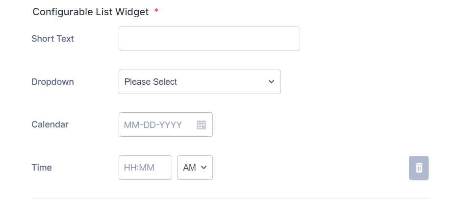
Vertical Layout
To change the layout of the elements from a column format to a vertical one, you would need to inject the following custom CSS codes.
@media (min-width: 600px) {

    #listContainer .configurable-list-field-label {
        min-width: calc(150px - 8px);
    }

    .configurable-list-field-row {
        -webkit-flex-direction: column;
        -ms-flex-direction: column;
        flex-direction: column;
        align-items: flex-start !important;
    }

    .configurable-list-field-wrapper {
        flex-direction: row !important;
    }

    #listContainer
    div.configurable-list-field-row-wrapper:not(:first-child)
    span.configurable-list-field-label {
        display: unset !important;
    }

}
The custom CSS codes have a desktop-only query to keep its responsive styling on mobile devices. Here’s the result of that:
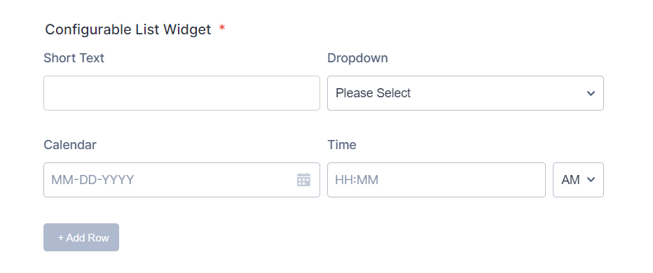
Column Layout
You can adjust the layout from fluid to fixed columns — for example, two columns by using the following custom CSS codes.
@media (min-width: 600px) {
.configurable-list-field-wrapper {
   min-width: calc(50% - 8px);
}
}
Adjust the 50% width to create a Three or Four column layout of the elements. Below is an example of a two-column layout:
Note
The above styles conform with the classic default theme. If you notice a problem after applying the custom CSS codes and are hesitant to switch to the default, kindly contact us for assistance.

Send Comment:
8 Comments:
February 25, 2025
How can I adjust specific elements? like create a new line for specific fields
May 26, 2024
I need to solve the problem that is happening
November 27, 2023
I've successfully applied the custom CSS to get the fields displaying vertically as with your example. Thank you for that.
Is there a way to accomplish the same thing when the form user is reviewing their information before submitting? Currently the field labels and values received are displayed as a single row of columns that are not easy to review. Thanks!
April 26, 2023
I added this css code. When I do a mobile preview, the text for each field box does not wrap correctly. A question will appear chopped up. For example, it will show:
How long have you ha
d this cat?
Instead of:
How long have you had this cat?
or
How long have you
had this cat?
What code can I use to make sure the words wrap correctly on mobile devices?
June 30, 2022
Hi. I have added the css code as instructed above. I am getting the small screen version both on the Desktop and on the Mobile preview. Please let me know what I am doing wrong here:
Link:
Code:
@media screen and (max-width:480px){
#list {
width: 100%;
border-collapse: collapse;
}
#list tbody:first-child > tr > td {
display: block;
padding: 6px 1px;
}
#list tbody:first-child > tr:first-child {
display: none;
}
#list tbody:first-child > tr + tr + tr {
border-top: 1px solid #ccc;
}
#list > tbody:first-child tr td.col1 {
padding-top: 20px;
}
.buttonsColumn {
text-align: right;
}
.mobileColumnName {
display: block;
padding-bottom: 4px;
box-sizing: border-box;
}
.mobileColumnName + input, .mobileColumnName + textarea, .mobileColumnName + select, .mobileColumnName + .radio-container, .mobileColumnName + .checkbox-container, .mobileColumnName + .dateContainer, .stepper-wrap input.stepper {
width: 100%;
display: block;
box-sizing: border-box;
box-shadow: none;
max-width: 320px;
}
input, select {
padding: 5px 5px !important;
}
.checkbox-container, .radio-container {
column-width: 240px;
max-width: 500px !important;
}
.checkbox, .radio {
display: flex;
flex-direction: row;
align-items: start;
}
.checkbox input, .radio input {
margin-top: 2px;
}
}
June 16, 2022
Yes its working..Thanks but the required feature of the fields are gone. I mean the feature is working ..but the required mark (* ) is gone ...But I need to show my customers the mark. Please guide me on this.
March 8, 2022
I marking fields as required while configuring. However by applying this CSS I'm loosing this required property. Could you please help me in marking these fields as Mandatory ??
January 11, 2022
Is it possible to perform calculations in the configurable widget? For example a product list: product, quantity, unit value and total value as quantity x unit value.