The Button Checkboxes widget lets you replace traditional checkboxes with sleek, button-style selections that enhance your form’s look and feel. With this widget, users can select multiple options using visually engaging buttons that display a colored arrow when clicked. It’s fully customizable; you can define button styles, colors, and the number of buttons per row to match your form’s design. Ideal for surveys, checklists, and interactive forms, the Button Checkboxes widget adds a modern touch while keeping functionality clear and user-friendly.
Here are a few ways to use it:
- Let users select multiple services in a visually engaging way.
- Highlight add-ons or optional features in order forms.
- Create modern-looking preference selectors for surveys.
- Allow customers to choose product variations (e.g., size, color, extras).
- Present membership benefits or packages with clickable options.
- Enable multi-select food or menu choices for catering forms.
- Simplify event activity selections (workshops, sessions, breakout rooms).
- Offer selectable donation amounts with preset options.
- Let users choose their interests or topics during registration.
- Replace traditional checkboxes with a more interactive, mobile-friendly layout.
Whether you’re creating a new form or updating an existing one, you can add and configure the Button Checkboxes widget in just a few easy steps. Here’s how to do it:
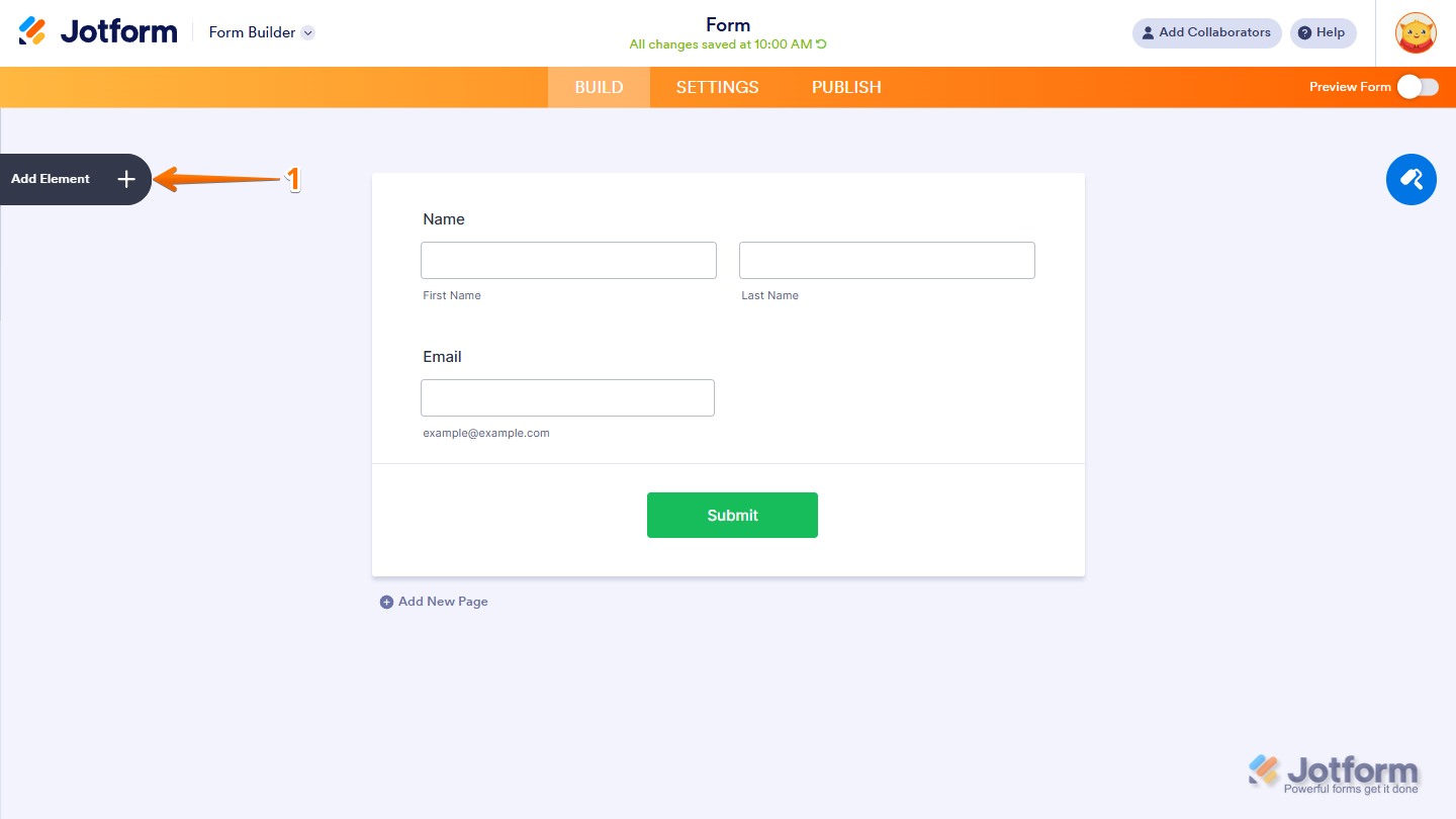
- In Form Builder, click on Add Element on the left side of the page.
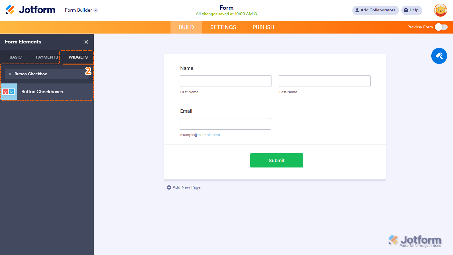
- Now, in the Form Elements menu, under the Widgets tab, search for Button Checkboxes and click on it. Or just drag and drop it to where you want it on your form.
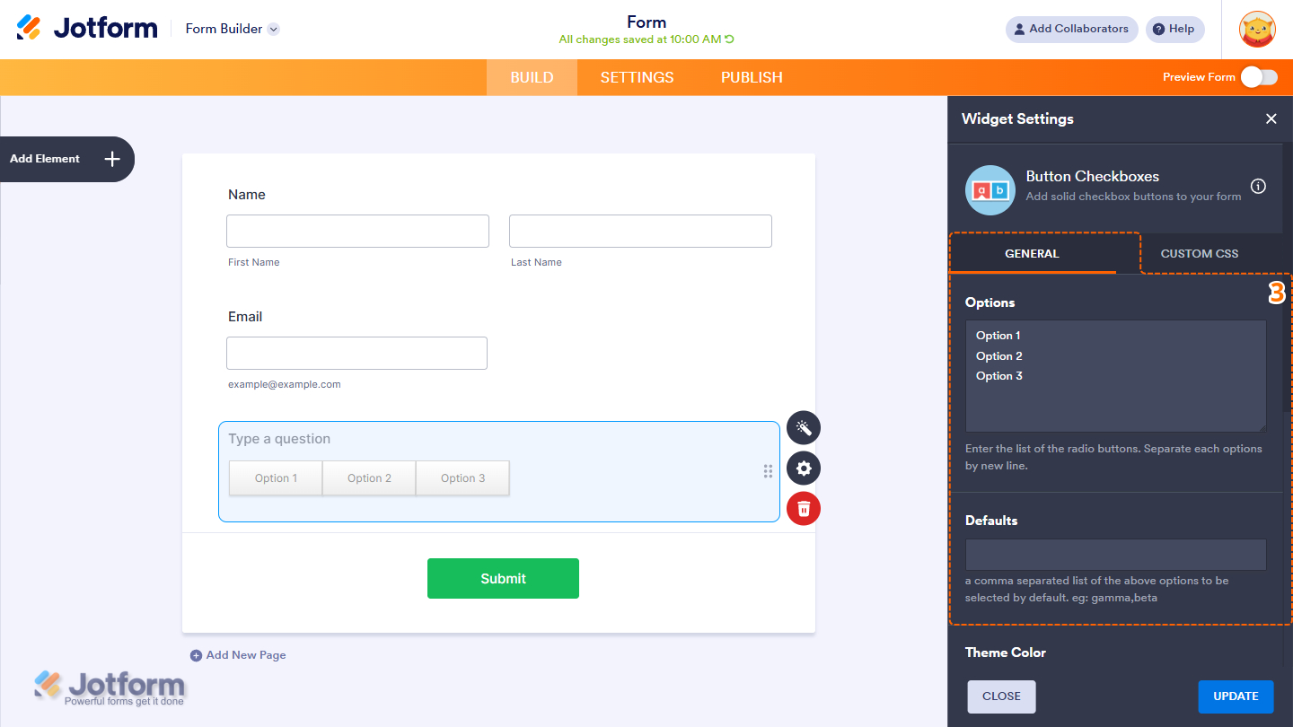
- Next, in the Button Checkboxes Settings menu that opens on the right side of the page, under the General tab, you can configure the following:
- Options — Enter the new options on separate lines.
- Defaults — Enter a comma-separated list of options from the Options box to be selected by default.
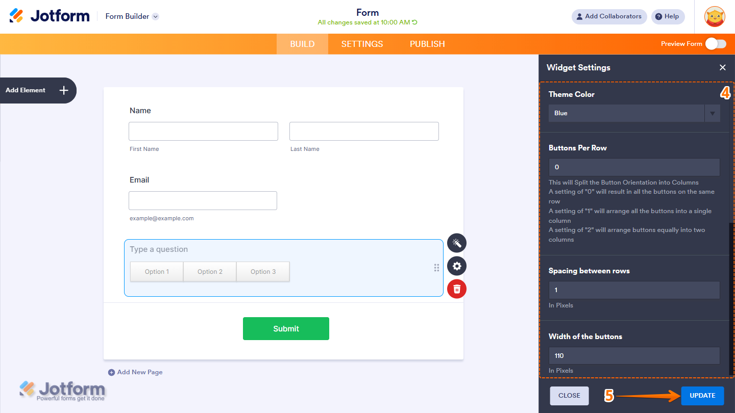
- Then, scroll down and continue to set up these settings:
- Theme Color — Select a theme that changes the colors of the text and small upward arrow icon when selecting an option.
- Buttons Per Row — Set the number of buttons per row. This is useful if you have multiple options and you wish to organize them into multiple rows.
- Spacing Between Rows — If you defined the Buttons Per Row, you can adjust the spacing of the rows. The value is in pixels.
- Width of the Buttons — Adjust the width of each button by entering a value in this box. The value is in pixels.
- Once you’re done, click on Update.
That’s it. You’ve successfully added and set up the Button Checkboxes widget on your form. You can explore how it looks with this demo form.
Notes
- For advanced styling of the widget, you can add your own custom CSS code under the Custom CSS tab in the Widget Settings. Our guide on How to Inject CSS Codes to Widgets walks you through everything.
- You can also configure the widget properties, like alignment, labels, size, visibility, and more, to control how it looks and behaves on your form. Check out our guide on How to Access and Configure the Question Properties of a Widget to learn more.

Send Comment: