The Calculation Chart widget makes it easy to turn your form’s calculated results into clear, visual charts. Whether you want to show a quote breakdown, display assessment scores, compare expenses, or visualize other calculated values, the chart updates automatically as respondents enter their answers.
Here are a few ways to use it:
- Visualize Quote Breakdowns — Show clients a clear chart of how different items contribute to a quote before they approve it.
- Display Assessment Scores — Give students or respondents an instant visual breakdown of their scores across different assessment sections.
- Track Budgets and Expenses — Turn calculated budget or expense totals into charts that make financial information easier to review at a glance.
- Compare Service Packages — Display calculated values for different service packages side by side, helping users easily compare their options.
Note
The Calculation Chart widget displays values from your form’s calculations, so make sure the calculation fields you want to visualize are properly configured before setting up the chart.
Adding and Setting Up the Calculation Chart Widget
With just a few simple steps, you can add the Calculation Chart widget to your form and turn calculated values into easy-to-understand visuals. Here’s how to set it up:
- In Form Builder, click on Add Element on the left side of the page.
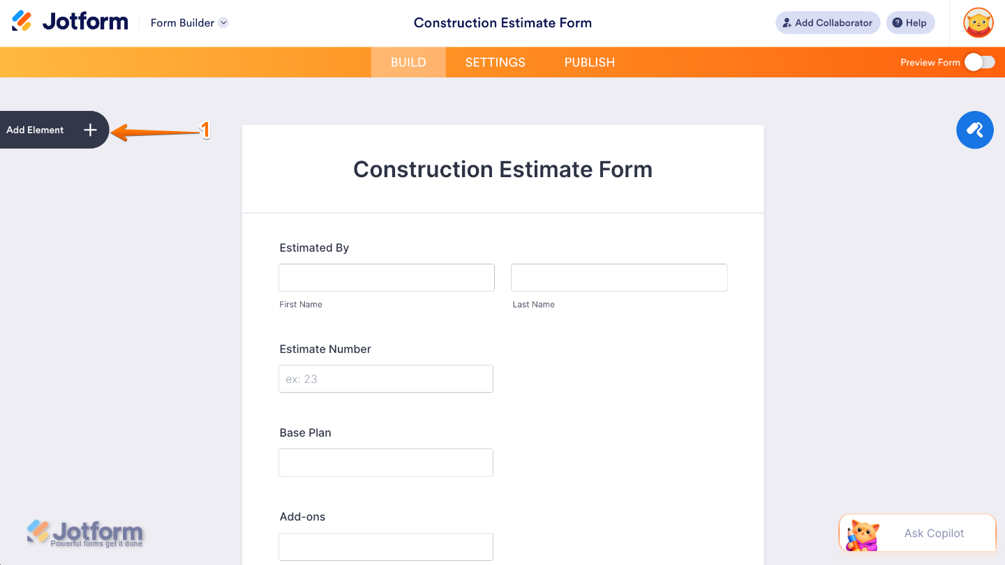
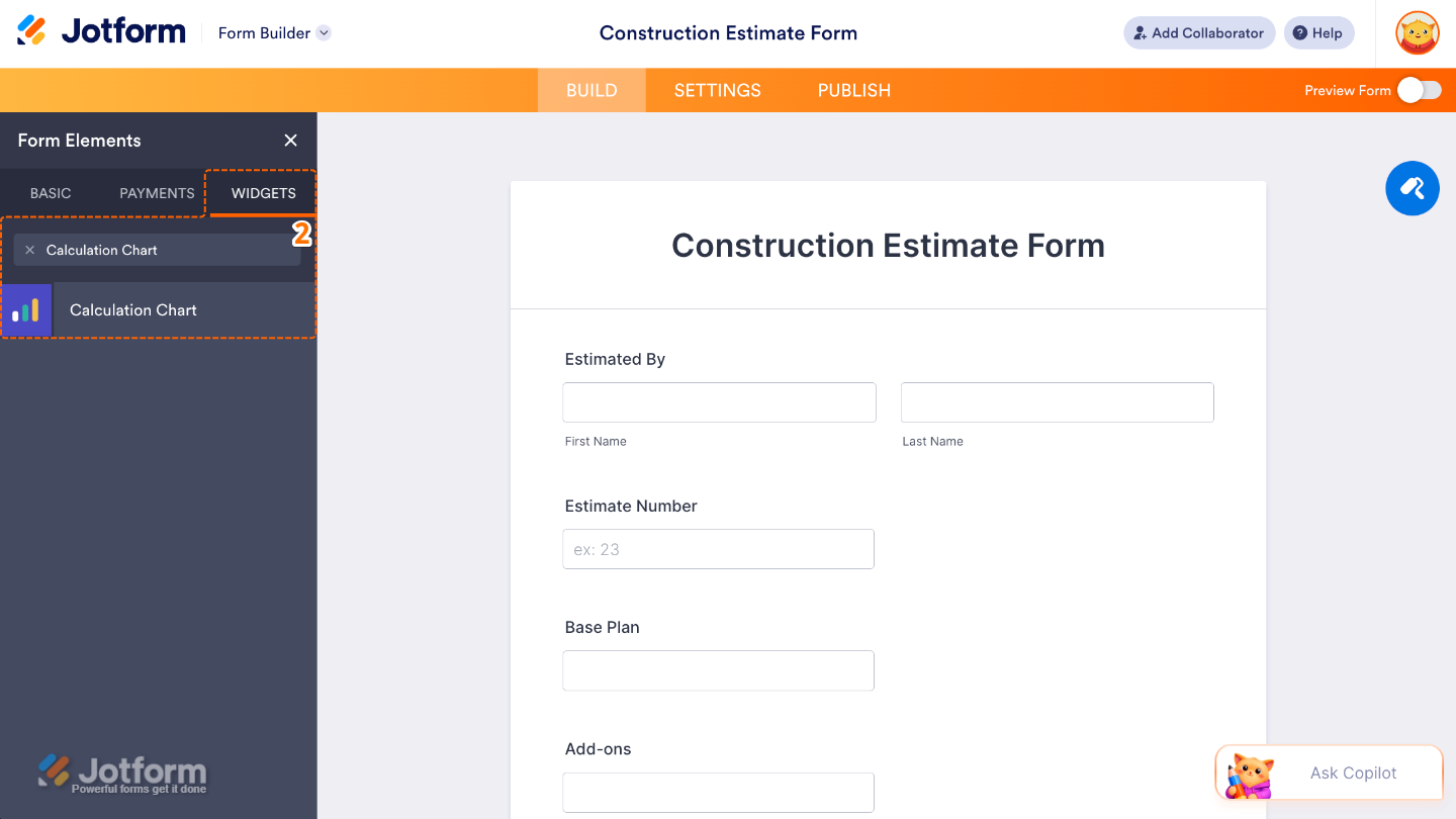
- Now, in the Form Elements menu, under the Widgets tab, search for Calculation Chart and then click on it. Or, just drag and drop it to where you want it to be on your form.
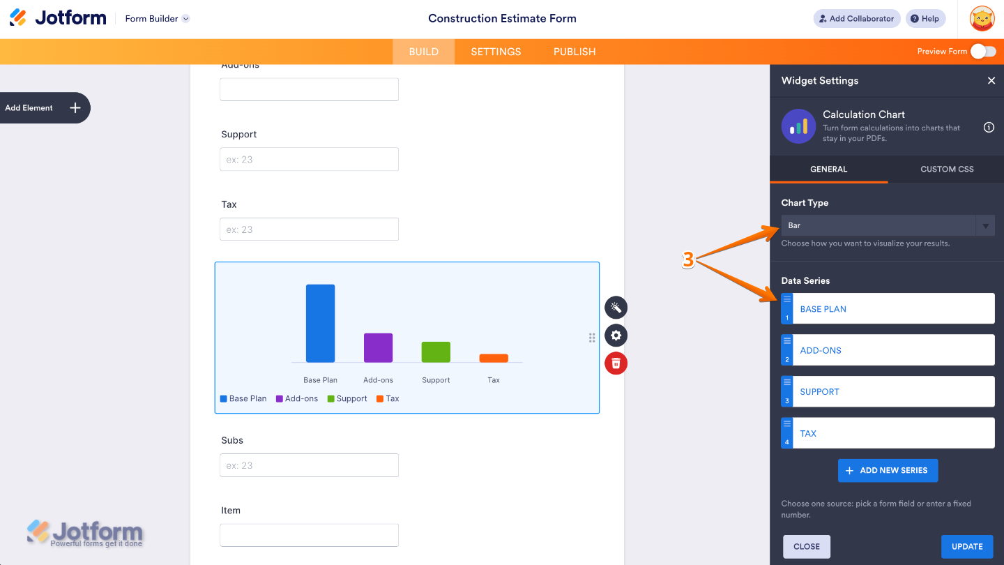
- Next, in the Widget Settings window that opens on the right side of the page, set up these options:
- Chart Type — Select the type of chart you want to use to display your calculated results, such as a bar, line, pie, or doughnut chart.
- Data Series — Choose the calculation results that you want to include in the chart. Each data series represents a value from your form that will be visualized in the chart.
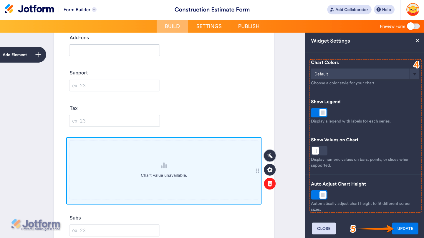
- Then, scroll down and continue to set up these options:
- Chart Colors — Customize the colors used to display the data in your chart.
- Show Legend — Show or hide the chart legend, which helps respondents identify what each data series represents.
- Show Value on Chart — Display the actual calculated values directly on the chart, making the results easier to read at a glance.
- Auto Adjust Chart Height — Automatically adjust the chart’s height based on the amount of data being displayed, helping keep the chart readable as the data changes.
- Once you’re done, click on Update.
That’s it! You’ve successfully added and set up the Calculation Chart widget on your form. Your calculated values can now be displayed as an easy-to-understand chart, helping users quickly visualize their results as they complete the form. Ready to see it in action? Check out this demo form.
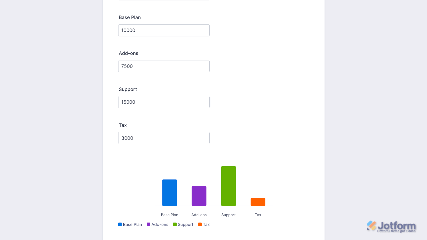
You can also configure the widget properties, like alignment, labels, size, visibility, and more, to control how it looks and behaves on your form. To learn how it’s done, see our guide on How to Access and Configure the Question Properties of a Widget.
Note
For advanced styling of the Calculation Chart widget, you can add your own custom CSS code under the Custom CSS tab in the Widget Settings. Our guide on How to Inject CSS Codes to Widgets walks you through everything.
Pro Tips
- Keep your chart simple by including only the most relevant calculation results. Too many data series can make the chart harder to understand.
- Turn on Show Value on Chart when respondents need to see the exact calculated values instead of relying only on the visual representation.

Send Comment: