Jotform’s Fancy Range Slider widget makes it easy to add a stylish slider that users can drag to choose a range of values. Whether you’re collecting price preferences, age brackets, or satisfaction ratings, this widget adds both function and flair to your form. You can also add currency symbols, set default starting values, choose from single and double slider types, and include multiple themes or add CSS codes to match your form’s look and feel.
Adding and Setting Up the Fancy Range Slider Widget
Add the Fancy Range Slider widget to your form to give users a smooth, interactive way to pick a value range—no coding needed. Here’s the quick way to do it:
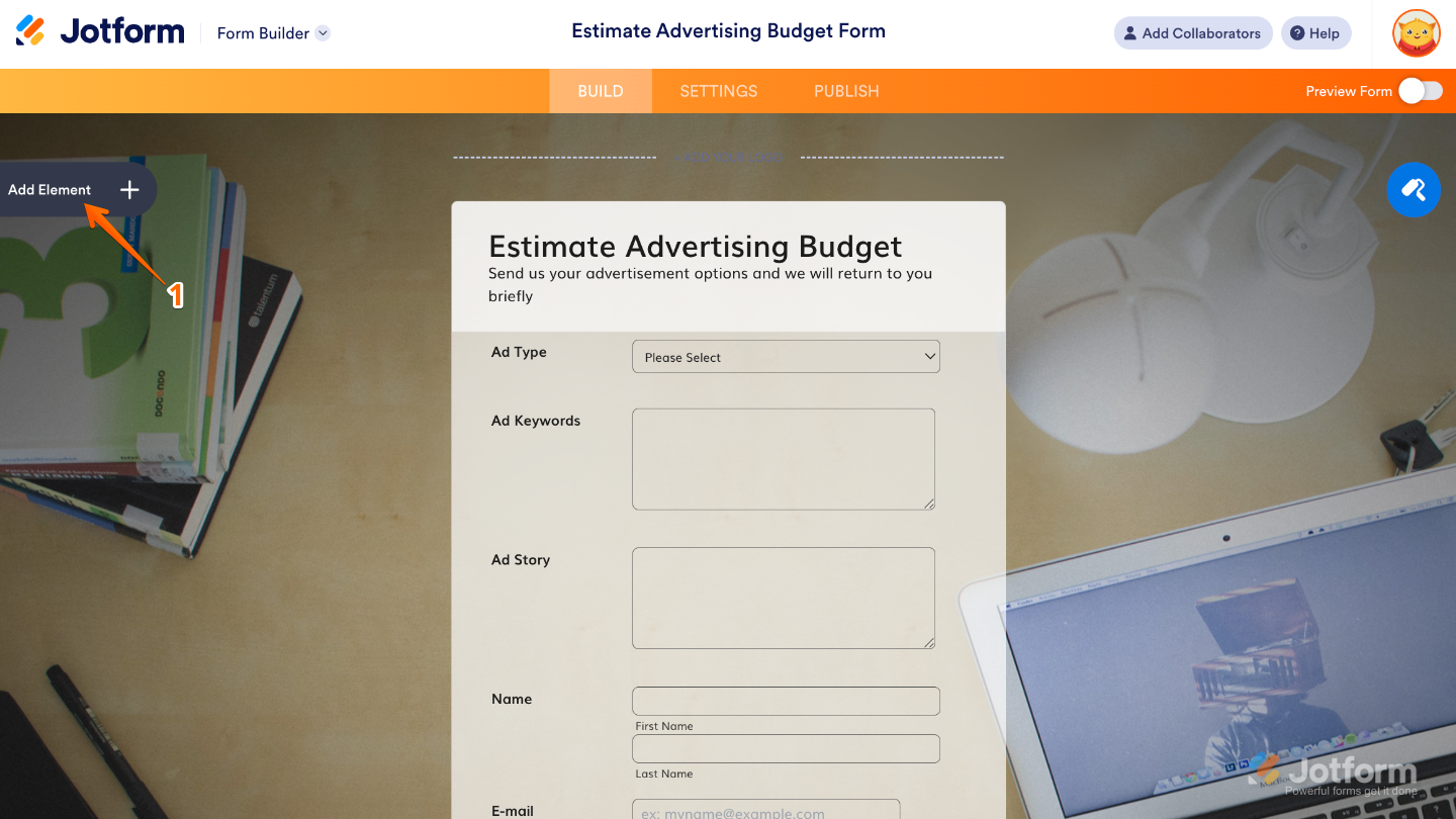
- In Form Builder, click on Add Element on the left side of the page.
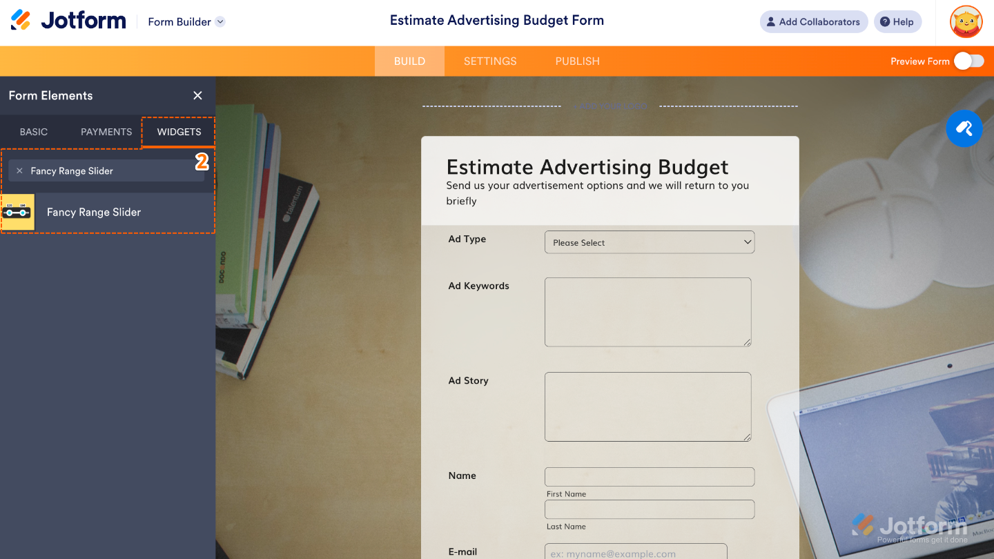
- Now, in the Form Elements menu, under the Widgets tab, search for Fancy Range Slider and then click on it. Or, just drag and drop it to where you want it to be on your form.
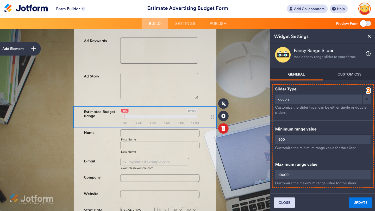
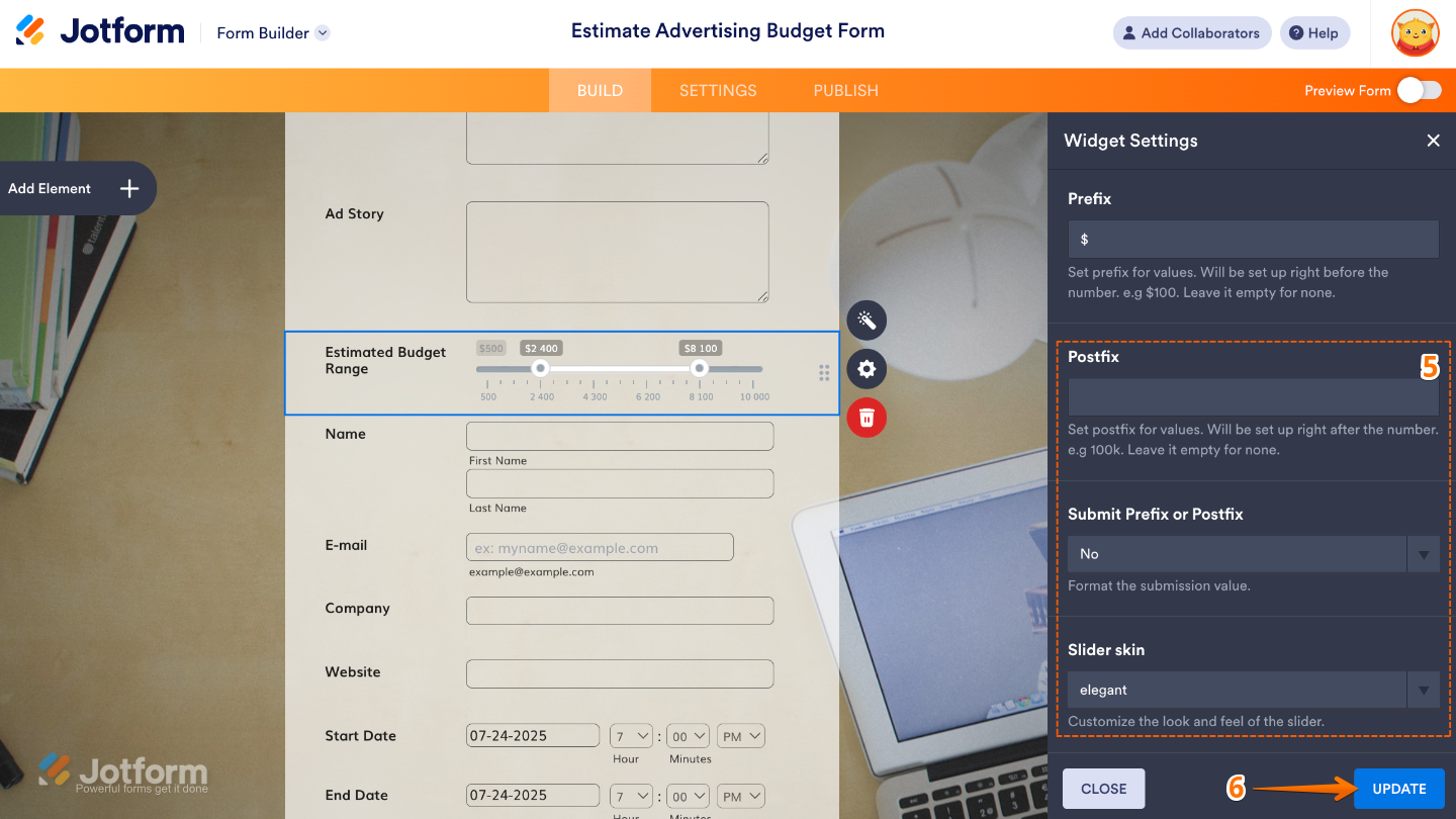
- Next, in the Widget Settings window that opens on the right side of the page, set up the following options:
- Slider Type — This defines the style of the slider, either:
- Single Slider: lets users select just one value.
- Range Slider: allows users to pick a range by setting both a minimum and maximum point.
- Minimum Range Value — Type in the lowest number you’d like users to be able to select on the slider.
- Maximum Range Value — Enter the highest number you’d like users to be able to select here.
- Slider Type — This defines the style of the slider, either:
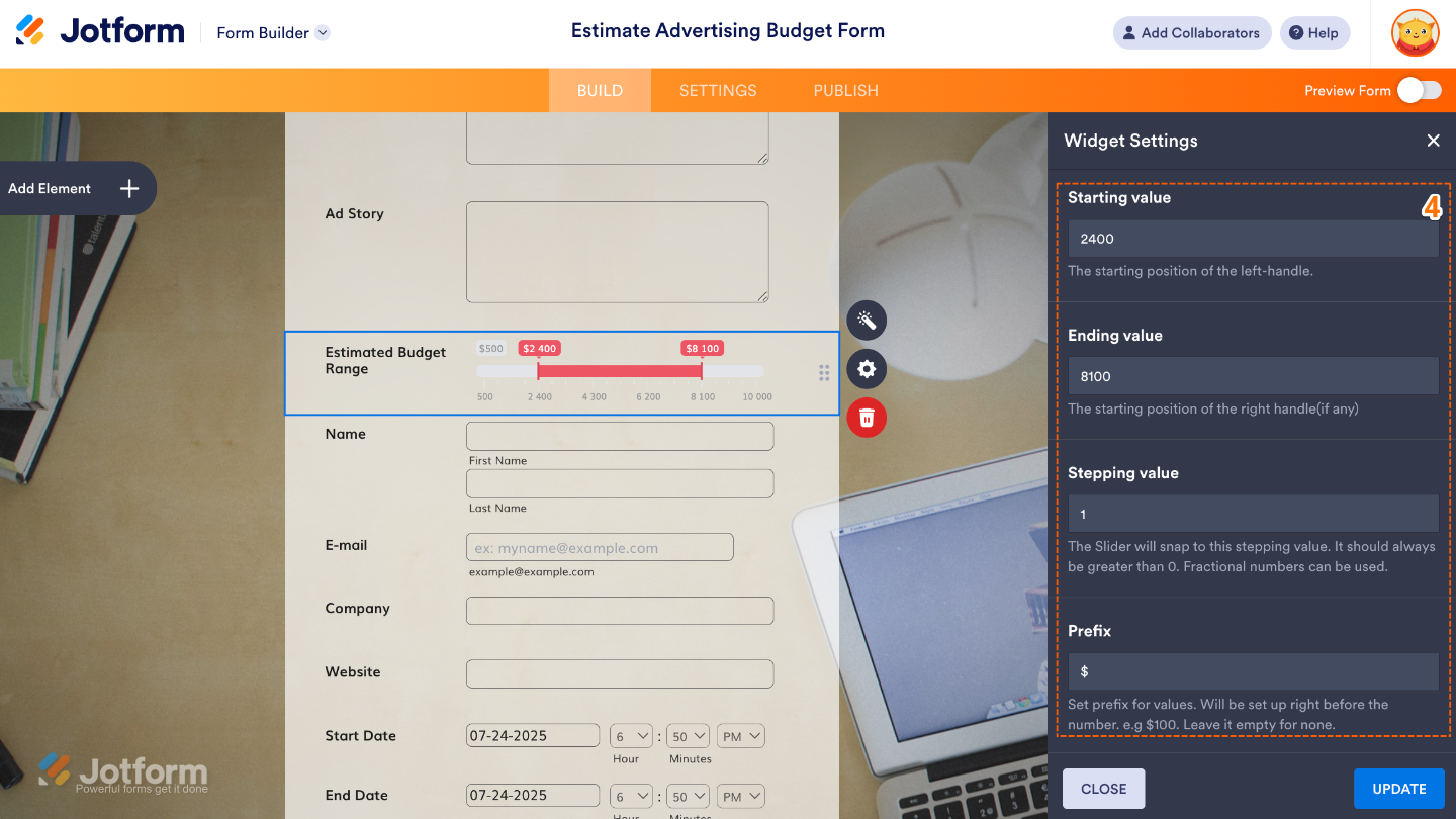
- Then, scroll down and continue to set up these options:
- Starting Value — This sets where the slider starts when your form loads; it’s the first value your users will see by default.
- Ending Value — If you’re using a range slider, this sets the starting point for the right slider handle, marking the end of the preselected range your users will see first.
- Stepping Value — Set this up to define the increment between slider values.
- Prefix — Adds a symbol or text (like ₱, $, or “Level”) before the numbers on the slider, helping users understand what the values represent.
- After that, scroll down to the bottom and set up these last three options:
- Postfix — Set this up to add a little text after the value on your slider.
- Submit Prefix or Postfix — Select an option to decide whether the prefix, postfix, or both you’ve added are sent along with the form data.
- Slider Skin — Pick the visual style of the slider, think of it as choosing a theme or color scheme to match the look and feel of your form.
- Once you’re done, click on Update.
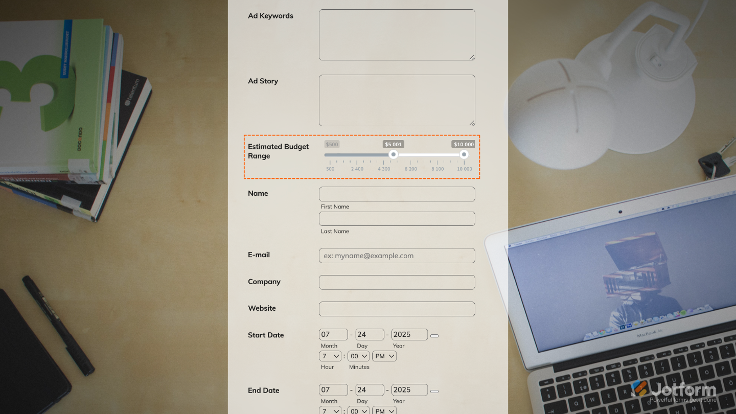
That’s it. You’ve successfully added and set up the Fancy Range Slider widget to your form. Now, you have a field in your form that supports both single and dual-handle sliders, perfect for selecting one value or a range. Wondering how it looks in action? Check out this Demo Form.
To further customize your Fancy Range Slider field appearance, just click on the Gear icon to open its properties.
Note
For advanced styling, you can add your own custom CSS under the Custom CSS tab in the widget settings and style the Fancy Range Slider field. Our guide on How to Inject CSS Codes to Widgets walks you through everything.
Pro Tips
- Use prefixes like $ or ₱ for pricing fields, and postfixes like “days” or “kg” to make values instantly clear to users.
- To keep your form layout clean, pair the slider with a Form Calculation widget to display selected values separately.
- For a smoother user experience, set default starting and ending values that make sense for most users.

Send Comment: