Jotform’s Image Checkboxes widget lets you present multiple image options for users to select with a single click, making form responses more visual and engaging. Ideal for product selections, design preferences, or any form where visuals speak louder than words, this widget enhances user interaction by replacing plain checkboxes with eye-catching images. It’s a great way to simplify decision-making, especially when visual choices are more effective than text alone.
Here are a few ways to use it:
- Allow users to choose menu items with visual previews.
- Present service packages with representative images to make selection easier.
- Enable event attendees to pick workshops or sessions visually.
- Let users choose colors, styles, or designs through images.
- Create interactive donation forms with image-based cause options.
- Allow students to select courses or activities using visual icons.
- Display subscription plans with graphical representations.
- Let users visually select room types, seating options, or layouts.
- Replace text-only checkboxes with a more engaging, image-driven selection experience.
Whether you’re creating a new form or updating an existing one, adding and setting up the Image Checkboxes widget only takes a second—here’s what to do:
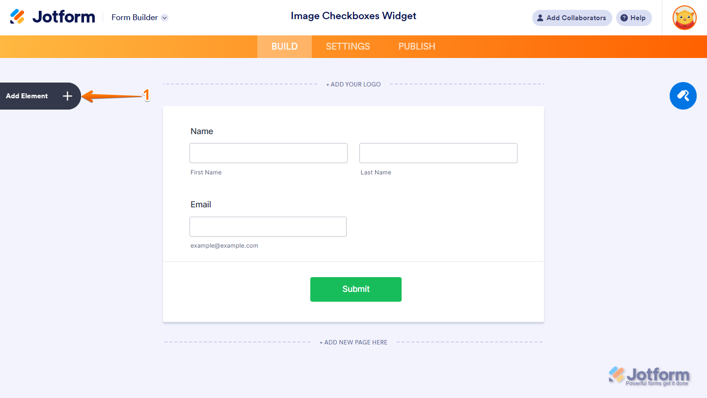
- In Form Builder, click on Add Element on the left side of the page.
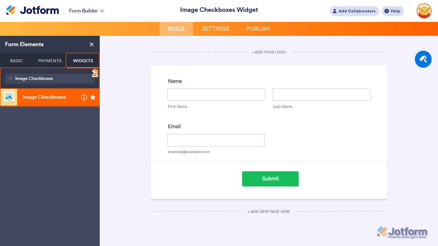
- Now, in the Form Elements menu, under the Widgets tab, search for Image Checkboxes and click on it. Or drag and drop it to where you want it on your form.
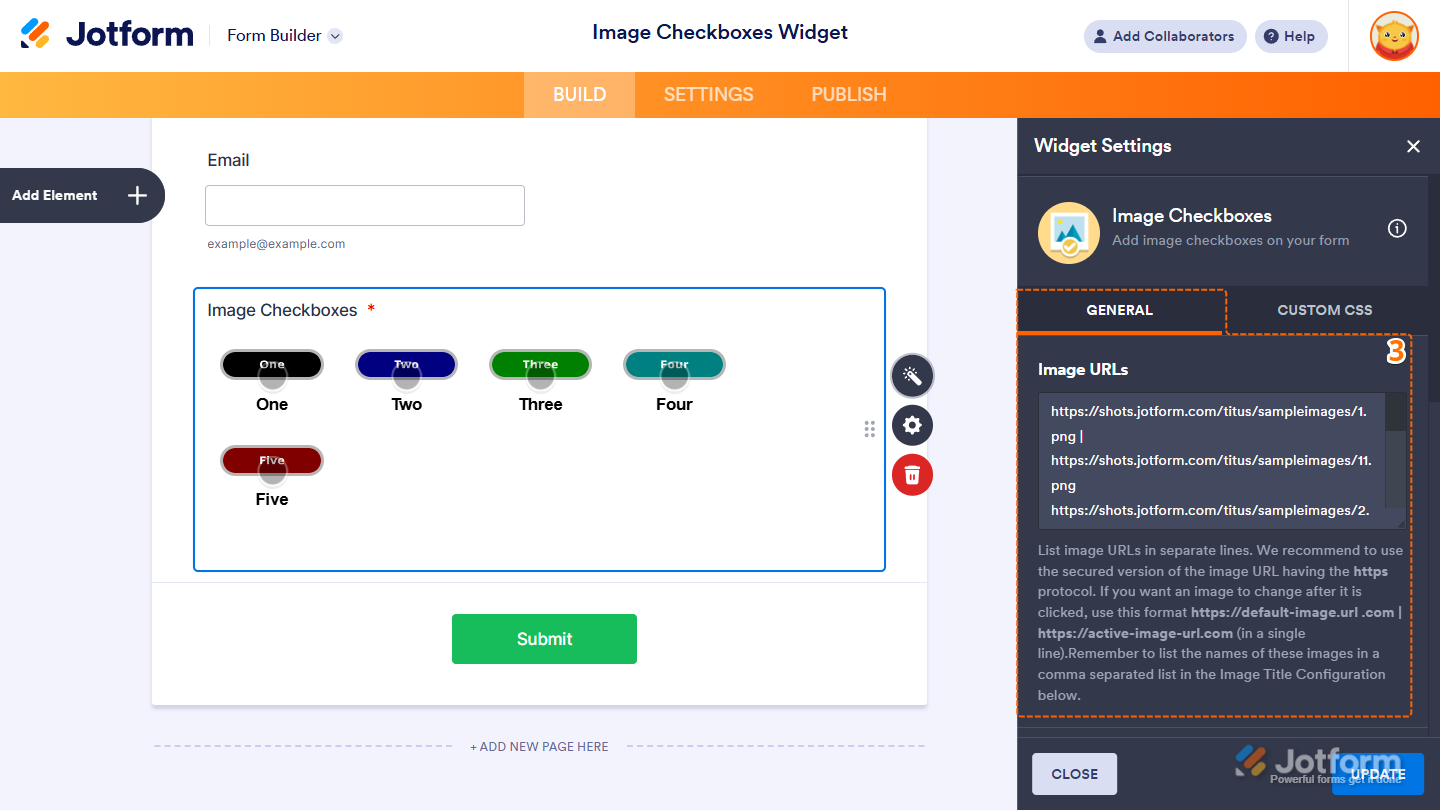
- Next, in the Image Checkbox Widget Settings menu that opens on the right side of the page, under the General tab, set up first the following option:
- Image URLs — Enter each image URL on a separate line. For security, use HTTPS for image links. To display a different image after the image is clicked, add the alternate image URL on the same line, separated by a vertical slash ( | ). For example,
https://default-image.url .com | https://active-image-url.com.
- Image URLs — Enter each image URL on a separate line. For security, use HTTPS for image links. To display a different image after the image is clicked, add the alternate image URL on the same line, separated by a vertical slash ( | ). For example,
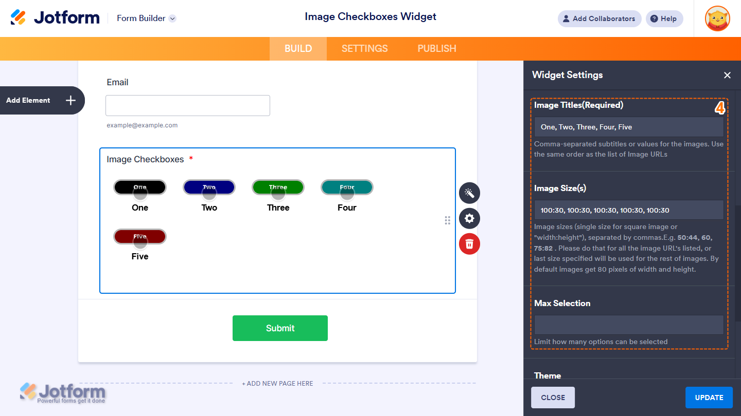
- Then, scroll down to the middle and continue to set up these settings:
- Image Titles — Enter subtitles or labels for the images, separated by commas. Make sure the order matches the list of Image URLs. This is required.
- Image Size(s) — Define the size for each image using a single value for square images or a “width:height” format (e.g., 50:44, 60, 75:82), separated by commas. Provide a size for each image URL in the same order; if not, the last specified size will apply to the remaining images. By default, images are set to 80×80 pixels.
- Max Selection — Set the maximum number of options a user can select.
- Now, scroll to the bottom and complete these fields:
- Theme — Select the widget’s visual style. Available themes are Black and Orange, allowing you to match the widget’s appearance to your form’s design.
- Shuffle Image Options — Randomize the image display order each time the form loads.
- When your settings are ready, click on Update.

That’s it! You’ve now successfully added and set up the Image Checkboxes widget to your form. Curious how it works on a live form? Check out this demo.
Notes
- The entries submitted in the widget will appear as text in Jotform Tables, Jotform Inbox, and PDF Reports, and are separated by a new line in Excel and CSV Reports.
- Changes to the items in the widget only apply to new submissions moving forward.
- To change the appearance of the widget, you can inject custom CSS into the Custom CSS tab in the Widget Settings. You can check out our guide on How to Inject CSS Codes to Widgets to learn more.
- You can also configure widget properties, such as alignment, labels, size, visibility, and more, to control how it looks and behaves on your form. Check out our guide on How to Access and Configure the Question Properties of a Widget to learn more.

Send Comment: