With Jotform’s Image Picker widget, you can let users select images directly on your form—perfect for photo contests, product selections, or personalized booking options. Just upload images by URL or from your device, adjust the display size, set selection limits, and publish your form. This widget makes your form more interactive and visually engaging, whether you’re collecting preferences, showcasing visuals, or helping users decide quickly. It’s a simple way to add a visual layer to your form without any complex setup.
Configuring the Widget
Whether you’re creating a new form or updating an existing one, you can add and set up the Image Picker widget in a few easy steps. Here’s how to do it:
- In Form Builder, click on Add Element on the left side of the page.
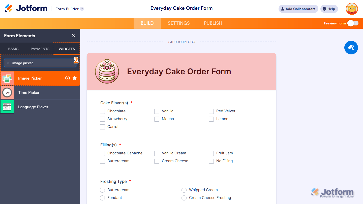
- Next, in the Form Elements menu, under the Widgets tab, search for Image Picker and click on it. Or, just drag and then drop it to where you want it to be on your form.
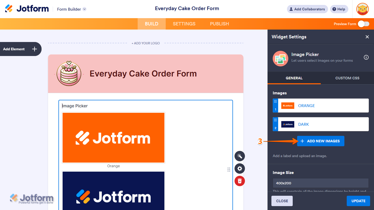
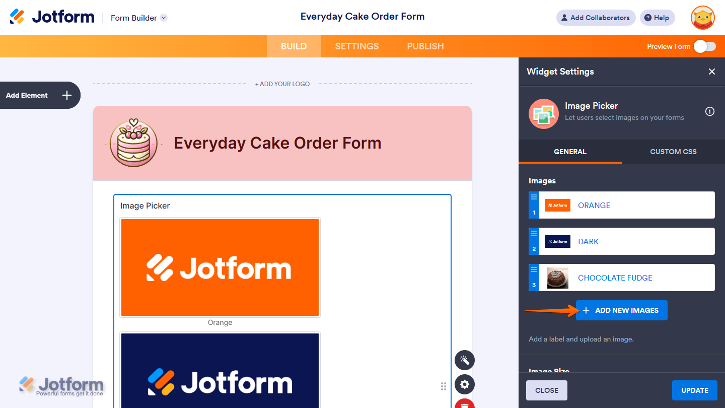
- Then, in the Widget Settings window that opens on the right side of the page, click on the Add New Images button to add an Image Option.
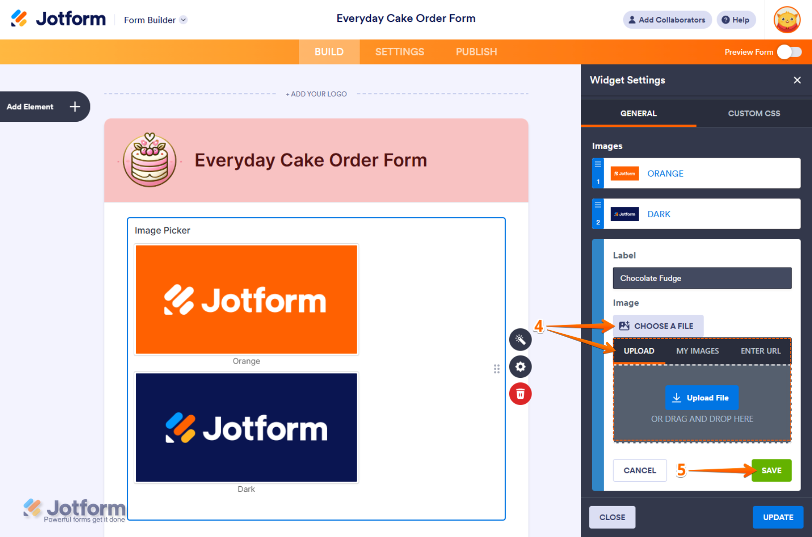
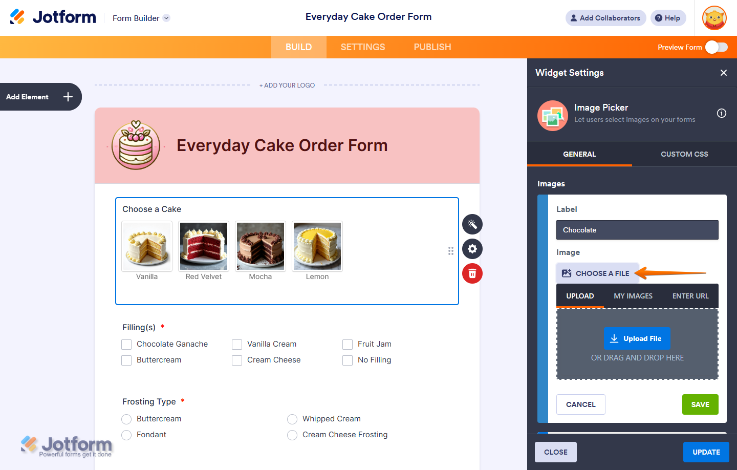
- Now, in the Image Option menu, enter a label for your image and click on Choose A File to upload your image through one of the following tabs:
- Upload — Select an image directly from your device.
- My Images — Choose from images you’ve previously used and saved in your account.
- Enter URL — Paste a direct link to the image you want to use.
- Then, click on Save.
To add the next one, click on the Add New Images button again.
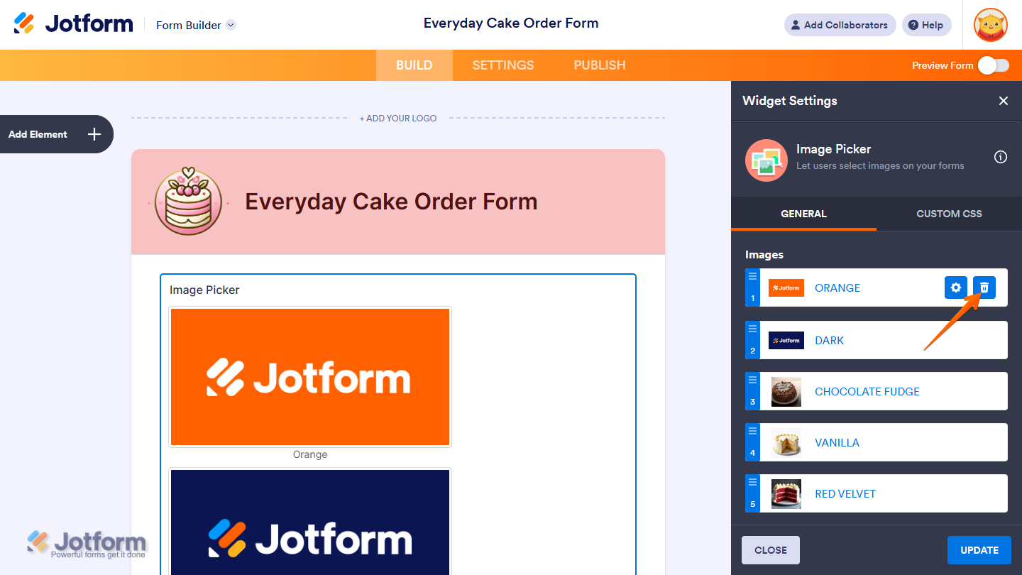
To remove an Image Option, hover your mouse over it and click on the Trash icon that comes up on the right side of it.
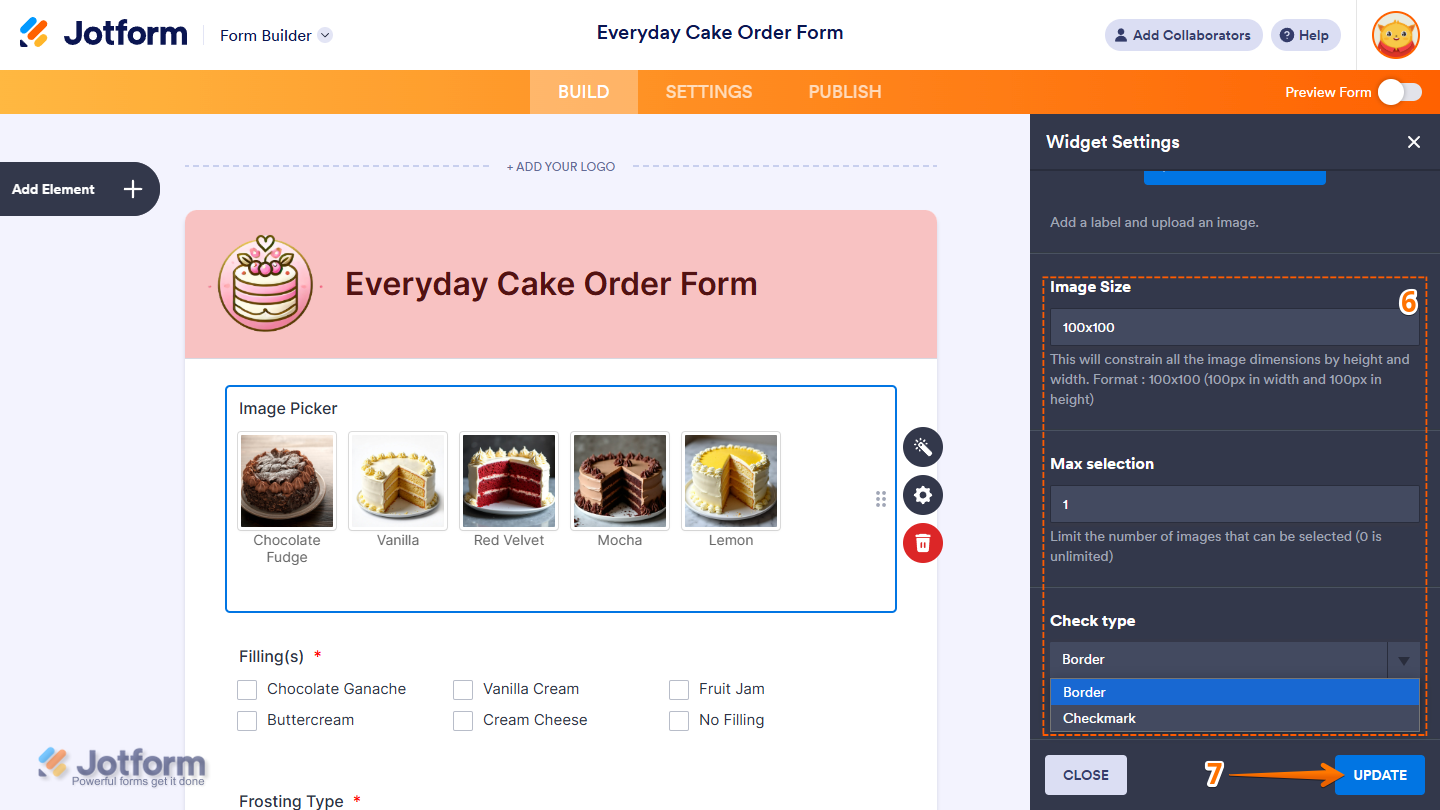
- Next, configure the following settings as needed:
- Image Size — Enter dimensions in the format width x height (e.g., 100×100) to constrain the image size within the specified pixels.
- Max Selection — Set the maximum number of images a user can select. Enter 0 to allow unlimited selections.
- Check Type — Choose how selected images will appear on the form:
- Border — Shows a border around the selected image.
- Checkmark — Displays a checkmark in the top-left corner of the selected image.
- Once everything’s set, click on Update.
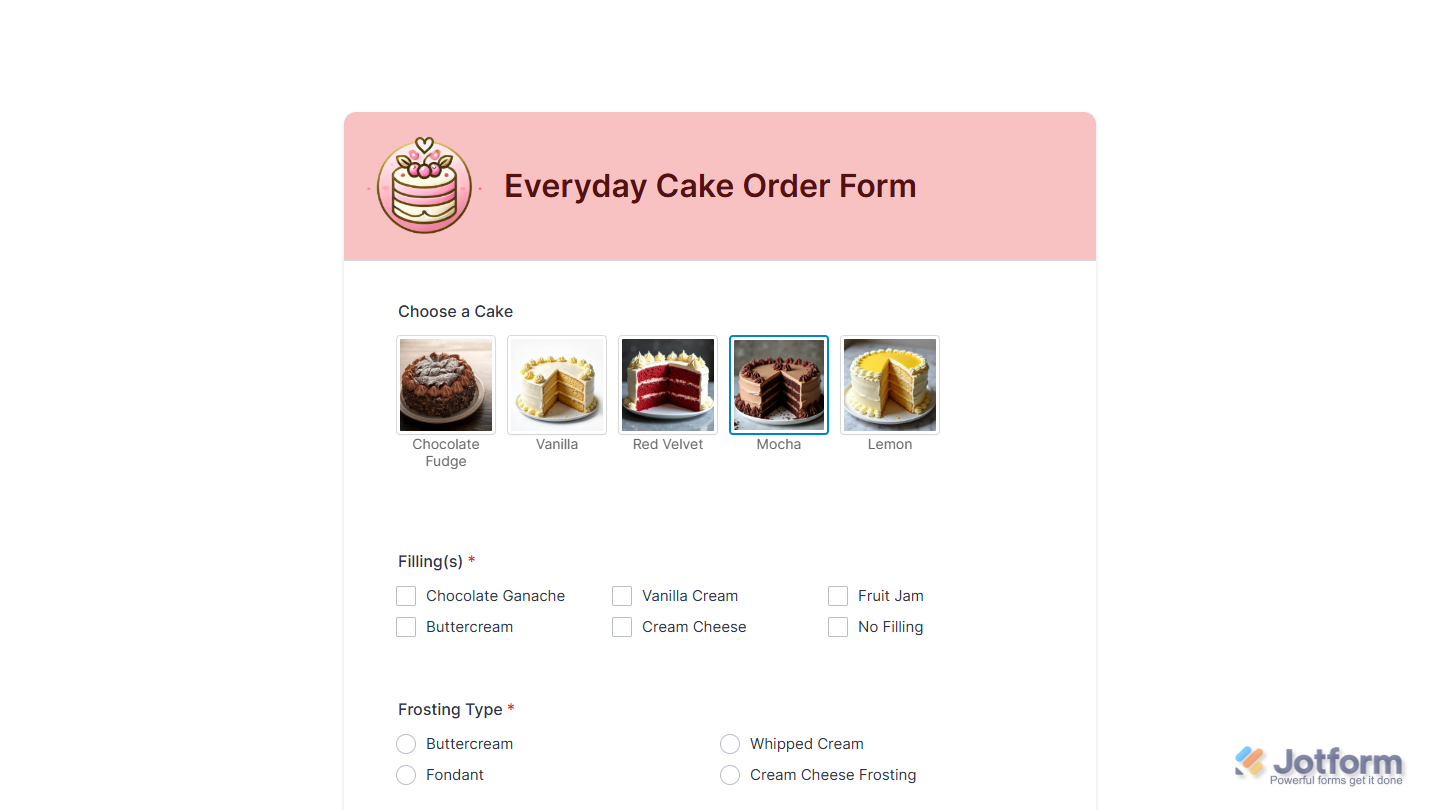
That’s it! Now, users can view and select images directly on your form, making the experience more interactive, visual, and personalized. You can explore how the Image Picker widget looks with this demo form.
Updating the Widget’s Image Options
If the images in your Image Picker widget are outdated, no longer relevant, or not in the right order, you can update them in a few easy steps. Here’s how to do it:
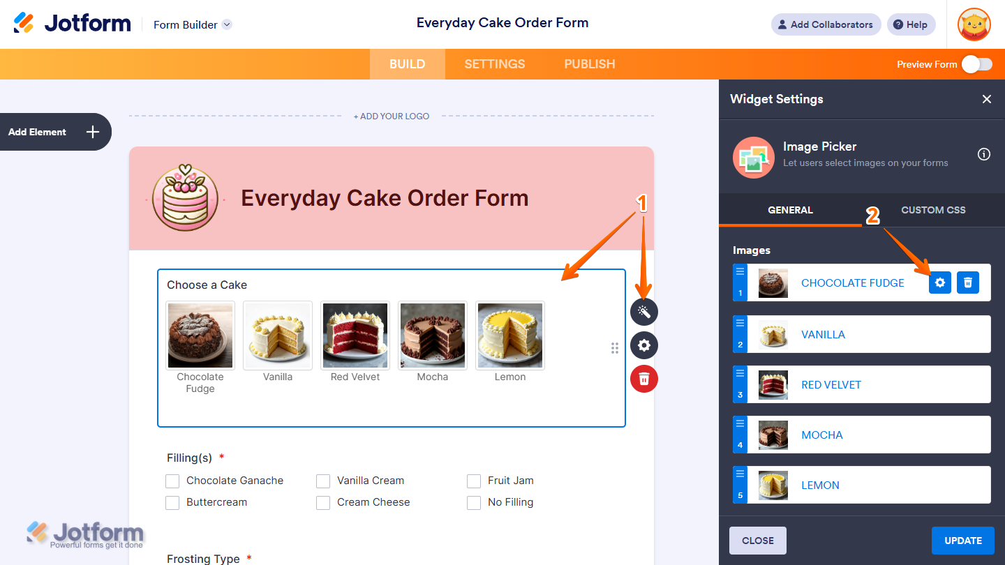
- In Form Builder, click on your Image Picker and then click on the Wand icon on the right side of it.
- Then, in the Widget Settings menu, hover your mouse over an Image Option and click on the Gear icon that comes up on its right.
- Now, in the Image Option menu, enter a new label for your image or click on the Remove Image next to the Image Thumbnail to change it.
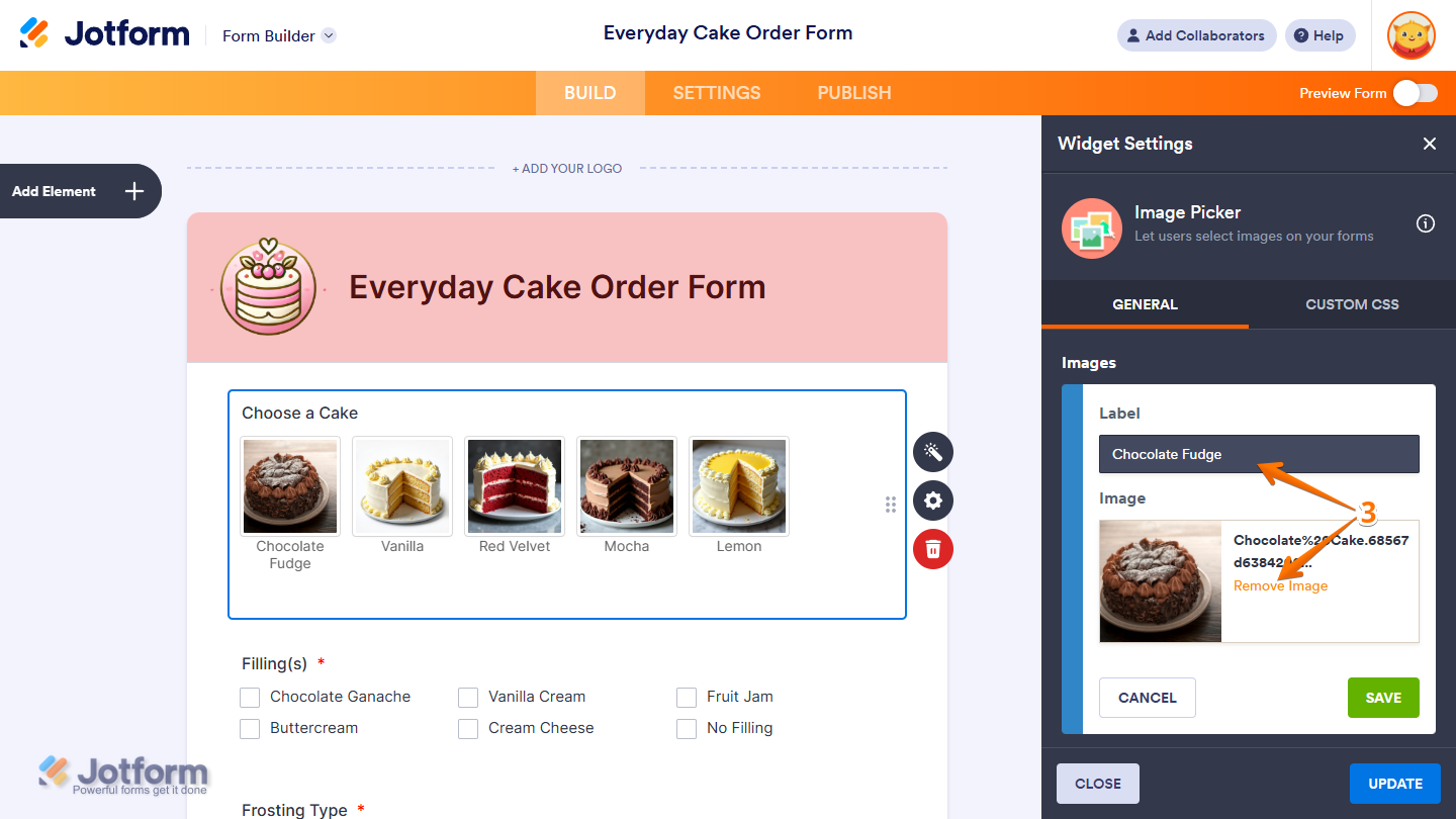
If you remove the image, click on Choose a File to upload a new one.
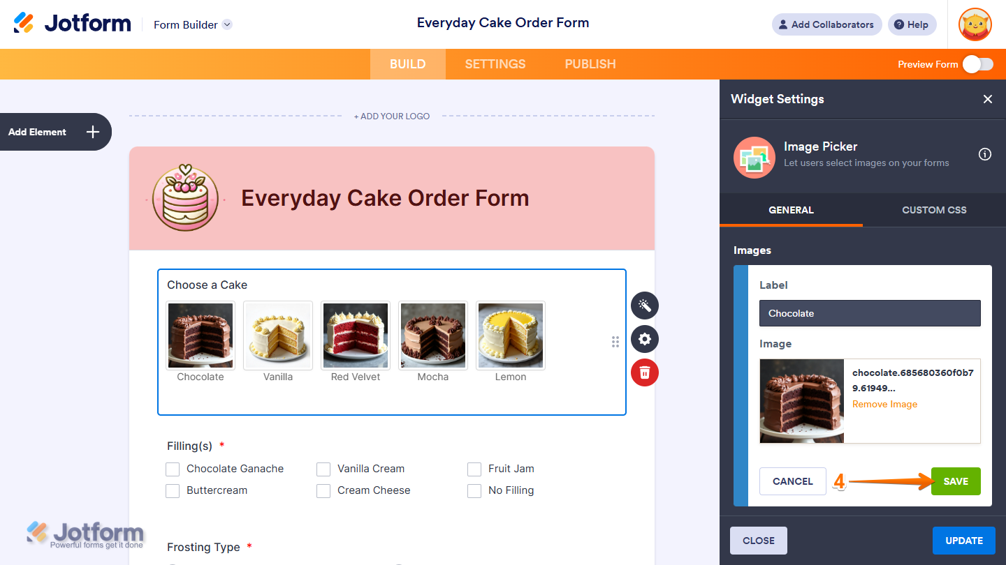
- Next, click on Save.
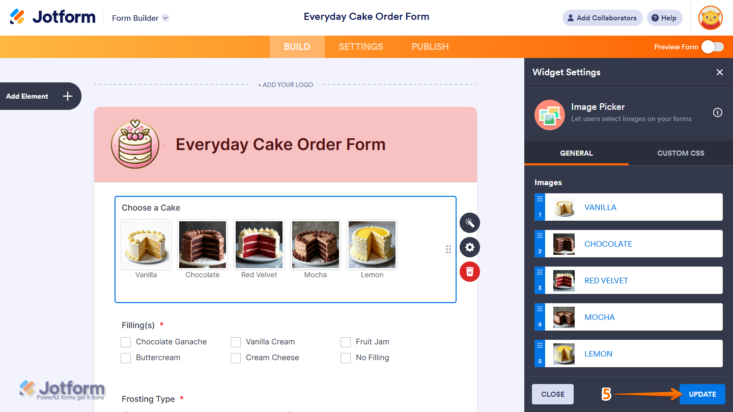
You can also rearrange the image options in the Image Picker field to keep your form organized and present them in the order you prefer. Just open the Widget Settings menu, click on and hold the blue area on the left side of any image option to grab it, and then drag it to a new position.
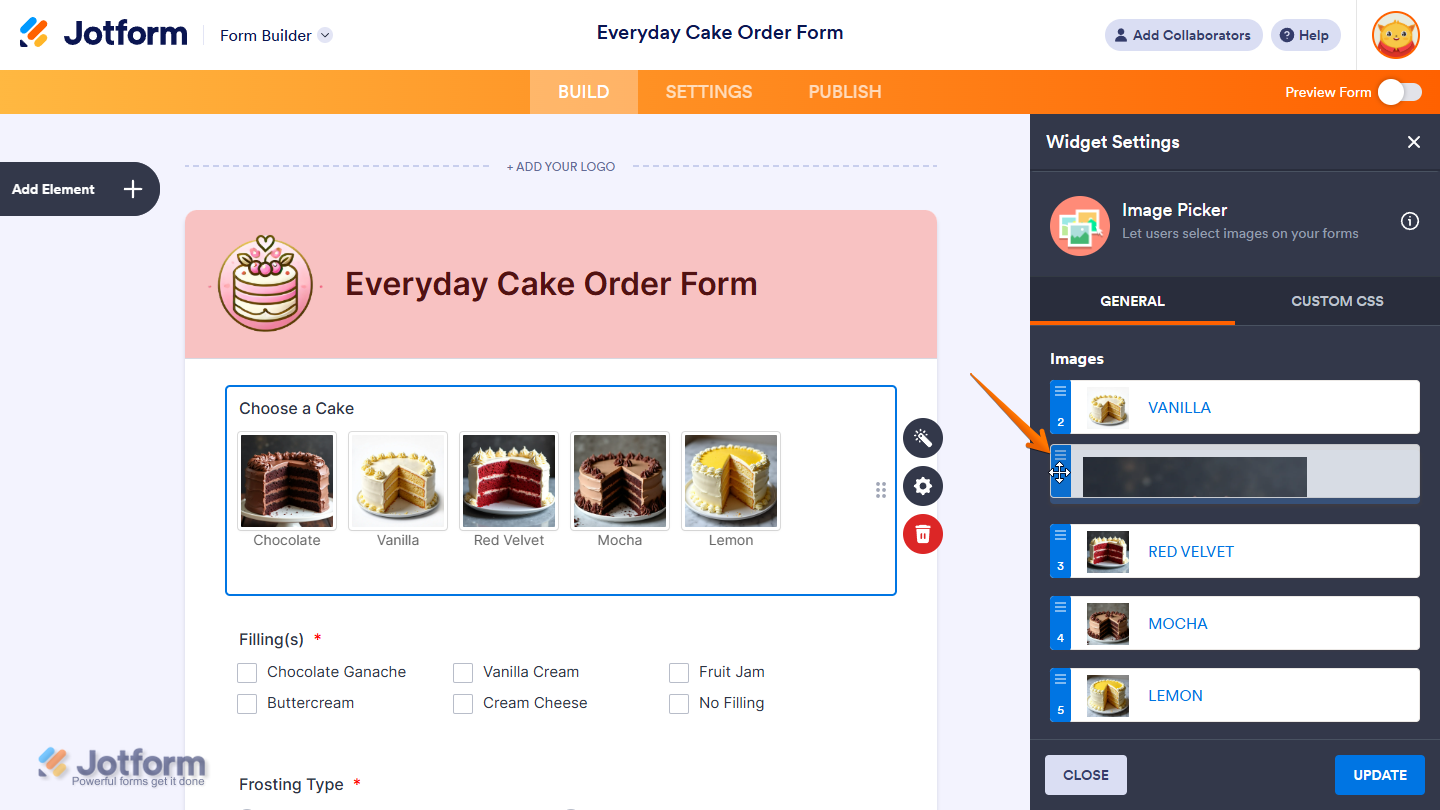
- Once you’re done, click on Update to save the changes.
That’s it! You’ve successfully updated the images in your Image Picker widget, keeping them relevant, organized, and displayed exactly the way you want.
Notes
- To style the fields and labels in the Image Picker widget, you can inject custom CSS into the Custom CSS tab in the Widget Settings. Need help getting started? Our guide on How to Inject CSS Codes to Widgets shows you how to do it.
- You can also configure the widget properties, like alignment, labels, size, visibility, and more, to control how it looks and behaves on your form. Check out our guide on How to Access and Configure the Question Properties of a Widget to learn more.

Send Comment: