Jotform’s Image Radio Buttons widget offers a visually engaging way to present multiple-choice options using images instead of traditional text-based radio buttons. Ideal for forms that require visual context—such as selecting a product, design, color scheme, or travel destination—this widget enhances user interaction and decision-making by allowing users to simply click on an image to make their selection. It’s especially useful in e-commerce, event planning, design surveys, or any scenario where visual appeal plays a key role in user choices.
Here are a few ways to use it:
- Let users select one product option using visual previews.
- Allow customers to choose a single plan or package with images.
- Enable selection of one menu item or meal option visually.
- Let users pick a preferred design, style, or layout.
- Replace traditional radio buttons with a more engaging, image-based selection.
Whether you’re creating a new form or updating an existing one, adding and setting up the Image Radio Buttons widget only takes a second—here’s what to do:
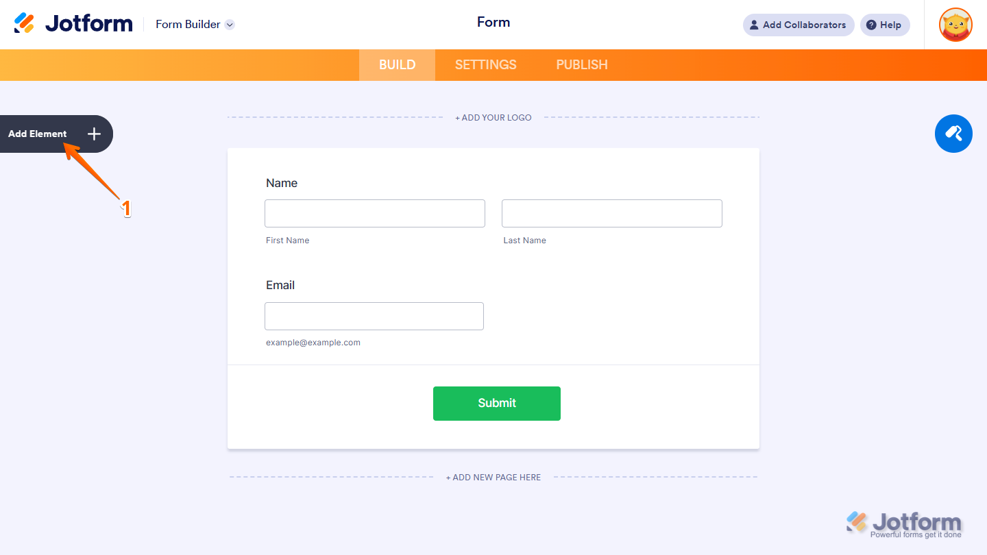
- In Form Builder, click on Add Element on the left side of the page.
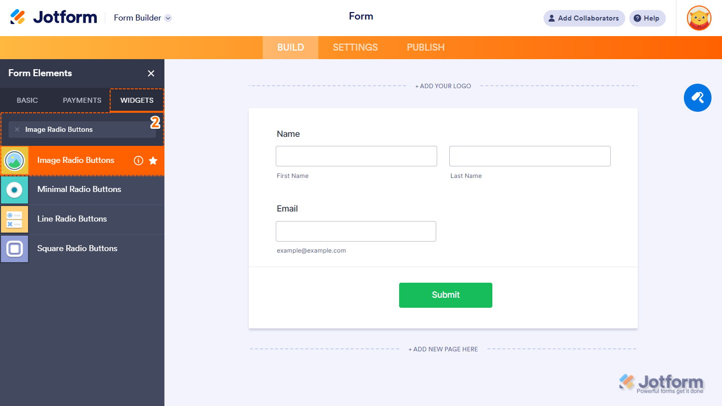
- Now, in the Form Elements menu, under the Widgets tab, search for Image Radio Buttons and click on it. Or just drag and drop it to where you want it on your form.
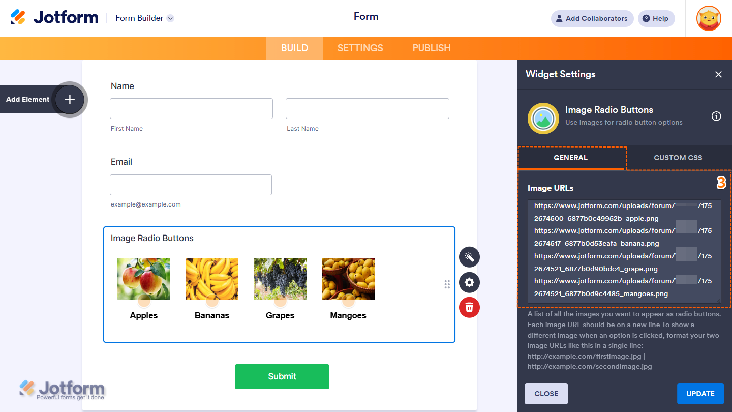
- Next, in the Image Radio Buttons Widget Settings menu that opens on the right side of the page, under the General tab, set up the following option first:
- Image URLs — Enter each image URL on a separate line. For security, use HTTPS links for images. To display a different image after the image is clicked, add the alternate image URL on the same line, separated by a vertical slash ( | ). For example, https://default-image.url .com | https://active-image-url.com.
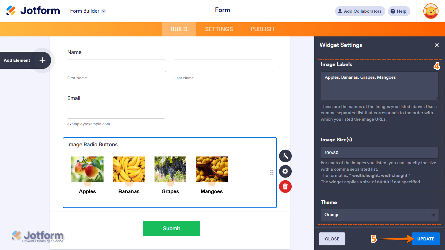
- Then, scroll down to the bottom and continue to set up these settings:
- Image Labels — These are the labels or names assigned to each image listed above. Enter them as a comma-separated list, matching the order of your image URLs.
- Image Size(s) — Define the size for each image using a comma-separated list in the format width:height (e.g., 100:100, 120:80). If left blank, the widget defaults to 80:80 for all images.
- Theme — Select a visual style for the radio icons displayed on each image. Available options include the Blank and Orange themes.
- Once you’re done, click on Update.
That’s it! You’ve now successfully added and set up the Image Radio Buttons widget to your form. Here’s a Demo Form so you can see it in use.
Notes
- The entries submitted in the widget will appear as an Image with its label in Jotform Tables, Jotform Inbox, and PDF Reports, and display as text separated by a new line in Excel and CSV Reports.
- Changes to the items in the widget only apply to new submissions moving forward.
- For advanced styling of the widget, you can add your own custom CSS code under the Custom CSS tab in the Widget Settings. Our guide on How to Inject CSS Codes to Widgets walks you through everything.
- You can also configure widget properties, such as alignment, labels, size, visibility, and more, to control how it looks and behaves on your form. Check out our guide on How to Access and Configure the Question Properties of a Widget to learn more.

Send Comment: