


-
wiltshsAsked on January 15, 2017 at 2:40 PM
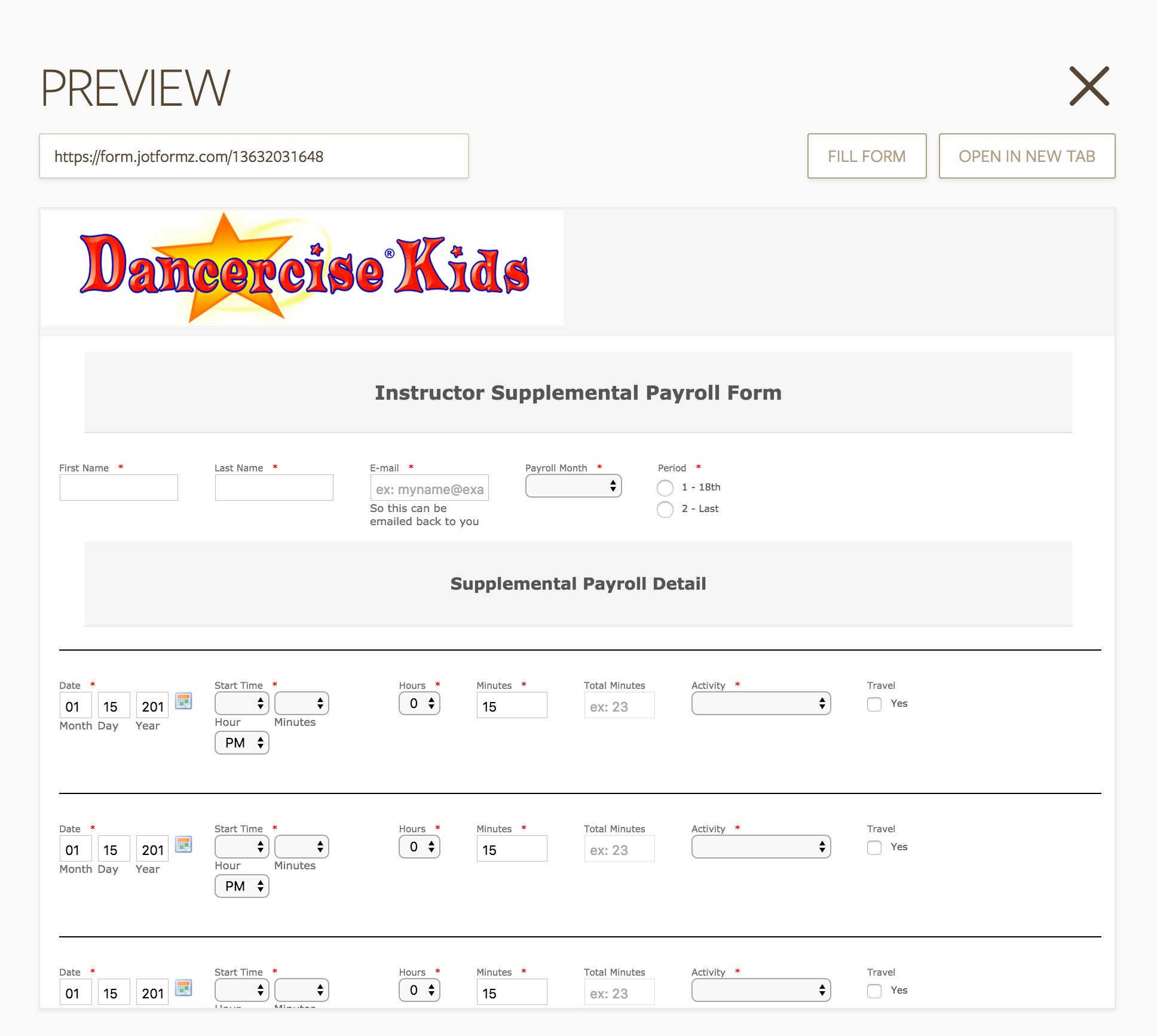
The form appears to be wide enough so I don't understand why the AM/PM piece wraps around underneath. In fact, in general, using your "quick" fields is a bit of a pain because they do seem to have limited control over basic things like width (I stopped using Full Name for the same reason). Please advise, thanks!
 Page URL: https://form.jotformz.com/13632031648
 -
Kevin Support Team LeadReplied on January 15, 2017 at 9:38 PM
Apologies for the inconveniences.
You could inject this CSS code to your form:
[data-type="control_time"]{
width: 19%;
}
[data-type="control_time"] .form-sub-label-container {
width: 30%;
}
That will display the fields properly when previewing the form:

Guide: How-to-Inject-Custom-CSS-Codes
Sample Form: https://form.jotform.com/70148610526956
Hope this helps.
-
wiltshsReplied on January 16, 2017 at 2:50 PM
This was helpful thanks. But I am confused as to how to extend this approach to other fields. For example, in my form right now, I have a date field that is very, very small and therefore does not show the date. Can you elaborate on the mechanism above so it's applicable to other fields? You can see from my form, that I am trying to get the first row right so that when I repeat it, it's correct and I don't have to edit the same row 30 times (the multi-row widgets just don't offer enough configurability for conditions and calculations as far as I can see, although that would be ideal)
From your example, it appears as if you are applying that css styling to any field of type "control time", is that right? So if I were to add any time field into the form, it would adopt that styling. And then you have somewhat arbitrarily picked 19% of the width of the form for the time data, and 30% of the width of the form for the overall control. That keeps it mobile responsive, is that the idea?
Then how do I remove the excessive padding around fields so I can get more next to each other on a given row?
Or if I am really making this hard and there actually is a way to use a multi-row widget while still doing totals and conditions inside each row, and across all entries, then please let me know.
Thanks!
-
Kevin Support Team LeadReplied on January 16, 2017 at 4:15 PM
As I can understand, you need to get some fields inline, then have multiple lines of these fields, setting up the fields properly with CSS codes will take some time since some fields have different elements and you need to handle all of them to display them properly.
The easiest way to get your fields displayed as you want and avoid injecting a lot of CSS code will be to add the Configurable List widget, it allow you to have multiple field types displayed inline and add more rows if needed.
Here's the link to the widget: https://widgets.jotform.com/widget/configurable_list
Here's also a guide about setting up this widget that will be helpful: How-to-Set-Up-the-Configurable-List-Widget
Hope this helps.
- Templates
- Integrations
- INTEGRATIONS
- See 100+ integrations
- FEATURED INTEGRATIONS
 PayPal
- Slack
- Google Sheets
- Mailchimp
- Zoom
- Dropbox
- Google Calendar
- Hubspot
- Salesforce
- See more Integrations
- Products
- PRODUCTS
- Form Builder
- Jotform Enterprise
- Jotform Apps
- Store Builder
- Jotform Tables
- Jotform Inbox
- Jotform Mobile App
- Jotform Approvals
- Report Builder
- Smart PDF Forms
- PDF Editor
- Jotform Sign
- Jotform for Salesforce Discover Now
- Support
