
-
HumbirdMediaAsked on April 18, 2024 at 1:56 PM
Hi Team,
I've embedded a jotform on my Wix site. However, my client is dissatisfied with how it is presented on mobile. See his comment below:
"This page isn't optimized for mobile. The text is way too large and misaligned, and certain elements are too large. Mobile visitors are more likely than desktop visitors, we have to get this right."
I've attached a screenshot of how it looks on mobile. Is there anything we can do to make the form look better on mobile?

-
HumbirdMediaReplied on April 18, 2024 at 2:02 PM
I also want to add that I embedded the iFrame.
Here's the link to the embedded form to view it on your phone: https://humbirdmedia.wixsite.com/somers-furnishing/book-a-site-visit
-
HumbirdMediaReplied on April 18, 2024 at 2:19 PM
Hi team, I made the element wider on mobile. I fixed it.
-
Paul Janver JotForm SupportReplied on April 18, 2024 at 2:49 PM
Hi HumbirdMedia,
Thanks for reaching out to Jotform Support. Just to confirm, the issue has been fixed already, and you don't need any assistance anymore?
If you have any questions, just reply to this thread, or you can create a Forum Thread from the Contact Us page. We’ll be happy to help. Let me show you how to create a Support Ticket:
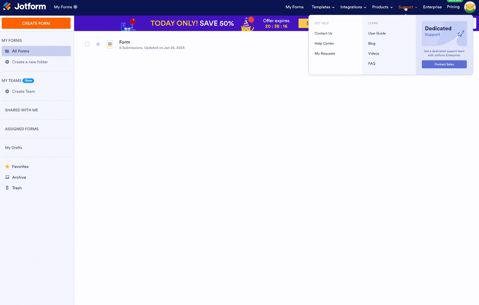
- On your My Forms page, click on Support on the top-right side of the dark-blue navigation bar at the top of your screen.
- In the menu that opens, click on Contact Us.
- Enter a title for your question in the box below ‘How can we help?’
- In the box below the title, enter some text that explains the situation.
- Now, just click on Post Question on the bottom-right side of your screen and you're good to go.

You can also:
- Add the link to your form or to the website that you embedded the form into by pasting that into the box under the Add a Link section.
- Click on Choose File under the Upload a Screenshot section to upload a screenshot of the issue.
- Tick Make Private to prevent other users from seeing your question or answer. We recommend that you tick it if the content includes sensitive information. If not, you can leave it unticked so other Jotform users can benefit from the answer.
Let us know if you need any other help.
-
HumbirdMediaReplied on April 18, 2024 at 2:51 PM
Hi, it turns out the issue is not fixed. When I widened the form on the mobile, it still did not become responsive. See screenshot below:

I noticed that when I visit the form using the Jotform link, it shows perfectly on mobile. But embedding on my website, which is what is ideal, doesn't scale very well as shown in my previous screenshot. What can I do?
-
Sidharth JotForm SupportReplied on April 18, 2024 at 4:10 PM
Hi Shauna-Kay,
Thanks for getting back to us. I understand how frustrating this is for you, and I’ll do my best to help you. Unfortunately, I am unable to check your embedded form as it is showing a connection reset error.

Are there any location-based restrictions preventing access to your website? To assist with the issue of your embedded form not being mobile responsive, we need to review it. Would you be able to temporarily remove any location-based restrictions so that we can access your page and provide assistance?
Once we hear back from you, we'll be able to move forward with a solution.
-
HumbirdMediaReplied on April 18, 2024 at 4:12 PM
Hi, please try this link again: https://humbirdmedia.wixsite.com/somers-furnishing/book-a-site-visit
The form is on the "Book a Site Visit" page.
-
Bilal JotForm SupportReplied on April 18, 2024 at 4:51 PM
Hi Shauna-Kay,
Thanks for getting back to us. When I checked your embedded the responsive was working as it should. Check out my screencast below:
If the issue persists you can try to remove the embedding from your website and embed the form again.
- In Form Builder, in the orange navigation bar at the top of the page, click on Publish.
- In the menu on the left side of the page, click on Embed.
- Now, click on the embed option you want to use, and copy the code.
- That's it. Embed your link on your webpage and you're done.
Reach out again if you have any other questions.
-
HumbirdMediaReplied on April 18, 2024 at 5:10 PM
Thanks for your screen recording. Let me be a little more clear. It's not that it's not mobile responsive. The responsive embedded version just doesn't look right on mobile.
Click here to watch my screen recording. You will see how the form looks on mobile when viewing from Jotform's URL (which is how I want it to look), and how it looks on mobile after being embedded in my website.
I hope this gives you a better understanding of my problem and how to solve it.
-
Afzal JotForm SupportReplied on April 18, 2024 at 5:56 PM
Hi Shauna,
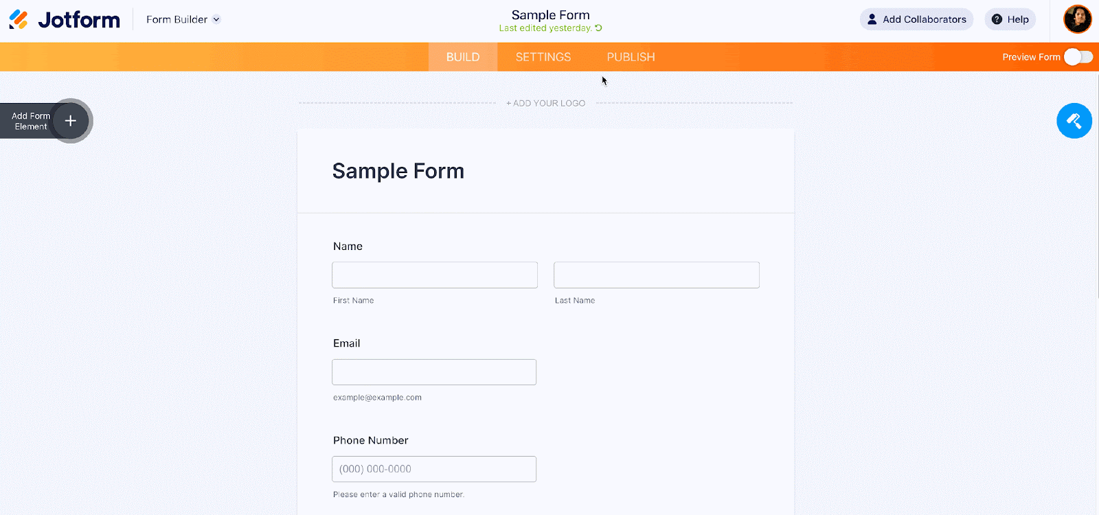
Thanks for getting back to us. Since the main concern of your client is to reduce the font size and the extra space we can do it using custom CSS code. Check out the steps below to see how it's done:
- Open your form in Form Builder and click on the blue Paint Roller icon on the right side of the screen.
- Under the Styles tab, paste the code below into the Inject Custom CSS area.
/*To make the form more responsive - 14036061*/

@media only screen and (max-width: 480px){

ul.form-section.page-section {

    padding-right: 2px !important;

    padding-left: 2px !important;

}


.header-large h1.form-header {

    font-size: 1.5em;

}


.form-all {

    font-size: 14px !important;

}


.form-all .form-pagebreak-back,

.form-all .form-pagebreak-next {

    font-size: 14px;

}

}
Here's what the result will look like:
Here's the cloned version of the form that you can test.
Please give it a try and let us know how it goes.
-
HumbirdMediaReplied on April 18, 2024 at 7:11 PM
THANK YOU! This is exactly what I wanted to know. Thank you so much for understanding and providing a fix!!!!!!!
I think this embedding responsive issue is something that others may be struggling with and I didn't see this solution in the support forum. Is there a way you can make this answer public so others can find it in the future?
-
Afzal JotForm SupportReplied on April 18, 2024 at 7:16 PM
Hi Shauna,
Thanks for getting back to us. Glad to know that the issue has been resolved. As per your request, I have set the thread privacy to public.
Let us know if there’s anything else we can help you with.
-
HumbirdMediaReplied on April 18, 2024 at 7:18 PM
That's it! Thank you! This fix will definitely help with my other embedded forms.
- Templates
- Integrations
- INTEGRATIONS
- See 100+ integrations
- FEATURED INTEGRATIONS
 PayPal
- Slack
- Google Sheets
- Mailchimp
- Zoom
- Dropbox
- Google Calendar
- Hubspot
- Salesforce
- See more Integrations
- Products
- PRODUCTS
- Form Builder
- Jotform Enterprise
- Jotform Apps
- Store Builder
- Jotform Tables
- Jotform Inbox
- Jotform Mobile App
- Jotform Approvals
- Report Builder
- Smart PDF Forms
- PDF Editor
- Jotform Sign
- Jotform for Salesforce Discover Now
- Support