


-
jay17vaAsked on October 22, 2018 at 10:11 AM
Hi,
We have this calculator form on our website but it doesn't seem to display properly on mobile devices. Can you help us with the CSS to make it fit on mobile devices?
Here's the link: http://www.southshorestatenislandhomesforsale.com/info-for-sellers/
I'm also attaching screenshots of the mobile and tablet view.
See below:
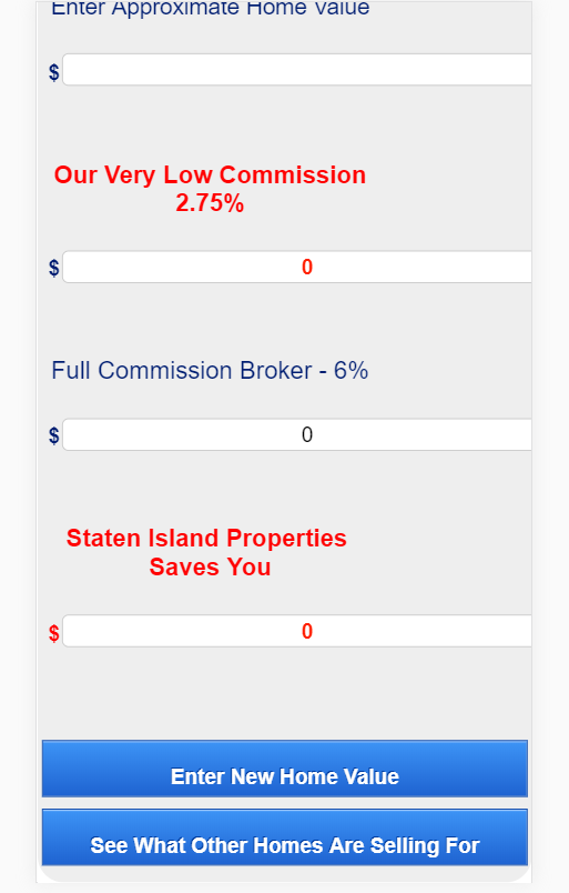
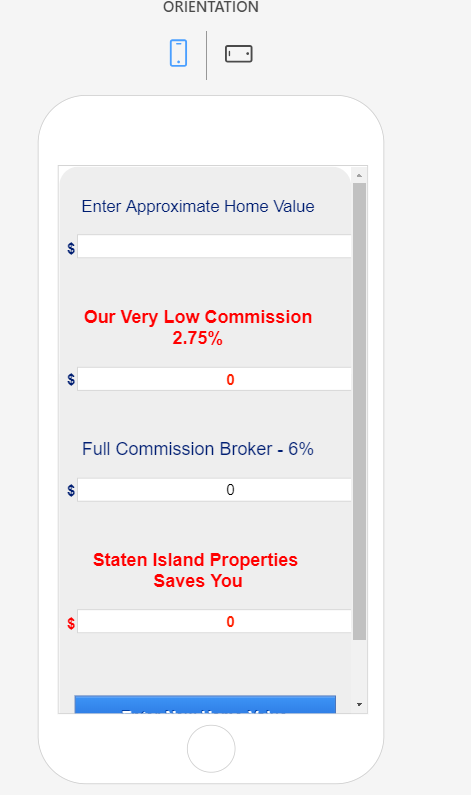
Mobile View:
- Can you place the $ sign beside the fields
- Can you make the fields more center like its label
- Can you make the scroll not show up?
- Can you please make the text fit the 2nd button?
- Can you also tell us where to add the CSS codes when the jotform source code has already been uploaded on our website?
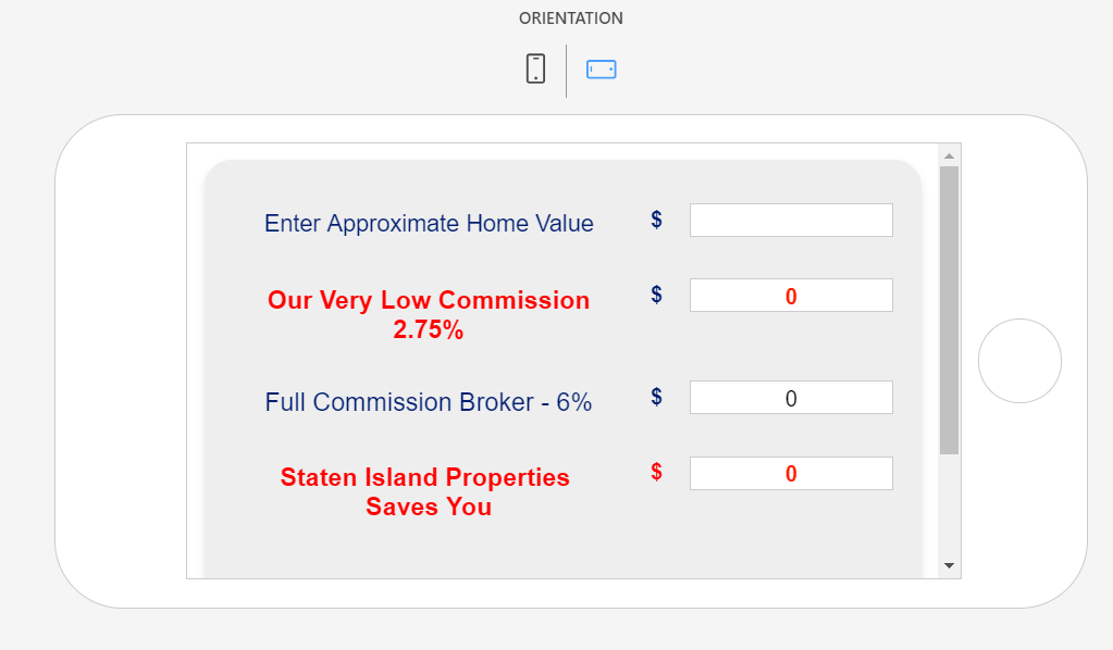
Tablet View:

-
Richie JotForm SupportReplied on October 22, 2018 at 12:21 PM
You can add these CSS code into your form.
@media screen and (max-width: 480px), screen and (max-device-width: 767px) and (orientation: portrait), screen and (max-device-width: 415px) and (orientation: landscape){
.form-textbox{
position:absolute;
margin-top:-50px;
margin-left:13px;
width:320px !important;
}
}Can you please try to use the Iframe code in embedding your form?
Please give it a try and let us know if the issue still remains.
Thank you.
-
jay17vaReplied on October 22, 2018 at 12:25 PM
Hello, can you at least not make the fields that wide?
Also the labels has to be in the center in mobile view..
where do we add the css code? which file on the file manager?thank you.
-
jay17vaReplied on October 22, 2018 at 12:43 PM
Hello again,
We have added the CSS code you provided and form is still not shown properly on mobile devices.
The $ sign is still at the top of the field.
The fields are still not centered.
The 2nd button is no longer visible.
See attached screenshot from an iphone x.
-
Richie JotForm SupportReplied on October 22, 2018 at 2:00 PM
Kindly change the CSS code to these to adjust the textbox.
@media only screen and (min-device-width: 375px) and (max-device-height: 667px) and (orientation : portrait) and (-webkit-device-pixel-ratio: 2){
.form-textbox{
position:absolute;
margin-top:-50px;
margin-left:13px;
width:320px !important;
}
}Guide:-How-to-Inject-Custom-CSS-Codes
And kindly embed your form using the Iframe code.
Please give it a try and let us know if the issue still remains.
Thank you.
-
jay17vaReplied on October 23, 2018 at 9:30 AM
Hi, where exactly do we add the css codes to?
We already downloaded the source code files to the webserver, all files are now hosted on the website.
Do we add it on the html file? or do we add it on a css file? can you please let us know where to add these codes?
Thank you. -
Richie JotForm SupportReplied on October 23, 2018 at 10:44 AM
You need to add these CSS codes in your form.
Guide:-How-to-Inject-Custom-CSS-Codes
If you have used the source code to embed your form, you may need to get the new source code with the new CSS codes in the form.
Or you can try to add it to the CSS file.
Please give it a try and let us know if the issue still remains.
Thank you.
-
jay17vaReplied on October 23, 2018 at 11:30 AM
Hi We added the css codes.
The form now looks fine on mobile portrait view but the labels are not yet centered.
Also can you make the fields not to wide?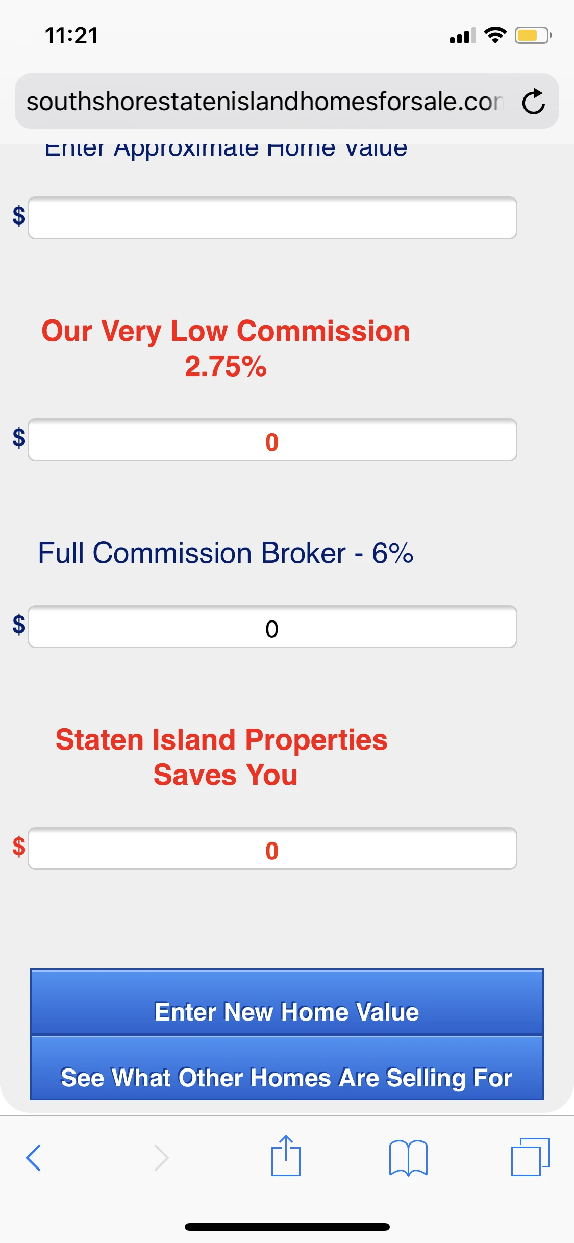
On the mobile/Tablet landscape view, the form looks messed up. See below:
Please help us fix these.
We uploaded the source code on this page foryou to check:
http://www.southshorestatenislandhomesforsale.com/Calc1/calc1.html -
Richie JotForm SupportReplied on October 23, 2018 at 1:03 PM
You can try these custom CSS code.
@media only screen and (min-device-width: 375px) and (max-device-height: 667px) and (orientation : landscape) and (-webkit-device-pixel-ratio: 2){
#text_11 {
text-align: initial;
width: -17px;
width: -30px;
width: 250px;
}
#input_26 {
margin-top: -10px;
}
#input_14 {
margin-top: -13px;
}
#id_15 {
width: 320px;
position: absolute;
margin-top: 100px;
margin-left: -439px;
}
#id_17{
margin-left: -120px;
margin-top: 45px;
}
#input_17 {
width: 150px;
text-align: center;
margin-top: -11px;
}
#input_18 {
width: 150px;
color: #ff1f00;
font-weight: bold;
text-align: center;
margin-top: -14px;
}
}Please give it a try and let us know how it goes.
Thank you.
-
jay17vaReplied on October 23, 2018 at 1:30 PM
Hello, it did not fix the problem.
The fields are still very wide.
The labels are still not centered.
The landscape view still looks very weird and messed up :(
Check here: http://southshorestatenislandhomesforsale.com/Calc1/calc2.html -
Richie JotForm SupportReplied on October 23, 2018 at 1:43 PM
May we know what mobile device are you using to test your form?
Can we have also a screenshot on how the form is viewed at your end?
Guide:How-to-add-screenshots-images-to-questions-to-the-support-forum
Thank you.
-
jay17vaReplied on October 23, 2018 at 1:45 PM
iphone x and ipad mini. The form still looks exactly the way it look on my previous screenshot.
-
Richie JotForm SupportReplied on October 23, 2018 at 2:14 PM
You can try these CSS code instead.
@media only screen and (min-device-width: 375px) and (max-device-height: 812px) and (orientation : landscape) and (-webkit-device-pixel-ratio: 3){
#input_26 {
margin-top: -10px;
}
#input_14 {
margin-top: -13px;
}
#id_15 {
width: 320px;
position: absolute !important;
margin-top: 100px !important;
margin-left: -439px !important;
}
#id_17{
margin-top: 100px;
margin-left: -120px;
position: absolute;
}
#input_17 {
width: 150px;
text-align: center;
margin-top: -11px;
}
#text_16{
margin-left: -330px;
margin-top: 40px;
}
#id_18 {
margin-top: -80px;
margin-left: 320px;
}
#input_18 {
margin-top: -14px;
}
}Sample screenshot using an emulator for iphone x:
Sample Form:https://form.jotform.com/82955512010954
-
jay17vaReplied on October 24, 2018 at 9:54 AM
The form still looks messed up. :(
Do we remove the previous codes or do we just add the new codes?
I tried removing the old codes and also tried adding the codes but none seems to be working.

-
Richie JotForm SupportReplied on October 24, 2018 at 11:16 AM
Kindly remove all the previous CSS you have added to avoid confusion and add these custom CSS.
@media screen and (max-width: 480px), screen and (max-device-width: 767px) and (orientation: portrait), screen and (max-device-width: 415px) and (orientation: landscape){
.form-textbox{
position:absolute;
margin-top:-50px;
margin-left:13px;
width:320px !important;
}
}
@media only screen and (min-device-width: 375px) and (max-device-height: 667px) and (orientation : portrait) and (-webkit-device-pixel-ratio: 2){
.form-textbox{
position:absolute;
margin-top:-50px;
margin-left:13px;
width:320px !important;
}
}
@media only screen and (min-device-width: 375px) and (max-device-height: 812px) and (orientation : landscape) and (-webkit-device-pixel-ratio: 3){
#input_26 {
margin-top: -10px;
}
#input_14 {
margin-top: -13px;
}
#id_15 {
width: 320px;
position: absolute !important;
margin-top: 100px !important;
margin-left: -439px !important;
}
#id_17{
margin-top: 100px;
margin-left: -120px;
position: absolute;
}
#input_17 {
width: 150px;
text-align: center;
margin-top: -11px;
}
#text_16{
margin-left: -330px;
margin-top: 40px;
}
#id_18 {
margin-top: -80px;
margin-left: 320px;
}
#input_18 {
margin-top: -14px;
}
}Here is a sample screenshot of the output.
Portrait
Landscape
Thank you.
-
jay17vaReplied on October 24, 2018 at 11:20 AM
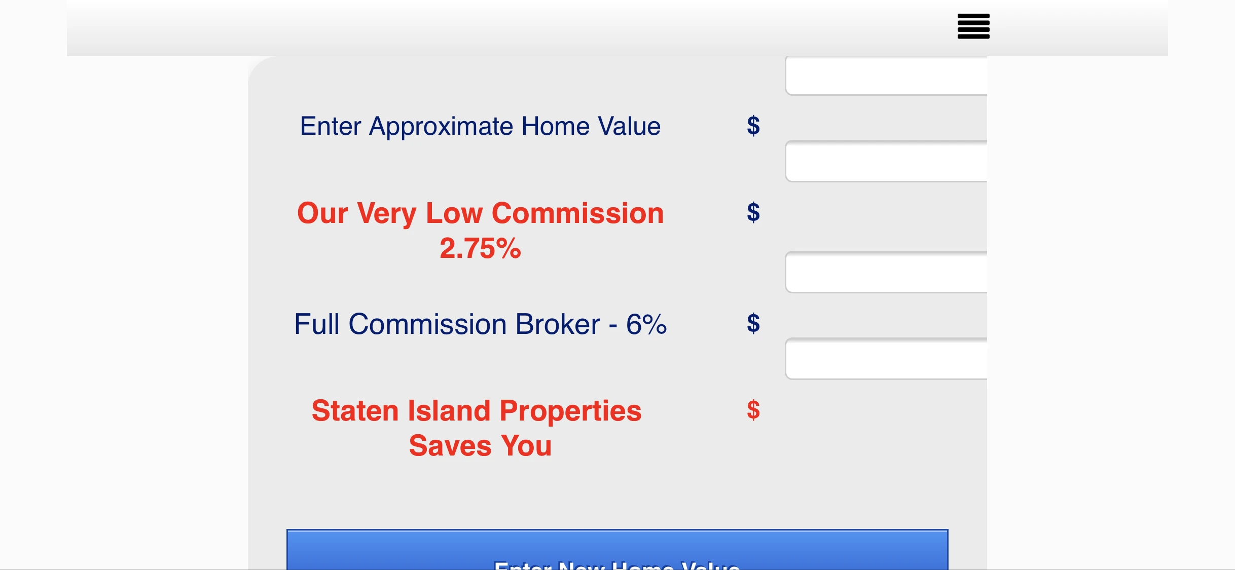
Please try the portrait orientation on the tablet view. It still does look messed up. :(
-
jay17vaReplied on October 24, 2018 at 12:28 PM
Here are the most updated screenshots.
See below:
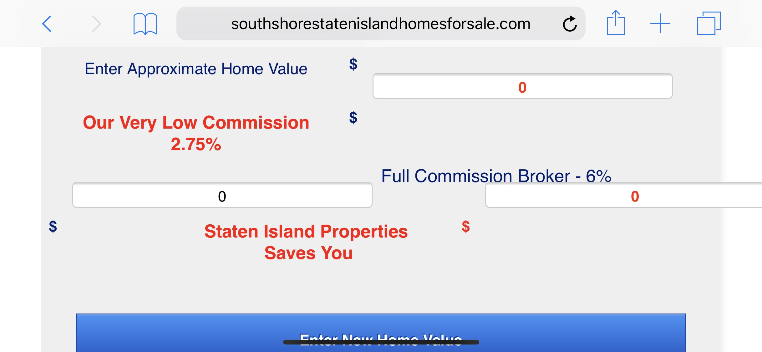
- the fields are still too wide.
- the fields are not properly aligned on the landscape view.
- the fields overlap the iframe.
Please how do we fix this?
Mobile portrait: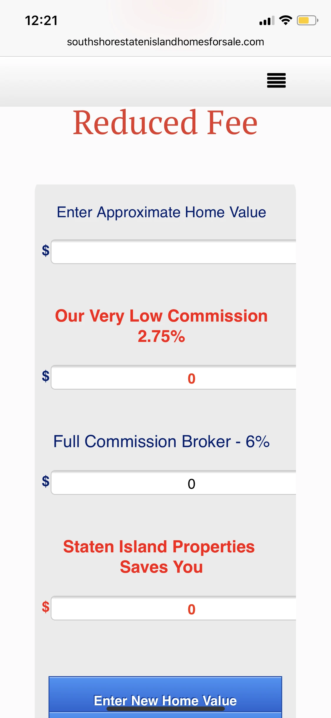
Mobile Landscape:
-
Richie JotForm SupportReplied on October 24, 2018 at 1:59 PM
Can you please try to embed your form using the Iframe code?
You can adjust your textbox by editing this line of code in your CSS.
@media screen and (max-width: 480px), screen and (max-device-width: 767px) and (orientation: portrait), screen and (max-device-width: 415px) and (orientation: landscape){
.form-textbox {
position : absolute;
margin-top : -50px;
margin-left : 13px;
width : 270px !important; /*decrease the value to adjust the width of the textbox*/
}
}Please give it a try and let us know how it goes.
Thank you.
-
jay17vaReplied on October 24, 2018 at 2:04 PM
we are using the source code on our website because we need to disable the enter button, disable the pop up message when clearing the form and we need to add autofocus on the first field.
All of these wont be possible if we use the iframe code. :( -
Richie JotForm SupportReplied on October 24, 2018 at 3:28 PM
Thank your for the clarification.
Can you add a meta data view port in your html field?
<meta name="viewport" content="width=device-width, initial-scale=1.0">
Do note that when you use the source code to embed your form, changes/edits in your form will not be auto updated in your embedded form. You must copy the source code again and manually update your form.
Kindly add these custom CSS code for iphone7 devices.
@media only screen and (min-device-width: 375px) and (max-device-height: 667px) and (orientation : landscape) and (-webkit-device-pixel-ratio: 2){
#input_26{
margin-top:-10px;
}
#input_14 {
margin-top: -13px;
}
#id_15 {
margin-left: -440px;
margin-top: 50px;
}
#id_17 {
margin-top: 90px;
margin-left: -120px;
}
#label_17{
margin-top: -34px;
}
#id_16 {
margin-top: -50px;
}
#label_18 {
margin-top: -30px;
}
.form-textbox{
width:290px !important;
}
}May we know what kind of Tab you're using to check the form?
Thank you.
-
jay17vaReplied on October 26, 2018 at 1:29 PM
Hello, it made the form look worse.
Can you help us finally fix this please.The form fields are no longer aligned etc.
You can check the form here. please try to access it via mobile. an actual mobile device. it looks worse now. :(
Please help us fix this. :(
http://southshorestatenislandhomesforsale.com/Calc1/Calc5.html
Responsive design checker: http://www.responsinator.com/?url=http://southshorestatenislandhomesforsale.com/Calc1/Calc5.html
If you want, you can go in and edit our form directly if that would be easier. -
Richie JotForm SupportReplied on October 26, 2018 at 2:19 PM
I have used the responsive design checker for your form.
Kindly remove all the previous CSS code I have given to avoid confusion and insert these custom CSS codes instead.
@media screen and (max-width: 480px), screen and (max-device-width: 767px) and (orientation: portrait), screen and (max-device-width: 415px) and (orientation: landscape){
.form-textbox {
position : absolute;
margin-top : -50px;
margin-left : 13px;
width : 270px !important;
}
}
@media screen and (max-width: 480px), screen and (max-device-width: 767px) and (orientation: portrait), screen and (max-device-width: 415px) and (orientation: landscape){
.form-textbox{
position:absolute;
margin-top:-50px;
margin-left:13px;
width:320px !important;
}
}
@media only screen and (min-device-width: 375px) and (max-device-height: 667px) and (orientation : portrait) and (-webkit-device-pixel-ratio: 2){
.form-textbox{
position:absolute;
margin-top:-50px;
margin-left:13px;
width:320px !important;
}
}
@media only screen and (min-device-width: 375px) and (max-device-height: 812px) and (orientation : landscape) and (-webkit-device-pixel-ratio: 3){
#input_26 {
margin-top: -10px !important;
}
#input_14 {
margin-top: -13px;
}
#id_15 {
width: 320px;
position: absolute !important;
margin-top: 100px !important;
margin-left: -439px !important;
}
#id_17{
margin-top: 100px;
margin-left: -120px;
position: absolute;
}
#input_17 {
width: 150px;
text-align: center;
margin-top: -11px;
}
#text_16{
margin-left: -330px;
margin-top: 40px;
}
#id_18 {
margin-top: -80px;
margin-left: 320px;
}
#input_18 {
margin-top: -14px;
}
}
@media only screen and (min-device-width: 375px) and (max-device-height: 667px) and (orientation : landscape) and (-webkit-device-pixel-ratio: 2){
#input_26{
margin-top:-10px;
}
#input_14 {
margin-top: -13px;
}
#id_15 {
margin-left: -440px;
margin-top: 50px;
}
#id_17 {
margin-top: 90px;
margin-left: -120px;
}
#label_17{
margin-top: -34px;
}
#id_16 {
margin-top: -50px;
}
#label_18 {
margin-top: -30px;
}
.form-textbox{
width:290px !important;
}
}
@media (min-width: 601px) and (max-width:960px){
#text_15{
margin-left: -320px;
}
#id_17{
margin-top: -65px;
margin-left: 320px;
}
}
@media (min-width : 768px) and (max-width : 1023px) {
#id_13{
margin-left:9px;
}
#id_16 {
margin-left: -440px;
}
#label_14 {
margin-left: -10px;
}
#label_18 {
margin-left: -121px;
}
#input_18 {
margin-left: -90px;
}
}My sample form:form.jotform.com/82985958601977
http://www.responsinator.com/?url=https%3A%2F%2Fform.jotform.com%2F82985958601977
Thank you.
-
jay17vaReplied on October 26, 2018 at 2:35 PM
If you are to check the different viewsfrom the responsinator, some shows too much space of the form. can you fix that too please?
It looks weird. :(
http://www.responsinator.com/?url=https://form.jotform.me/81906719193465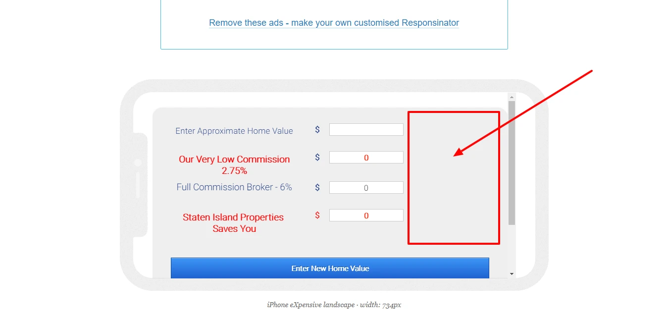
-
Richie JotForm SupportReplied on October 26, 2018 at 3:03 PM
You can add this CSS code inside the section @media (min-width: 601px) and (max-width:960px){}
.form-section {
margin-left: 60px;
}You can also increase your textbox by adding this custom CSS to the same section.
.form-textbox{
width:390px !important;
}Please give it a try and let us know how it goes.
Thank you.
-
jay17vaReplied on October 26, 2018 at 3:04 PM
do i add these codes or replace the old one?
-
Richie JotForm SupportReplied on October 26, 2018 at 3:27 PM
Kindly add the CSS code inside the section @media (min-width: 601px) and (max-width:960px)
.form-section {
margin-left: 60px;
}.form-textbox{
width:390px !important;
} -
jay17vaReplied on October 29, 2018 at 6:09 AM
Here's a screenshot of the tablet portrait mode after adding the codes you've provided. :(

-
Victoria_KReplied on October 29, 2018 at 9:51 AM
Hello,
It seems that you have completely customized your form with CSS code. I was working on a cloned form to adjust the layout and can suggest the following code to replace yours:
@import url('https://shots.jotform.com/elton/genericTheme.css');
#id_11 {
width : 320px;
}
#id_13 {
width : 320px;
}
#id_15 {
width : 320px;
}
#id_16 {
width : 320px;
}
#id_12 {
width : 120px;
padding : 26px 26px 26px 0px;
}
#input_12 {
width : 156px;
}
#id_14 {
width : 120px;
padding : 26px 26px 26px 4px;
}
#input_14 {
width : 150px;
color : #ff1f00;
font-weight : bold;
text-align : center;
}
#id_17 {
width : 120px;
padding : 26px 26px 26px 4px;
}
#id_18 {
width : 120px;
padding : 26px 26px 26px 4px;
}
#input_17 {
width : 150px;
text-align : center;
}
#input_18 {
width : 150px;
color : #ff1f00;
font-weight : bold;
text-align : center;
}
#text_11 p.hover {
}
#text_11 {
text-align : center;
width : 250px;
}
#id_22 {
width : 120px;
padding : 26px 26px 26px 0px;
}
#input_23 {
display : none;
}
#cid_23 div.form-buttons-wrapper {
}
.formFooter {
font-family : -apple-system,BlinkMacSystemFont,"Segoe UI",Roboto,Helvetica,Arial,sans-serif,"Apple Color Emoji","Segoe UI Emoji","Segoe UI Symbol";
position : fixed;
left : 0;
right : 0;
bottom : 0;
color : #eee;
padding : 6px 10px;
background-color : #333;
text-align : left;
z-index : 901;
display : none;
}
.undefined span {
}
#text_16 {
style : red;
text-align : center;
width : 250px;
}
#label_14 {
}
#input_26 {
width : 150px;
text-align : center;
}
#id_26 {
width : 120px;
padding : 26px 26px 26px 4px;
}
#label_18 {
color : #ff0000;
}
#text_13 {
}
#id_23 {
}
#text_13 p.hover {
}
#text_15 {
text-align : center;
width : 250px;
}
.form-html hoverSticky p {
}
#text_13 p.hover {
text-align : center;
}
.form-html hoverSticky span {
}
#text_16 p.hover {
}
#text_13 p.hoverSticky {
}
#text_13 p.hover {
}
#text_13 {
text-align : center;
width : 250px;
}
@media screen and (max-width: 480px), screen and (max-device-width: 767px) and (orientation: portrait), screen and (max-device-width: 415px) and (orientation: landscape){
.form-textbox {
position : absolute;
margin-top : -50px;
margin-left : 13px;
width : 270px !important;
}
input[type*="text"] {
width: 15em !important;
}
li {
padding-left: 20% ;
padding-right: 20% ;
}
}
@media screen and (max-width: 480px), screen and (max-device-width: 415px) and (orientation: portrait){
li {
padding-left: 20% !important;
padding-right: 20% !important;
}
}
@media screen and (max-width: 480px), screen and (max-device-width: 767px) and (orientation: portrait), screen and (max-device-width: 415px) and (orientation: landscape){
.form-textbox {
position : absolute;
margin-top : -50px;
margin-left : 13px;
width : 320px !important;
}
}
@media only screen and (min-device-width: 375px) and (max-device-height: 667px) and (orientation : portrait) and (-webkit-device-pixel-ratio: 2){
.form-textbox {
position : absolute;
margin-top : -50px;
margin-left : 13px;
width : 320px !important;
}
}
@media only screen and (min-device-width: 375px) and (max-device-height: 812px) and (orientation : landscape) and (-webkit-device-pixel-ratio: 3){
#input_26 {
margin-top : -10px !important;
}
#input_14 {
margin-top : -13px;
}
/*
#id_15 {
width : 320px;
position : absolute !important;
margin-top : 100px !important;
margin-left : -439px !important;
} */
/*
#id_17 {
margin-top : 100px;
margin-left : -120px;
position : absolute;
} */
#input_17 {
width : 150px;
text-align : center;
margin-top : -11px;
}
#input_18 {
top: 75px;
}
/*
#text_16 {
margin-left : -330px;
margin-top : 40px;
}
#id_18 {
margin-top : -80px;
margin-left : 320px;
}
#input_18 {
margin-top : -14px;
} */
}
@media only screen and (min-device-width: 375px) and (max-device-height: 667px) and (orientation : landscape) and (-webkit-device-pixel-ratio: 2){
#input_26 {
margin-top : -10px;
}
#input_14 {
margin-top : -13px;
}
#id_15 {
margin-left : -440px;
margin-top : 50px;
}
#id_17 {
margin-top : 90px;
margin-left : -120px;
}
#label_17 {
margin-top : -34px;
}
#id_16 {
margin-top : -50px;
}
#label_18 {
margin-top : -30px;
}
.form-textbox {
width : 290px !important;
}
}
@media (min-width: 601px) and (max-width:960px){
.form-section {
margin-left : 60px;
}
.form-textbox {
width : 390px !important;
}
#text_15 {
margin-left : -320px;
}
#id_17 {
margin-top : -65px;
margin-left : 320px;
}
}
@media (min-width : 768px) and (max-width : 1023px){
#id_13 {
margin-left : 9px;
}
#id_16 {
margin-left : -440px;
}
#label_14 {
margin-left : -10px;
}
#label_18 {
margin-left : -121px;
}
#input_18 {
margin-left : -90px;
}
}
#text_16 p.hoverSticky {
}
#text_16 p.hover {
}
I have copied all the code to avoid any confusion.
Here is the result:


On iPad devices, the form should look like desktop version. Here is a test form: https://form.jotform.com/83013503183951
-
jay17vaReplied on October 30, 2018 at 8:10 AM
Hello, just a clarification, DO I DELETE THE ENTIRE CSS CODES found on the css editor and replace it with the codes you provided above?
Please advise.
Thank you. -
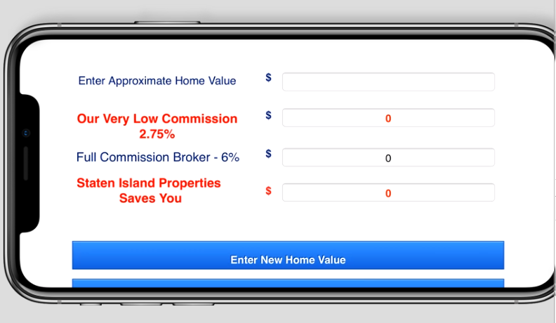
jay17vaReplied on October 30, 2018 at 8:25 AM
Hi Again,
I have used the new CSS code you've provided. The form looks fine on both portrait and landscape on my mobile now. However, the text on the button is not showing all the words.
It should show "See what other homes are selling for"
Please see below:
-
Richie JotForm SupportReplied on October 30, 2018 at 10:54 AM
Just add this CSS code to adjust the height of your button.
@media screen and (max-width: 480px), screen and (max-device-width: 767px) and (orientation: portrait), screen and (max-device-width: 415px) and (orientation: landscape){
.form-buttons-wrapper button {
height: 50px !important;
}
}
- Templates
- Integrations
- INTEGRATIONS
- See 100+ integrations
- FEATURED INTEGRATIONS
 PayPal
- Slack
- Google Sheets
- Mailchimp
- Zoom
- Dropbox
- Google Calendar
- Hubspot
- Salesforce
- See more Integrations
- Products
- PRODUCTS
- Form Builder
- Jotform Enterprise
- Jotform Apps
- Store Builder
- Jotform Tables
- Jotform Inbox
- Jotform Mobile App
- Jotform Approvals
- Report Builder
- Smart PDF Forms
- PDF Editor
- Jotform Sign
- Jotform for Salesforce Discover Now
- Support


