


-
ClintlunaAsked on March 15, 2019 at 11:56 PM
Hi,
Having trouble with mobile compatibility on this form (Linked below). It's not seeming to fit on a mobile screen - eg have to scroll left/right/up/down.
Here's the link: https://www.jotform.com/build/83616966031157
Thanks
-
AndrewHagReplied on March 16, 2019 at 3:22 AM
I checked your form and seems it is appearing fine on mobile, I am also able to scroll the form. Did you embed your form in any website? If yes, could you please share the URL of the web page where you embed the form so that we can look into this and assist you accordingly?
-
ClintlunaReplied on March 16, 2019 at 5:30 PM
Hi Andrew, thanks for the reply....Actually I'm trying to get the page to not scroll, i.e. I'd like it to fit on mobile without having to scroll. Thanks
-
MikeReplied on March 16, 2019 at 8:06 PM
The horizontal scrolling could be caused by a custom CSS added to the Form Tabs Widget.
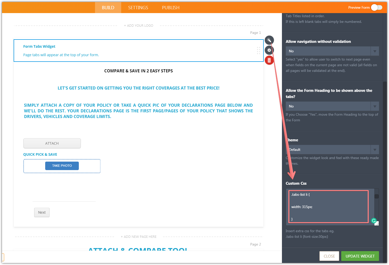
You may also try adding the next CSS to the widget to reduce the tab size on the mobile screens:
@media only screen and (max-device-width: 550px) {
.tabs-list li {
width: 250px !important;
}
} -
ClintlunaReplied on March 18, 2019 at 2:53 PM
Hi Mike, thanks for the reply. Tried this code but didn't seem to affect the size of the tabs at all. Also noticed it seemed that a bracket "}" was missing so added that it and tried but didn't work either. Also, noticed that the "Next" button gets cut off on mobile as well....Thanks!
-
Richie JotForm SupportReplied on March 18, 2019 at 4:29 PM
You may add this custom CSS in your form.
@media (max-width: 480px){
.jotform-form{
width:100%;
}
}
Guide:https://www.jotform.com/help/117-How-to-Inject-Custom-CSS-CodesPlease give it a try and let us know if this fits your requirements.
-
ClintlunaReplied on March 19, 2019 at 6:06 PM
Hi Richie, thanks for your reply.
I added this code but the tabs are still cut of on the mobile version / they don't fit within the mobile screen.
-
MikeReplied on March 19, 2019 at 7:36 PM
You are right, one bracket } was missing in my CSS. I have now added the CSS to your Form Tabs Widget:
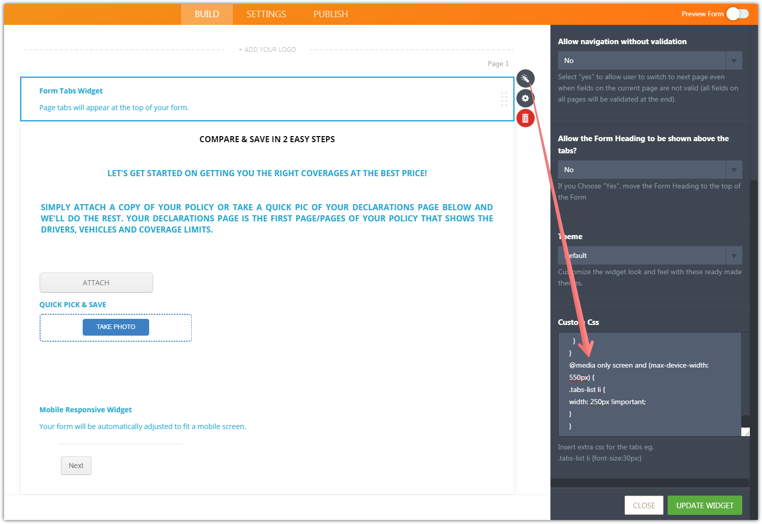
Can you please check the form now? Are you still having issues with the oversized tabs on mobile? If so, what device and browser do you use to test this?
-
ClintlunaReplied on March 20, 2019 at 2:05 AM
Hi Mike, yes I tried this and it still has issues. I've tried it on my iPhone (the 6s) as well as on the JotForm mobile viewer device.
-
Ashwin JotForm SupportReplied on March 20, 2019 at 4:39 AM
I am sorry for the trouble caused to you. I do not have a real iPhone 6s device but I did check your form in mobile emulator and it seems to display our form correctly.
I would suggest you to please share a screenshot of the issue and we will take a look. The following guide should help you how to upload image in forum post: https://www.jotform.com/help/438-How-to-Post-Screenshots-to-Our-Support-Forum
We will wait for your response.
-
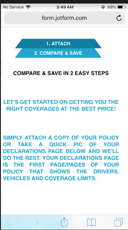
ClintlunaReplied on March 20, 2019 at 2:27 PM
Yes, here's a screen shot of what it looks like on JotForm mobile preview (tabs cut off at top) it also looks like this on my mobile phone. Thanks

-
Richie JotForm SupportReplied on March 20, 2019 at 3:52 PM
You may add this custom CSS inside your Tab widget to change the width of your tabs.
@media (max-width: 480px){
#form-tab-1{
width:160px;
}
#form-tab-2{
width:160px;
}
}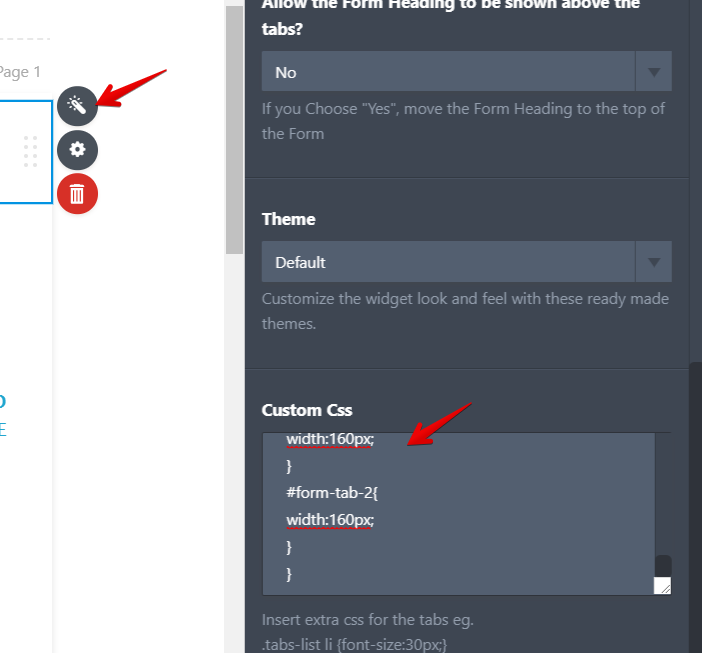
Sample screenshot:
Please give it a try and let us know if you have further questions.
-
ClintlunaReplied on March 25, 2019 at 3:42 PM
Thanks Richie, that changed the size! Is there some code I can put here to make the tabs adjust / fit the screen size of whatever mobile device is being used to view this form? Let me know if this question is not clear. Thanks!
-
MikeReplied on March 25, 2019 at 4:59 PM
You may try the next CSS to make the tab size dynamic on the mobile screen:
@media (max-width: 480px){
#form-tab-1{
width: calc(100% - 42px);
}
#form-tab-2{
width: calc(100% - 42px);
}
}
- Templates
- Integrations
- INTEGRATIONS
- See 100+ integrations
- FEATURED INTEGRATIONS
 PayPal
- Slack
- Google Sheets
- Mailchimp
- Zoom
- Dropbox
- Google Calendar
- Hubspot
- Salesforce
- See more Integrations
- Products
- PRODUCTS
- Form Builder
- Jotform Enterprise
- Jotform Apps
- Store Builder
- Jotform Tables
- Jotform Inbox
- Jotform Mobile App
- Jotform Approvals
- Report Builder
- Smart PDF Forms
- PDF Editor
- Jotform Sign
- Jotform for Salesforce Discover Now
- Support


