


-
easymovegtaAsked on February 18, 2021 at 3:08 AM
Hi I need help with changing SMS Confirmation Widget. I need it not to get cut off when viewed on a mobile phone.
Here is a link to my site where it is displayed
https://www.easymovegta.com/whattoknowaboutsellingyourhomeduringcovid/
I also would like all of the boxes to be the same size. If you notice my E-mail Validator Widget will put the button below the box when on the iphone.
I don't know any CSS coding so I am lost on how to make these changes. If you can also direct to place that can teach me how to make these changes that would be much appreciated.
-
Ariel JotForm SupportReplied on February 18, 2021 at 6:25 AM
Hello,
Try injecting this code into your form's CSS:
#customFieldFrame_9, #customFieldFrame_10 {
min-height: 36px;
}
#cid_7, #input_7 {
min-width: 217px;
width: 217px !important;
}
@media only screen and (max-width: 328px) {
#customFieldFrame_10 {
min-height: 80px;
}
}The following code to the SMS Confirmation widget's CSS:
#phone {
width: 218px;
height: 36px;
}
#send_btn {
height: 37px;
}
.sms-confirm-wrapper {
max-width: 100%;
}And this one to the E-mail Validator widget's CSS:
#mail {
width: 218px;
height: 36px;
}
#mailSubmit {
height: 36px;
border: none;
border-radius: 0;
box-shadow: none;
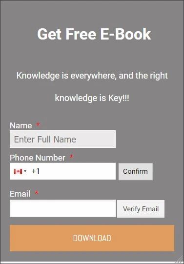
}Once applied, it should look something like so:
Give it a try and let us know how it goes.
Most of the rules involve width and height properties, you can learn more about it here: CSS Height and Width.
- Templates
- Integrations
- INTEGRATIONS
- See 100+ integrations
- FEATURED INTEGRATIONS
 PayPal
- Slack
- Google Sheets
- Mailchimp
- Zoom
- Dropbox
- Google Calendar
- Hubspot
- Salesforce
- See more Integrations
- Products
- PRODUCTS
- Form Builder
- Jotform Enterprise
- Jotform Apps
- Store Builder
- Jotform Tables
- Jotform Inbox
- Jotform Mobile App
- Jotform Approvals
- Report Builder
- Smart PDF Forms
- PDF Editor
- Jotform Sign
- Jotform for Salesforce Discover Now
- Support
