


-
ztwerskyAsked on September 22, 2014 at 12:25 AM
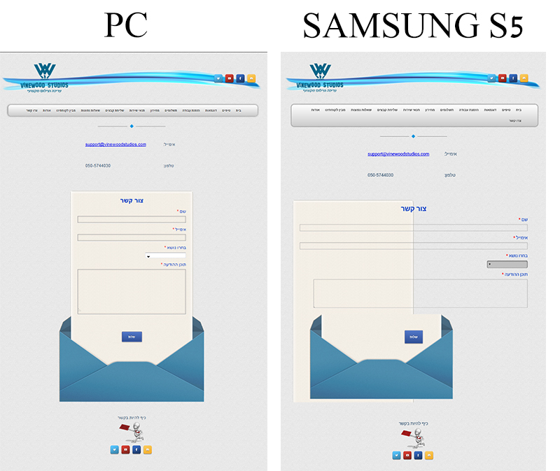
I tried using the smartphone widget but it didn't help. This contact me form is messed up on a Samsung S5 and iphone 4. Any idea of maybe a css code that can fix this? Thanks.
-
Ashwin JotForm SupportReplied on September 22, 2014 at 4:30 AM
Hello ztwersky,
Please inject the following custom css in your form and see if that helps you:
@media only screen and (max-device-width: 550px){.form-textbox{width:300px !important;min-width:300px !important;max-width:300px !important;}
.form-textarea{width:300px !important;min-width:300px !important;max-width:300px !important;}.form-all
{width: 550px !important; min-width:550px !important;max-width:550px !important;}}
The following guide should help you in injecting custom css code in your form: http://www.jotform.com/help/117-How-to-Inject-Custom-CSS-Codes
Hope this helps.
Do get back to us if the issue persists.
Thank you!
-
ztwerskyReplied on September 22, 2014 at 12:04 PM
It made the Samsung a little better but messed up the "rtl" text and background image on a pc. (Don't check my site because I did undo to your code for now.)
By the way, I already had CSS injected before this and what I did is try to combine yours with what I had. Maybe I did it wrong. Below is my whole CSS that created the image below - please tell me if something is wrong.

@media only screen and (max-device-width: 550px){
.form-all
{
padding-top: 0;
text-align: right;
width: 550px !important; min-width:550px !important;max-width:550px !important;
direction: rtl !important;
unicode-bidi: bidi-override !important;
}
/*--red border on error--*/
.form-validation-error {
border: 1px solid #FFB0B0 !important;
}
/*---form textbox styles fixed---*/.form-textarea, .form-textbox {
border: 1px solid #b7bbbd;
-webkit-border-radius: 2px;
-moz-border-radius: 2px;
border-radius: 2px;
padding: 4px;
background:transparent !important;
width:100%;
-webkit-appearance: none;
-webkit-box-shadow: inset 0 0 4px rgba(0,0,0,0.2), 0 1px 0 rgb(255,255,255);
-moz-box-shadow: inset 0 0 4px rgba(0,0,0,0.2), 0 1px 0 rgb(255,255,255);
box-shadow: inset 0 0 4px rgba(0,0,0,0.2), 0 1px 0 rgb(255,255,255);
border: 1px solid #AEAEAE;
color: #333;
-webkit-box-sizing: border-box;
-moz-box-sizing: border-box;
box-sizing: border-box;
}
ul.form-section li.form-line:first-child {
background:url('https://shots.jotform.com/elton/images/bg_envelope_02.gif') no-repeat 0 2px;
}.form-line{
background:url('https://shots.jotform.com/elton/images/bg_envelope_wrapper.gif') repeat-y;
}/*---remove error message---*/
.form-error-message {
display: none !important;
}
.form-line-error {
background: url('https://shots.jotform.com/elton/images/bg_envelope_wrapper.gif') repeat-y;
}/*---submit button move--*/
.form-submit-button{
margin-top:60px;
cursor: pointer;
}.form-textarea:focus, .form-textbox:focus{
outline:none !important;
}/*--fix captcha--*/.form-captcha .form-textbox{
width:130px !important;
}
.form-textbox{width:300px !important;min-width:300px !important;max-width:300px !important;}
.form-textarea{width:300px !important;min-width:300px !important;max-width:300px !important;}
.form-line {
padding: 6px 28px 6px 30px;
width: auto;
}
.form-buttons-wrapper{
text-align:center !important;
background: url('https://shots.jotform.com/elton/images/bg_envelope_11.gif') no-repeat 32px -10px;
height: 315px;
margin: -10px -100px -8px -100px;
}
.form-button-error {
position: absolute;
top: 120px;
left: 131px;
width: 195px;
}} -
Ashwin JotForm SupportReplied on September 22, 2014 at 1:30 PM
Hello ztwersky ,
Your css should not create any issue as I sent you only mobile specific css code.
I would suggest you to please inject the custom css code back in your form. This will help us check the appearance of your form in mobile device and further customize it.
Do get back to us once you inject the custom css code in your form and we will take a look.
We will wait for your response.
Thank you!
-
ztwerskyReplied on September 22, 2014 at 1:39 PM
Ok, it's injected.
-
David JotForm SupportReplied on September 22, 2014 at 2:52 PM
Hi,
I checked your page and your form's iframe embed code seems a bit off. If you could please try the full iFrame embed code rather than the version you have in your page and see if that resolves the formatting. Here is our guide on how to get the full iframe embed code:
http://www.jotform.com/help/148-Getting-the-Form-iFrame-Code
If this still does not resolve the formatting issue, let us know and we will be happy to see what else we can do.
-
ztwerskyReplied on September 23, 2014 at 1:58 AM
Ok, original iframe code in place. Same problem.
-
Ashwin JotForm SupportReplied on September 23, 2014 at 5:45 AM
Hello ztwersky,
Did you may any changes to your form injected css code recently? I did check your form in my laptop, it does not seems to display the blue envelop background at all. Please check the screenshot below:
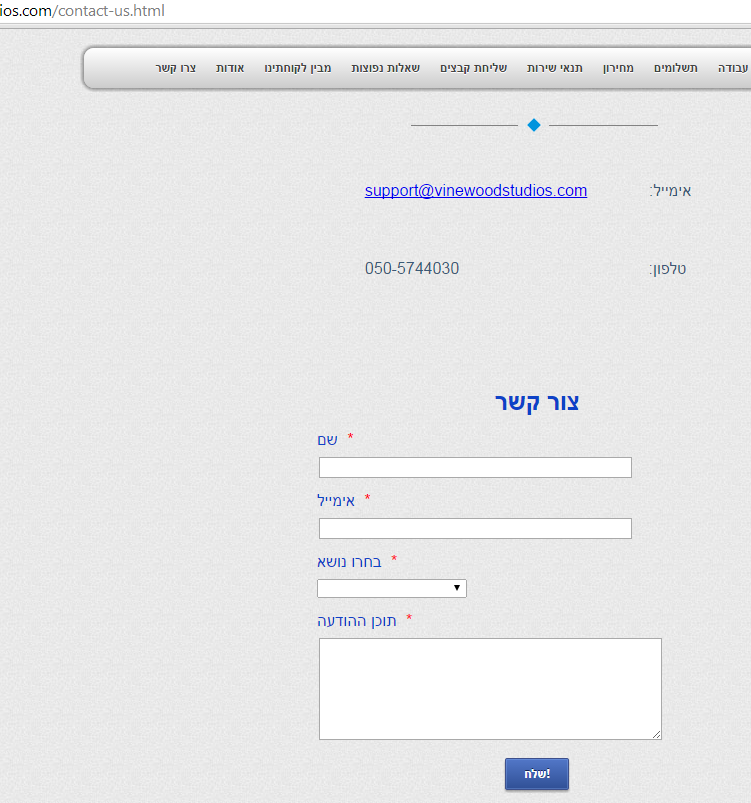
It does display the envelop in the mobile browser. I did check the injected custom css code and found that all the existing css code is wrapped in "@media only screen" code. That is the reason why the blue envelop is only visible when accessed from mobile device.
Is this intentional?
We will wait for your response.
Thank you!
-
ztwerskyReplied on September 23, 2014 at 8:26 AM
I just copied what you told me to. @media was what you wrote me to do. If you can, please give me again the whole css code and I will copy paste it exactly like you tell me.
The only thing that's important to me is that text should be on right (rtl) and the head title should be centered and that it should look good on PC and smartphone.
Thank you.
-
Ashwin JotForm SupportReplied on September 23, 2014 at 9:14 AM
Hello ztwersky,
Please copy the complete set of css code form this location: http://pastebin.com/2CHaES6a
Once you inject the above css code in your form, it should resolve the desktop view and partially the mobile view. We can then try to further customize it form there.
Thank you!
-
ztwerskyReplied on September 23, 2014 at 11:18 AM
Ok, like you said, it fixed the PC and partially the smartphone. Now what? Thank you.
-
Ashwin JotForm SupportReplied on September 23, 2014 at 12:50 PM
Hello ztwersky,
I have made the required changes in your form's custom css code and now it seems to be working as expected (courtesy my colleague @Ege).
I updated the mobile specific custom css code as below:
@media only screen and (max-device-width: 550px){.form-textbox{width:300px !important;}
.form-textarea{width:300px !important;}
.form-all{ width:454px !important; }
.form-buttons-wrapper { margin: -10px -100px -8px -100px !important }
}
Do check your web page in your mobile device and let us know if is displayed correctly.
Thank you!
-
ztwerskyReplied on September 23, 2014 at 12:56 PM
Yes, it all works! I can't believe it! You guys are absolutely the best!!! Thank you so much!!
-
David JotForm SupportReplied on September 23, 2014 at 1:11 PM
On behalf of my colleagues you are very welcome! Let us know if there is anything else we can help you with and we will be happy to do so.
- Templates
- Integrations
- INTEGRATIONS
- See 100+ integrations
- FEATURED INTEGRATIONS
 PayPal
- Slack
- Google Sheets
- Mailchimp
- Zoom
- Dropbox
- Google Calendar
- Hubspot
- Salesforce
- See more Integrations
- Products
- PRODUCTS
- Form Builder
- Jotform Enterprise
- Jotform Apps
- Store Builder
- Jotform Tables
- Jotform Inbox
- Jotform Mobile App
- Jotform Approvals
- Report Builder
- Smart PDF Forms
- PDF Editor
- Jotform Sign
- Jotform for Salesforce Discover Now
- Support


