


-
slider17Asked on October 29, 2014 at 9:24 AM
hi
my form is overlaying into some whitespace on iphone devices. this does not occur on android devices.
any idea why this is happening??
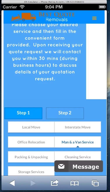
screenshot taken from browserstack simulation:
http://gyazo.com/e738ba3a911a18c0f114bf2fbd2154ce
-
CharlieReplied on October 29, 2014 at 10:51 AM
Hi,
May I know which part of the form is overlapping to? Upon checking the screenshot you provided, is it embedded in one of your websites and part of your form is overlapped by other parts of your web page? If this is the case, we might need the link to your website for us to further assist you on this.
You can also try embedding them using different embed form code, depending on the platform you have, you can check this link: http://www.jotform.com/help/67-Which-Form-Embed-Code-Should-I-Use.
We'll wait for your response.
Thank you.
-
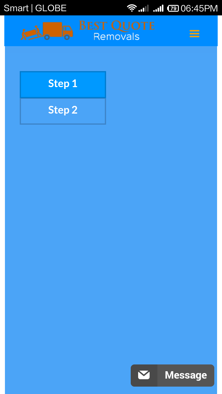
slider17Replied on October 29, 2014 at 11:35 PM
hi the jotform is embedded at the following site link
http://best-quote-removals.webflow.com/#quote
please view the above site on an iphone device, u will notice how the form juts out to the right of the display, causing whitespace overlay to appear.
-
Welvin Support Team LeadReplied on October 30, 2014 at 6:48 AM
You have a widget to the form, and these widgets aren't yet mobile compatible with mobile devices. Unfortunately, this is how I see it using my Android device:
A workaround would be to make the options into a single row and fields beneath each other.
Thank you!
-
slider17Replied on October 30, 2014 at 6:52 AM
what android device are u using??
on my nexus4 its displayed perfectly.
http://gyazo.com/5ace15e1d49a2005ff3619f985e5fe43
-
Welvin Support Team LeadReplied on October 30, 2014 at 8:03 AM
Redmi 1S from Xiaomi using default browser. Anyway, since the form was designed through our Form Designer, I would advise removing the Mobile Responsive Widget to the form. See if that makes a difference. Form designer automatically add a custom CSS codes to your form for mobile responsiveness so the mobile responsive widget would just create a conflict there.
Please update us here for the results.
Thank you!
-
slider17Replied on October 30, 2014 at 8:17 AM
ok i got rid of the mobile responsiveness widget.
please try again on your device.
-
CharlieReplied on October 30, 2014 at 9:08 AM
Hi,
Have you tried viewing it on your devices?
In my emulated environment, the menus show in iOS iPhone and Android.
Let us know if you are still having problems with it. I've also tried tested it on different mobile device layout, it should work fine now.
Thank you.
-
slider17Replied on October 30, 2014 at 9:12 AM
yes its works fine on my nexus 4
my original question was around the fact that on an iphone device my form is not confined into the area defined for my site, as u can see by the screenshot u posted above, it is overhanging to the right of the display causing white space to appear above it.
this does not happen on an android device.
is their a way to fix this?
-
CharlieReplied on October 30, 2014 at 9:59 AM
Hi,
Sorry for the confusion, I now see the problem.
It seems that you have a mismatch on the width of the form and your website page. It's probably an issue on how iPhone browser handle minimum widths.
Can you try one by one which of the following codes will work.
1. Add this CSS styling in your website (not in the JotForm form)
p.aboutus_desc.quote_desc {
width: 100% !important;
}2. If code #1 doesn't work, try this one. You'll need to add this on your Jotform using Inject Custom CSS or in the JotForm Form Designer under the CSS pane Change the min-width to which the browser will match the width you have in your website, try getting it lower up to 200px.
@media only screen and (min-device-width : 320px) {
min-width: 200px;
}
I hope this helps. Let us know if something worked.
Thank you.
-
Manoj PatidarReplied on August 19, 2016 at 3:02 AM
i also getting same issue i used 'display: inline-block;' CSS for parent div than it's working for all device
- Templates
- Integrations
- INTEGRATIONS
- See 100+ integrations
- FEATURED INTEGRATIONS
 PayPal
- Slack
- Google Sheets
- Mailchimp
- Zoom
- Dropbox
- Google Calendar
- Hubspot
- Salesforce
- See more Integrations
- Products
- PRODUCTS
- Form Builder
- Jotform Enterprise
- Jotform Apps
- Store Builder
- Jotform Tables
- Jotform Inbox
- Jotform Mobile App
- Jotform Approvals
- Report Builder
- Smart PDF Forms
- PDF Editor
- Jotform Sign
- Jotform for Salesforce Discover Now
- Support

