


-
lerhycAsked on November 10, 2014 at 4:30 PM
The image header and youtube video doesn't fit. Long sentences in my form doesn't fit as well.
Please, how to resolve it?
-
David JotForm Support ManagerReplied on November 10, 2014 at 5:34 PM
Your form is looking good, this it how is shown:

Could you let us know what is not fitting in? Maybe you could upload a screenshot image to see what the issue is, we will be glad to assist you.
-
David JotForm Support ManagerReplied on November 10, 2014 at 6:06 PM
Sorry, I can see what you mean, there are issues with the responsiveness on mobile devices:
Please try the injecting the following CSS code in your jotform:
/*-----------RESPONSIVE LAYOUT-----------*/@media (max-width: 480px) {.form-textarea,.form-textbox,.form-dropdown,
.form-html
{width: 100% !important;-webkit-box-sizing: border-box;-moz-box-sizing: border-box;box-sizing: border-box;}.form-label-left, .form-label-right{width: auto;}.form-buttons-wrapper{margin-left:0 !important;}.form-input {width: 100%;}.form-all{width: 75%;}.form-sub-label-container {width: 100%;display:block;}}
Let us know if this helps you, we will be glad to assist you.
-
lerhycReplied on November 10, 2014 at 7:40 PM
OK I tried but I don't know anything about CSS so it doesn't work. I think I did a mistake.
Can you help me? I put your text at the top of the CSS text field as you can see below :
*** CSS DELETED***
-
Ashwin JotForm SupportReplied on November 10, 2014 at 11:40 PM
Hello
Please inject the following custom css code in your form and see if this solves the responsive issue you are having:
@media only screen and (max-width: 550px){
.form-all {
width:100% !important
}
.form-checkbox-item label {
white-space:normal;
}
}
.form-radio-item label, .form-checkbox-item label {display: block !important;
margin-left: 19px !important;
margin-top: -7px !important;
width:300px !important;
}
The following guide should help you in injecting custom css code in your form: http://www.jotform.com/help/117-How-to-Inject-Custom-CSS-Codes
Thank you!
-
lerhycReplied on November 11, 2014 at 1:20 AM
Hello,
Sorry, it doesn't resolve the issue.
I inject the last code instead of the first code you gave me. I put it in the top of the CSS.
-
Ashwin JotForm SupportReplied on November 11, 2014 at 3:03 AM
Hello lerhyc,
I did clone your form and injected the custom css code. It seems to work as expected. Please take a look at the following cloned form and see if this is being displayed correctly in your mobile device: http://form.jotformpro.com/form/43139036467962?
If this does, then I will make changes in your form.
We will wait fro your response.
Thank you!
-
lerhycReplied on November 11, 2014 at 8:32 AM
Hi,
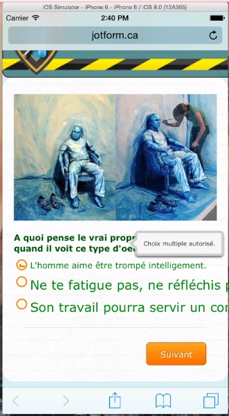
Thanks but it still doen't work as you can see in the attached file.
The header is still crop and the text too (it's a little bit better for the text).
We should be able to the the Eye logo at the top right of the header in any situation.
-
JanReplied on November 11, 2014 at 10:21 AM
Hi,
You have to make the top image responsive in order to do that. Please try adding this custom css code.
.form-cover-wrapper.top.center > img { width: 100% !important; height: auto !important; }
The image will scale down depending on the screen size. Here's the guide on How to Inject Custom CSS - (http://www.jotform.com/help/117-How-to-Inject-Custom-CSS-Codes-to-your-Form)
Hope this helps. Thanks.
-
lerhycReplied on November 11, 2014 at 3:01 PMIt seems to work better but with the responsive smartphone version I have a
big gap between the header and the form.
How to fix that?
2014-11-11 10:21 GMT-05:00 JotForm Support Forum <
noreply@jotform.com>:
... -
Mike_T Jotform SupportReplied on November 11, 2014 at 4:46 PM
I do not see the gap on the mobile version of your form.
What exactly do we need to check?
-
lerhycReplied on November 11, 2014 at 5:34 PM
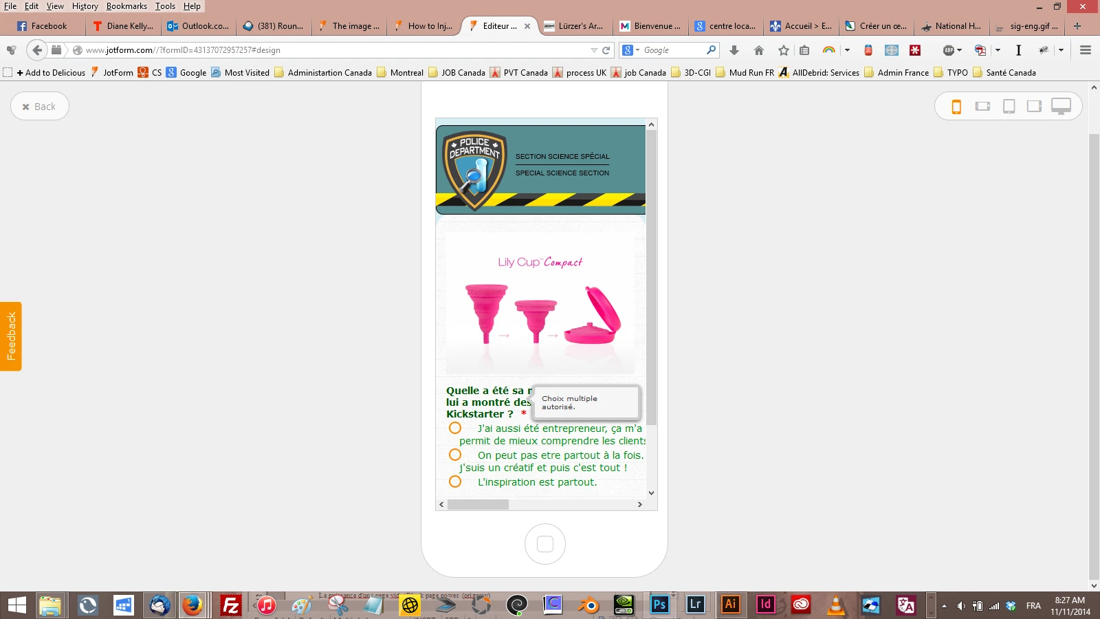
Your screenshot is the one before I added your css code. As you can see in your screenshot the header is croped.
Please, take a look to the screenshots (after added your css code) below and you will be able to see the gap.


-
Mike_T Jotform SupportReplied on November 11, 2014 at 6:35 PM
You can use the following CSS to set the 100% width to your Form Cover image:
.form-cover-wrapper.top.center > img {
width: 100% !important;
}The image height will be static 130px in this case, so the form will be without gaps on different devices.
-
lerhycReplied on November 12, 2014 at 5:24 PM
I'm completly lost.
Too many people helping me on that project.
I don't know anything about CSS code and each of you give me a different CSS code.
I don't know how to explain, I don't know how to do it, do i have to copy/past your code anywhere in the actuall CSS code? etc.
I worked on the cloned you did for me.
In the responsive smartphone mode :
1- I just don't want to have croped header and space between the header and the content form.
2- I don't want to have text and youtbe video croped
Please see attached files.
Regards


-
KadeJMReplied on November 12, 2014 at 5:50 PM
Our apologies, I believe my colleagues were following up your response with further suggestions because of your replies thereafter. Anyhow, lets try to take this a little slower so that we can make it happen for you.
Jan had replied to you with the mention of two guides and yes the css would have to be injected so that you could understand those better.
#How-to-Inject-Custom-CSS-Codes
The first was for your responsiveness but then you stated you were having issues with the image part and a few other parts so we were trying to help you with correcting those pieces to add together for the whole form so you would need to inject all of them if it is a different part.
Here's another explanation of example uses for css below.
#http://www.jotform.com/help/75-Customize-your-Form-using-Custom-CSS-Codes
If you don't want those applied then you would need to remove the related css that was added which has condensed and|or cropped your jotform.
Which cloned form are you working with now that you are seeing the cropped parts on?
-
lerhycReplied on November 13, 2014 at 6:53 PM
Please, find the clone here http://www.jotform.ca/form/43163762025248
-
raulReplied on November 13, 2014 at 8:05 PM
Hi,
Please allow me some time to work in a demo form and I'll get back with you.
Thanks.
-
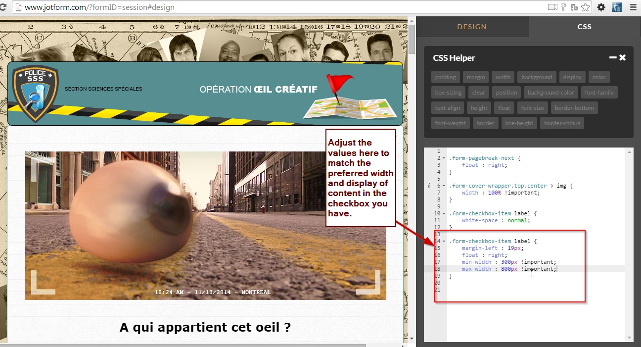
CharlieReplied on November 13, 2014 at 8:59 PM
Hi,
Can you please try cloning this form: http://form.jotformpro.com/form/43168002498961?
You can clone it using this guide: https://www.jotform.com/help/42-How-to-Clone-an-Existing-Form-from-a-URL
What I have changed:
1. Content not anymore being cropped.
2. I added a code in the Form Designer->CSS tab.
Code:
.form-pagebreak-next {
float : right;
}
.form-cover-wrapper.top.center > img {
width : 100% !important;
}
.form-checkbox-item label {
white-space : normal;
}
.form-checkbox-item label {
margin-left : 19px;
float : right;
min-width : 300px !important;
max-width : 800px !important;
}
3. YouTube now adjust on the display of the device.
4. What I did is adjust the width to "100%" and a specific height for the YouTube embed code.
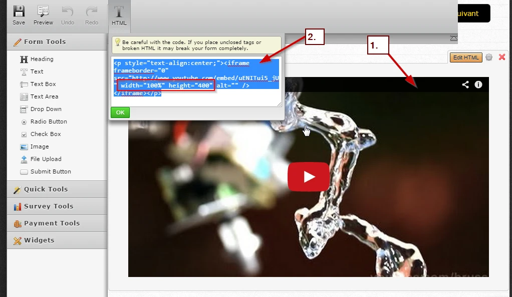
This is the YouTube Embed Code:
<p style="text-align:center;"><iframe frameborder="0" src="//www.youtube.com/embed/uENITui5_jU" width="100%" height="400" alt="The image header and youtube video does not fit using the designer tools for responsive form. Image-4" /></iframe></p>
All the values can be adjusted to your preferred one. Also, you can just clone the form I have so that you won't be confused to where to put the code, but the screenshots above should also help you give an idea to where they are placed.
I hope this helps. Let us know if you need further assistance on this.
Thank you.
-
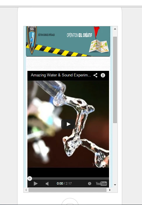
lerhycReplied on November 13, 2014 at 9:42 PM
Thx, I clone it
- It's OK for Youtube video.
- It's OK for the header.
- It's almost OK for the text. It's not responsive anymore. Take a look to screenshots below.

-
Ashwin JotForm SupportReplied on November 14, 2014 at 12:13 AM
Hello lerhyc,
Please take a look at the following cloned form and see if this works as expected: http://form.jotformpro.com/form/43168593036964?
The radio button options should be responsive now. Do check and get back to us if the issue persists.
Thank you!
-
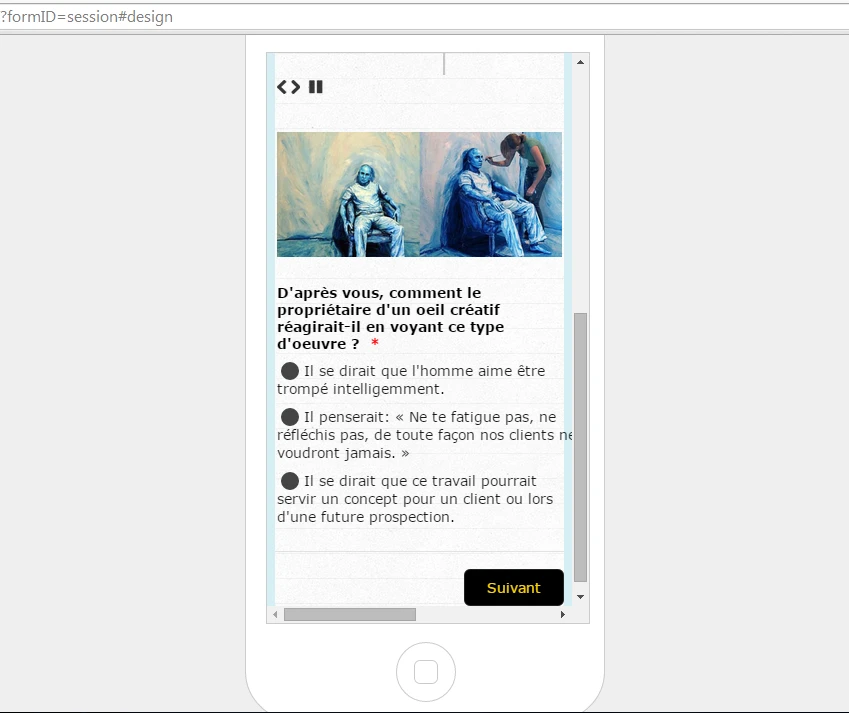
lerhycReplied on November 14, 2014 at 9:33 AM
Thanks !
It's lot of better ! but not perfect yet ;)
I invit you to take a look to the red outline of my screenshots.


-
lerhycReplied on November 14, 2014 at 10:41 AM
Youtube issue is OK.
You can do an other topic if you want.
-
CharlieReplied on November 14, 2014 at 11:54 AM
Hi,
I cloned the form that my colleague, ashwin_d, and made a few adjustments. Although, the same issue will still be visible like the spacing of the checkboxes, but this is because of the different display resolution.
http://form.jotformpro.com/form/43174321796963?
It will be very hard to have a cross compatibility to all displays and all browsers. You can also adjust the values of the width with your preferences so that you can explore more.
I hope this helps.
Thank you.
-
lerhycReplied on November 15, 2014 at 8:36 AM
I dont see any change.
However even if its not perfect responsive form, we still have a big problem as you can see below.
I don't think the radio button is responsive at all

-
jonathanReplied on November 15, 2014 at 5:05 PM
I suggest also that you do NOT use any html codes within the selection options (i.e. in the Radio options) because it will caused issue on the output

If you like, you can also add this CSS codes
.form-pagebreak{
float:left;
}
to make the Next (page break button) to aligned to the left on the form

Inform us if there is more we can assist you with.
Thanks.
- Templates
- Integrations
- INTEGRATIONS
- See 100+ integrations
- FEATURED INTEGRATIONS
 PayPal
- Slack
- Google Sheets
- Mailchimp
- Zoom
- Dropbox
- Google Calendar
- Hubspot
- Salesforce
- See more Integrations
- Products
- PRODUCTS
- Form Builder
- Jotform Enterprise
- Jotform Apps
- Store Builder
- Jotform Tables
- Jotform Inbox
- Jotform Mobile App
- Jotform Approvals
- Report Builder
- Smart PDF Forms
- PDF Editor
- Jotform Sign
- Jotform for Salesforce Discover Now
- Support


