
As a Jotform developer, my goal is to make Jotform better every day. We develop new features and improve existing features continuously. But, how do we know if we made the product better or not?
The solution is to track user behavior. To measure our success, we keep track of and monitor user behavior on our changes and email reports to our team on hourly, daily or weekly basis. Today, I will describe how we measure our success in detail.
Every analytics solution should include three steps.
- Collect events
- Build queries
- Visualize results
And every analytics based visualization is an aim to obtain insights on a rather complex system. You count the number of events (say, specific usage of a specific feature), and then you aggregate raw event data. By displaying data in a visual way, you can detect abnormalities or correlations.
Knowing how things change over time is usually more important than the hard numbers.
This leads to better hypothesis generation and better workflows. This is how you know what is happening and at what rate. If your charts include time series graphs, then you can monitor changes over time. Knowing how things change over time is usually more important then the hard numbers.
There are tons of analytics tools. But, in this post I’ll talk about the simplest one for UI intensive apps like Jotform, Keen IO.

Keen IO is great since you can easily send event data from your UI directly to their database. Then, you can create amazing looking charts with them or use the data as you wish.
Two Real World Examples on How Measuring Things Helped Us
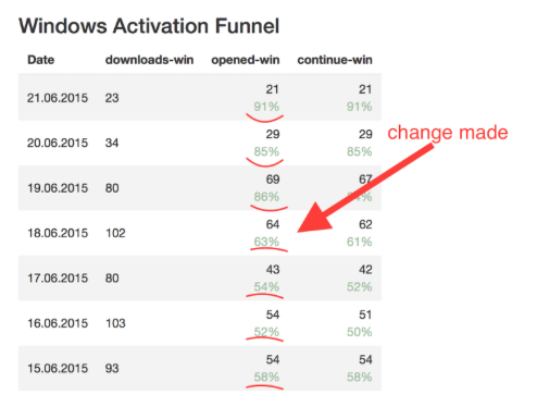
- Adobe FormsCentral was shutting down, so we released an installable import software tool to help Adobe FormsCentral users migrate to JotForm. By measuring the conversion rates using Keen IO we were able to find out that there was a problem on the windows version, and fix it.
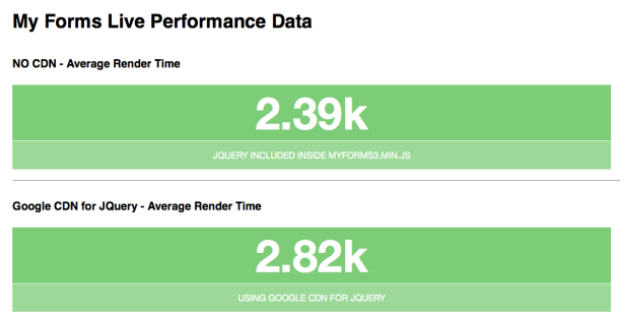
- Some users reported that our Workspace page (formerly My Forms) was too slow for them. We were able to find out the reason by tracking a variety of metrics. The problem was the slowness of the Google CDN.
Let’s Dive In
To use the code snippets below, you should include keen.js in your webpage as follows:
<script src="https://d26b395fwzu5fz.cloudfront.net/3.2.6/keen.min.js" type="text/javascript"></script>
And if you are working on node.js, you should first install keen via npm:
npm install keen-js
and require it:
var Keen = require(‘keen-js’);
then, all below code snippets would work.
1. Track Events
In Keen IO, you can have multiple projects, and each project can have multiple collections. First, you should decide what you will keep track of in a project and then manually create that project in keen.io. For collections, keen does that automatically for you.
var client = new Keen({
  projectId: 'yourprojectid',
  writeKey: 'yourprojectwritekey'
});
Now we are ready to collect events. Let’s test it. Send an example list of events:
for(var i = 1; i <= 10; i++){
  client.addEvent('sampleCollection', { name: 'Event '+i });
}
Once you confirm that this is working, plug this code with real data and start tracking! That’s pretty much all the code we need to track user behavior. Keen IO is amazingly simple.
2. Build a Dashboard
Once you start collecting events, you are ready to prepare a dashboard. Keen IO supports great visualization methods. They are extremely easy to implement.
client.draw(query, selector, config);
The default chart type is Google Charts. Once you include the Keen library, you can set chart type, title, label, colors, etc. Chart types can be used as follows: areachart, barchart, columnchart, linechart, metric, piechart and table.
{
  colors: [ "#ff0000", "#222", "lightblue" ], //
  title: "",        // string or null
  height: 400,      // integer
  width: 600,       // integer or "auto"
  labelMapping: {
    "Step 1",
    "Step 2 (75%)",
    "Step 3 (50%)",
    "Step 4 (12%)"
  },
  colorMapping: {
      "Home": "#ff0000",
      "Gallery": "purple"
  },
  chartOptions: { //example usage
      isStacked: true,
      legend: { position: "none" },
      bar: {
         groupWidth: "90%"
      }
  }
}
You can write common functions for drawing different kind of charts or calculating multiple queries by giving various arguments.
client.run([query1, query2], function(response){});
//evaluates 2 queries
3. Statistically Analyze Results
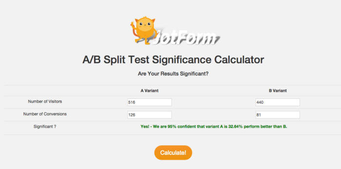
As you know, A/B testing (also known as split testing) is comparing two versions of a web page to see which one performs better. You can compare two web pages by showing the two variants to visitors at the same time. The one that gives a better conversion rate will wins! To be able to statistically say a winner variant is really better, you need to calculate the significance of your results.
Significance calculation requires a lot of math. So, to save the trouble of doing all the math by yourself, you can use one of the readily available calculators on the web. At Jotform we’ve build our own. Feel free to use it on your projects:
Free A/B Split Test Significance Calculator
You can now easily test your A/B test results from our calculator to be confident of your success!
Now, it’s your turn to track your data, make dashboards and measure your success!


Send Comment: