


With the Configurable List widget, you can define and display a set of fields or questions on your form. Your respondents can then add and answer as many of those fieldsets on your form as you allow. This is ideal for asking a set of questions multiple times.
Setting Up the Widget
Here’s how to set up and configure the Configurable List widget:
- In Form Builder, choose Add Form Element in the upper-left corner.

- In the Form Elements pane on the left, select Widgets at the top.
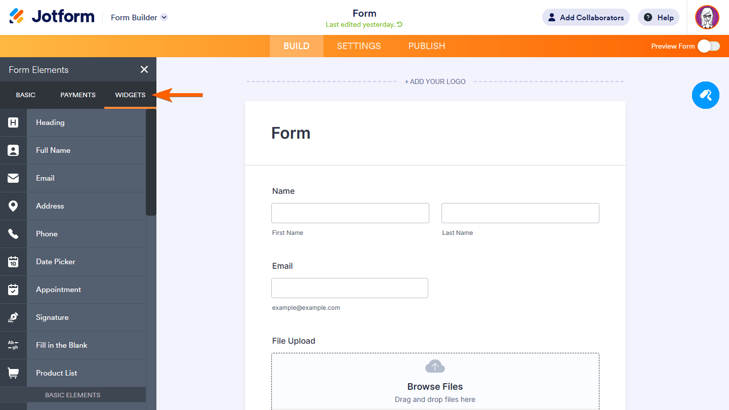
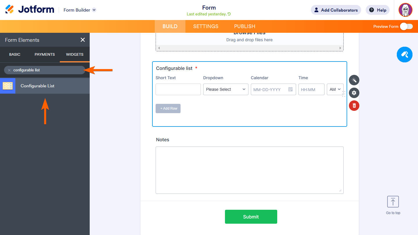
- Now, search and select Configurable List.
After adding the widget to your form, its settings pane should show up on the right side. If not, click on the widget’s wand icon to open Widget Settings.
- In the Widget Settings pane on the right, define your fields in the Fields configuration area.

Note: Field declarations should be separated by a line break.
Here’s the list and syntax of supported field types that you can use in your dynamic list:
text
Accepts single-line plain texts.
[label]:text[:placeholder]Examples:
- Name: text
- Email: text: Type here…
number
Accepts numbers only.
[label]:number[:placeholder:step,min,max]Example:
- Quantity: number
- Age: number: Enter your age
- Rating: number:: 1, 1, 10
textarea
Accepts plain texts and line breaks.
[label]:textarea[:placeholder]Example:
- Notes: textarea
- Comments: textarea: Type here…
dropdown
A list of options in a drop-down list.
[label]:dropdown:option1[,option2,...:placeholder]To have one of the options selected by default, replace placeholder with one of the options on your list.
Examples:
- Pizza: dropdown: Cheese, Pepperoni, Sausage
- Size: dropdown: Small, Medium, Large: Please select
- Drink: dropdown: Apple, Orange, Pineapple: Orange
radio
Single Choice (radio button) — select one of the available options.
[label]:radio:option1[,option2,...]Examples:
- Order: radio: Pick-up, Deliver
- Vegetable: radio: Carrot, Radish, Broccoli
checkbox
Multiple Choice — check off available options.
[label]:checkbox:option1[,option2,...]Examples:
- Addons: checkbox: Soda, Salad, Fries
- Sauce: checkbox: Sweet, Sour, Spicy
dateInput
A date picker with calendar pop-up.
[label]:dateInput[:format]If the date format is undefined or invalid, it defaults to y/m/d. You can interchange the letters as you wish.
Examples:
- Date: dateInput
- Date of Birth: dateInput: m/d/y
timeInput
A time selector.
[label]:timeInput:format[,now] - The allowed
formatvalues are 12 (with AM/PM selector) and 24. If invalid, it defaults to 12. - To set the current time as default, append “
,now” to the declaration.
Examples:
- Arrival Time: timeInput: 24
- Current Time: timeInput: 12, now
date
A three-field date picker.
[label]:date[:format:range:today]- If the date
formatis undefined or invalid, it defaults to y/m/d. You can interchange the letters as you wish. - The year
rangeis formatted as start-end (e.g., 2015-2025). If undefined or invalid, it defaults to 10 years back up to the next year. - To set the current date as default, append “
:today” to the declaration.
Examples:
- Date of Birth: date
- Arrival Date: date: m/d/y: 2025-2030
- Date: date: d/m/y:: today
time
A three-field time selector.
[label]:time[:format,now]- The allowed
formatvalues are 12 (with AM/PM selector) and 24. If undefined or invalid, it defaults to 12. - To set the current time as the default, append “
,now” to the declaration.
Examples:
- Arrival Time: time
- Current Time: time: 12, now
static
Display a message or text.
[label]:static:[text]You can include some basic text-related HTML tags.
Examples:
- Note: static: We are open 24/7.
- Tip: static: Click on the <strong>Add Row</strong> button to add more.
Setting Fields as “Required”
To prevent your form fillers from skipping mandatory fields, you can set them as “required” by adding an asterisk (“*”) at the beginning of the field declaration.

Your form fillers won’t be able to submit the form as long as the required fields are empty.
Setting Up Other Configurations
In the Widget Settings pane on the right, scroll down past Fields configuration under the General tab to see more options to configure the widget.

Here are the available options:
- Minimal rows number — The minimum number of fieldsets to display on your form.
- Maximal rows number — The maximum number of fieldsets allowed on your form. Zero stands for unlimited.
- Label for Add — The text to appear in the “add” button.
Changing How the List Looks
It’s often necessary to style your form to look exactly how you would like, perhaps to match your product image or corporate identity among other reasons. With this widget, you can further customize how the list looks by adding custom CSS.

Send Comment: