Jotform helps you quickly upgrade your form’s design with the Polaris Checkbox widget, which adds larger and more modern checkbox options using a Polaris-style theme. You can customize the appearance in Form Builder to match your layout, then add it to your form in just a few clicks.
Here are a few ways to use it:
- Add Polaris-style checkboxes to your form.
- Make your form more visually appealing.
- Improve clarity when users select options.
- Create a more modern and polished form experience.
Whether you’re creating a new form or updating an existing one, you can add and set up the Polaris Checkbox widget in a few easy steps. Here’s how to do it:
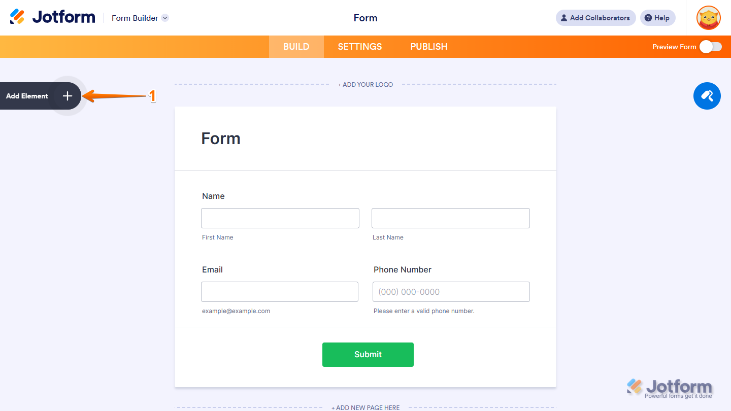
- In Form Builder, click on Add Element on the left side of the page.
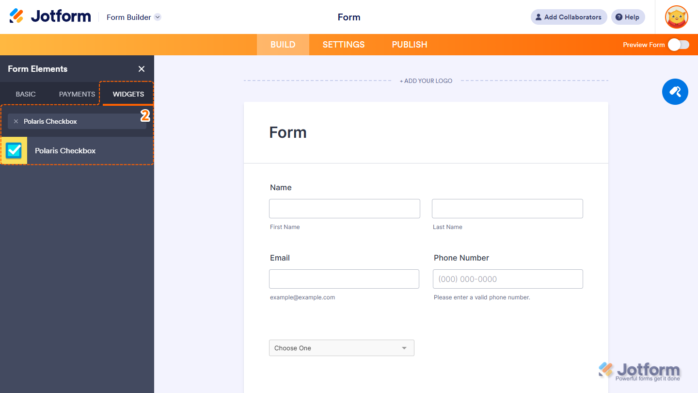
- Now, in the Form Elements menu, under the Widgets tab, search for Polaris Checkbox and click on it. Or, just drag and drop it to where you want it to be on your form.
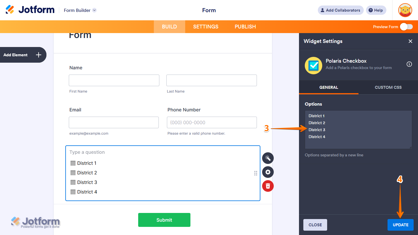
- Next, in the Widget Settings window that opens on the right side of the page, under the General tab, enter your list of options in the Options Input box, each on a new line.
- Once everything’s set, click on Update.
That’s it. You’ve successfully added and set up the Polaris Checkbox widget on your form. Wondering how it looks in action? Check out this demo form.
Note
- For advanced styling of the Polaris Checkbox widget, you can add your own custom CSS code under the Custom CSS tab in the Widget Settings. Our guide on How to Inject CSS Codes to Widgets walks you through everything.
- You can also configure the widget properties, like alignment, labels, size, visibility, and more, to control how it looks and behaves in your form. Check out our guide on How to Access and Configure the Question Properties of a Widget to learn more.

Send Comment: