Jotform’s Masked Input widget helps ensure users enter numeric data in a consistent and structured format, making it ideal for forms that collect financial figures, percentages, or measurements. By automatically applying formatting rules—such as decimal places, currency symbols, and thousand separators—the widget reduces input errors and simplifies data validation. This is especially useful in order forms, expense reports, or any scenario where clean, properly formatted numeric input is crucial.
Here are a few ways to use it:
- Ensure phone numbers are entered in a consistent format.
- Standardize date inputs to prevent formatting errors.
- Collect credit card numbers in a structured pattern.
- Format Social Security or national ID numbers correctly.
- Enforce postal or ZIP code formatting rules.
- Capture license plate numbers in a required structure.
- Standardize employee or student ID entries.
- Guide users when entering account or reference numbers.
- Reduce input errors by displaying a clear typing pattern.
- Improve data accuracy for forms that rely on strict formatting rules.
Whether you’re creating a new form or updating an existing one, you can add and set up the Masked Input widget on your form in a few easy steps. It only takes a minute to set up—here’s how:
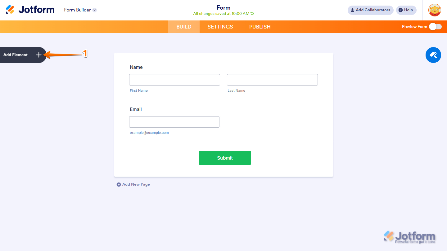
- In Form Builder, click on Add Element on the left side of the page.
- Now, in the Form Elements menu, under the Widgets tab, search for Masked Input and click on it. Or just drag and drop it to where you want it on your form.

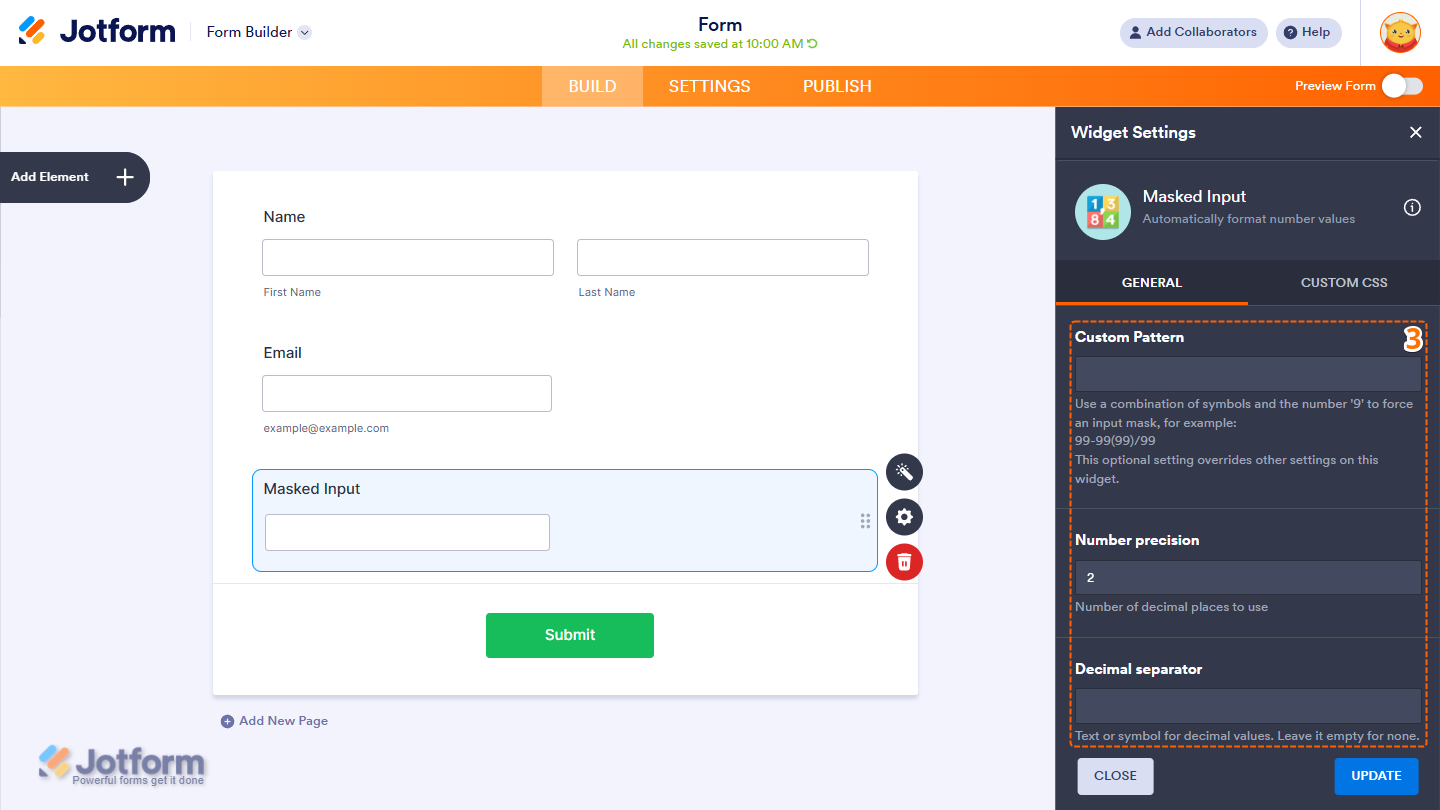
- Next, in the Masked Input Widget Settings menu that opens on the right side of the page, under the General tab, set up the following things:
- Custom Pattern — Use a combination of symbols and the number ‘9’ to force an input mask. Number 9 represents number inputs. Setting this up will override other settings on this widget.
- Number Precision — Set the number of decimal places.
- Decimal Separator — Enter a text or symbol for decimal values. Leave it empty to use the default, which is the dot symbol.
- Then, scroll down to the middle and continue to set up these settings:
- Thousandths Separator — Enter a sign or symbol to separate thousands or millions. Leave it empty to use the default, which is a comma.
- Allow Numbers Only — Set this to correct the value to numbers by removing illegally entered characters.
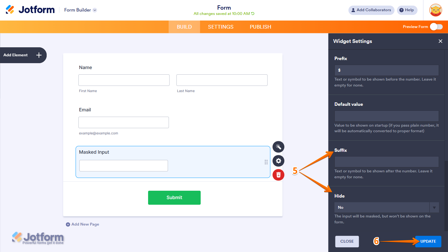
- Prefix — Set the text or symbol to be shown before the number. Leave it empty for none.
- Default Value — Enter a value to be the default when your users view the form.

- Now, scroll down to the bottom and complete these fields:
- Suffix — Set the text or symbol to be shown after the number. Leave it empty for none.
- Hide — Choose to show or hide the widget in the form, but keep the input masked, especially if you have a default value.
- Once everything’s set, click on Update.
That’s it! You’ve now successfully added and set up the Masked Input widget to your form. Take a peek at this Demo Form to see it in action.
Notes
- For advanced styling of the widget, you can add your own custom CSS code under the Custom CSS tab in the Widget Settings. Our guide on How to Inject CSS Codes to Widgets walks you through everything.
- You can also configure the widget properties, like alignment, labels, size, visibility, and more, to control how it looks and behaves on your form. Check out our guide on How to Access and Configure the Question Properties of a Widget to learn more.

Send Comment: