With Jotform’s Brazilian Postal Code (CEP) Validator widget, you can validate Brazilian CEP postal codes as respondents enter them. The widget automatically normalizes CEPs and provides format feedback while letting you configure accepted cities or CEP prefixes. Here are a few ways to use it:
- Verify delivery areas — Check whether a CEP belongs to a supported city.
- Restrict service requests — Accept requests only from defined CEP areas.
- Manage local registrations — Collect registration details for events serving specific areas.
- Control regional eligibility — Limit applications to approved locations.
Whether you’re creating a new form or updating an existing one, you can add the Brazilian CEP Validator widget in just a few steps. Here’s how:
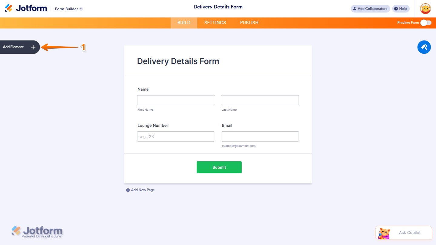
- In Form Builder, click on Add Element on the left side of the page.
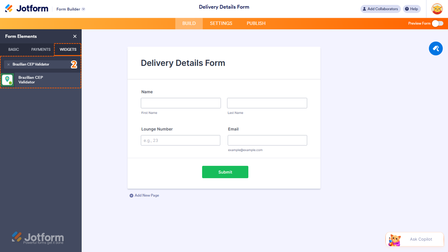
- Then, in the Form Elements menu, under the Widgets tab, search for Brazilian CEP Validator and then click on it. Or, drag and drop it to where you want it to be on your form.
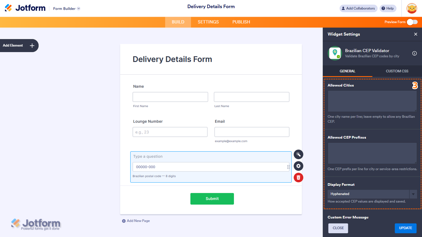
- Next, in the Widget Settings menu that opens on the right side of the page, configure these settings:
- Allowed Cities — Enter one city name on each line. Leave this field empty to allow CEPs from any Brazilian city.
- Allowed CEP Prefixes — Add one CEP prefix on each line to restrict CEPs by city or service area.
- Display Format — Click on the Dropdown menu and select Hyphenated or Digits Only to set how accepted CEP values are displayed and saved.
- Now, scroll down to the bottom and configure these options:
- Custom Error Message — Enter the message displayed when the CEP format is invalid or the city restriction isn’t met.
- Block Submission on Invalid — Keep this toggled on to prevent forms from being submitted when the CEP is invalid or isn’t associated with one of the allowed cities.
- CEP Placeholder — Add placeholder text to be displayed inside the CEP field.
- Once you’re done, click on Update at the bottom of the page.

That’s it! You’ve successfully added the Brazilian CEP Validator widget to your form. Check out the screenshot below to see how it looks:

Try it out and see what it looks like on this demo form.
Notes
- For advanced styling of the widget, you can add your own custom CSS code under the Custom CSS tab in the Widget Settings. Our guide on How to Inject CSS Codes to Widgets walks you through everything.
- You can also configure the question properties of the widget, like labels, alignment, size, visibility, and more, to control how it looks and behaves on your form. Check out our guide on How to Access and Configure the Question Properties of a Widget to learn more.

Send Comment: