Creating accessible forms ensures that every user, including those using screen readers or motor-assistive technology, can complete your form successfully. Use these strategies to optimize your labels for maximum inclusivity.
Optimize the Field Label
The Field Label serves as the programmatic name for your form element. This is the primary information a screen reader announces when a user focuses on a field.
- Be Descriptive: Instead of just “Name,” try “Full Name” or “First and Last Name.”
- Avoid Placeholder Text as Labels: Never use Placeholder text as a replacement for a label. Placeholders often have low color contrast and disappear once a user starts typing, which can disorient users with cognitive disabilities or memory impairments.
Guiding Users with Sub-labels
Labels tell a user what to enter, while sub-labels tell them how. By placing small hints directly below the input field, you remove the guesswork that often leads to mistakes or frustration.
When to use them
Sub-labels are perfect for “micro-instructions” like formatting hints (e.g., Include area code) or specific constraints (e.g., Maximum 200 words). Many forms use gray text inside the box that disappears once you start typing. Sub-labels are a better choice because:
- They stay visible: Users can double-check the rules even after they’ve started filling out the field.
- They are accessible: Unlike disappearing text, sub-labels are easily read by screen readers, ensuring no one misses important context.
- They prevent errors: Keeping instructions in plain sight helps users get it right the first time, leading to higher completion rates.
Use Accessibility Checker
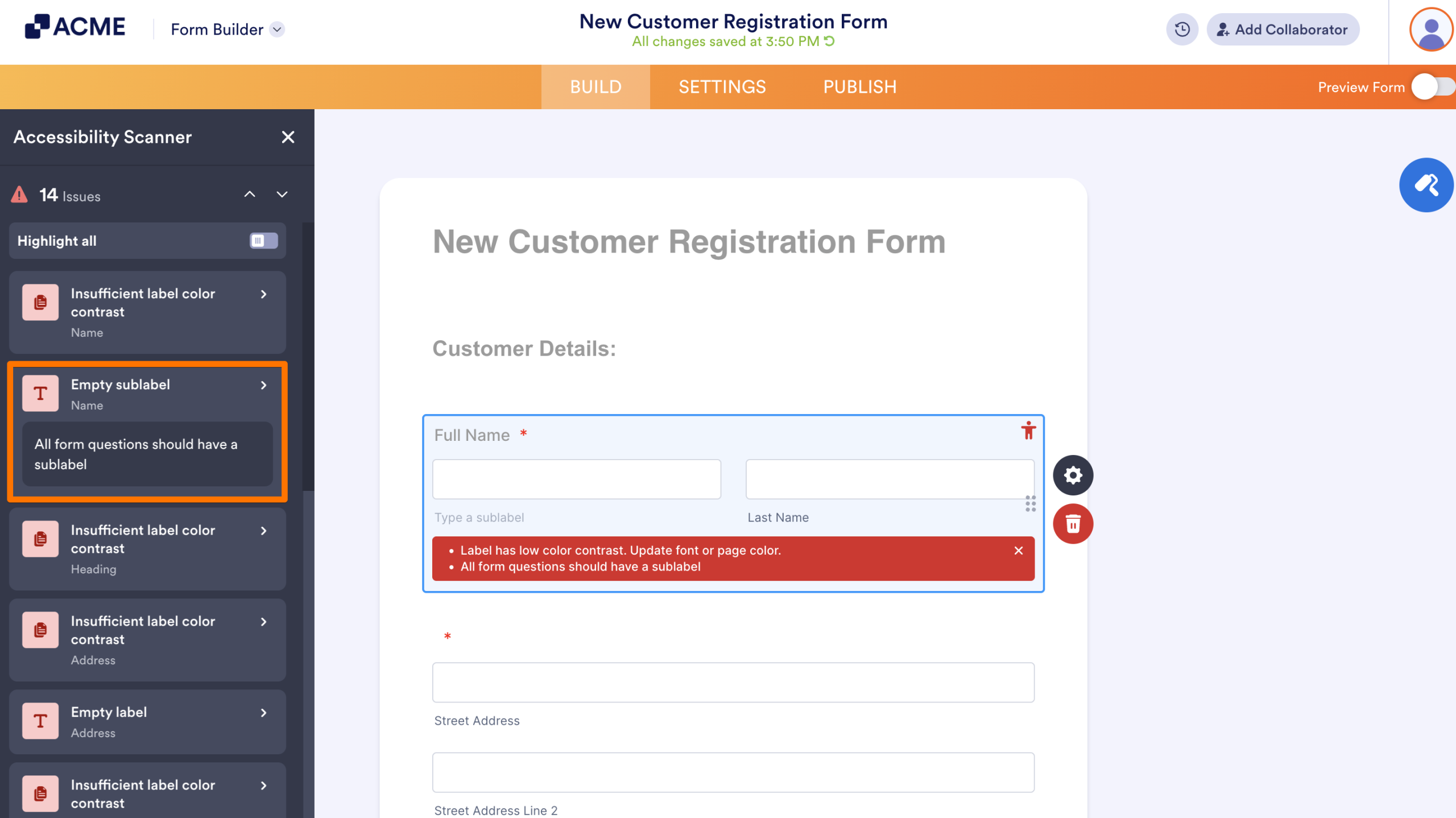
Before you publish, use the built-in validator to catch any issues you might have missed. If the Form Accessibility is not enabled, you can turn it on in the form settings.
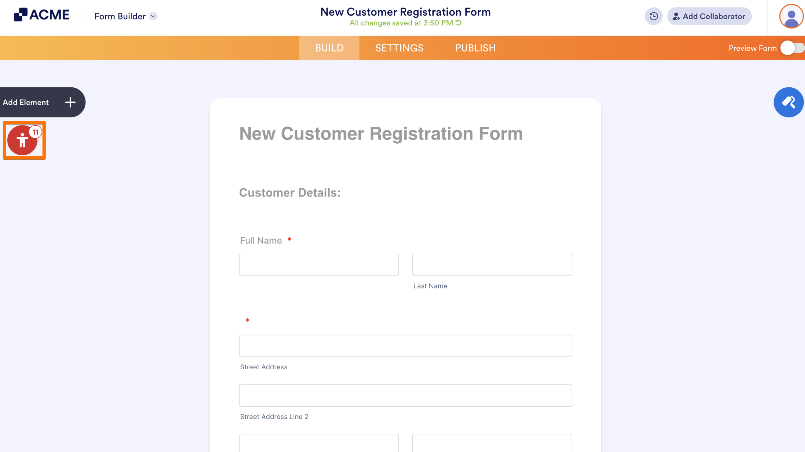
- In the Form Builder, click on the red Person icon to open Accessibility Checker.
- Next, click on the issue system flags to update them.
See also:

Send Comment: