Ensure your form is readable for everyone, including users with low vision or color blindness. Color contrast refers to the difference in brightness between your text and its background. When contrast is too low, text becomes difficult to read. Use these steps to identify and fix contrast barriers in your design.
Identify Color Contrast Issues
Before making design changes, use the scanner to pinpoint exactly where your form falls short of readability standards:
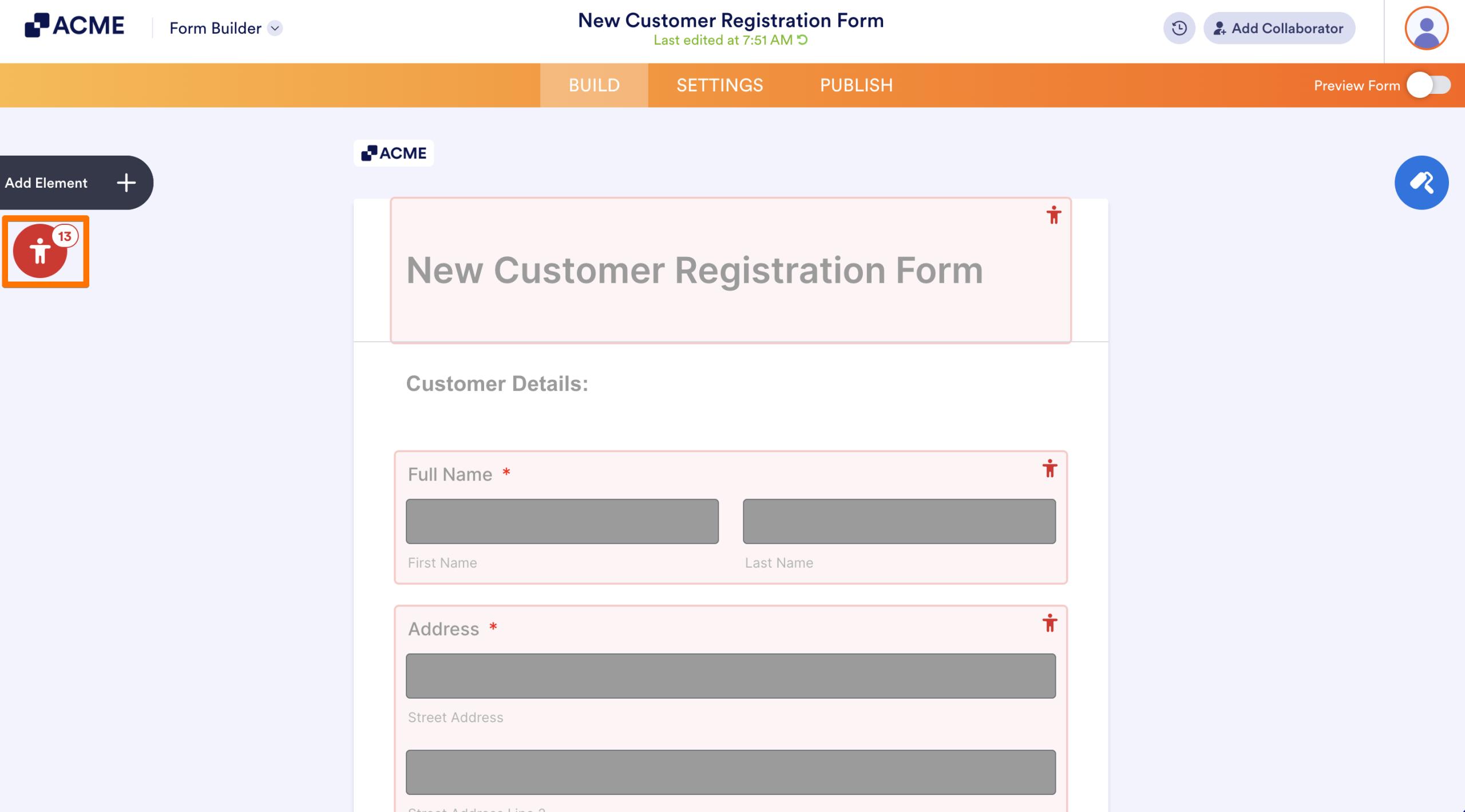
In the Form Builder, click on the red Person icon to open the Accessibility Scanner.
Look for the following specific warnings:
- Color contrast warning: Typically refers to the main question labels.
- Input color contrast warning: Refers to the text or background inside the entry fields.
- Inaccessible theme: A general warning that your overall color palette is non-compliant.
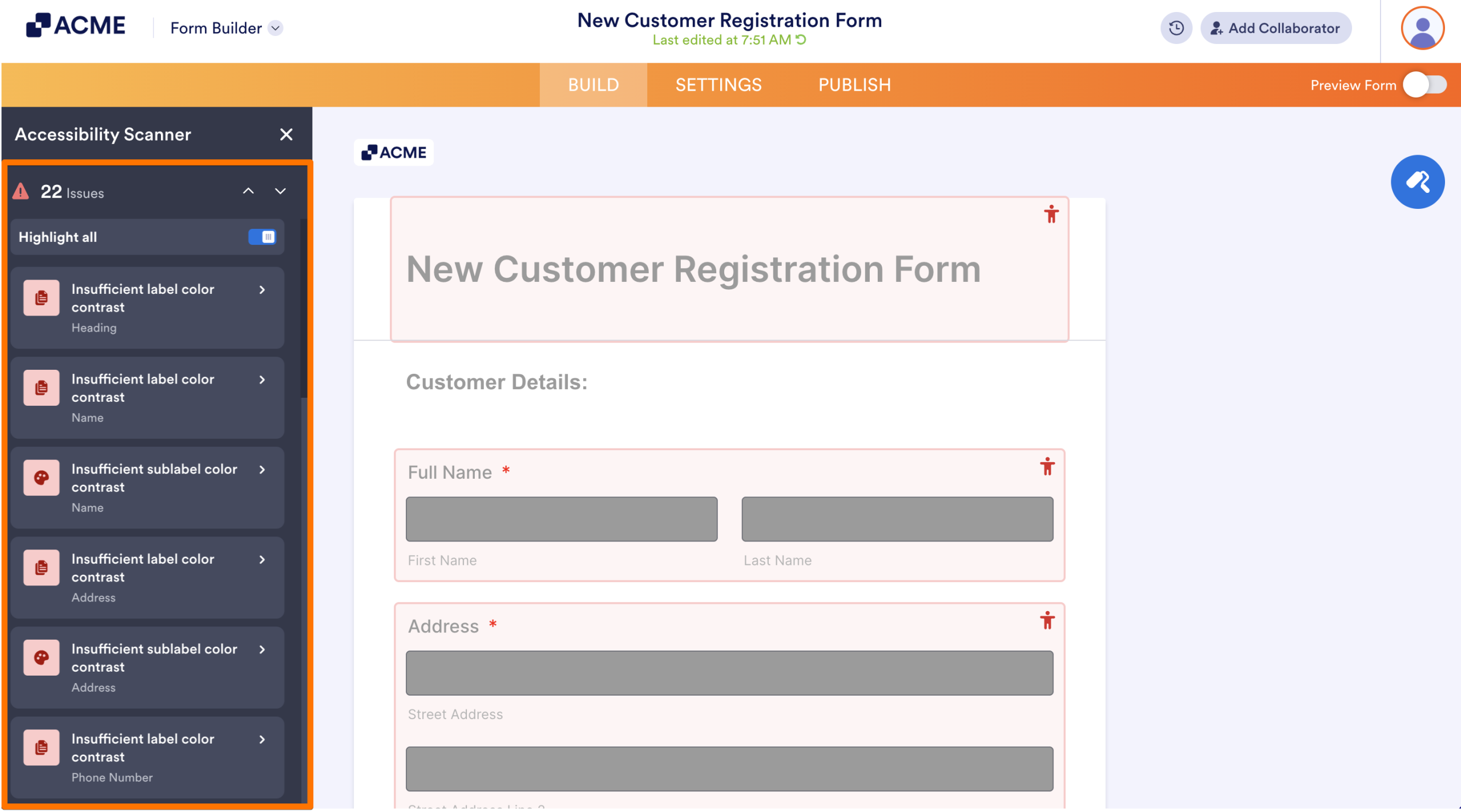
Clicking any issue in the list will highlight the exact field that needs a fix.
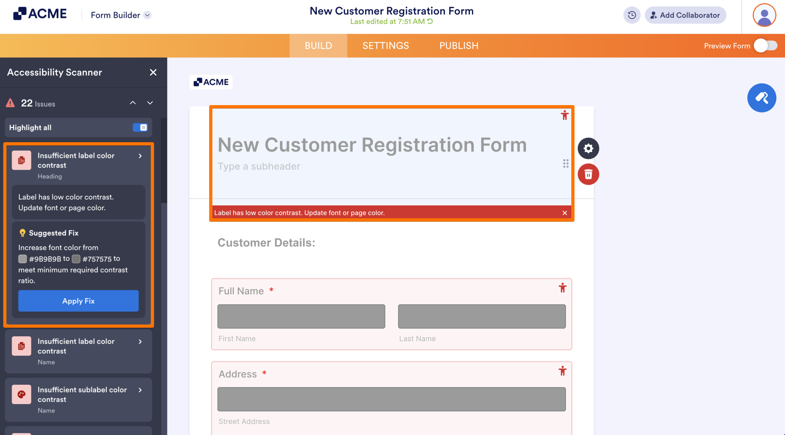
Resolve Color Contrast Issues
Once you have identified the problematic areas, you have several ways to fix them depending on whether you want a quick fix or a global design change:
Use the Quick Fix
- In the Form Builder, select the specific contrast error in the Accessibility Scanner panel.
- Next, click on Apply Fix.
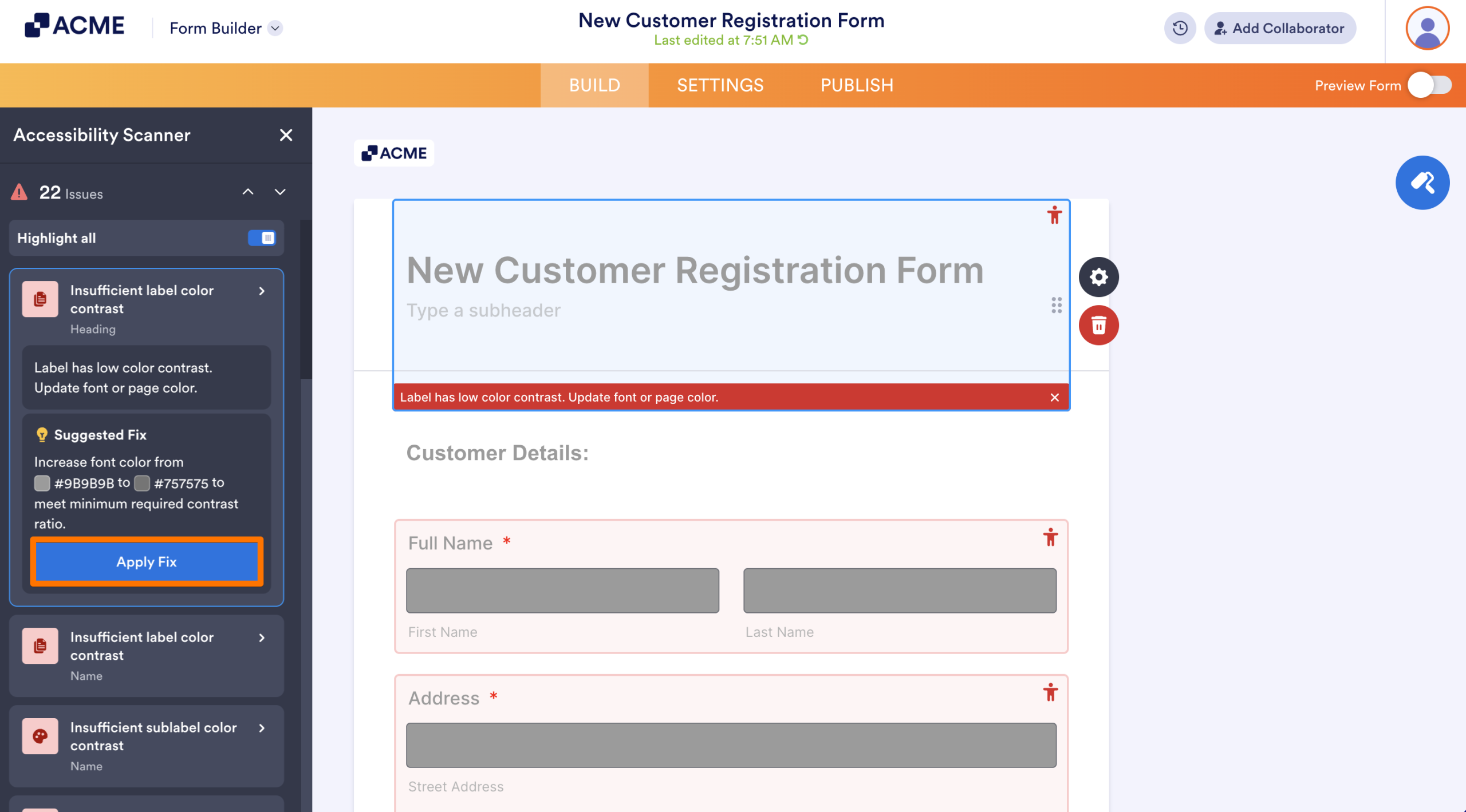
This allows the system to automatically adjust the color to a compliant ratio for that specific element.
Adjust via Form Designer
To manually style your form or resolve multiple issues at once, use the Form Designer tool:
- In the Form Builder, click on the Paint Roller icon on the right side of the page.
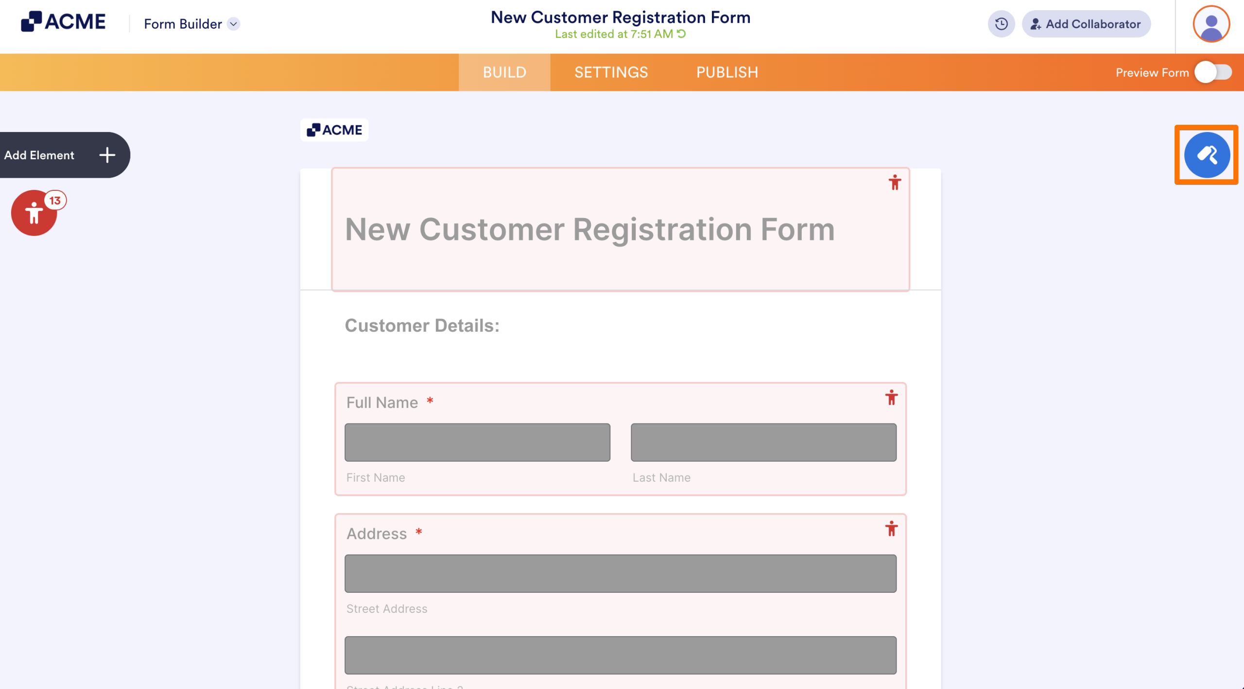
- Under the Colors tab, use the following settings to fix specific contrast issues:
- To fix label and sublabel contrast: Adjust the Form Color (the background behind your fields) or the Font Color until the text stands out clearly.
- To fix input contrast: Change the Input Background color to ensure it contrasts sharply with the text typed inside the fields.
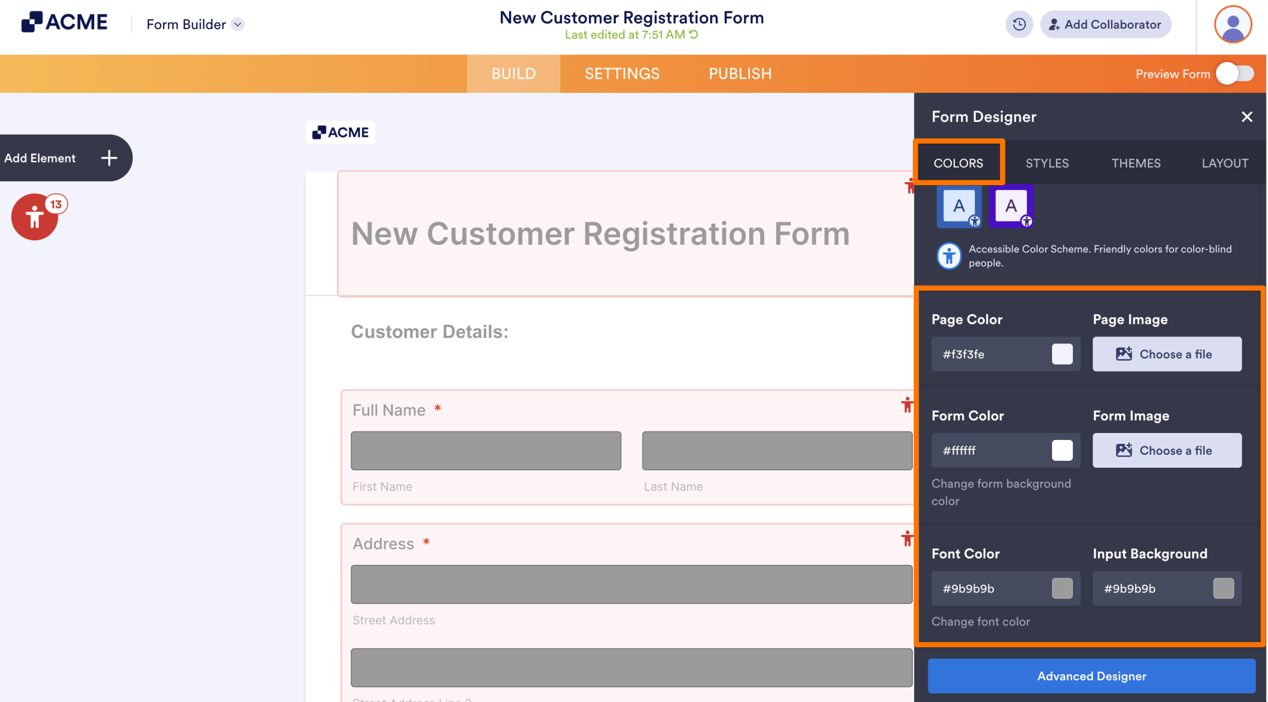
Monitor the Accessibility Scanner as you make changes; the errors will disappear once the colors meet the required contrast ratio.
Handle Inaccessible Themes
If you receive an Inaccessible Theme warning, it is best to change the overall look by selecting a different theme:
- In Form Builder, click on the Paint Roller icon on the right.
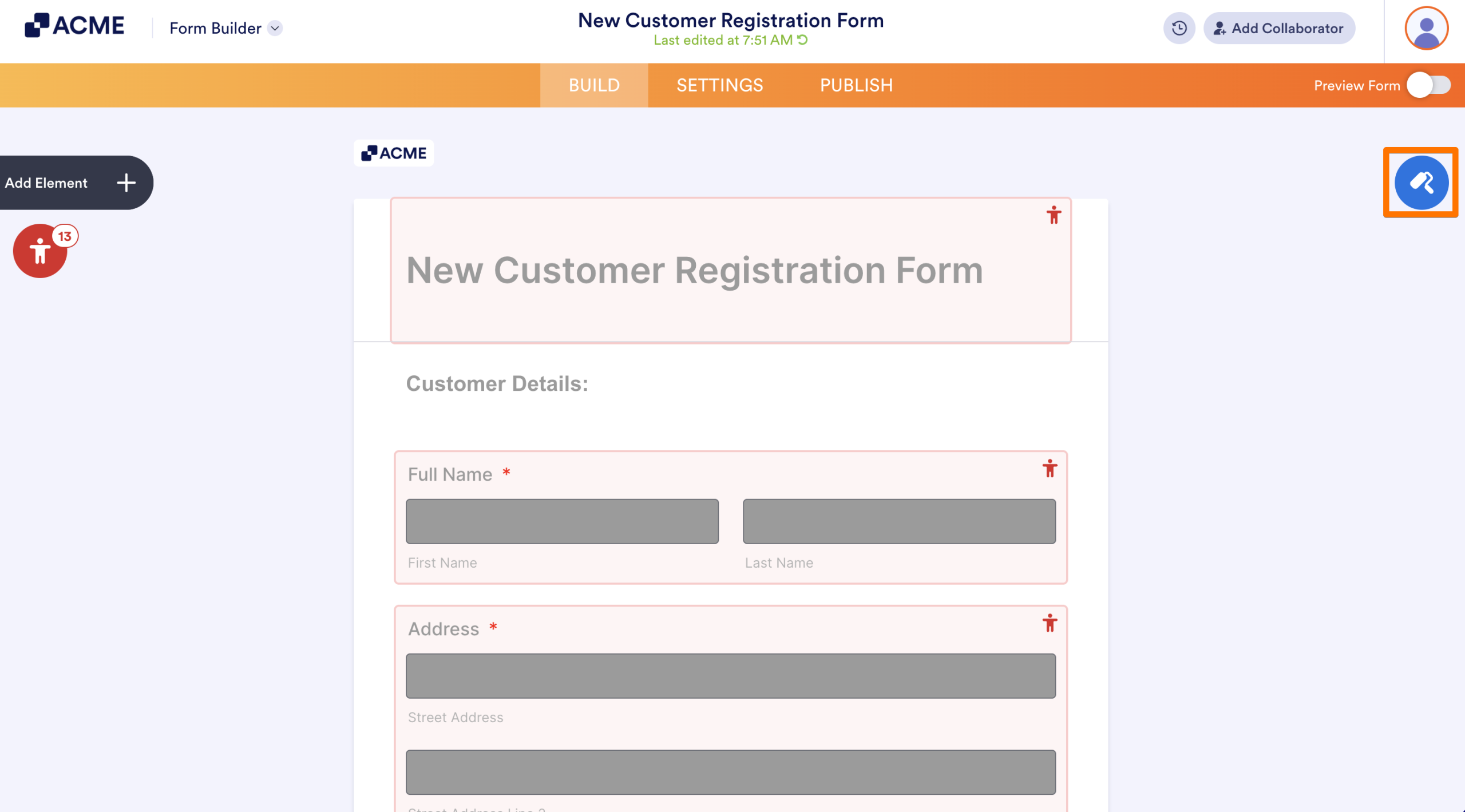
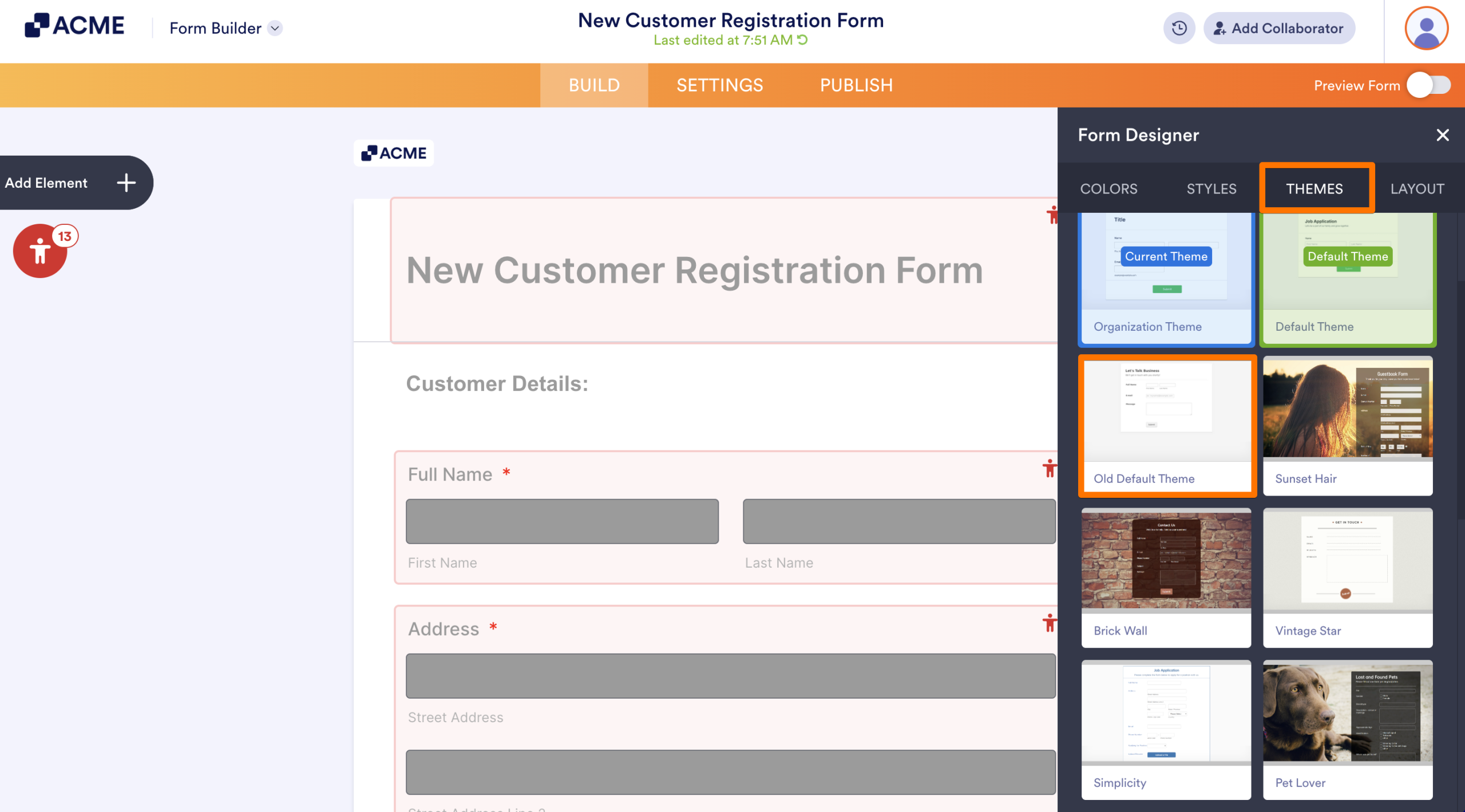
- In the Form Designer, navigate to the Themes tab.
- Click on a different theme to apply that theme to your form.
Tips
- If you have too many contrast issues, it is best to select a new theme to resolve them at once.
- To further ensure brand and accessibility consistency, you can create an organizational template with a pre-verified accessible theme for the form creators to use.
See also:

Send Comment: